Choice of Visuals: Reasons
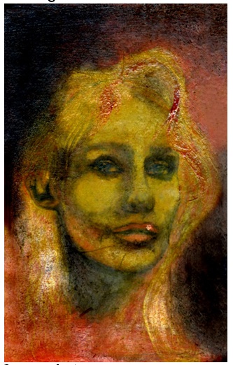
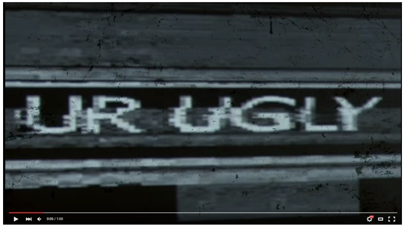
The reasons for choosing the pictures above as the support for the text conveying the message are quite basic. The images (see Appendix A) were chosen to create a mild yet noticeable contrast between the message that the textual part of the visual contains and the image that serves as the support. As a result, the audience will be able to receive a nuanced piece of information and approach it from different angles when processing it.
Visuals and the Intended Message: Support
Each of the visuals in question supports the message substantively at the same time provoking a discussion. For instance, the billboard shows that the modern concept of beauty is often used at its most superficial level in order to cater to the target audience. The photo, in its turn, allows for an in-depth analysis of modern clichés of attractiveness. Combined with the message, the picture allows the audience to conclude that the lack of details serves as a boost for the viewer’s imagination and, therefore, helps build an attractive image based on a comparatively small number of characteristics.
The video comments on the controversy of the contemporary concept of beauty whereas the screenshot displays clearly that the problem of the modern beauty concept has not been explored fully yet. The drawing, however, displays quite evidently that the current concept of appearance and beauty, though shaped significantly by the uniform set of principles foisted on people by modern media, is still affected significantly by the unique viewpoint of an individual. Moreover, the drawing makes it very clear that the concept of physical attractiveness is flexible enough to be seen in the images that are typically interpreted as failing to comply with the contemporary attractiveness standards. More importantly, the visuals discussed above allow suggesting that the phenomenon of beauty cannot possibly exist outside the society.
The combination of the five visual aids provided above helps understand the modern culture of beauty. As a result, a better understanding of where the line can be drawn between attractiveness and the lack thereof is provided. Specifically, the tools for marking the characteristics that make a certain object, person or idea attractive can be identified.
Expected Reaction: Assumptions
It is expected that the reaction of the audience is going to occur at least at two stages. First, the audience will understand the contextual meaning of the message and consider it from the perspective of their culture. It is assumed that the members of the audience will perceive the information in different ways depending on their age, gender, ethnicity, and social background. The differences in the message perception can be attributed to the variety of prejudices that will make the target audience view the message through the goggles of specific social standards. E.g., women may consider the message in question as clichéd whereas men may assume that it promotes a positive image of a woman.
The second stage of the audience’s reaction can be defined as recognizing the underlying ideas of the message and the double meaning that it contains. Last but definitely not least, the reinforcement of the message in question with the help of the font characteristics is expected. Particularly, it is expected that some members of the audience will display clearly positive emotions as the message becomes increasingly evident, whereas others, on the contrary, may become irritated as the message is being rubbed in. However, no neutral attitudes to the message in question are expected.


