Packaging is an extremely important aspect of marketing the product and also the product itself. Although it may be the last part of the products manufacturing process and constitute only 5-10 of the cost of manufacturing the product it should always be planned beforehand and given due importance. Packaging is an important part of getting the consumer to try the product the first time.
First of all packaging of the product needs to be clear and uncluttered. It is important that the consumer is able to easily understand the message that the manufacturer is giving about the product.
The packaging needs to be in line with the theme of the product that the manufacturer wants to project. For example if the manufacturer is trying to sell the product as an environmentally friendly one, then it makes sense to ensure that the packaging is also in line with this concept. Theme is also very important when we consider all aspects of the package from the design of the package to the materials used in its construction. The color’s , the graphics used the placement should all fuse together to give a unified message.
Another important part of good packaging is that it should differentiate your product from your competitors. This is especially important when a product is competing in a heavily dominant or competitive market and the manufacturers are trying to secure an edge by tackling a specific niche In the market. Also if the packaging is not different in terms of color scheme or graphics consumer’s might not be able to differentiate the product from the competitions.

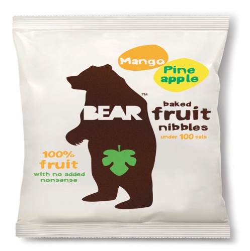
This is an example of good packaging. For starters there is no cluttering anywhere. The products attributes are being communicated very cleanly and clearly to the consumer. The graphic is clearly playing a important role in attracting the consumers, because of its connection to the theme of the product and also because it has a large presence on the packaging. The colors are smooth and blend in together with each other. A very important point is that each element of the packaging is in line with the theme of the product. The simplicity of the package, the colors, the graphic and even the font contribute towards emphasizing the natural appeal of the product. Also the packaging is original and creative and stands out from the packaging of competing products.

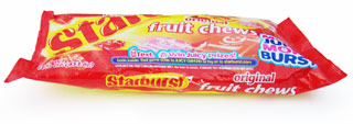
This can be taken as an example of bad packaging. First of all the packaging is cluttered with color and words, which means the products message is not being communicated clearly to the consumer. There is also no distinctive graphic with which the product can be associated. Also the packaging is not really thematically unified. The product’s name is starbursts which gives the reader the impression of the color yellow. However instead of yellow the packaging is mostly a bright shade of red. Another issue with this packaging is that it does not really stand out from the competitors packaging. In conclusion consumers will not really find this packaging appealing or original in anyway.