Executive Summary
Using statistical analysis to examine data comprehensively and thoughtfully offers several advantages for decision-making. Conclusions based on statistics are objective and unbiased as long as the analysis is done correctly. By removing personal opinion and human error from statistical analysis, more reliable and transparent decisions can be made, increasing efficiency in the application environment.
This paper uses a dataset of fertility and life expectancy for 2019 for 191 countries worldwide. The analysis tools are descriptive and inferential statistics, namely correlation and regression analysis, combined with the study of general distribution trends. The analysis helps determine the patterns in the data and how fertility is related to life expectancy.
Descriptive Statistics
The first step in analyzing the data is using descriptive statistics to identify common distribution patterns. Table 1 summarizes the results of calculating both measures of central tendency and some measures of variability. The table shows that the average fertility rate for the 191-word sample in 2019 was 2.6 (SD = 1.2) children per woman, and the average life expectancy was 73.81 (SD = 7.12) years.
Table 1: Descriptive statistics for the two variables
Standard deviations indicate the average amount by which each item in the table deviates, on average, from its corresponding mean. For example, the deviation for fertility was 1.2 children, about half of the mean; for life expectancy, it was 7.12 years, about one-tenth of the mean.
It is also worth noting the median values, which split the distributions in half: For fertility, this value was 2.2, and for life expectancy, it was 77.47 years. This means that exactly half of the observations in each distribution were below the calculated values. The most frequent number (mode) for fertility was 1.7 (f = 14).
Thus, Australia, the Bahamas, Brazil, China, Costa Rica, the Czech Republic, Denmark, Estonia, Ireland, Montenegro, New Zealand, Sweden, Trinidad and Tobago, and the United States had similar fertility rates. The same life expectancy was found in Antigua and Barbuda and China.
Another essential feature is the range, which shows the spread of the distribution. The range is calculated as the difference between the maximum and minimum values, so the more significant the value, the greater the spread in the distribution, given the context. For fertility, the range was 5.9, with a minimum of 0.9 (Korea, Rep.) and a maximum of 6.8 for Niger. The range for life expectancy was 30.1 years, with a maximum for Hong Kong (85.29) and a minimum for Chad (55.17).
The Shape of the Distributions
It is interesting to examine the shape of the distributions for each variable using histograms. Figure 1 provides a visual representation (histogram) of fertility, and Figure 2 shows life expectancy. It can be immediately seen that the shapes of the distributions are different: the fertility distribution has a density shift to the left, and the life expectancy distribution has a density shift to the right.


At the level of interpretation, this means that most of the world’s women had fewer children, while most of the world’s people lived longer. This could indicate a possible relationship between fertility and life expectancy, which will be discussed in more detail in the next section. Notably, neither distributions are bell-shaped, which is natural for a normal distribution, so they can safely be classified as asymmetric.
Regression and Correlation Analysis
Regression and correlation are necessary at a more in-depth level of statistics. Figure 3 shows the results of a regression analysis performed on a scatterplot. This model uses life expectancy as the output variable, and the fertility rate is the independent variable.
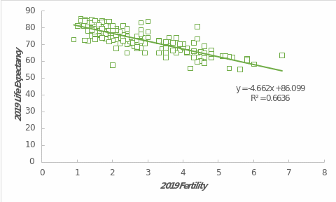
As can be seen from the figure, the data is characterized by a downward trend: as the fertility rate increases, life expectancy decreases. Quantitatively, life expectancy decreases by 4.662 years globally for each additional child per woman. Interestingly, the y-intercept of this model, equal to 86.099 years, represents the maximum life expectancy at zero fertility.
The coefficient of determination, R2 = .6636, explains the reliability of the constructed model. This figure indicates that up to 66.36% of the variance in this data set can be explained by the regression model. This is a moderate value that is acceptable for real data. In addition, the relationship between the variables is also confirmed by the Pearson correlation coefficient, r = -.81.
A negative value confirms an inverse relationship between the variables, and an absolute value indicates a relatively strong relationship. These results suggest that the more children a woman has, the lower the global life expectancy. However, one should be careful with the results: despite the large magnitude of the correlation coefficient, it does not provide insight into causal relationships.
The correlation only allows us to estimate the direction and strength of the relationship between them, but it does not follow that a decrease in the number of children in a family will lead to an increase in life expectancy. Considering additional latent variables and mediating factors, it is easier to say whether the two indicators have a genuine causal relationship.
Predicting
One advantage of a regression model is its ability to predict values. Although the reliability of such predictions is not excellent, it helps to determine the approximate behavior of the data, all other items being equal. For instance, if one takes a fertility rate of 1.7, typical for the United States, the regression equation would predict that life expectancy is 78.17 years. It is 79.11 for the real U.S., a difference of almost one year — this illustrates the regression model’s imperfection but helps give a rough estimate of the predicted values.
Hidden Variables
With such fundamental variables, one should always pay attention to hidden factors that may be contributing. In particular, epidemics, pandemics, and diseases in a region may affect life expectancy and fertility. In addition, an individual’s gender can also lead to biases, especially if the average values of the variables of interest are very different for men and women. Nor should one exclude the state of the health care system, expressed, for example, as a percentage of GDP. Other latent variables should include lifestyle and quality of life, age, unemployment rate, education level, and happiness index as factors that may affect the relationship between the two variables.
Limitations
This dataset uses averages for states for 2019, but that does not mean that the data can be predicted for an individual. As Hans Rosling pointed out in his TED talk, averages can be confusing because they are susceptible to variations in the data (TED-Ed, 2013). For example, the fact that the average fertility rate in the United States is 1.7 children per woman does not mean that every woman will have that number of children: it could be zero, ten, or even more. Similar reasoning applies to life expectancy. The regression equation should be used cautiously for global data and predicted values by region, but it cannot be accurate for a diverse and heterogeneous society.
Dynamics Over Time
Turning to the Gapminder provides insight into the dynamics of the indicators over time. As the comparison in Figure 4 shows, correlation trends have varied considerably. More than 60 years ago, the data did not show a stable linear relationship, and there was much variation. Over time, countries gradually moved toward fewer children per woman and longer life expectancy. This resulted in a linear downward trend similar to that shown in Figure 3.

References
Gapminder. (n.d.). Bubbles. Gapminder. Web.
TED-Ed. (2013). The best stats you’ve ever seen — Hans Rosling [Video]. YouTube. Web.