According to Daniel Pink in his book A Whole New Mind, both the left brain and the right brain need to be put into action for a business or an individual to be successful. The right brain is represents the creative side while the left brain is the analytical, sequential and intellectual side. Design is a combination of utility (has to work) and significance (has some other kind of attribute). Utility means that the product has to perform the task which it’s meant to perform while significance implies that it has to have some other kind of relevant attribute. The following are some examples of brilliant and terrible designs.
Brilliant designs

The toilet brush and other toilet cleaning tools designed by Michael Graves are examples of brilliant designs. Not only do they perform the task that they are meant to perform, they also have significance in their design. This is evident in their cool shade of colors and the nifty handles which enable them to be linked with other kinds of housewares.
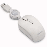
Toshiba USB Retractable Mini Mouse

This Toshiba USB optical mouse has a design that’s a combination of both utility and significance. It meets its objective as a pointing device and also has a few additional attributes. Its small size and light weight enhance portability while its retractable cord reduces cable clutter on the surface which the mouse is placed on.

Terrible designs
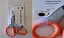
Staples’ packaging of scissors
The design used in packaging Tonic Studios’ pair of scissors at Staples office stores also fails to meet both aspects of utility and significance. The packaging is sleek and attractive. However, to remove the scissors, one needs another pair of scissors to cut the edge of the package. The assumption is the person who bought this pair of scissors had no extra pair.
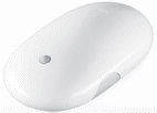
Apple’s Mighty Mouse

The design of Apple’s Mighty Mouse fails to meet the combination of utility and significance. In terms of usability, the design looks nice and the side buttons are helpful. However, the right click button fails to work after a short period of use. In addition, the scroll wheel gets clogged up with dirt after a while and needs to be serviced frequently for one to continue using it effectively.
References
www.technologytell.com
www.goodexperience.com
www.toshibadirect.com
www.michaelgraves.com