Attribute variable control charts are a tool for managing various indicators. For health care providers, control charts for attributive variables are a tool for identifying causes of morbidity or prolonged hospital stays (Slyngstad, 2021). Np control charts are tools for identifying changes in a particular group over time. Tracking changes allows for identifying defects – deviations from the accepted standard under certain conditions. The np control charts determine whether the care process is normal and the clinic standards are used. They establish potential deviations that are either in normal variation, dangerous or critical. An analysis of the factors that change the tracking conditions allows the fluctuations to return to the normal limits.
NP charts can be used for:
- management: for example, the number of staff in the surgery department is 25, but in the last two months, staff turnover has increased, and the number has dropped to 20; the administration noticed this with the np-map and made changes to the support program, and after a while, the chart has leveled off again to 25 people a day;
- performance: for example, with 200 patients in two weeks, the natural mortality rate is 1%, which is consistent with the standard of the clinic; when the mortality rate decreases, the np chart will begin to decrease, which will be compatible with the positive dynamics in the innovation of resuscitation introduced.
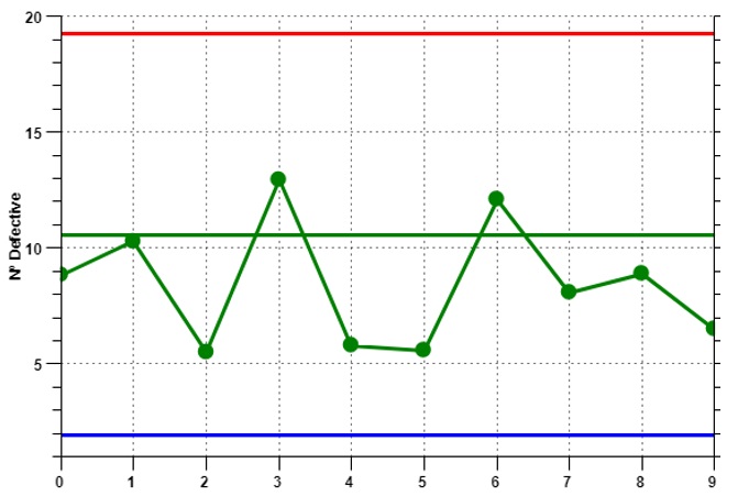
Suppose the Mayo Clinical Center is running an innovative endometriosis treatment program. It is required to determine if the treatments used to treat the disease are working. There are ten days of measurements, during which zero to 30 people show ineffectiveness from the treatment. An np control chart reflecting this process is shown in Figure 1.

The following conclusions can be drawn from this chart:
- the average number of individuals with no treatment effect should not exceed 20 individuals;
- normal range of 5 to 15 individuals; the average value of about 11;
- a general trend toward a decrease and a gradual decrease in the mean value.
Thus, implementation of treatment works and is under control because no value is out of the normal range.
Reference
Slyngstad L. (2021). The contribution of variable control charts to quality improvement in healthcare: A literature review.Journal of healthcare leadership, 13, 221–230.