Introduction
The purpose of using statistical analysis is to draw valid and unbiased conclusions, primarily based on numerical data. This paper uses descriptive statistics to examine measures of central tendency and measures of variability. Measures of central tendency (mean, median, mode) superficially describe the distribution of quantitative variables: they can be used to estimate the central values of a variable. Measures of variability (standard deviation) are used to estimate the spread of the data, that is, the extent to which each element of the distribution differs from the mean.
Two continuous variables, the Management Quality Grade (MQG) and the State Performance Score (SPS), are measured for each U.S. state and used as data. First, the MQG is a four-point scale assessing quality management for each state. Second, the SPS is a 100-point scale that evaluates the performance of each state. In both cases, the higher a state’s score, the higher its quality management and performance scores are. The purpose of this paper is to use descriptive statistics to examine the distribution patterns of both variables.
Analysis
Measures of central tendency (Mean, Median, Mode) and variability (standard deviation) were calculated for all variables. The results, found in Table 1, indicate a mean Management Quality Grade of 2.5 (SD = 0.6) and a mean State Performance Score of 49.4 (SD = 11.6).
Table 1: Descriptive Statistics of Two Variables
Several conclusions can be drawn from this: first, the average MQG was closer to the positive scores than the negative scores, unlike the SPS. This means that states had higher scores than the overall performance. Second, the ratio of the mean to the standard deviation in both cases was nearly identical, indicating that both distributions are approximately equally scattered. For the MQG, each element of the distribution deviated by 0.6 from the mean (M = 2.5) on average, while for the SPS, the deviation was 49.4 from the mean (M = 11.6).
The median reflects the level in the distribution of a variable that divides that distribution into two equal parts. The MQG median was 2.7, which means that exactly half of all measurements of this variable were below this level. For the SPS, the median was 48.0, which also created two halves of the distribution. The last measure of central tendency was the mode, which indicates the value that occurs most frequently in the variable.
The mode of the MQG was equal to 3.0, which occurred 12 times out of 50 measures. The SPS mode was 47.0, and this value occurred seven times in the 50 measurements. As one can see, in the MQG distribution, the mode was repeated about twice as often as in the SPS, which may be explained by the higher range for the second variable.
Histogram
A histogram is a visual representation of the distribution of a continuous variable, resembling a set of rectangles whose area corresponds to the frequency of each observation. Drawing a histogram helps identify, at first glance, the normality of a particular distribution: the more bell-shaped the histogram looks, the closer it is to the pattern of normal distribution.
In Figure 1, one can see that the bell-shaped shape is generally preserved, with a peak value closer to the middle and a frequency decrease closer to the ends. Another confirmation of a perfectly normal distribution could be the equality of all three measures of central tendency (The UU, 2021). In the case of the MQG distribution, the mean (2.5), median (2.7), and mode (3.0) were closely aligned, indicating an approximately normal distribution.

Based on the visual representation plotted, one can see that the majority of states had scores between 2.16 and 2.74, which is slightly above the average possible level. This means that most states performed satisfactorily, as their scores were not very high. However, it is also important to note that the number of states that did well (3.32 to 3.90) was higher than the number of states that did the worst (1.00 to 1.58). This may be a positive signal because it is more common for states to score high than low.
Scatter Diagram
If two variables are represented on a continuous scale, a scatter diagram is possible for them. This diagram displays each of the two variables on its respective axis, with the data represented by points scattered in the plane. With a scatter diagram, it becomes possible to determine the overall pattern of the relationship between the two numerical variables.
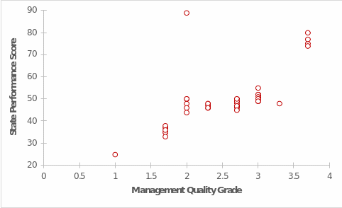
An upward trend appears to be evident: the higher the Management Quality Grade, the higher the State Performance Score, and vice versa. This implies that an increase in its levels would also lead to an increase in the SPS. This may seem logical because when a state has a high MQG, that region’s performance will also be higher. The converse is also true: the worse a state does at managing quality, the lower that state’s overall performance will be.
Conclusion
This paper focused on performing descriptive statistical analysis for the MQG and the SPS. The statistics included three measures of central tendency, standard deviation, a histogram to determine the shape of the distribution, and a scatter plot to identify the relationship between the two variables. The results determined that both distributions were about equally scattered, with the mean MQG values being closer to positive than the SPS. The histogram showed that it had an almost normal distribution. Finally, it was found that the better the MQG the staff did, the higher it scored on overall performance.
Reference
The UU. (2021). The normal distribution and Z scores. The University of Utah. Web.