The Most Exciting Thing About the Course
Among the variety of courses offered to the students, it is hard to define the one that excites the most because each subject has its own positive and negative aspects. However, talking this particular course, it is possible to identify several aspects which turn out to be rather interesting and education. First of all, this course helps students understand that the role of history is integral indeed, and the way of how people perceive their backgrounds and their roots defines their present and future. In addition, with the help of this course, students realize how to learn their past and what spheres become more important for people.
Still, the most exciting thing that has been learnt so far in this course is all about the works of art, their diversity, and importance to society. One the one hand, all buildings and other pieces of art may be considered as the required things for living. However, on the other hand, each building helps to comprehend the history of the whole community.
For example, Frieze, Tempietto that is San Pietro in Montorio, Rome was created by Bramante between 1502 and 1503. Bramante’s main purpose was to create a kind of fusion of humanism and Christianity essentials. It is not the only another rotunda building, it is an attempt to help people improve their lives and beliefs.
Looking at the Hardwick Hall that is Derbyshire, England, people could not help but think about the power of English will. This magnificent building was created by Robert Smythson in later 16th century. This hall is a perfect union of stability, order, and aristocratism that were inherent to English people during that period.
This is what excites the most about the subject: the possibility to learn more about the nature of other people, their interests, and preferences.
Three Important Trends in the 21st Century
How does each trend relate to a specific historical design trend?
The peculiar feature of all the 21st design trends is that all of them are based on a variety of technological innovations, flexibility, profuseness of colors, and lighting (Browne 7).
It is not always that easy to identify the most important trends in designs which are inherent to the 21st century, still, it is always possible to think about the most captivating and influential values which change human perception of the reality.
Taking into consideration personal preferences and the number of works analyzed, the three most important trends of the 21st century are involving people to artworks by means of new technologies like optics which define new perspectives of environment, encouragement of movement and continuity between the outside and the inside, and virtual and hyperspace repetitions that serve as a bright evidence of a technological revolution. Each trend relates to some historical design trends which were popular during the period of Renaissance and the 17th-18th centuries.
For example, the use of optics was not inherent to 16th-18th centuries, and this trend may be regarded as the new one due to the development of the technologies (Figure 1). The trend to involve people to the scenarios offered by the designer seems to be a new achievement that has to be recognized within a short period of time.
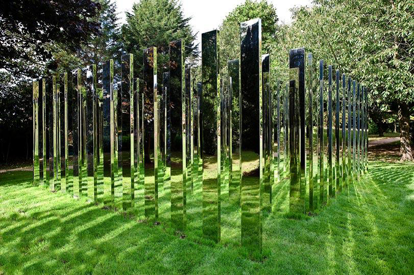
New technologies help not only to present a work to public but also to make them become a part of the idea. The work by Jeppe Hein in Bristol is one of the best examples of how optics may influence human perception of the reality. However, similar traits and effects on people are observed in the works by Etienne-Louis Boullee (Design for a National Library in 1784).
This designer supported the picturesque mode and the idea of sensation in architecture that will involve public to his works. The Rococo period was characterized by the appearance of new technologies which helped to create huge buildings and organize each detail of the building in a unique way, this is why it seems to be possible to relate the works by Hein and Boullee as those where the role of new technologies regarding the century influence public’s perception of the artwork.
The encouragement of movement and continuity related to the interior and exterior is another trend to be identified. It relates to the Renaissance trend of vertical openings and movements supported by Andre le Notre. Shigeru Ban (Figure 2) introduced his Centre Pompidou-Metzs (2004 – 2010) to prove how it is possible to relate the outside and the inside.
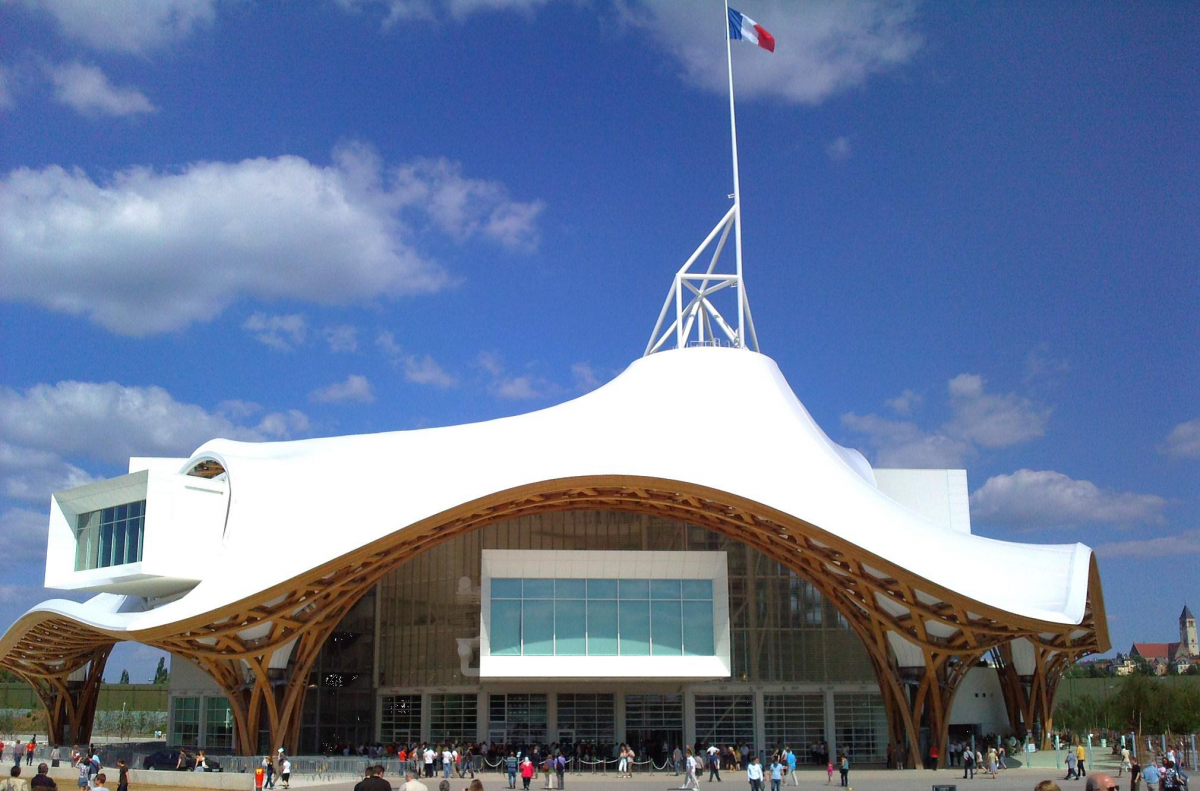
His work looks like the work of an artist who put the lines slightly and playfully taking into consideration the things around. His attempt is similar to the historical design trend offered by Le Notre in 1657 where an emphasis was made on dramatic vistas. This historical trend shows that it is possible to define the sequence of spaces that may move from public to private sectors (Figure 3).
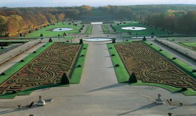
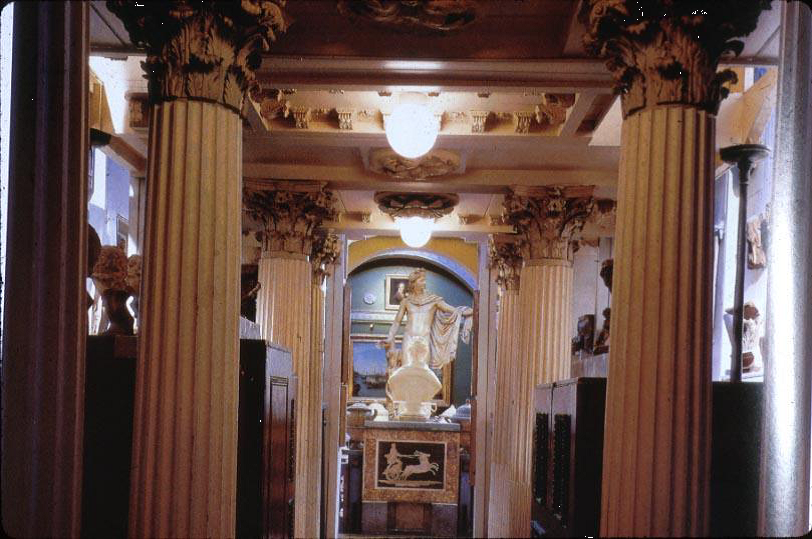
Finally, the trend to benefit from repetitions in white colors (Figure 4) has to be mentioned. The similarities to this trend may be observed in the works by John Soane Home (Office to the Dome Exhibition Space).
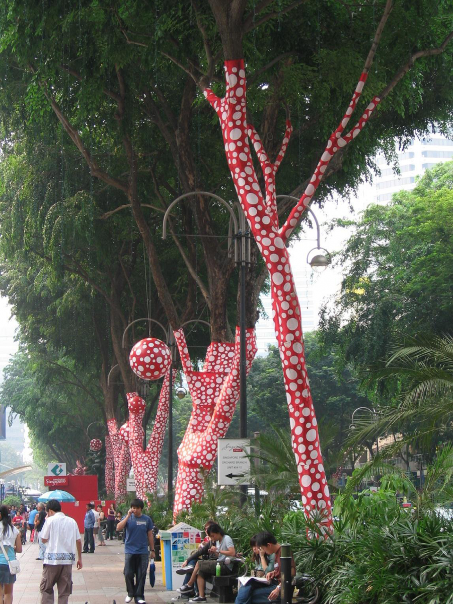
The designer made an attempt to repeat the elements of the room in order to prove that the chosen art work was worth attention and recognition. It was not enough to enter the room but follow a kind of map offered by the designer in the form of constantly repeated huge columns which were inherent to the style of Rococo (Figure 5).
The Pros of the Trends Identified
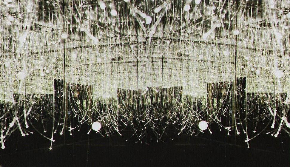
The point is that the trends identified have a number of pros which make many designers choose them and improve by means of the technology available. For example, the work by Electric Dreams, Pleasant Bar that is in Stockholm, Sweden from 2007 (Figure 6) shows how several optic elements may change the reality and involve people into a new world, full of mystery and pleasure. It is not enough to create some visual elements but define each element in a proper way to introduce a true masterpiece.
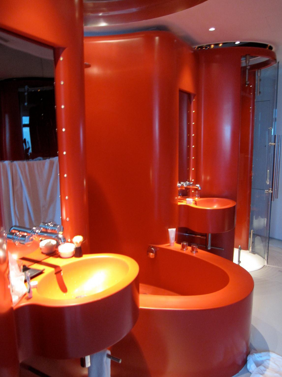
Another pros of the trend based on movement and continuity is that the designers are free to use the space available to its full extent. For example, the bathroom (Figure 7) in the Spanish Hotel Puerta America proves that it is possible to use several massive elements of furniture in a small room and create comfortable apartments. Continuity is not always easy to create, still, if the designer succeeds in the chosen activity, the results may be amazing.
The trend of repetition is the key point of many exhibitions around the whole world due its main pros – compactness. The designers find this trend rather beneficial for meeting their purposes: they repeat their thoughts to involve the public into their worlds and their ideas. Though it is not an easy task to repeat the ideas and objects and remain to be logical and comprehensive. This is why some misunderstandings may take place. Still, the designers’ main task is to choose the most appropriate ways and achieve success.
The Cons of the Trends Identified
Talking about the cons of the trends identified, it is necessary to admit that not all these trends may be understood by the public. For example, the idea to use optics in design is quite new, and many people are at loss when the time to observe the creation comes.
So, the main con of the three trends discussed in this paper is designers’ inability to interpret their ideas and intentions to all people in a proper way. In spite of the fact that the trends relate to the historical design trends in some ways, failures to meet public’s expectations may take place.
Conclusion
In general, each trend identified in this paper is worth attention and recognition. Repetition and white objects, encouragement of movement and continuity, and choice of optical technologies have their own pros and cons in the sphere of design. The works chosen for this papers show that the designers are able to use their skills, ideas, and technologies available to attract more people to art.
They are successful and they are unique for the 21st century. This is why the chosen trends may be regarded as ones of the most important ideas which are supported and developed in a variety of ways in the 21st century.
Works Cited
Browne, Beth. 21st Century Interiors. Mulgrave, Victoria: Images Publishing, 2010.