Paintings suggested for the analysis will be analyzed from the perspective of design’s basic principles and elements: line, shape, positive and negative space, color, and texture.

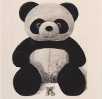
Michael Kempson’s Present with presence is masterfully created through etching. The lines used by the creator of the painting are curved, which makes the painting’s mood softer. Kempson primarily uses the circle and sphere forms in his work. As it is well-known, the orb-related shapes are considered ideal from the geometrical perspective. Implementing this approach, the author tries to make the panda in the painting a perfect image of a “guardian” who can be trusted. Notably, the small toy in the lower part of the painting has more sharp forms, showing imperfection.
However, the central focus is on the panda, highlighting that genuine nature is always hidden behind something ideal. The positive space of the painting is occupied with the spherical figures. The spacial relationships between place and the consistent elements of the panda create the 3D effect making the picture more alive. The creator uses negative space to highlight and contrast the vital aspects of the painting. The surrounding space is free of almost any details, excluding some shadows allowing to create the effect of the whole engagement with the central object. The etching technique conditions the texture and color. However, the volumetric texture style and design should be mentioned. It allows the author to make the toys more true-to-life. The eyes are created by leaving the glares without textural filling. This technique makes eyes more human but at the same time empty from the physical and ideological perspectives.

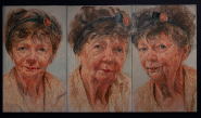
The lines used by the author are invisible, which allows making the portrait more realistic. A variety of forms and shapes are used to convey the details of the skin, hair, and facial expression. The figures are primarily organic, masterfully identified through color choice and shadowing. The painting has an interesting space distribution: the decision to implement the different angels on one picture contributes to a more diverse understanding of the differences one person can have. The author uses the inherent portrait art technique to highlight the positive space objects while leaving the negative space without attention.
The color and texture are the fascinating aspects of the picture’s design. The color choice, which is contrary to the white background, creates an emotional contrast. Margrett’s portrait seems calm and soft: the light is put under the head of the model, which highlights the kind expression on her face. The primary accent is placed on the eyes, expressed through a combination of coloring and texture. The work is extremely outstanding from the textural perspective. The minor details of the eyes, skin, and even dress of the Matgrett emphasize that everything in the people is beautiful, creating a unique image of a person.

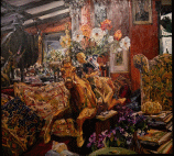
The oil painting represents the detailed interior providing a lively and vibrant atmosphere. The lines and shapes are organic, helping to reflect the nature of the objects. The lines are invisible, while forms are created through the coloring schemes. The central focus is disturbed between the bouquet and horse. The painting is an example of the active usage of the design technique of integrating both positive and negative space. Many details provide the opportunity to be captured the atmosphere depicted by the author.
This work stands out thanks to its texture and color allocations. The variety of color shift dynamics allows the creator to convey the forms in detail. Despite the vast amount of objects, colors, and focuses, the picture does not seem disturbed. This effect is achieved through the choice of the color combinations mixed within one palette’s limits. There are particular objects which are highlighted by the author using the color and texture techniques. The flowers are emphasized, especially violet ones representing the organic forms in the negative space. Such art decision emphasizes the idea that the beauty is in the details surrounding the center, the human, as depicted in the picture.