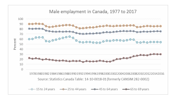
The chart below represents the periodic characteristics of employment rates in Canada for males. The chart was developed using Excel spreadsheets and it concerns employment statistics covering 1977 to 2017. The chart, therefore, progressively represents the movements of different age groups along their respective curves. In forty years, the data is summarized for visual appeal to enhance inter-group comparisons.

As presented in the chart above, the lowest employment rates have been experienced by male citizens in the 65-69 years category. At the top is the group categorized in the 25-44 years and below that group is the section represented by 45-64 years. Although there is a clear distinction in the levels of employment between these two groups, the margin of difference is relatively smaller compared to the first two groups in the chart. The latter comprises members in the 65-69 and 15-24 in the order of majority in terms of employment levels. There is a significant gap in levels of employment between these two groups with the elder category having fewer members. Perhaps this could be explained by the virtue of the age difference in the sense that past 65 years, workers have grown old and would desire to retire. At the age group 15-24, these are young citizens who are starting to experience real-time working and earning.
For the 65-69 group, the chart indicates an increasing trend in the number of male citizens participating actively in the labor force in Canada in recent years. In 1977, the chart starts slightly above 20 years but maintains a downward development until around 2000 when the tendency leans upwards. In 2017, the chart caps at a 30% employment rate for this cluster, a difference that has not been observed in the rest of the scenarios.
The second category in the ladder is a unique chart of peaks and troughs, a feature that is not visible in the rest of the clusters. This trend makes it possible to predict the next phase of development in the time chart given the previous inclination. For instance, it can be predicted that the next stage after 2017 would be a downward drift in the employment rate for this category. This forecast can be deduced by observing that by the end of 2017, the chart for this category was already reaching the peak. As a result, based on the preceding trend, a downward slope would be expected.
The deviation between the topmost two sets is progressively constant making the two curves almost parallel to each other. The category 25-44 years is on the top and below it is the 45-64 years. Approximately, a maximum of 10% variance is sustained between the two curves. Individually, the curves do not reveal significant fluctuations as time goes but they tend to stick to a trend that resembles a straight line.
From the foregoing, the chart presented above visually presents the differences and trends of employment rates in the four age-group categories. The groupings are presented as 15-24, 25-44, 45-64, and 65-69 in which the age gaps are 10, 20, 20, and 5 respectively. In this respective order, the employment rates average at 60%, 90%, 80%, and 20% over the years. The chart is, therefore, an important tool for comparison between the categories and can be used to identify trends. It can also be used to project the inclinations of the charts in the future based on the historic behavior.
Reference
Labour force characteristics by sex and detailed age group, annual, inactive. (n.d.). Statistics Canada.