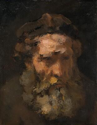
In the work Head of Saint Matthew, painted by Follower of Rembrandt van Rijn, from page 124 (number 8.4), the darkened face of an older man is located in the center. This image may be called the best work of art due to how interesting the way of drawing is combined with the moods of the painting. All the viewer’s attention is focused on the face, and the dark background only emphasizes its importance for the picture’s composition. The man is half-turned, and by the tilt of his head, it can be stated that he is looking below eye level. His eyes and the far half of the face are hidden in shadow.

The work is painted with wide, monotonous strokes, making its lines soft and blurry. The colors are dark and warm; there is no variety of palette in the painting, reducing the use of colors to dominant black with lighter shades of beige and brown. Tones do not contrast but complement each other, gather for the sake of a picture unity. The man’s face is the only figure in the picture, and it occupies the center, not allowing the eye to jump to other shapes. Because of the monotonous background, the space seems to be a bottomless and unlimited canvas. The painting achieves an asymmetrical balance because the rotating head transfers the man’s eyes, beard, and nose to the right side. The rhythm of photography is stagnant and frozen, without the possibility of many figures to move. The concept of the painting reduces to unity, unlike the one that will be presented as the worst work in the textbook.

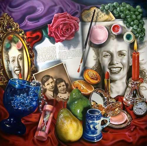
The painting Marilyn (Vanitas), drawn by Audrey Flack from page 13 of the textbook (number 1.11), depicts the concept of a multitude of objects on a plane similar to a dressing table. I consider this image one of the worst representatives of works of art because of its diversity and clutter. The viewer pays attention to the portrait of Marilyn Monroe in the right corner first and only then looks at the rest of the items. In the picture, the proportion between the lower and upper parts seems to be broken, which leaves a feeling of anxiety and unreality. The portrait reflected in the mirror seems distorted as well. Since there are a lot of objects in the picture, it is difficult to concentrate on them, and as a result, turning away, it will be difficult to say what was depicted on it.
The composition of the work is overloaded with many shapes. It has a lot of lines and sharp corners that intersect, merge and create the effect of excessive clutter. The variety of shapes and figures in the painting is compared with many objects on the so-called dressing table. The colors of the work are bright, variegated, and sharply contrasting. Interrupting each other, they make the eye run across the canvas and create a small effect of movement in the initially seemingly stagnant picture. In this regard, the rhythm of the image is fast, involving, as if it puts a person in the center of the active activity of what is happening outside the frame. Due to the spot of the portrait on the right side of the picture, it creates an asymmetric balance in which one of the parts pulls over the vector of attention. There is no idea of unity in the picture; all the depicted objects seem to be trying to take the initiative, which prevents the composition from being put together.
References
Flack, A. (1977). Marilyn (Vanitas) [painting]. University of Arizona Museum of Art. Tucson, Arizona, USA.
Follower of Rijn, R. (1660s). Head of Saint Matthew [painting]. National Gallery of Art. Washington, D.C, Washington, USA.