Conducting a survey on nutrition on residents of Berks County
The aim of the survey will be to know more about the residents of Berks County and their knowledge on nutrition. Matters related to food have been causing debates globally. Several studies demonstrate that people are what they are because of the food they consume. Therefore, it would be prudent to know what the residents of Berks County are and correlate this to the food they consume. Several parameters will be used to define what these will be. Some of these are their weight, health and socio-economic status.
There are three major surveys that could be used to know the people of the Berks County and their knowledge on nutrition. These are face-to-face survey, questionnaire survey and telephone survey. Considering the advantages and disadvantage of the three survey methods, I settle to use face-to-face survey for this study.
Face-to-face survey will enable the researcher to physically assess the respondents and make conclusions based on their physical looks (Dykema, Danna and Nora 35). This type of survey will also make it possible for the researcher to monitor facial expressions of the respondents. Respondents will have an opportunity to explain issues and give additional information that would not be anticipated. Consider the question, “What do you think most residents of Berks County should consume to lower risks of lifestyle diseases like diabetes and hypertension?” A respondent may answer like “Take low amounts of carbohydrates and fats”. This answer may not be specific. The respondent could be asked to expand on the answer by answering the question, “Between carbohydrates and fats, what do you think is the leading cause of lifestyle diseases?” The respondent would say, “Unsaturated fats are the main causes of lifestyle diseases”.
The face-to-face surveys are flexible because they allow a researcher to ask only the relevant question and allow respondents to ask for clarification (Dykema, Danna and Nora 39). In addition, the researcher has the freedom to change the order in which questions are asked. This flexibility is not accommodated by questionnaire surveys (Wilkinson 594).
Three graphs on cereal nutrition
Three graphs were used to represent results computed from one column of data each based on the “Cereal Nutrition” on Statcrunch. The “Cereal Nutrition” on Statcrunch contains information on nutritional components of various cereals. The columns of data used for the three graphs were fiber, carbohydrates and calories.
The pie chart
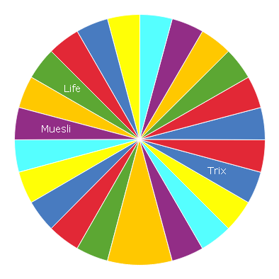
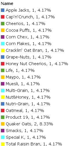
The pie chart above was used to graphically represent the amount of fiber in the cereals on Statcrunch. Pie charts are made up of sectors that represent proportions of a variable. The proportions might be frequencies or percentages. The sizes of the sectors correspond to the proportions being represented in the charts. From the graphical representation above, it is easy to visualize the proportions of the amount of fiber in various cereals. The cereal with the highest amount of fiber is Quaker Oats (8.33%). A number of cereals have the same amount of fiber, i.e. 1g and 2g. Also, a number of cereals have no fiber content. The information represented by the pie chart is essential in nutrition matters. Fiber has been demonstrated to be an important part of nutrition. It has been found that fiber plays a role in bowel movement along the alimentary canal by adding the mass of the bolus. When there is normal bowel movement along the alimentary canal, there is proper digestion and constipation is avoided. From the results, the general population can be advised on the types of cereals to consume based on their fiber content. For persons with poor bowel movement it would be recommended that they consume cereals with high amounts of fiber. This would speed up their bowel movement and help avoid digestion disorders caused by clogging of food in the alimentary canal.
Carbohydrates chart
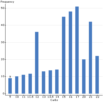
The chart above used vertical split bars to represent the frequencies of cereals with different amount of carbohydrates. There were 10 groups or classification of carbohydrate figures (in grams). The groups were 9, 10, 11, 11.5, 12, 13, 13.5, 14, 15, 16, 17, 20, 21 and 22. As the figure shows, the lowest amount of carbohydrates in the cereals was 9 and the highest amount was 22. A carbohydrate is composed of carbon atoms, hydrogen atoms and oxygen atoms bonded together to make a monosaccharide molecule. Many monosaccharides combine to form a polysaccharide. A glucose molecule is an example of a monosaccharide. Carbohydrates have different functions in the body. One of their roles is to provide energy to the cells during cell metabolism. The results represented by the chart above are essential in identifying the various cereals with their carbohydrate content. Therefore, people can be advised to choose cereals depending on their carbohydrate nutritional requirements. For persons living sedentary lives, it would be prudent for them to consume cereals with low amount of carbohydrates. Persons with sedentary lifestyles include secretaries and other office personnel with limited daily movements and physical activities. On the other hand, people whose daily routines encompass active activities could be advised to consume cereals with high amount of carbohydrates for energy sources. Physically active persons include athletes and persons working in construction sites.
Calories chart
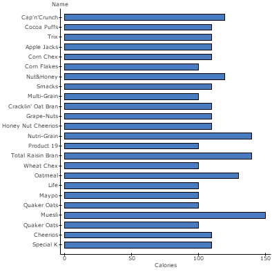
The above chart was used to represent the amount of calories in various cereals. The chart used horizontal split bars to represent the amounts of calories in the cereals. A calorie is defined as the amount of energy needed to do some work. In nutrition, the term kilojoule (Kj) is often used. A calorie refers to the amount of energy that a certain food contains. The chart shows that the cereal with the highest amount of calories was Muesli (150). Several other cereals had the same calories of 130, 120, 100, and 140. The lowest amount was found to be 100. The results represented by the chart are essential in nutrition because they identify the cereals with the amount of energy they provide to the body. Energy is required for living cell metabolism to occur. The activities that need energy include growth and development, reproduction and movement, among others. Nutritionists would guide persons with high energy requirements to consume cereals with high calorie content. For example, adolescents undergo rapid growth and development among other physiological changes. Therefore, they would be advised to consume cereals with high calorie content to provide them with energy requirements. Physically active people, for example athletes and persons working in construction sites, would also be advised to consume cereals with amounts of calories. On the other hand, nutritionists would advise persons with low energy requirements to consume cereals with low amounts of calories. For example, the elderly persons have low energy requirements because their body metabolism is low. They would, therefore, be advised to consume cereals with low amounts of calories. Likewise, persons living sedentary lives would be advised to consume cereals with low amounts of calories because their energy requirements are low. If a person consumes high amounts of calories than required, then she or he may become obese because the extra calories are stored in the body muscles. This has been an issue of great concern in the modern world where the number of persons living sedentary lives is increasing annually.
Measures of central tendency
The “Starbucks Data Set” was used to find the measures of central tendency, standard deviation and box plot for calories. The summary statistics obtained are shown in the table below.
Summary statistics
Box plot
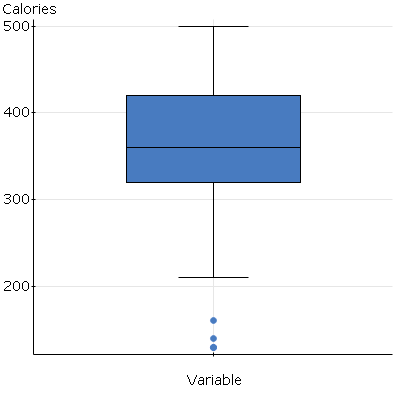
The summary statistics show that the mean for the calories variable was 361.3333 while the median was found to be 360. The median appears to be the best measure of central tendency for the sample variable. It fits because it not affected by the outliers identified in the summary statistics (Wilcox and Keselman 254). The box plot shows that there are three figures of the variable that do not fall within the expected region of the box plot. The figures are 120, 130 and 140. In such circumstances, the sample mean can be trusted to represent the true mean of the population because it is affected by the outliers. Ordinarily, the mean, the median and the mode are used to compute summary statistics of sample variables. The results obtained are then used to infer to the population under study. The results obtained from the summary statistics are consistent because they do not have a lot of variability. The range between the maximum and the lowest values was found to be 370. The standard error for the sample variable was found to be 15.214294. This is a small value which makes the results to have little variability. In addition, among all the sample values (n=45) only 3 values were found to be outliers. Therefore, the sample median for the sample variable (calories) could be inferred to be similar to that of the population.
Probability
Probability is concerned with finding the chances of an event or events occurring. It is based on guesswork (Mertler, Craig and Rachel 23). The “Starbucks Drinks” data was used for the analysis to compute for probability. The probability question was:
What is the probability of ordering a drink off the menu and getting more than 30 grams of carbohydrates?
The data was analysed and the probability was found to be 0.83. The figure implied that a person has a 0.83 chance of ordering a drink off the drinks menu and getting more than 30 grams of carbohydrates. The results are essential in examining the reasons why people getting unwanted calories from drinks. People obtain extra calories from drinks because most of the drinks they take have high amounts of carbohydrates.
Fast food French fries
The “Nutrition Information for Fast Food French Fries” data was used for the analysis in this chapter. The percentage of French fries that had more than 25 grams of total fat was found to be 52%. The amount of fat in the French fries was considered unhealthy. The probability of consuming French fries with unhealthy total fat was found to be 0.52. The probability that 7 out of 10 students would have a fry order labeled “unhealthy” was calculated to be 0.364. The results are essential because nutritionists in learning institutions can estimate the number of students likely to consume unhealthy total fat. The students can be advised on the dangers of continuous exposure to unhealthy total fat. Research demonstrates that unhealthy total fat is the cause of cardiovascular conditions.
Cereal nutrition
The “Cereal Nutrition” was used for the analysis in this chapter. The sample size for the cereal nutrition was 25. The cut-off for the value that marked the highest 20% of sodium –containing cereals was found to be 220. The value was calculated using the stat/calculator/normal option.
95% confidence interval
The “KaitzProject Local produce” data was used to find 95% confidence interval for the whole foods and trader Joe’s columns. The results were as follows:
95% confidence interval results (whole foods)
μ : Mean of variable
Standard deviation not specified.
95% confidence interval results (trader Joe’s)
μ : Mean of variable
Standard deviation not specified.
A confidence interval computed for sample variables gives the probability that the region contains the true value of the sample parameter. This could be sample mean, the sample median or the sample mode. The 95% confidence intervals were compared for the two columns in the data computed. The sample mean, standard deviation, lower limit and upper limit for the whole foods column were 2.6603333, 0.33983954, 1.9942601 and 3.3264066 respectively. The sample mean, standard deviation, lower limit and upper limit for the trader Joe’s column were 2.376667, 0.32217225, 1.7402207 and 3.0031127 respectively. The whole foods column had a higher sample mean value than the trader Joe’s column. The sample standard error for the whole foods column was also higher than for the trader Joe’s column. It was also found that the higher and lower limits for the whole foods column were higher than for the trader Joe’s column. However, the sample size (n) was 30 for both columns. What could have brought the differences in the sample confidence interval parameters could be the individual values in the two columns.
Blood glucose levels
The “Blood Glucose Levels” data on Statcrunch was analyzed and tested at the 0.10 level to examine the mean. The results were as follows:
μ : Mean of variable
Standard deviation not specified.
The sample mean was found to be 115.19231 and not 110. The standard error, lower limit and the upper limit were confirmed to be 1.76375541, 114.97067 and 115.41394 respectively. The sample size used in the analysis was 26. A depicted in the table above, the range (the difference between the upper and the lower limit) was a small value of 1.154128. The results, therefore, dispute the assertion that the sample mean for the blood glucose levels variable is 110. The test mean differs from the assumed mean because it could be that the assumed mean was the population from which the sample was derived. In such cases, the sample mean cannot be used to infer to the population mean because the difference is big. Making inference based on sample results that significantly differ from the population results could lead to wrong conclusions. For example, assuming that the blood glucose levels at 0.10 level is 110 when in fact it is 115 could lead to wrong clinical nutrition conclusions. Blood glucose levels are measured in persons when testing for some conditions like diabetes mellitus.
Summary statistics: Organic food price comparison fall 2011
The Statcrunch Data set “organic food price comparison fall 2011” was analyzed and the prices compared between the target and whole Foods for organic food. The results were as follows:
Both variables had a sample size of 30. The average price for the target Foods was 2.8516667 while the average price for whole Foods was 3.144. Therefore, the prices for the Whole Foods were slightly higher than those for target organic foods. The variance, standard deviation, standard error and median for the target foods were 1.5104695, 1.229011, 0.22438579 and 3.015 respectively. The variance, standard deviation, standard error and median for the target foods were 1.867542, 1.366580, 0.2495023 and 3.19 respectively. The results presented in the table are essential in making conclusions on the feeding behavior among people in the population. It has been found that people are shifting towards organic food to have healthy lives (Magnusson et al 210). Organic food does not have chemicals that might cause diseases like cancer. Therefore, people many people prefer it to other food that is assumed to contain dangerous chemicals. People also tend to consume food that is cheap in the market. The results show that the target food is cheaper than the whole food. It is assumed that people would consume more target food than the whole food due to its relatively cheaper price. In the field of nutrition, nutritionists would be interested in finding the reasons why some foods are consumed more than others. In this case, the variation in prices of the whole and the target food could be the reason. Nutritionists can then go ahead and analyze the nutrition components for the two types of food so that they can advise the general population on the nutritional benefits of the food they consume. It could be that some food might be expensive but it has low nutritional benefits. It could also be that some food might be expensive but it has high nutritional benefits. The nutritional information on the food can only be assessed by a nutritionist suing specified parameters.
Correlation and linear regression
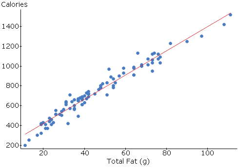
The nutrition information for Fast Food Hamburgers was used to test for correlation and regression analysis for total fat and calories variables. The results were as follows:
Correlation analysis
Correlation between Calories and Total Fat (g) is: 0.97745876
Linear Regression
Simple linear regression results
Dependent Variable: Calories
Independent Variable: Total Fat (g)
Calories = 173.93661 + 12.2803 Total Fat (g)
Sample size: 96
R (correlation coefficient) = 0.97745876
R-sq = 0.95542563
Estimate of error standard deviation: 55.820997
The correlation between calories and total Fat (g) was found to be 0.97745876 (correlation coefficient). Correlation tests are used to show a relationship between variables. They do not accommodate the assumption that the variables are dependent. Correlation analyses show or dispute correlation between two variables, an independent variable and a dependent variable (Pagano 35). The dependent variable was calories while the independent variable was total fat. There are three types of relationships expected in correlation analyses. The first one involves a decrease in one variable when the other variable increases. The second one is shown when both variables increase simultaneously. The third relationship show no correlation between two variables (r=0.0). The correlation relationship for the calories and the total fat is a positive relationship which implies that the values for the two variables increase simultaneously (Pagano 45).
Regression analyses are used to describe how a dependent variable is controlled by an explanatory variable. These tests assume that there is a causal effect to the response variable. The response variable in this case was the calories. The calories were being influenced by the total fat in hamburger. The relationship that is obtained through regression analysis is used to obtain a straight line graph with regression equation. The equation is manipulated to obtain various values of the variables of interest. For example, we can use the graph to find the amount of total fat given a value for the calories. Given the amount of calories to be 600, then the amount of total fat would be 38.45g.
One-way ANOVA for exam incentives
The “exam incentives” data on Statcrunch was used to compute one-way ANOVA. The results were as follows:
Parameter estimates
Analysis of variance table for regression model
Analysis of Variance results
Responses in score.
Factors in incentive.
Factor means
ANOVA table
The response variable was the score while the factor was the incentive. The one-way ANOVA was used to assess for the relationship between the scores and the incentives among students in a class. There were 8 treatments and an error of 11(P<0.0001). It can be concluded from the results that scores were being influenced positively by the incentives given to the students. As the amount of incentives increased so did the average of the scores by the students. It could also imply that people could eat better when they are offered money than when they are not. The money could act as an incentive to influence their feeding habits. Little money could have little influence on feeding while much money could have statistically significant positive effects on eating.
Works Cited
Dykema, Jennifer, Danna Basson, and Nora Cate Schaeffer. Face-to-face surveys. London: Sage Publications Ltd, 2007. Print.
Magnusson, Maria K., et al. “Attitudes towards organic foods among Swedish consumers.” British food journal 103.3 (2001): 209-227. Print.
Mertler, Craig A., and Rachel A. Vannatta. Advanced and multivariate statistical methods. Los Angeles: Pyrczak, 2002. Print.
Pagano, Robert R. Understanding statistics in the behavioral sciences. Cengage Learning, 2011. Print.
Wilcox, Rand R., and H. J. Keselman. “Modern robust data analysis methods: measures of central tendency.” Psychological methods 8.3 (2003): 254. Print.
Wilkinson, Leland. “Statistical methods in psychology journals: guidelines and explanations.” American psychologist 54.8 (1999): 594. Print.