The coronavirus disease 2019 pandemic in the United States resulted in numerous aggregated recorded cases. Gold et al. (2020) prepared the report to show the race, ethnicity, and age trends in Persons Who Died from COVID-19. An examination of 114,411 COVID-19–related fatalities recorded to the National Vital Statistics System between May and August 2020 revealed that “51.3% of decedents were non-Hispanic White, 24.2% were Hispanic or Latino (Hispanic), and 18.7% were non-Hispanic Black” (Gold et al. (2020), p. 1520). Additionally, the percentage of Hispanic decedents grew significantly from May to August. The study used in the article is quantitative because it is solely based on the death’s numbers comparison.

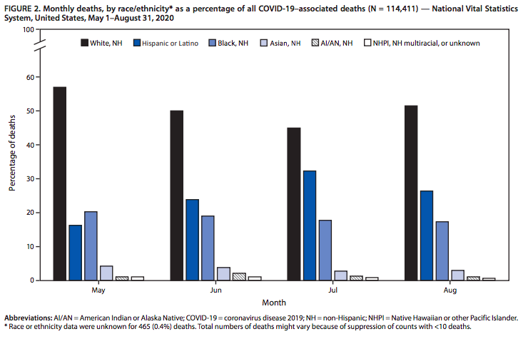
For my lab, I chose a bar graph; it depicts categorical data in the form of rectangular bars with heights, in my case, or lengths proportionate to the values they indicate. The data displayed in the graph shows monthly deaths as a fraction of total COVID-19–related deaths by race/ethnicity. The total number of numbers utilized for analysis is 114,411. The timeframe includes May, June, July, and August 2020. It is a clustered bar chart; each categorical group has two or more bars that are color-coded to reflect a specific grouping, such as White, Hispanic or Latino, Black, Asian, AI/AN, and NHPI, NH multiracial, or unknown. Categorical data is data that has been divided into discrete groups, such as months of the year, as shown in the graph. Categories display along the horizontal axis, and the height of the bar equates to the score of each class. The distribution shapes are skewed right, with minimal data sets found to the right of the graph toward the greater numeric values. The explanatory variables are months, and the response variables are races/ethnicities.
The graph concludes that from May to August, the proportion of White decedents declined from 56.9 percent to 51.5 percent, while Black decedents dropped from 20.3 percent to 17.4 percent. Nonetheless, the number of Hispanic decedents climbed from 16.3 percent to 26.4 percent. Essentially, Hispanics were the only racial and ethnic group whose total mortality rate increased. The majority of COVID-19–related fatalities (51.3 percent) occurred among White people, whereas Black and Hispanic people were overrepresented.
The data could be displayed with two other presentation options: table and dot plot. The authors chose a graph over a table because the information is included in the values’ shape (patterns and trends). Thus, the bar graph aids in displaying correlations between complete sets of values, whereas the table may confuse the reader due to the number of data inserted. Dot plots are one of the most manageable statistical representations and are appropriate for small to medium data sets; another advantage is that numerical information is maintained. Bar graphs categorize data, allowing researchers to easily compare numbers within each group, whereas a dot plot displays each numerical piece of data above the horizontal axis. Hence, a bar graph will better reflect the gathered data in this scenario. To conclude, the bar graph was the best option since it provides proportions of many categories, clarifies patterns better than tables, and allows for a visual assessment of rationality. The authors’ choice is understandable, given that the main goal was to evaluate race, ethnicity, and age trends in persons who died from COVID-19 in May, June, July, and August 2020.
Reference
Gold, J., Rossen, L. M., Ahmad, F. B., Sutton, P., Li, Z., Salvatore, P. P., Coyle, J. P., DeCuir, J., Baack, B. N., Durant, T. M., Dominguez, K. L., Henley, S. J., Annor, F. B., Fuld, J., Dee, D. L., Bhattarai, A., & Jackson, B. R. (2020). Race, ethnicity, and age trends in persons who died from COVID-19 – United States, 2020. MMWR. Morbidity and Mortality Weekly Report, 69(42), 1517–1521.