A bar chart is a type of visual technique that enables its readers to easily recognize patterns or trends in the data set they are checking (Statistics Canada, 2009). A bar chart consists of rectangular bars whose length is proportional to the value it represents. A bar chart is used to compare two or more values that represent different conditions or options.
Bar charts are usually used when the data set is small. A bar chart can be horizontal or vertical. On looking at a bar chart, one can easily find the tallest or the shortest bar, compare two bars, check the change in one bar over time, etc. (SkyMark Corporation, 2009).
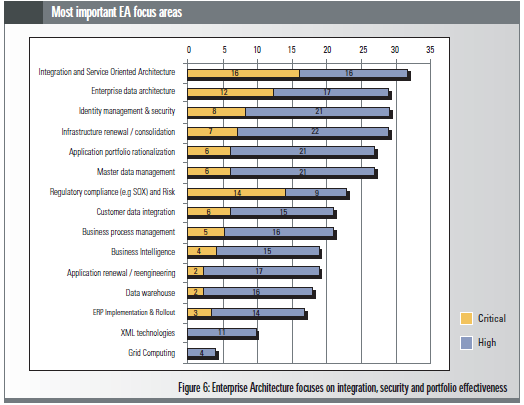
For the purposes of this assignment, the following bar chart is used which is a stacked bar chart, a special type of bar chart. This is one of the many charts used in the survey conducted by Infosys on Enterprise Architecture (Infosys, 2005).

The stacked bar graph can be especially helpful when it is required to show segments of totals (Brio Software, Inc., 2002) which in this case it represents how many respondents voted the focus area as critical and how many voted it as high.
Thus, using a single chart, one can convey a lot of information using stacked bar charts. However, if there were more segments, then it would have become difficult to analyze the items in each stack. With more items, it can become more complicated to analyze stack bar charts and hence are not frequently used.
The chart represents the most important focus areas of Enterprise Architecture. As can be seen from the chart, the bars are sorted according to the total number of votes for a focus area with the focus area that has received the highest total votes at the top.
Upon careful inspection of the chart, one can understand that although the focus area “Enterprise data architecture” is ranked as the second highest most important focus area, it is critical by less number of people as compared to “Regulatory compliance (e.g. SOX) and Risk” which is 7th highest most important focus area. This is also highlighted in the text and justified that this is considered critical by more people as it is being externally imposed (Infosys, 2005).
Again, the focus area “Infrastructure renewal / consolidation” was considered as highly important focus area by maximum people as compared to the other focus areas.
The chart also brings out very clearly that none of the respondents considered “XML technologies” and “Grid computing” as critical focus areas of Enterprise Architecture.
While the stacked bar chart is very helpful in understanding the overall votes by respondents as well how many considered each focus area as critical or high, it does not give an idea of the total votes, it needs to be calculated (Klass, 2001). Also it does not tell how many respondents were there and what percentage of respondents voted for each focus area. The text provides information that there were 45 respondents in all.
Considering this, “Integration and Service Oriented Architecture” was voted by 32 respondents or 71% in all. Without the text providing that information, one could be misled into thinking that there may be 35 respondents only or perhaps much more. Also, this means that the respondents could choose more than one focus area and that there was no restriction on the number of focus areas that one could choose.
References
Brio Software, Inc. (2002). “Stacked Bar Charts “, Brio Software, Inc. Web.
Infosys Technologies Limited (2005). “Infosys Enterprise Architecture Survey 2005”, Infosys Technologies Limited. Web.
Klass, G. (2001). “How to Construct Bad Charts and Graphs “, Illinois State University. Web.
Sky Mark Corporation (2009). “Bar Charts“, SkyMark Corporation. Web.
Statistics Canada (2009). “Bar graphs“. Web.