Introduction
Several years ago many people argued that business and design do not go hand in hand. For instance, Richard Sapper, German designer, stated that in many firms “design decisions are in the hands of people without the slightest knowledge of the subject”. Nowadays corporations address professionals to make their spaces profitable. It is not only about stores or restaurants.
The heads of corporations understand that people working in an appropriate environment can do and do more. Thus, when McKinsey & Company decided to occupy the top floor of the famous Piano’s Nemo Museum of Science, they addressed professionals who managed to turn the museum space into a working place. The company who made this design miracle is Veldhoen + Company. The company has carried out a project for Marsh, “insurance brokers and risk consultants”.
They created a new concept for the company’s work place. It is important to note that Veldhoen + Company focus on technology, so it was not that difficult for them to reshape Piano’s space. Piano “established technology as a starting point for his designs”. Thus, McKinsey & Company office is realization of two major ideas: the use of technology and working inspiration.
Historical Introduction
McKinsey & Company needed an office where employees would be creative and hardworking. They addressed Veldhoen + Company that had enough experience to complete the project. Moreover, the vision of the two companies coincide: both of them understand that creative working place is favorable for the working environment. It is necessary to point out that both companies shared their views and ideas which enabled Veldhoen + Company accomplish the project which met all requirements and longings of McKinsey & Company.
Spatial organization and planning
As far as spatial organization is concerned it is necessary to point out that Veldhoen + Company were to create a brand new project. The building’s “unusual form, which includes rounded shapes, slanting walls and ceilings 15 metres high”. The office occupied the entire top floor of the Nemo Science Museum. Piano paid much attention to every detail and he realized a major idea rather than constructed a building. Piano once said:
It’s not because I believe that technology is more important than everything else, I just believe that there is a poetry of making things. And beauty also comes from the well-crafted bearing of a building.
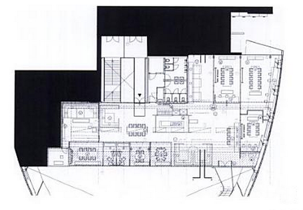
Piano realized the idea of a ship, so Veldhoen + Company should create a space within a ship. They had a large space (900 square meters) shaped like a ship to create an office (pic.1). The architects have divided the space into numerous working spaces: multi-functuional team room, cockpits which “allow privacy for individuals”, lounges “where two or three collegues can work together”, social spaces and relaxation areas.
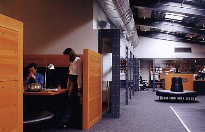
As far as materials are concerned Veldhoen + Company followed the major idea of the building designer, Piano. Thus, the architects have kept services “exposed rivets and glazed partitioning”. Notably, the architects managed to create the space where all those technological details fit perfectly (pic.2). Of course, not everything remained unchanged. For instance, carpet flooring is used for the floor, which is quite common for working spaces.
Furnishings and ornamentations
Admittedly, the space created by Piano did not presuppose any furniture. Piano major idea was to create a museum which would become a celebration of science and at the same time present several piazzas to the city of Amsterdam. Thus, Veldhoen + Company could make as many areas as they find it necessary. As has been mentioned above the architects made several areas for individual or collective work, for meetings and relaxation.
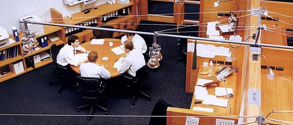
The furniture used by designers includes wood desks, leather chairs, sofas and panels which serve as bookcases (pic.3). Veldhoen + Company had numerous discussions with their partner which resulted in the idea of great flexibility. Thus, employees working in the new office have laptops and cell phones, so it makes it possible to create a really flexible working space.
Apart from the creative use of the working space and the use of appropriate furniture, the use of specific color and light contributes greatly to creating a good working place. Basically, steel as constructing material prevail, so grey color also dominates (pic.2). It could seem that this color will become quite suppressive.
The space could seem cold and workers could feel as if they were robots in a steel trap. Nevertheless, the architects added some home-like and, so to speak, warm colors: brown (tables and shelves) which is enhanced by deep black colors (sofas and chairs). The architect also made use of “warm” light. Thus, many lamps do not only make the rooms light, but make them a bit more home-like.
Functions and significations
Admittedly, Veldhoen + Company had quite a difficult task of reshaping the museum hall into a profitable working place where employees would feel comfortable. It goes without saying that the architect paid more attention to details. In fact, they created a brand new space due to the use of thoughtful details.
For instance, they had to tackle with the very high ceiling (15 meters). However, they used numerous lamps which made this height “invisible” (pic.3). These lamps lighted the areas and created an effect of “usual” ceiling. Of course, this was a very good idea since very high ceilings do not fit fruitful work in an office.
The use of materials is also worth mentioning. Thus, Veldhoen + Company had the space created by Piano who adored technology. The space was constructed with the help of steel. The architects, nevertheless, did not hide the steel elements.
Veldhoen + Company resorted to wooden furniture and black leather seats. Thus, effects produced by cold and suppressive steel were neutralized by warm leather and wood. It is also important to mention that Piano’s museum is very airy since the architect was fascinated by transparency in buildings:
From the bottom of the stairs on the first floor, you can see ahead through the building to the bright, glazed temporary exhibition hall, and looking up, you can see almost to the furthest reaches of the building.
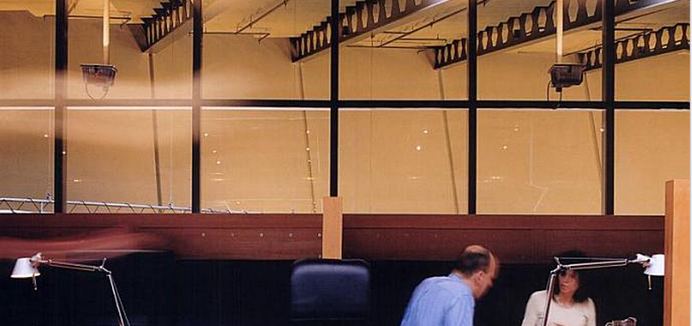
The top floor of the museum (just any other floors) contained glass walls rather than windows (pic.4). Veldhoen + Company remained this detail unchanged, they preserved that specific atmosphere of airy spaces.
Interestingly, though the architect had to create many areas, in this way drawing some limits, it is clear that the office remained still airy. Employees have a lot of space for various activities. More so, every employee is free to occupy any place due to their technological flexibility. This flexibility in space managing creates an atmosphere of collaboration and creativity.
It is also necessary to mention the exceptional use of color and light. The architects tries to create warm atmosphere, the place where people would be eager to work and, what is more important, cooperate. Thus, the grey cold colors affect people in such a way that employees are concerned with the completion of their tasks.
Steel is the material which calls for action. Whereas, such warm color as brown creates a warm atmosphere of collaboration. It is possible to discuss issues or simply relax in such environment. Thus, the mix of colors enables employees to be productive, but still feel comfortable.
Designers’ inspirations and precedents
It is necessary to state that while working on the project Veldhoen + Company were inspired by Piano’s work. It can be seen that the architects tried to remain the major idea of the space. They wanted to preserve the feeling of airiness and technological sophistication. Piano’s project, Science Center Nemo, is, by all means unique in terms of architecture. However, it is possible to state that it is typical for Renzo Piano who admired technology and transparency.
For instance, his famous Centre Georges Pompidou, is also referred to as “inside-out” building, “exposes its mechanical systems outside of its glass facade, freeing interior spaces for maximal flexibility”. As Ashmore has claimed “its signature cross-bracing and colored tubing” has become “a modern Parisian landmark”. Likewise, the museum in Amsterdam is a building which boasts with its technological details. Piano remains faithful to his idea of technology and transparency in both projects.
Veldhoen + Company are also faithful to their major concern: to “build a new way” for working. The company strives to create as comfortable working environment as possible. Not only their project for McKinsey & Company follows such principles. Veldhoen + Company carried out a similar project for Marsh, a large consulting company.
CEO of Marsh, Marcel Polk stated: “Our task was to transform ourselves from a restricted, conservative organization into a transparent, service-minded consultancy”. Veldhoen + Company managed to create the necessary working environment to bring Marsh’s ideas into life. The architects used the same idea of transparency. Reportedly, it became “much more natural for employees to consult one another and work in teams”.
Thus, in their project for McKinsey & Company Veldhoen + Company followed their principles of creativity and transparency and Piano’s ideals of technological buildings.
Conclusion
In conclusion, it is possible to state that Veldhoen + Company created an appropriate working place for a company which understands that the right environment will lead to increase in employees’ productiveness.
Though, the architect had to reshape the space constructed for the museum, they managed to preserve some basic principles of the entire building and make it a creative working place. Veldhoen + Company managed to preserve the atmosphere of airiness due to the use of a mix of materials and colors, even though they divided the space into several areas.
The office does not seem crowded since the architects created areas for all sorts of activities necessary for the comfortable work and made use of flexibility which modern technology can provide. Thus, the office realizes the major ideas of the architects: the mix of technology and working inspiration is the most suitable when designing working places.
Works Cited
Ashmore, Lisa. “Renzo Piano Gold Medal”, ArchitectureWeek. 365 (2008): pN1.1.
Bradburne, James M. Space Creatures. Journal of Museum Education. 24.1-2 (2005): 16-20.
Jevnaker, Birgit Helene. “Vita Activa: On Relationships between Design(ers) and Business.” Design Issues. 21.3 (2006): 25-48.
Reznikoff, S. Interior Graphic and Design Standards. New York: Watson-Guptill, 1986.
Ross, Philip, and Jeremy Myerson. The 21st Century Office. London: Laurence King Publishing, 2003.
Sharp, Dennis. The Illustrated Encyclopedia of Architects and Architecture. New York: Quatro Publishing, 1991.
Veldhoen. This Concept Is a Fabulous Change-Management tool. 2011. Web.
Veldhoen. 2011. Web.
Illustrations

Pic.1

Pic.2

Pic.3.

Pic.4.