Architecture works in many ways to help communicate cultural values and beliefs. Rather than simply erecting a specific building, the architect can contribute to society’s advancement by communicating through his engineering or technical advancement, structural political engagement, or through a variety of other means.
Like art, what a building communicates about the customs and culture of the time in which it is built depends somewhat upon how it is viewed and how it is used by the people around it. Architects such as Tadao Ando have worked well within a modernist perspective in the design and construction of their buildings to try to convey some of these social processes that have been taking place in relatively recent world history while tying these ideas back into the traditional structures of their culture.
The ideas of modernism incorporate the social changes that are constantly emerging, how these changes are experienced by the individual, and the reflection of these experiences in various social, political, and industrial circles. As a result, modernity is both a world of definition and one of ambiguity, full of static definitions at the same time that it’s undergoing constant change, an appeal to the traditions of the past at the same time that it is a stretch toward the future. As the following discussion will demonstrate, these are the concepts that Tadao Ando has striven to incorporate within his designs.
To be able to understand how the designs of Tadao Ando communicate the concepts of modernity, it is necessary first to have an idea of how the term has been defined and developed. Marshall Berman says modern humans “are moved at once by a will to change – to transform both themselves and their world – and by a terror of disorientation and disintegration, of life falling apart.”
For Berman, the contradictions of modernity are characterized by a tendency to order space and time while simultaneously promoting their ruination and failure. These seemingly competing concepts are particularly evident within the world of architecture.
Within this context, modernity can be considered as a collection of studies investigating the social processes that organize the world we inhabit while managing to remain constantly flexible and changeable. Berman describes modernity as “a mode of vital experience—the experience of space and time, of the self and others, of life’s possibilities and perils—that is shared by men and women all over the world today. I will call this body of experience ‘modernity’.”
Although the city, in general, is perceived to be a melting pot of various cultures, people, ideas, practices, and numerous other concepts regardless of its character or location, Berman illustrates how it is also “an endless series of completely sterile and empty gigantic spaces all over the world.” Within these spaces, a variety of means to create meaning have been developed thus affecting how we live our lives in the modern world.
Much of the work of Tadao Ando has been retroactively classified as minimalist architecture, which is a specific offshoot of the modern movement, but it is the result of a return to traditional cultural values in the form of wabi-sabi design. The concept of wabi-sabi design was brought forward by Sen no Rikyu: “In contrast to all of the major architectural styles of the past … he gave refined expression to the aesthetic value he found in the humble houses of the common people.” The concept of wabi-sabi starts with the ideas of simplicity brought forward by Rikyu, flavored with a general disdain for the flashy and ostentatious. It continues
“In daily life and many fields of traditional culture … the Japanese people are fond of calm, but it must be a calm charged with the tension of dynamic action.” This was accomplished by the dynamic interplay of light and shade, material and form, that were used in the construction. The art of the tea house also incorporated ideas of nature in symbolic form. In the traditional tea house, this took the form of rustic ancient materials used for the pure aesthetic appeal they offered, but Ando chooses instead to use the new modern materials in undisguised form.
“Ando’s preference for unfinished concrete can be interpreted as the spirit of the Wabi aesthetic expressed in modern terms.” The traditional concepts of Japanese simplicity at first glance and complexity in the subtle shifts of light, balance, texture, and space are thus interpreted by the Western world as expressions of the modern minimalist movement in which these same concepts of Zen are understood in a new context as a rejection of the commercial frenzy and a retreat to the inner sanctum.
“In the field of architecture, the term Minimalism was used … to connote the works of architects from profoundly different origins and cultural backgrounds, who had based their work on a reduction in expressive media, a rediscovery of the value of space and a radical elimination of everything that does not coincide with a program, also with minimalistic design overtones, of extreme simplicity and formal cleanliness.” The concepts of minimalism grew out of the Expressionist school, particularly through the influential artist Walter Kandinsky. Kandinsky felt art that approaches the truth of human nature is also art that is mostly abstract in its expression, enabling it to speak on a more fundamental level to its potential audience.
Like many artists following this approach, Kandinsky was calling for a return to the spiritual element in art as a means of recapturing the sense of religion that had been lost in recent years as a result of developments in science and technology – the same zen of Japanese tradition. In keeping with these ideas, Ettlinger points out how the Expressionist artists reduced their art to the most basic and universal expressions of human nature and spirit by reducing their use of recognizable or realistic shape and form.
Working within this perspective, many artists discovered that there weren’t any universal symbols capable of crossing cultural and social boundaries other than the very basic geometric shapes of triangles, squares, and circles. This discovery led to the more elemental or minimalist approach taken by later artists, sculptors, and architects.
Tadao Ando provides a very popular example of modern architecture in keeping with the wabi-sabi approach within his design for Azuma House in Osaka, Japan (see Fig. 1).
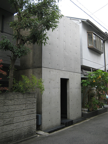
From the street front, the house looks like a simple but large concrete block. “Ando developed a radically new architecture characterized by the use of unfinished reinforced concrete structures. Using a geometric simplicity which reveals a subtlety and richness in spatial articulation.” The blank front façade is intended to shut out any intrusions of the outside world into the interior space. This enables it to protect its residents from the busyness of the outer world by offering a soothing sanctuary to the residents at the same time that it completely rejects the commercialism that drives the stress of that outer realm.
The interior space of Azuma House can be considered to be the opposite of its stark and seemingly lifeless exterior. Within the house, Ando has provided the owner with his private oasis of open space. “With spaces flanking an interior courtyard, there is an attempt to return the ‘contact with light, air, rain and other natural elements to the Japanese lifestyle.” Although the home is relatively short on available living space in terms of square footage, each room within is opened up to natural light and a view of the sky courtesy of large windows that open to a central courtyard.
On the second floor of the home, Ando has designed an open concrete walkway that extends from one wing of the house to the other, making navigation seem simple while still providing tenants with the ability to enjoy their secluded slice of the natural world (see Fig. 2).
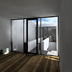
Several important concepts of minimalist architecture are revealed when analyzing this particular construction. For example, there is a strong economy of design as the house is constructed on a plan of simple, solid, flat planes. It also has a very simple and clean squared-V footprint to provide the central courtyard traversed by a miniature echo of this shape in the form of the concrete upper-level walkway
Ando emphasizes the need to de-clutter the mind and divorce oneself from the commercial messages of the outer world by remaining focused throughout the design on simple, natural elements by providing access to the sky, weather, light and space. Throughout the design, he purposely leaves his building materials visible unless there is a good reason to hide them which has the effect of encouraging closer connections with foundational ideas.
This same approach can be seen in Ando’s design for the Church of Light, constructed in a suburban area near Osaka. Again, the exterior element of the church is relatively blank-faced although with a bit more interest given through the interlocking concrete cubes than was provided in the Azuma House. Reinforced concrete is again the primary building material used in construction, giving the church a sense of solidity and permanence even as these forms are intersected and bisected by intentional cuts designed to allow the admittance of light for which the church derives its name (see Fig. 3).
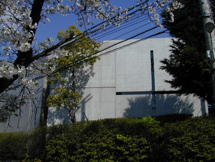
Inside the church, Ando achieves as stunning an effect of the spiritual essence of light as he had achieved a sense of space within the Azuma House through his recognition of the impact of contrasts. While the Azuma House depends on its effect upon the stark nature of the exterior as compared to the seeming openness of the interior, the Church of Light depends on darkness to achieve its celebration of light (see Fig. 4).
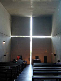
The interior chapel of the church is lit by the natural light entering the building through the cruciform intentionally cut into the concrete wall of the building that reaches from wall to wall on the horizontal axis and from floor to ceiling on the vertical axis. Because it is perfectly aligned with the seams in the walls, it could be thought that this positioning was merely an accident of the pouring, thus allowing the structure to exist on its own while emphasizing the integrated nature of form and spirit. Light is also permitted to enter the chapel through the back in a similar fashion (see Fig. 5).
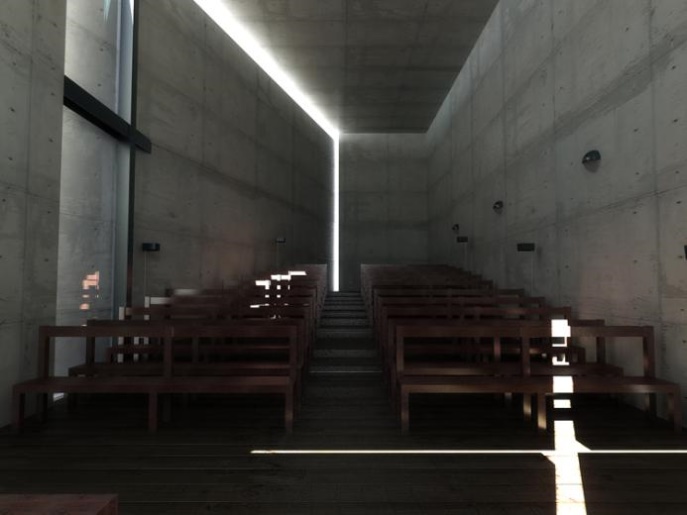
As a result of this careful arrangement, the light that is permitted to enter the chapel buildings does less to illuminate the inner space than it does to accentuate the shadows where the worshippers sit. Again, the building manages to convey more about the spirituality of the people using it through this juxtaposition. Ando also introduces an early awareness of ‘green’ construction within this structure as he used the wood from the construction scaffolding to plank the floor and create the pews in keeping with his philosophy of minimalist techniques and blending of nature and technology.
The use of the minimalist approach in architecture has significantly changed the way new generations view the world. Looking at these two examples, though, it can be reasonably argued that this is not necessarily the result of the designs themselves, but is instead an unconscious reaction to the same underlying structures to which minimalism was responding. “Living in urban spaces requires paradigm shifts not only mentally but also spatially.
Space constraints have led to dwellings rising vertically, discarding the earlier horizontal spaciousness that enveloped our lifestyle.” The spaces defined by Ando are effective in themselves, but both are very small structures with neither being much larger than a small house. In the case of the Azuma House, the structure is very effective in opening up the outside natural spaces secluded from the issues of the outer world, but only as long as these inner spaces are not overwhelmed with the furnishings and possessions of a normal family.
In the case of the Church of Light, the structure is very effective in conveying its message during the daylight hours but loses much of its power after the sun goes down. The change with minimalist design is in its creative use of space that allows for plenty of light and an impression of open space within the interior, regardless of how limited the actual space is. “Many people think that Minimalist art or architecture is something cold, abstract, and sterile. Instead, Minimalism is not only art or architecture it is an idea that does not elude existence. It is analogous to the editing of a film, where there is an inherent concentration of form and experience.
More than a subtraction, Minimalism is an inherent concentration of experience and pleasure.” This impression of minimalism as a means of cutting the clutter out of life and connecting to the basics is slowly but inexorably changing the focus of the populace and the way they choose to live their lives.
Bibliography
Berman, Marshall. (1982). All That is Solid Melts Into Air: The Experience of Modernity. New York: Penguin Books.
Berman, Marshall. (2002). Big Apple Redux: An Interview with Marshall Berman. Web.
Cinar, Selin. (2000). “Minimalist Architecture.” World Architecture Community. Web.
Ettlinger, L.D. (1968). “German Expressionism and Primitive Art.” The Burlington Magazine. Vol. 110, N. 781: 191-201.
Gabellini, Michael cited in Kiser, Kristen. (2002). ArcSpace. Web.
Levy, Darlene. (2003). Tadao Ando: Light and Water. Kenneth Frampton, Ed. Basel, Switzerland: The Monecelli Press.
Matthews, Kevin. (2009). “Tadao Ando.”Great Buildings.
“Minimalism, the new mantra in furniture.” (2004). The Hindu. Web.
Silloway, Kari. (2004). “Church of Light: Osaka, Japan.”Galinsky.
Takeyama, Kiyoshi. (1983). “Tadao Ando: Heir to a Tradition.” Perspecta. Vol. 20: 163-180.