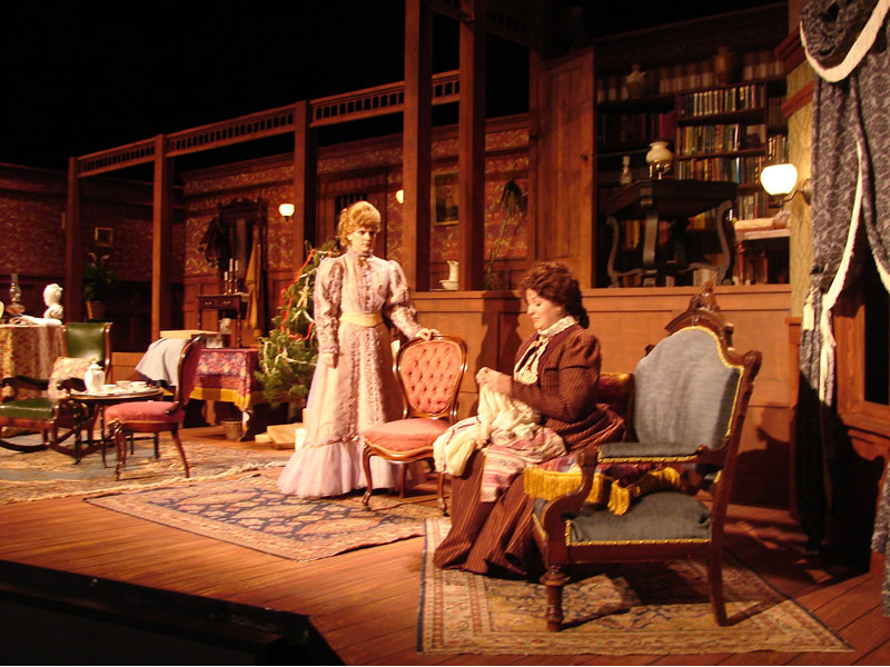
The play A Doll’s House is the best play the audience is presented to. First premiered in 1879 in Denmark it still makes you want to watch it over and over again. Along with many productions of this play, I think, the best ones are those that reflect the nineteenth-century costumes and atmosphere. In order to achieve success in conveying this atmosphere, it is necessary to set up the right decorations. I love the picture above; this is a production that makes you feel cozy. It is clearly seen what age is presented on the scene from the chairs’ design and the protagonists’ outfits. Nora’s hair is combed the way women used to do their hair in the nineteenth century. I liked the way they dressed up the main actress, this reflects the way the author describes her as an elegant and graceful woman.

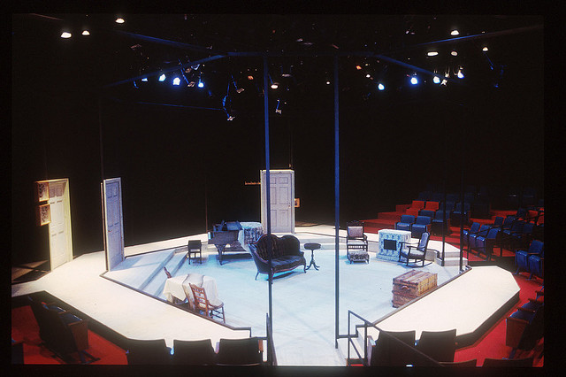
This is a new and contemporary view of the play. Of course, it is quite inappropriate trying to say the contemporary art is insulting, though it does turn over the way spectators are used to seeing the play. It is not that I am not ready for such minimalistic sets but this significantly complicates the way to indulge in the nineteenth-century environment. Besides, the actors must come up to the audience from behind the scenes because the viewer does not need to see the work of the director, decorators, costumiers, whereas this setting makes it available for the audiences’ eyes who and how is going to enter the doors. Therefore, richer elements of the decorations are also impossible to apply here because there are no walls or backgrounds to attach them to. It seems to me that the lights up on the ceiling are not enough to see the facial expressions of the actors, whereas such a small auditorium was surely meant to see everything closely. Moreover, the placement of the decoration items (chimney place, piano, table, etc) is too piled-up upon each other. The viewer does not particularly distinguish the various scenes, everything is too tightly located. I guess the actors’ play should make it all up.

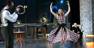
This little image features Soutra Gilmour’s startling design that I would be amazed at if invited to such a play. This is a glasshouse that reflects the initial meaning of the play – the protagonists live in a transparent house though still remain blind to their marriage problems. The lights and colors of the setting are very appealing to the audience, I think. Namely, colors are calm which does not evoke extra attention to the details; rather the actors are in the spotlight. So, the element of the glasshouse is what strikes me the most in a good way. I would love to see it with my own eyes. It plays an important role in conveying the plot when you see the play for the first time and wonder why they chose this very decoration until you learn why in the end.