The use of fine art and architecture in advertising and other media has a long history. Fine art has lent its aura of respectability and elite sophistication to all sorts of promotional material, movies, and television for generations.
Whether by endowing a product with greater status or credibility (Boston College), enhancing brand recognition, or simply displaying a time tested, and pleasing combination of colors, line, form, space and texture, fine art is useful. Like architectural landmarks, famous works of art also help the viewer to determine where the product, actor, or action, is located in time and space.
They may also provide clues to the character’s social background. However, the advertising industry and the fine arts world have for decades been engaged in a continuing discussion of what constitutes fine art. This has accompanied an ongoing examination of how to distinguish fine arts from images or objects created exclusively for promotional purposes. Recent research has also investigated and quantified what constitute the most appropriate and effective uses of fine art in advertising.
Fine art has long been the standard against which most visual media have been judged. It is usually defined as including objects created for their beauty (Merriam Webster). Student observers might say that what distinguishes fine art from, for example, craft, or other useful created items is that it can be appreciated on its own. In other words, it is compelling even when viewed apart from its original purpose, application, or setting.
To understand how advertisers use fine art, it is helpful to know how advertising developed in the first place. It is also helpful to know what the place of fine art occupied from the beginning of advertising.
Fine art has always included examples that conveyed a narrative. Much of religious art actually depicted Bible stories for non-literate viewers. Thus, even some of civilization’s greatest treasures fulfilled an illustrative function. For millennia, artists created whatever they were commissioned to create, exactly as advertisers do today (Bogart 8).
The eighteenth century witnessed the emergence of the phenomenon of the independent artist. This artist made art for art’s sake; expressing exclusively personal feelings (the development of a prosperous middle class with discretionary funds to spend on art, often entirely secular, rather than under the aegis of a church, and to support offspring who wanted to pursue art, was at least partly responsible for this shift in Europe and Britain). The era of painting for patrons or for God, or both, was largely past (Bogart 18)
Central to the development of advertising was fairly recent development of art explicitly created as illustration. Modern illustration should be distinguished from, for example, the illuminations of the medieval period. It was enabled by increased use of mechanized printing of books, and periodicals for mass distribution. The reproduction en masse of items such as wrappers, boxes, or posters enriched with fine art images further transformed fine art into ephemera, for the first time.
Mass production of printed materials also, as McClintock points out, altered public access to fine art dramatically. For example, advertising posters featuring artwork (in addition to text) permitted images that in an earlier era might have remained the intimate visual property of their commissioning patron, or at most, a modest population of worshippers or elite viewers of a piece of art, to become nearly everyone’s property (McClintock 511).
However, as Bogart notes, the relation between fine art, illustration, and advertising art, has been fluid (Bogart 17). The relationship has evolved from near unity, to divergence.
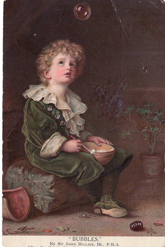
The mid-1800s witnessed the development of advertising as a specialized occupation. It included fine arts from the start. One of the first readily recognizable advertising efforts was the Pears Soap campaign, initiated by the entrepreneur Thomas J. Barrat (McClintock). He bought the rights to a painting, titled Bubbles, by a well-known artist, the Pre-Raphaelite Brotherhood adherent John Everett Millais (Millais).
The painting depicted a lovely young boy gazing up at a floating bubble (a symbol of transience as well as an object of geometric perfection and iridescent beauty, difficult to capture in two dimensions) (The bubble is a transient object of wonder, geometric perfection, and iridescent beauty, all difficult to capture in two dimensions). Barrat modified it by the insertion of a cake of Pears soap (McClintock 510). This thereby created, arguably, the first instance of product placement.
McClintock argues that Barrat’s modification and subsequent widespread distribution of the image created what she terms a “visible aesthetic space” around a commodity (i.e., soap). She notes that this achievement was unprecedented, and far-reaching in effect (McClintock 511). She further argues that Barrat and subsequent imitators were tapping into the non-verbal, non-rational, perhaps not ordinarily permitted feelings and ideas that art can so powerfully evoke; “its unique powers of communication” (Boston College).
The aim, however, was to make the viewer buy, buy, buy (McClintock 511). This distinguished the Pears campaign from creative efforts to help the viewer achieve salvation or to submit to a ruler, as many previous works of art were doubtless meant to accomplish.
Note that, as far back as art can be identified, there is usually some attempt to sell an idea. The ancient world’s giant stone deities and sovereigns are clearly public relations projects. Thus, distinguishing between creative output that is fine art versus creative output that is merely advertising is neither simple, nor straightforward, and possibly not always useful.
For artists born in the late 1800s such as Norman Rockwell, art school was the training needed for both fine art and illustration. However, by the early years of the 20th century, advertising had become more of an industry of its own, as opposed to being just one activity among many of an entrepreneur or business.
Although it was an outgrowth of both the arts of printing and typography as well as illustration, advertising still looked a great deal like fine art. However, an idealist such as Rockwell might take an oath to eschew doing advertising work (later broken, clearly) in the same way that other young aspiring people might have taken the temperance pledge (Bogart 72). His work, by ironic happenstance, was, of course, advertising gold, and helped to sell millions of copies of The Saturday Evening Post.
Today’s advertisers have access to centuries of fine art, much of it digitally imaged, and thus, digitally modifiable in a huge range of ways. However, in many ways their uses of fine arts do not differ dramatically from Millais’ exploitation. Many similar elements can be identified from current and recent advertising campaigns.
Pears Soap, for example, used a painting that was gracefully composed. Thus, it would please even an unfavorably disposed viewer. Current research suggests that, if used with care, fine art retains its power as art. If used carelessly, however, customers judge it as an illustration (Boston College).
As an example of a current image that exploits formal principles of contrast, proportion, variety, harmony, and movement, consider the Boysen Paint advertisement (Salomon).
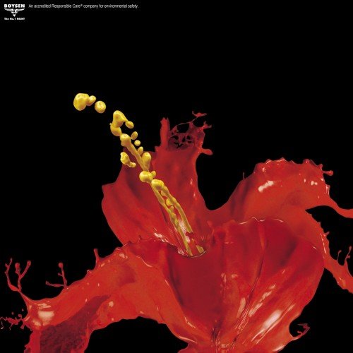
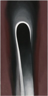
This, for many observers, might evoke the nearly abstract floral studies of the American painter Georgia O’Keeffe (O’Keeffe). The O’Keeffe Jack in the Pulpit series (these are housed at the National Gallery of Art) apparently uses a similarly limited number of colors, provides movement vertically, and leads the eye to finish the flower although it is only suggested.
This is parallel to what the Boysen Paint image accomplishes, using only splashed paint, captured in motion by photograph. Even if one does not even recognize the brand name or associate it with paints, this image is, as a result, gorgeously pleasing to the eye.
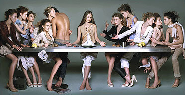
The Pears Soap campaign also selected a work by a respected and well-known artist. A parallel example would be the frequent use in media of The Last Supper (da Vinci). A recent obvious reference in advertising to the distinctive composition of this fresco was banned in Milan (Merritt). The authorities found it offensive.
This was because, among other things, it substituted women for men, and included a semi-naked figure where St. John would be. It was perhaps also inflammatory because it equated the fashionable clothing line of Marithé and François Gribaud with the serious topic of the last days of Christ.
Like the 19th century entrepreneur, Marithé and François Gribaud have selected an artist to borrow from who is exceedingly well-known and well-respected as an artist and an innovator, still today.
Like Millais, and the Pre-Raphaelite Brotherhood in England, Leonardo da Vinci was trying ou t new directions in art, as well as proposing inventions in other fields as well, such as manned air flight. Thus, until the ad was banned (Merritt) the fashion house could borrow from da Vinci the exciting aura of being multi-talented, cutting-edge, and individual.
Many people, even those who have not taken an art appreciation course, probably have heard of his bold choices for everything from his painting media (ultimately disastrous in the case of this fresco) to his shockingly human depiction of these iconic characters from the Biblical narrative. The completely uninformed may not know these facts, but they are perhaps not the target audience for the high-end sportswear. They could have chosen a contemporary media darling as well, with similar results (Gibbons 133)
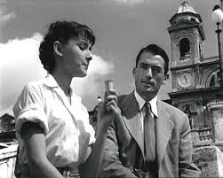
Movies also use fine art and architecture to great advantage. While those who have not visited Rome may not know the names of all the background monuments and buildings and fountains in the 1953 film, Roman Holiday (Hepburn and Peck), they are highly recognizable. Such valuable pieces of set dressing are available conveniently without construction and without a sound stage (Hoffman 76) .
The art and architecture provides immediately identifiable atmosphere, and places the tale in Rome or its equivalent instantly. What could otherwise be a lightweight tale of a confused and spoiled girl becomes mysterious and elegant by its background associated with the grandeur of tourist, classical, Rome.
Thus, in all popular media for centuries now, fine art has been a source of inspiration, fodder for parody and satire, and helpful visual cues for the viewer. Ads have used the expert eye of the artist to help them set up appealing compositions, whether seriously or in humorous homage.
They have used the high status and respectability or innovativeness of the artist as a source of borrowed characteristics and prestige. Moviemakers have used art and architecture to give credibility to their stories and instant depth and richness of detail to their scenes. All of these uses can be traced to the earliest applications of fine art to the selling of a commodity. Further, it could be suggested, much of art has been selling something, whether religious or political, since the first artist applied themselves to the earliest media.
Works Cited
Bogart, Michele H. Artists, Advertising, and the Borders of Art. Chicago: University of Chicago Press, 1995. Web.
Boston College. “Fine Art in Advertising Can Backfire.” 2011. Science Daily. Web.
da Vinci, Leonardo. The Last Supper. Convent of Santa Maria della Grazie, Milan. Fresco.
Gibbons, Joan. Art and Advertising. London: I.B.Tauris, 2005. Web.
Hoffman, Barry Howard. The Fine Art of Advertising. New York: Stewart, Tabori & Chang, 2002. Web.
McClintock, Anne. “Soft-soaping Empire.” The Visual Culture Reader. Ed. Nicholas Mirzoeff. Florence: Psychology Press, 2002. 507-518. Web.
Merriam Webster. “Fine art.” 2013. Merriam Webster. Web.
Merritt, Jeralyn. “Fashion Ad Pulled of Models at ‘Last Supper’.” 2005. Talk Left. Web.
Millais, John Everett. Bubbles. Lady Lever Art Gallery, Wirral. Oil. 2013. Web.
O’Keeffe, Georgia. Georgia , Jack-in-the-Pulpit VI. Oil on canvas, 1930. 36″ x 18″. Right. National Gallery of Art, Washington. Oil on Canvas. 2013.
Roman Holiday. Dir. William Wyler. Perf. Audrey Hepburn and Gregory Peck. 1953. Film.
Salomon, Lukas. “Great Examples of Creative Print Advertisement Design.” 2010. aext.net. Web.