Introduction
A data set containing 100 female tennis players and their earnings (in dollars) in 2010 was used to conduct an analysis, and the results were presented in tables, and figures. The country of origin of the players and their earnings were the main interest in this analysis as presented and interpreted in this paper. Tables, a pie chart and histograms have been used to present the findings with descriptive statistics and tests of normality (Kolmogorov-Smirnova and Shapiro-Wilk’s tests) being used to further check the normality of the earnings.
Country Distribution of the Top 100 Female Tennis Players
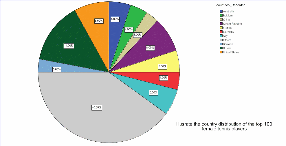
A pie chart display of the data (Figure 1) shows that the individual country which had the highest number of female tennis players in the 2010 chart of best female tennis players was Russia, with a 14 per cent of the players. The Czech Republic and the United States had the second largest proportion of 2010 top 100 best female tennis players, each with 8 per cent of all the players. While Italy had six players only, France and Australia each had five players on the list. Germany and Belgium had four players each in the top 100 list of female tennis players in 2010 while Romania and China had three players each. Almost half of the players (40 per cent) were from other countries in the world other than the ten countries indicated in the pie chart.
2010 Earning Distribution of the Top 100 Female Tennis Players
A histogram (Figure 2) of the 2010 earning distribution of the top 100 female tennis players show the highest peak (constituting 36 players) to be earning $25,000 to 50,000. The histogram shows that the earnings are skewed towards the left, i.e. between $0 and $75,000 as indicated by the three highest peaks within this margin of earning. The three highest peaks constitute 76 of the players (23+36+17) while the rest 24 players earned beyond $75,000 with the highest-earning player (1) getting an earning of between $500,000 and $525,000. Earnings of above $275,000 were sparsely distributed to the right of the histogram.
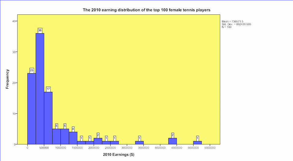
The histogram, therefore, indicates that the earnings of 2010 top 100 female tennis players were abnormally distributed (the data is somewhat exponentially distributed) and this can be confirmed by skewness and kurtosis statistics as well as the Kolmogorov-Smirnova and Shapiro-Wilk’s tests. The skewness for the earnings as presented in the descriptive statistics Table 1 is 3.034 with a standard error of.241 while the kurtosis is 10.003 +.478 SE.
Table 1: Descriptive Statistics for 2010 Earnings ($) Distribution for Top 100 Female Tennis Players.
The high range of earnings ($ 4,854,837) is also an indicator that the earnings lack normal distribution. The mean earnings for the 100 top players were $736571.50 with a very high standard deviation of 89243.69 thus further confirming that there is an abnormal distribution in the earnings (though means are not helpful in comparisons of data which does not assume normality in distribution).
The Kolmogorov-Smirnov test (which is not only a non-parametric test but it is also distributed free) of normality for 2010 earnings for top tennis females players was significant, K-S D (df 100) =.267, p =.001. The Shapiro-Wilk statistic was also significant, W (df 100) =.603, p =.001 (Table 2). The fact that these statistics are significant indicates that the dataset or else the 2010 earnings were not normally distributed.
Table 2: Tests of Normality: K-S D and Shapiro-Wilk Tests.
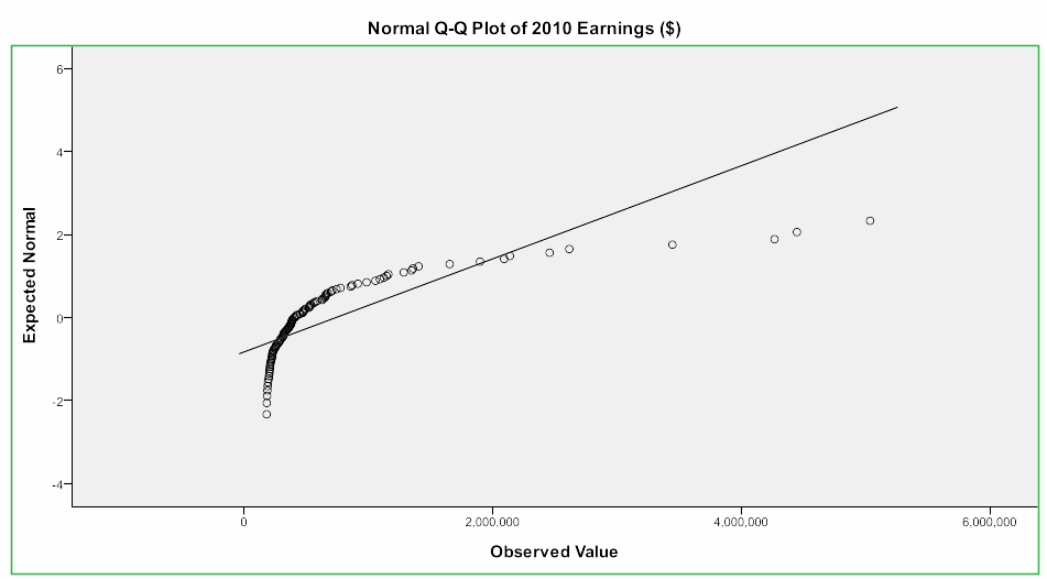
From the normal Q-Q plot of 2010 earnings (Figure 3), the confirmation that the earnings are highly non-normally distributed is made as indicated by most of the points lying very far from the line y = x. It is only a few data points (earnings) that lie along the line of best fit with a majority of the earnings being very far away from the line, thus confirming that the earns lack normal distribution. Most data points are distributed between 0 observations and $2,000,000.
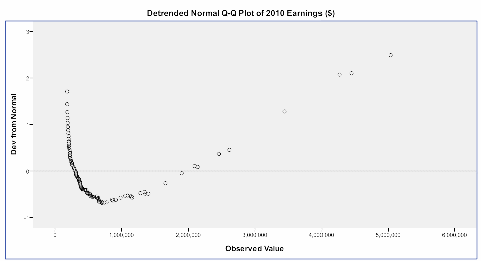
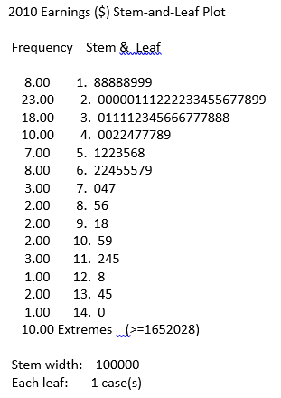
The detrended normal Q-Q plot of 2010 earnings also indicate most points to be lying far from the normal curve with some deviating to the positive side of the curve and others to the negative side. Only a few points lie on the line (Figure 4). The stem & leaf plot indicates the earnings as non-normally distributed by showing stem 2 and 3 to have the longest branches while from stem 7 to stem 14. The branches are very short (Figure 5).
A random sample of 15 female tennis players (taken without replacement) was taken from the 2010 population of the top 100 female tennis players and presented in Table 3.
Table 3: Random Sample of 15 Female Tennis Players (Taken from Top 100 Female Players Population).
Descriptive statistics were generated (Table 4) for the 15 random samples to aid in comparing the distribution of earnings with the total population. The mean earning for this sample was $1040997.80, with a standard deviation of $1222805.094. The skewness for the sample was 2.791, SE =.580, while the kurtosis was 8.870, SE 1.121. The range for the sample was $4849365. Despite this sample having a relatively higher mean than for the population, the standard deviation for the mean is equally large, thus indicating that the sample is also non-normally distribution. Furthermore, the skewness value is a positive value which far much from zero, just as the kurtosis is, thus implying that the data is non-normally distributed. It is no different from the characteristics of the whole population.
Table 4: Descriptive Statistics for the Random 15 of the 2010 Top 100 Female Tennis Players.
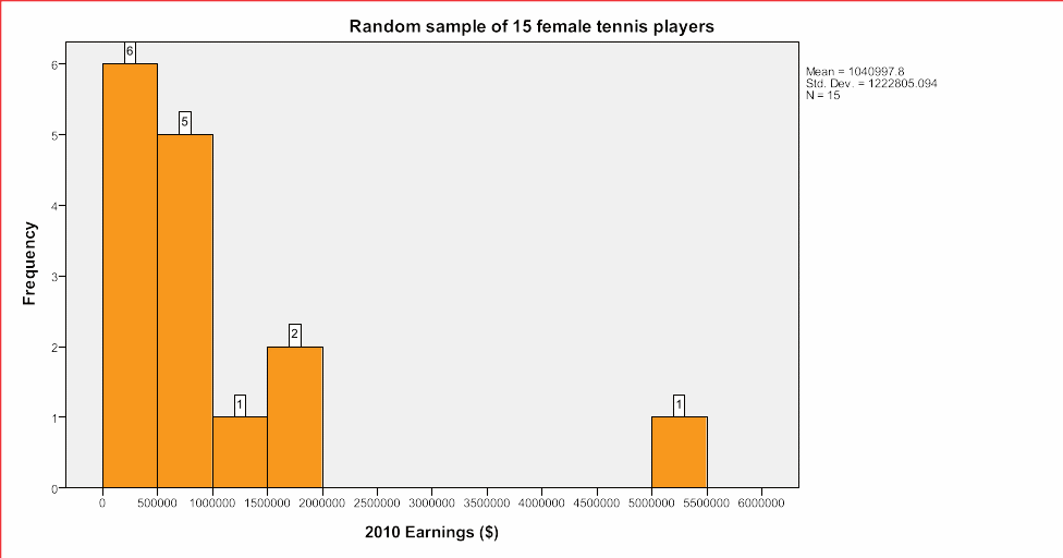
The histogram (Figure 6) for this sample also indicates that the earnings are skewed to the left, which was the same form of skewness in the entire population. The majority in the sample (11 players) earn between $0 and $1000000 while the rest four earning an amount beyond $1000000 but this is sparsely distributed in the right with a lone player earning between $5000000 and $5500000. Indeed, the sample has similar characteristics with the total population, indicating that the sample is representative and the data is suitable for this analysis.
