Introduction
Some fundamentals on the picture
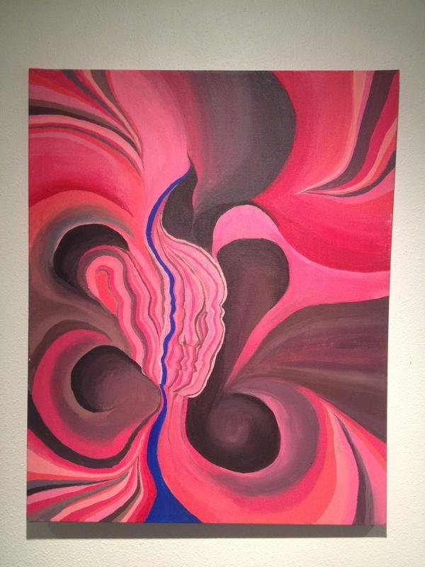
The picture I would like to analyze is called The Battle. It belongs to an abstract art. The most interesting point, however, which may surprise many people, is that The Battle was created not by a well-known artist as most of people think, but by a psychotherapist from New York. Tracy Morgan is the author of the work of art.
Body
The Battle and its technical characteristics
The colors and their significance
While discussing the importance of the picture, some technical details must be analyzed. First of all, it is necessary to point out that The Battle is considered to be a two-dimensional picture. The basic colors of the production are pink and black.
Taking into account the fact that colors have specific meanings, one can probably conclude that the author is aware of symbolism. As far as pink has an individual significance, one can state that the author chose it to evoke strong mental images. On the other hand, one is to keep in mind the relationship between certain colors, as color schemes determine the author’s general purpose.
The composition of the painting
The composition of the picture seems to be of a particular importance, as numerous elements of the painting, including texture, forms, lines, etc. show the depth or perspective of the author’s work. It must be noted that lines in the picture lead into the painting, what is extremely important to keep viewers’ attention on the production, but not off the painting. Pink and black are combined in such a way, to show they appear more distinct.
It is difficult to say for sure whether there are large light areas are combined with small dark ones, or large dark areas balanced with small light ones. Visually, it seems that the area of black is smaller; so, the chroma seems to be stronger. In other words, one can probably state that the author relied on one of the basic principles of the joint effects of chroma, as “for colors of different value, subjects preferred a narrow band of either the light or the dark color, avoiding equally sized areas of different values” (“Visual Preferences,” n. d., para. 16).
Furthermore, while pink can be regarded as a dominant color, the picture seems to cause positive feelings. Black, in its turn, determines the symbolical meaning of Morgan’s work. Thus, in my opinion, the picture reflects the fight between good and evil; the theme is considered to be not new, but topical at all times.
Tracy Morgan’s main aim
The focal points of the piece of art reflect black inscribed circles. This aspect should be carefully analyzed, as through the inscribed elements the author depicted the vortex of events. Taking into account the fact that color consistency of Tracy Morgan’s painting is heterogeneous, but invisible, one can conclude that the author’s main aim was to create aesthetically pleasing work.
Conclusion
“
As far as the painting involves numerous tints, one can suppose that Morgan wanted to show the fight inside. In other words, it seems to be evident that verbal and visual processes of information perception are accepted by people in different ways. Thus, one can speak about the battle, and one can see the battle; the processes are not the same; so, the author gave viewers an opportunity to understand what perceptual knowledge is. Generally, I think that the author depicted a complex philosophical issue.
Reference
Visual Preferences. Macalester.edu, Web.