Introduction
The works of an Austrian architect, Adolf Loos, contributed to the style of modernism and modernist theory. However, even his style has changed over time, although he began to advocate for modernism early in his career and wrote many texts on the topics of the modernist style and ornamentation.
One of his earlier works, Café Museum, a building repurposed into a café in 1899, was opened in Vienna, Austria, and showed his attempt at creating a modern interior in a building designed by a different architect. Although the exterior of the building seemed simplistic as opposed to some more rich and stylized designs, its original interior was utterly devoid of decorations, creating a simple and serious look. It was an explicit rejection of the ideology of Vienna Secession, in which the architect was briefly interested at the very end of the nineteenth century.
Later, his approach started to change as he chose a more simplistic and modern look for the outside but a more comfortable and domestic one for the inside, while still advocating against adornments and decorations. His later work, Villa Müller, designed by the architect in 1930, is still preserved in its original form as a museum. The building showed a different style, devoid of any decorated surfaces but filled with expensive, high-quality materials and a variety of colors and textures. Currently, it serves as a great example of the architecture of the early modernist period.
The differences between these two buildings are apparent, as they have a distinct look of two separate ideas of their creator. Loos’ decisions for Café Museum’s interior were dictated by his disagreement with the existing styles, especially Vienna Secession, which he despised for unnecessary decorations. Villa Müller showed a similar approach to practicality, however, including a more relaxed design for the interior and separating the moods for the two spaces – outside and inside of the house.
Café Museum
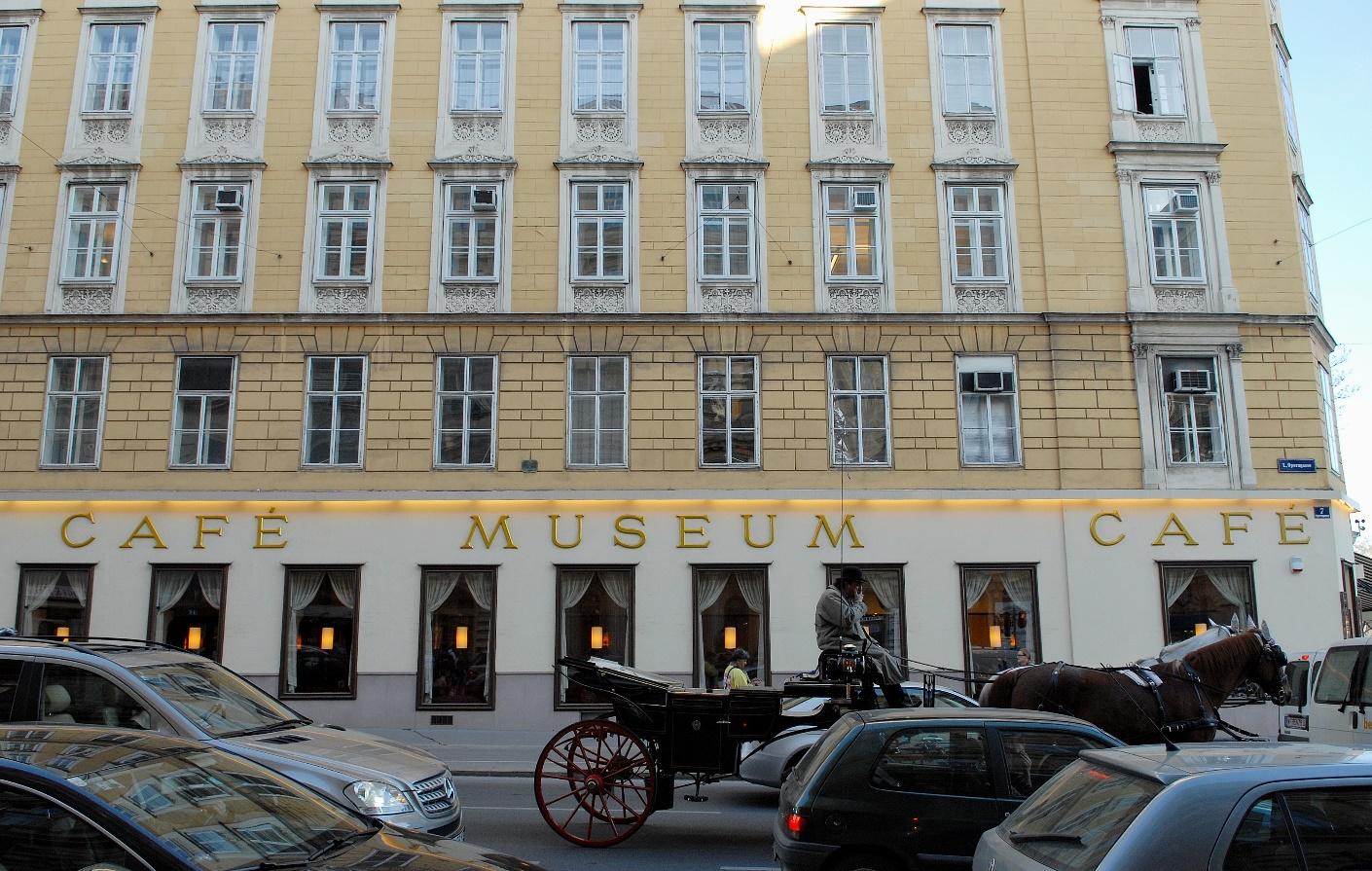
The interior of the Café Museum can be considered as one of the first significant works of the architect, who was guided by his views on contemporary culture in creating this concept. Interestingly, the outside of the café was designed by another architect, who also did not use many decorations for the façade of the first floor. As can be seen in Image 1, he chose a simple white wall for the bottom of the building and natural beige brickwork for the top.
The only possible decoration for the café on the outside is its name, displayed in large golden letters. The inside of the building was created by Loos, who at the time was disenchanted with the style of other contemporary architects and wanted to present a modern look different from the popular trends of Vienna.
The rise of Vienna Secession with its highly ornamented designs, neoclassical inspirations, and a conservative outlook did not appeal to Loos, who advocated for practicality and absolute necessity. Thus, his design of the café directly corresponded with his views, presenting a simple room structure, muted colors, and the lack of any decorative pieces. As can be seen in Image 2, the original interior of the café included only the furniture that was absolutely needed for the restaurant to function.
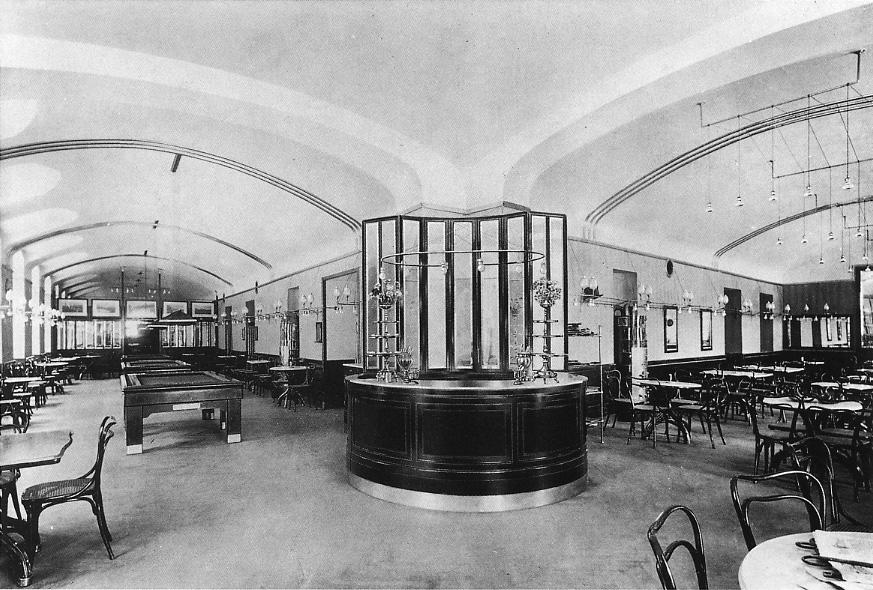
Moreover, the chairs and the tables were made from a material of one solid dark color, the same color used for the lower part of the walls. The material used was mahogany, a dark red and brown colored wood. The lighting also lacked any decorative details, serving only according to its primary purpose. Although the color of the walls, which was a kind of pale green, differed from the white ceiling, it was still muted enough not to become a distinctive detail of the design.
It can be recognized that the café’s interior did not feature many materials, using wood and metal as the primary sources of color. In fact, Loos did not use many painted or colored furnaces in his works, creating the design and the atmosphere by choosing high-quality materials and utilizing their natural characteristics such as color, shape, and texture.
However, the café’s atmosphere was still incredibly modest, which even led to it receiving the name “Café Nihilismus” from its visitors and critics. The interior could be considered lifeless and uncomfortable by some guests, who expected a more homelike charm of a café. It is possible that Loos’ later works would be more appealing to these critics, as they had a different atmosphere and feel to them.
Villa Müller
Loos’ beliefs did not change significantly over the years, as he still believed in the superiority of modernism and its logical use of materials and decorations. His later work, Villa Müller is a clear example of the creator’s devotion to the modernist style. Loos continued to advocate against adornments for the design, not using any patterns, decorations, or unneeded details in his designs.
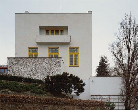
As can be noticed on Image 3, the exterior of the villa is minimal – the building has a cubic shape, has no decorations, and is made from a material with a muted white or light beige color. Its only elements are windows with a balcony and the front door. The windows are painted yellow, which may serve as a splash of color on such an austere design. Thus, Loos’ view of modernism remained the same through the years, as he continued to value necessity over adornment.
However, the interior design of the villa reveals the change of style that occurred in the works of Loos during his career. As can be seen in Image 4, the library of the house looks completely different from the café’s design. The walls of the room are hidden behind reddish-brown wood panels with noticeable texture and a glossy finish. They also serve as furniture as they have installed shelves made from the same material.
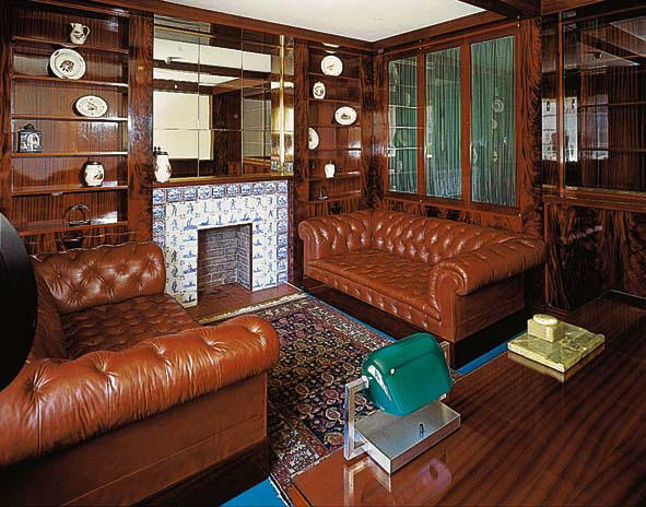
The floor is bright blue, contrasting the warm brown color of the walls. The sofas are also made from the same brown-colored leather, creating a sense of luxury and comfort. The room still has few decorations apart from a carpet and a chimney, covered in white and blue tiles. However, the atmosphere in this room completely differs from the one in the café. It is much more homelike and plentiful.
It is the primary distinction between the old and new approaches of the architect. In the villa, Loos focused on creating a different view of its exterior and interior. From the outside, Villa Müller resembles a neutrally colored cube without any signs of the coziness of an occupied home. On the other hand, the inside is full of textures, colors, and forms, creating a separate atmosphere for every space of the house.
The library that was mentioned before uses the surface of the wood as a central decoration. Its complex coloring replaces the need for other ornaments or accessories, making the design more attractive. Image 5 presents another example of using textures. In this lady’s dressing room, Loos used a lighter color of wood for its built-in closets, bringing more light to the place. He also replaced large leather couches with a wicker chair in a similarly light tone. White parts of the table which is made from the same wood as the wardrobe serve as decorative details and make the room appear even brighter.
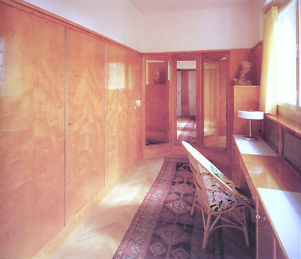
In this case, Loos’ deliberate choice of these materials lies in their particular purpose. In the library, comfortable leather couches are intended for spending evenings near a lit fireplace, as they exude warmth and comfort. The dressing room is made of light-colored materials to make the room bright and clean, suitable for a morning routine that may require good lighting.
Loos’ design of different spaces focused on their purpose while using the elements of the room to increase usability further. It can be noticed that the walls in the rooms double as cupboards and shelves, creating a more open and less cluttered feel. This use of space is similar in all rooms of the house.
Such utilization of free space can be viewed as a symbol of Loos’ devotion to modernism. It can be assumed that the architect strongly believed in objects needing to have a specific purpose to be a part of the final design. Therefore, each detail of the rooms is thought out. The differences between the interiors of the café and villa are obvious. Loos used colors and textures much more abundantly in the later work, creating a more interesting and complete space.
The inside of the house cannot be called nihilistic as it exudes a different feeling. Loos was much more open to using bright colors which could be seen in the library. Moreover, his choice of furniture also corresponded with the purpose of the rooms. The use of space was more thought-out, as Loos incorporated many built-in pieces. As a representative of early modernism, Loos tried to create designs that would not need adornments and would be sufficient on their own. Thus, he used bold colors and contrasting textures.
Reasons behind Similarities and Changes
While comparing the interiors of the two described works, one might see many differences in their styles. However, the similarities between the designs of these two buildings can also be outlined. For instance, the simplicity of the café’s interior still finds a place in the villa’s structure. Loos continued to avoid decorations and unnecessary details, using only useful furniture. Furthermore, he preferred natural materials such as wood, glass, and metal and explored their existing features as elements of the design.
The café’s furniture made from mahogany was the main focus of the room. Similarly, wooden structures and built-in shelves of the villa also dictate the style and create the atmosphere. The lighting in both designs is simplistic and is seen as a source of light and not as a piece of décor. There are no complicated forms in the design of the room’s space, although the placement of all elements is rather sophisticated.
The change of style seen in the works of Loos can be explained by his continuously progressing view of modernism. The separation of spaces and areas in the house could come from his ideas of Raumplan, according to which the building “should be silent on the outside and speak only inside.” This concept was formed with Loos’ search for the rhetoric of modernism that suited his beliefs. Villa Müller is a clear example of that statement, as its exterior and interior are completely different.
The outside of the house does not have any distinct features and seems completely devoid of any elements of style. It is as simple as a building that can be both in its form and its color. In contrast, the villa’s interior is full of interesting decisions and elements that make it more suitable for comfortable living. Loos’ use of simple but high-quality materials creates a feeling of luxury and homeliness.
Conclusion
Loos’ view of modernism was centered on such concepts as usability, necessity, and simplicity. His firm belief in the need to avoid all decorations while creating designs remained inherent to his craft over the years. While one of his first works, Café Museum, was an example of restriction and limitation, his later design of Villa Müller revealed his progression as a modernist, as he refined his vision of usefulness and comfort. Although these works appear to be completely different from one another, they both represent their creator’s beliefs.
Each piece of furniture in these designs had a purpose, and all of them correspond to each other in color and shape. Nevertheless, Loos’ later works also gained a sense of homeliness and a distinct look for each designated space. His desire to work with natural materials did not change much, but he started to use them as decorations, instead of completely ignoring the possibilities of colors and textures.
Bibliography
Café Museum, the Story. Digital image. Café Museum. Web.
Café Museum, View from Outside, Operngasse. Digital image. Wikipedia. Web.
Charciarek, Marcin. “Playing ‘Hide and Seek’ or Penetrating Architecture.” Czasopismo Techniczne 2015, no. 9-A (2015): 71-77.
Gronberg, Tag. “Coffeehouse Encounters: Adolf Loo’s Café Museum.” FKW Zeitschrift für Geschlechterforschung und Visuelle Kultur 30, no. 32 (2001): 22-33.
Lorenz, Wolfgang E. “Measurability of Loos’ Rejection of the Ornament – Using Box-Counting as a Method for Analysing Facades.” Shape, Form and Geometry 1, no. 1 (2014): 495-504.
Macarthur, David. “Reflections on ‘Architecture is a Gesture’ (Wittgenstein).” Paragrana 23, no. 1 (2014): 88-100.
Schiermer, Bjørn. “On the Ageing of Objects in Modern Culture: Ornament and Crime.” Theory, Culture & Society 33, no. 4 (2016): 127-150.
Van Duzer, Leslie, and Kent Kleinman. Villa Muller: A Work of Adolf Loos. New York: Princeton Architectural Press, 1997.
Villa Müller, Lady’s Dressing Room. Digital image. Architectuul. Web.
Villa Müller, the Library. Digital image. Architectuul. Web.
Villa Müller, View from Outside. Digital image. Architectuul. Web.