Advert 1
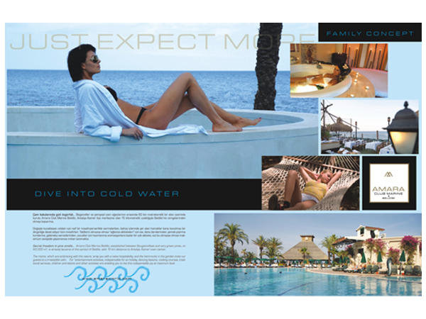
The advert shown below is a magazine advert by Amara Hotels and Resorts; it is an example of a simple but effective advert. From a glance, target market can learn of features and services in the resorts. It has combined bright (shouting) and dull colors (colors of harmony) well to create a pleasant feeling that visitors are likely to get in the hotels and resorts.

In the advert framework, target customers can learn more than four services offered by the hotels. The advert users get into details of the advert to understand what the hotel offers and its locations. The above attributes of the adverts make it simple and straight-forward.
Color mix used in the advert is another strength portrayed; the colors make the viewers feel harmony and peace. They have been used to communicate the feeling customers are likely to get from their stay in the resorts. The advert background is not only made by appealing combination of shades, but the shades also communicate of more features likely to be found in the hotel.
Since the advert is divided into different segments, each area seems to address particular service in the resort. The above gives the advert an upper hand and facilitates effective communication with target customers.
The words correctly rhyme with the advert tag; they both have been used to bring more information of the resorts/hotels. The marketing team has used selected words to ensure that customers understand more about the facility and how well they can enjoy their time there.
As if all above mentioned is not enough, the advert gives the company an opportunity to write to the customers on different issues regarding the resorts. The advert meets all the requirements of an effective advert (Rakesh, 2005).
Advert 2
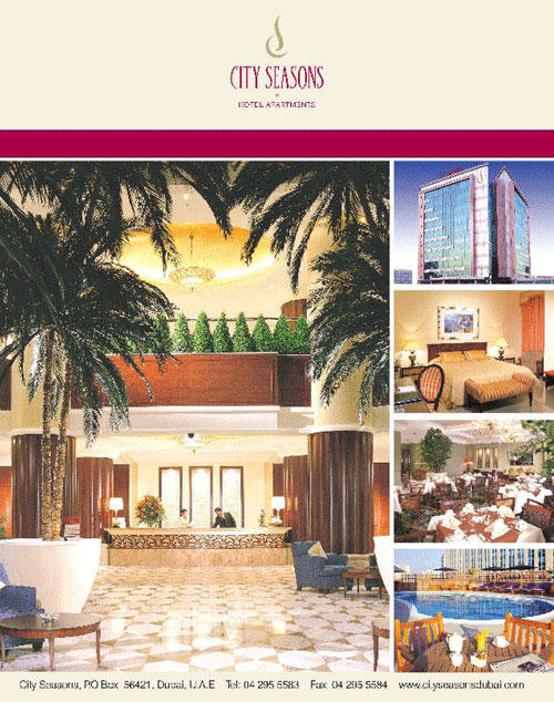
Advert 2 portrays an ineffective advert made by City Seasons Hotels. There is an obvious mismatch between the name of the hotel and what is portrayed in the advert. When making adverts, it is important for the management to consider even the name of the hotel or the product. In this case, the name of the hotel suggests a place with numerous activities that meet the season of a year.

However, it is not reflected in the advert. According to it, the place has more of indoor activities; it seems so because of the image of a beautiful interior design that the advert portrays. Although the finishing looks superb, the notion created by the name dismisses the good look.
The color mix of the advert is not appealing; there is monotony of brown color which is supposed to be a shouting color and color of harmony. The background colors of the advert do not also go with each other well, there is nothing else communicated by the advert than what is coming out explicitly.
Another problem that the advert has is the use of computer generated/artificial vegetations. The advert should show that the facility has well maintained vegetation. However, a closer look at the picture creates the impression that these trees are made to fit the situation or emphasize a decor and design of the interior, but here they seem to be out of place.
The advert has concentrated on one area of its service, provision of accommodation. It has ignored the outdoor services that the resort offers. Since making an advert is expensive to every organization, it would be wiser to take all the possible advantages of it (Kerin & Peterson, 2009). However, City Seasons Hotels failed to use their chance.
References
Kerin, R. A., & Peterson, R. A. (2009). Strategic Marketing Problems: Cases and Comments (10th ed.). London: Pearson Education.
Rakesh, J. (2005).International Marketing. New Delhi: Oxford University Press