Financial Performance of Airbnb
Airbnb is the selected company, and it is necessary to analyze its financial performance for 2018. This report will rely on the data found on the professional website (Macrotrends, 2022). Firstly, one should focus on profitability ratios, including gross profit margin and operating profit margin. Special calculations reveal that 2018 witnessed a 2.18% increase in the gross profit margin and a 116% rise in the operating profit margin compared to the 2017 data. Secondly, leverage ratios can also disclose useful information about the company. In 2018, the return on equity ratio was 3.26, while the return on assets was estimated at -0.25 (Macrotrends, 2022). Thirdly, it is reasonable to look at the free cash flow per share data. In 2018, this ratio increased by 133% compared to 2017 (Macrotrends, 2022). One can use these financial ratios, percentages, and growth rates to assess the company’s financial performance.
The increases in the profitability ratios demonstrate that Airbnb kept increasing its revenues in 2018. One should also highlight that the gross profit margin rise was dramatic compared to the previous year’s data. In turn, the leverage ratio analysis generated some controversial outcomes. On the one hand, the return on equity ratio of above 3 denotes that the company’s financial health was beneficial, and the business managed to generate decent revenues. On the other hand, the negative return on assets indicates that the organization had difficulties obtaining sufficient profits to cover the amount of asset. Furthermore, a significant increase in the free cash flow per share data denotes that the company became more financially flexible in 2018 compared to 2017. In conclusion, this information reveals that Airbnb featured decent financial performance in 2018, but some weaknesses were also found.
Strategic Group Map

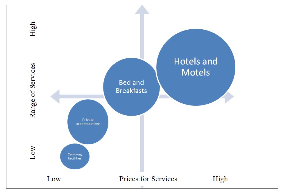
The strategic group map above represents the analysis of the accommodation industry and the businesses that represent it. They are placed in the graph according to how many services they offer in addition to the accommodation itself (the vertical axis) and how much these organizations charge for their services (the horizontal axis). Hotels and motels occupy the top position in the graph because they offer the highest number of services, including accommodation, business, corporate meetings, and celebrations. However, these establishments are the most expensive in the sector. Camping facilities and private accommodations are the cheapest offerings, but they do not impress with attractive service ranges. As for bed and breakfasts, they offer a wide number of services, but customers can purchase them for lower prices compared to hotels and motels. Since Airbnb is a representative of the latter industry segment, it is located in the center of the diagram.
Reference
Macrotrends. (2022). Airbnb financial ratios for analysis 2017-2022 / ABNB. Web.