Abstract
Data visualization is a useful tool to facilitate the perception and analysis of information. You can present important information using different charts, different types of which are better for various functions. The choice of a chart should be made based on what data is used and what analysis goals are a priority. In particular, it is necessary to consider which question is answered by a particular visualization. There are four functions that charts perform, including comparison, distribution, composition, and correlation. The selection of the appropriate type of visualization is based on the definition of the required function, as well as clarification of the type and amount of data. Each of the functions contains a number of types of graphs that best visualize the data included in it.
Introduction
Information visualization is an important stage in project analysis, as it allows a more detailed examination of the available variables. It is much easier for viewers of the presentation to perceive graphical data. However, there is often a difficulty in choosing a chart that would most effectively illustrate a particular type of information. This stage of work on the presentation of the analysis is extremely important since the perception of the entire project depends on the visualization used. There are various charts that serve to display different types of data. However, the most important aspect when choosing a visualization is the goal behind the analysis.
Determining the Goal of the Analysis
To select the chart that best illustrates the required data, one must first define the goals of the project presentation. Hardy (2019) proposes the framework, which consists of three elements: question, goal, and outcome. To choose the right type of visualization, special attention must be paid to the goal, which is the basis of the presented data. Different charts can illustrate four features of the information: comparison, distribution, composition, and relationships. Thus, it is initially necessary to determine what process is reflected in the presentation. Questions should be asked to describe the anticipated results. They help determine which chart should be selected based on the function it should perform.
In addition to the goal of the analysis, other important factors that influence the description of project-relevant information should also not be overlooked. It is also important to consider what type of variable is used to illustrate the data, as well as its volume (Data visualization, 2021). It should also be taken into account who will be the viewer of the illustrated information and how easy it will be for them to understand the data. Moreover, when forming the goal of the analysis, it is necessary to understand which variables are important to viewers, as well as what relationships between the data they would like to examine.
Data Comparison
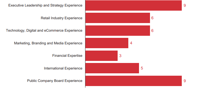
Comparison charts are intended to illustrate the comparison of variables by different parameters. This type of visualization allows you to highlight differences or similarities between products, services, or tools, as well as assess their benefits (What is a comparison chart, n.d). Graphs that are often used for comparison are the Venn diagram, quadrant charts, percentage comparison, bar charts, comparison circles, and columns. In particular, the Venn diagram is the best way to show the differences and similarities of analyzed items. Quadrant charts are usually utilized for SWOT analysis, PEST analysis, and Eisenhower Matrix (What is a comparison chart, n.d). This type of data visualization allows one to identify and compare different variables in order to establish relationships between them later.
It is best to use a percentage or pictographic comparison to illustrate small data sets. Different bar charts allow one to compare the volume of one dataset with others. The most effective in this case are vertical and circular bar charts. Comparative circles and columns are similar to bars charts but illustrate different data using various element sizes. The example of the comparison chart is presented in Figure 1 in Appendix.
Data Distribution
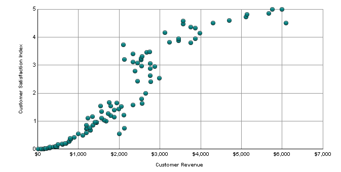
Distribution charts are used to illustrate the distribution of variables over time to identify trends. To perform this function, one should utilize bubble charts, dot charts, box-and-whisker charts, range charts, or polar charts (Choose right chart type, 2017). The most commonly used dot and bubble charts are used to illustrate patterns and trends in the distribution of data. Moreover, such charts can be used to establish the presence or absence of relationships between datasets. Box-and-whisker charts are utilized when it is necessary to visualize a range of distribution and compare them for different variables. In contrast to the previous one, range charts are used to analyze imprecise items and their minimum and maximum distribution points. Polar charts allow one to conduct more detailed analysis by presenting data “with a spatial perspective – positioning, navigation, or anything else regarding degrees (angles) and distance” (Choose right chart type, 2017). These chats are more suitable for providing specific technical information. The example of a distribution chart is presented in Figure 2 in Appendix.
Data Composition
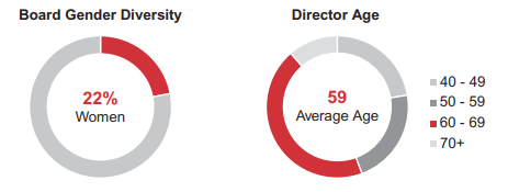
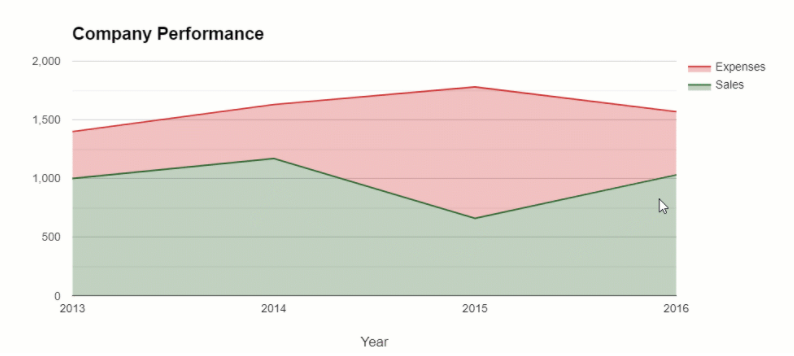
Composition charts are used to illustrate parts of a whole dataset. In particular, they visualize how the composition changes over time. To perform this function, such chart types are used as stacked area charts, stacked bar charts, pie charts, treemaps, funnel (pipeline) charts (Rovnik, 2019). Stacked area and stacked bar charts are utilized to visualize composition over time and how categories are divided into subcategories. Pie charts are used to provide static information about which components are included in the dataset in percents. Treemaps allow one to illustrate the hierarchical relationship between the components of the whole. Funnel charts are utilized for visualization of the decrease of the number of items on a particular stage. The examples of composition charts are presented in Figure 3 and Figure 4 in Appendix.
Data Relationships
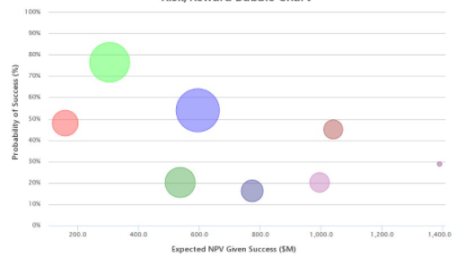
Relationships or correlation charts help visualize the link between causes and effects. The chart types that are used to perform this function can be found in other categories, but they contain more variables. For example, scatter charts are often utilized to establish relationships, as well as to identify a distribution. However, several values are used to visualize causes and effects, between which a correlation is identified. Thus, one can say that separate distribution charts are combined into one for a more descriptive display. Bubble charts are used to visualize more datasets and dependencies between them. The most common use of such charts is to assess the risks of a project. The example of a relationship chart is presented in Figure 5 in Appendix.
Conclusion
The choice of the type of chart depends on what goals are presented for visualization. Different charts can be utilized for comparison, identification of distribution, determination of composition, and for establishing relationships between variables. Depending on which of the presented goals is chosen as the key one, a certain type of charts are applied. It is also important to consider what amounts of data are used and who is the viewer of the presentation. Based on this information, specific instruments should be selected from their broader groups.
References
Choose right chart type for data visualization. Part 4: Data distribution. (2017). AnyChart. Web.
Data visualization: Choosing a chart type. (2021). Berkley Library. Web.
Franz, N. (2018). Risk/reward bubble charts – More than just a pretty output.Syncopation Software. Web.
Hardy, J. (2019). How to choose the best chart or graph for your data. Google Cloud. Web.
Rovnik, V. (2019). How to choose charts to show data composition. WebDataRocks. Web.
Scatter plot. (n.d). MicroStrategy. Web.
Under Armor, Inc. (2021). Notice of 2021 annual meeting of stockholders to be held May 13, 2021[PDF-file]. Under Armor. Web.
What is a comparison chart and how do you use it? (n.d). Beutiful.ai. Web.
Appendix
