Introduction
As pointed out by the Institute on Climate and Planets (2010), the sharing of findings is a direct responsibility of people engaged in research. When one completes a study, they would be expected to communicate the results, and different tools can assist in the process. All future researchers need to be aware of their options and familiar with the diverse methods that can be employed for different types of inquiry.
This presentation is going to discuss the use of the various methods of presenting the results of descriptive and correlation research. The following outline will be used to structure the content. First, both descriptive and correlation designs will be briefly defined. Second, various methods of data presentation that can be employed by them will be considered. Third, specific examples of such methods will be introduced and discussed. Finally, the strengths and limitations of both designs, as well as their data presentation approaches, will be investigated. As a result of this exercise, learners will be expected to be able to demonstrate some knowledge of the two designs and the data presentation methods that they use, explain their advantages and disadvantages, and provide their own examples to illustrate their points.
Descriptive and correlational designs: Overview
Descriptive and correlational designs are very different because they set and are capable of achieving different goals. Thus, descriptive research has the purpose of describing a phenomenon; it is generally done to improve the understanding of this phenomenon by responding to some basic questions about it. Thus, descriptive research is an explorative approach to inquiry, and it typically presupposes reporting the results of observation, case study, or surveys (Houser, 2016; Jackson, 2016). Descriptive research can only describe; it cannot be used to infer.
Correlational research, on the other hand, is one of the predictive methods, which differ from descriptive approaches in that they attempt to find and demonstrate correlations between particular variables. Correlational research is specifically employed when the variables of interest cannot be manipulated; when they can be changed, experimental or quasi-experimental studies are considered. However, this presentation is dedicated to correlational studies, and in them, the relationship between variables can be assessed, although the causation cannot be demonstrated.
In order to assess relationships, correlational studies use inferential statistics, which is the type of statistics that can help to make conclusions about entire populations while only employing the data from a particular sample (Polit & Beck, 2017). An example of inferential statistics that a correlational study would benefit from is correlational coefficients, which are meant to test correlations between variables that are measured on the scales from nominal to ratio.
On the other hand, descriptive studies are supposed to use descriptive statistics. The most common examples of statistics that should be employed to describe data include percentages, as well as means with standard deviations (Hussain, 2012). Thus, descriptive and correlational research produce different types of findings for distinct purposes, which may affect their data representation.
Data presentation
That said, the approaches to reporting findings are rather common among different types of research. The general structure of a study report is the same for most cases; it presupposes specifying the background information, which often takes the form of a literature review, and following it by the methodology and findings with their discussion and conclusions (Institute on Climate and Planets, 2010). In this regard, it is important to remember to include the limitations of a study and demonstrate a connection between the findings and the hypothesis or research question. Other than that, it also makes sense to highlight the value and implications of the research.
From the more technical aspect of data presentation, the Institute on Climate and Planets (2010) recommends tailoring one’s approach to the audience that one plans to be working with, as well as the type of data and research that has been conducted. All these factors can affect the format of data presentation that would work the best for a particular study. For example, the data presentation approaches that would work for a poster meant for a group of students differ from those best suited for a publication in a peer-reviewed journal.
Some of the most common ways of presenting data include tables and figures; in addition to that, there are maps, which are very helpful for geographic information (Martin et al., 2017). Furthermore, when datasets are not particularly large, it is a good idea to include them in publications; this approach will facilitate peer review (Weissgerber, Milic, Winham, & Garovic, 2015). These methods can be employed by both descriptive and correlational research.
Questions to ask
Some additional comments about the way the data can be presented need to be made. The Institute on Climate and Planets (2010), as well as other literature on the topic (Weissgerber et al., 2015), recommends considering the following issues and concerns when preparing data for presentation. First, it is crucial to select the data that would best describe the research. Publications, posters, presentations, and other dissemination tools usually require being mindful of the available space. As a result, it is necessary to incorporate the data that can indeed respond to the research question and then consider adding supporting information.
Second, the data need to be presented in a logical manner that helps the reader understand the research and its conclusion. The Institute on Climate and Planets (2010) points it out that the chronology of an inquiry is less important than the logical organization of its findings.
Finally, a major aspect of data presentation is its quality; the information is supposed to be understandable. As a result, decently-sized, well-labeled, and adequately-explained tables, figures, and maps are required. It may also be important to consider the colors that are used; at the very least, they need to be in contrast to each other and enable reading.
In general, data presentation is supposed to be effective and assist the reader rather than distract them. All this information and advice can technically be employed by both descriptive and correlational designs. However, there are also differences between the two, especially from the perspective of the form and content of the graphs and tables that they could incorporate.
Research Examples
Descriptive Research
Descriptive graphs are very diverse; they can employ a wide variety of forms which may be particularly helpful for describing specific phenomena. This presentation contains several graphs from the most recent educational material by the Centers for Disease Control and Prevention [CDC] (2016). The handout is dedicated to smoking in the US, and it reports the 2016 data.
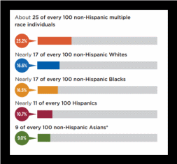
Consider Figure 1, which depicts a bar graph. When it is necessary to compare one and the same parameter within different groups, such graphs, as well as their varieties, can be employed. These graphs can be horizontal (in which case they are typically called bar graphs) or vertical (then, they might be called column graphs). The presented example shows that in the US, the numbers of smokers vary for different ethnicities with Asian American smokers being especially uncommon.
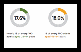
On the other hand, when a study needs to demonstrate a particular figure as a percentage of a greater group that it belongs to, various pie charts are a very popular solution. In the CDC (2016) report, a variety of the pie chart is used, which can be called a doughnut chart. The only difference between the two is their forms; they communicate the same information, but they can look differently. CDC (2016) chose the shape of a doughnut to place important information in its middle. The charts inserted here in Figure 2 show the percentages of smokers among the US population within the age ranges of 25-44 and 45-64. The figures are 17.6% and 18% respectively.
In addition, Figure 1 can demonstrate the fact that the functions of bar graphs and pie charts can be united in stacked or 100% stacked bar graphs. Figure 1 is technically a 100% stacked bar graph; it is used to show the percentages of smokers within different ethnicities and to compare them by placing them side-to-side.
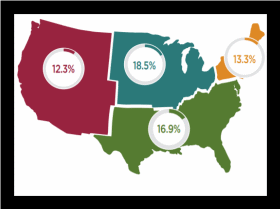
A method of data presentation that is most obviously meant for particular types of data is the map one. Indeed, maps are supposed to display geographic data, which is why a study that describes, for instance, the prevalence of smoking within particular areas can use a map to highlight the regions with the greatest and smallest numbers of smokers. In the case of the CDC (2016) example (see Figure 3), the map also included doughnut graphs which specified the percentage of smokers within each region. The example demonstrates the different ways in which colors and figures can be used to make charts visually appealing and informative.
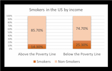
Finally, this slide contains a self-made graph to demonstrate the possibilities of MS Excel (see Figure 4). The graph utilizes the information from the same report by CDC (2016), and it uses a 100% stacked column chart to show that the number of people who smoke differs for those living above and below the poverty line. Since CDC (2016) compares the percentages of the two groups, a 100% stacked graph fits the task of illustrating the difference; however, it would also be possible to use simple columns without non-smoker percentages to demonstrate that the number of smokers is greater in one of the groups.
In summary, the graphs used by descriptive studies can be very complex; they may incorporate multiple variables and showcase their values for different groups. However, they do not aim to demonstrate correlations. For example, the presented graph suggests that people who live below the poverty line might be more likely to smoke, but they cannot prove this implication since they do not report any correlational analysis.
Correlational Research

As a result, the graphs that are best suited for a correlational study may be different from those in a descriptive one. Admittedly, they can be similar in form, but they are going to be distinct in content because a correlational graph needs to demonstrate correlations, and not every graph can do that.
A very common approach to illustrating correlation is the plot chart (Trochim, 2006), an example of which is presented here (see Figure 5). It is taken from the Gapminder (2018) website, which is a non-profit organization that aims to foster development across the globe. This chart is meant to demonstrate the relationship between lifespan and income levels in all countries in the world.
As can be seen from Figure 5, the chart consists of two axes, one of which (the y-axis) is used to represent lifespan and the other (x-axis) is supposed to represent income. Each country in this graph is depicted with a dot that is located utilizing the coordinates determined by its average lifespan and income level. The chart visually represents the tendency of countries with higher income to have increased lifespans as well. There do exist certain outliers; for example, North Korea demonstrates a relatively prolonged lifespan when compared to other countries within the Level 1 Income group. Similarly, the United Arab Emirates exhibit a rather short lifespan for a Level 4 Income country. However, the people of North Korea still live less than those from the United Arab Emirates. Thus, the general tendency is apparent: the greater a country’s income, the longer its people live.
To clarify, a correlational article may include descriptive graphs, but to present the results of correlational analyses, graphs that can grasp correlation are required. The displayed graph is suited for the task; it directly exhibits that a relationship between variables does exist and that it is positive. However, this graph cannot demonstrate the significance of this relationship, which is why another method of data presentation can be introduced.

Here, a table that reports the results of a statistical inquiry is presented; it comes from a study by El-said et al. (2015) which was dedicated to checking if a correlation exists between serum magnesium and glycemic control in patients who had been diagnosed with type 2 diabetes for five years or more. Thus, the study was correlational; it presupposed finding out if particular variables demonstrate a correlation while also working with variables that the researchers could not and did not intend to affect.
Tables that can be used in correlation studies are unlikely to be very different from those employed in other types of research in their form. However, their content may be specific and reflective of the data that they are meant to represent. Consider this example (Figure 6), in which magnesium and several parameters of patients are presented. The first column specifies the factors of interest, including weight, height, age, fasting glucose and insulin, and so on. The second column contains a correlation coefficient (in this case, Pearson), and the third one specifies the statistical significance of the relationship between magnesium and each parameter.
Thus, the content of the table is determined by the specifics of the study; this table serves to report the findings that directly report the existence of a relationship between various variables or its absence. From the table, it follows that several parameters, including fasting glucose, indeed suggest a statistically significant relationship with magnesium.
Descriptive Research

As a comparison, consider this descriptive table (see Figure 7). It comes from the Centers for Disease Control and Prevention (2013) data, and it represents the average numbers of alcohol-associated deaths in the US that were recorded between 2006 and 2010. It includes both total numbers and those for particular age groups, and it also incorporates deaths related to chronic alcohol-induced health conditions and acute causes that were associated with alcohol, including poisoning and drowning as a result of inebriation.
As is apparent from the table, it cannot be used to prove a relationship between one variable and another; in fact, it does not even offer any descriptive statistics. Instead, it summarizes the figures that can be used to describe a particular phenomenon (in this case, deaths that can be attributed to alcohol). Therefore, this table can be viewed as a part of a dataset, which, as it has been mentioned, is a relatively common way of presenting data (Martin et al., 2017). Again, such tables can be present both in correlational and descriptive studies, but they are incapable of demonstrating a relationship between variables, which can be considered a limitation of this particular table and descriptive designs in general.
Limitations
Indeed, there are important limitations that both descriptive and correlational designs exhibit. In the case of descriptive research, it is obvious that since this design has no predictive ability, the generalizability of findings is complicated (Houser, 2016; Jackson, 2016). Indeed, the most common approaches to descriptive research are case studies and surveys, as well as observational methods. They have limited samples (especially when case studies are concerned) and no inferential statistical tests. As a result, their findings will not be used to make inferences about related populations, and their discussion, as well as the presentation of their results, should carefully point out these limitations.
However, as highlighted by Jackson (2016), correlational research is even more likely to be misinterpreted because people frequently assume that correlation may be used to make inferences about causation. Nevertheless, correlational studies cannot provide that level of evidence; only experiments or quasi-experiments might answer the questions of causation. Therefore, when presenting the findings of a correlational study, it is important to point out its inability to determine causation and limit the report to stating the inferences for the population that can be made.
Strengths
Despite the limitations, though, both types of research design can be very helpful. Thus, the descriptive design is highly praised by researchers for its ability to explore phenomena and provide their in-depth descriptions (Houser, 2016). As a result of this specific feature, descriptive designs are frequently used to provide the data for future investigations since their goal consists of answering the most basic questions which can help to identify potential areas for additional research. For example, Houser (2016) points out that descriptive research is especially critical for nursing and other healthcare disciplines because it incorporates incidence and prevalence studies. It is apparent such studies can be employed to gather the evidence indicating possible relationships between particular conditions and risk factors, and since descriptive research cannot be used to prove them, future investigations that have correlational or experimental designs may contribute more data on the topic.
Indeed, correlational studies can reliably demonstrate correlations between phenomena, and the relationships between risk factors and health conditions are a suitable example. In fact, as is pointed out by the literature on the topic (Houser, 2016; Jackson, 2016), correlational studies can be indispensable in this regard when variables cannot be manipulated. For instance, to determine the correlation between gender and particular types of cancer, a correlational study would have to be used since neither of those variables can be manipulated. Similarly, the correlation between smoking and cancer also requires correlational research; while it is technically possible to manipulate one’s smoking status, it would not be ethically appropriate given the negative outcomes of smoking. In summary, both designs can be very helpful when employed appropriately and with their weaknesses taken into account.
Conclusions
To summarize, the following conclusions about data presentation in descriptive and correlational research can be made.
First, the two designs demonstrate very notable differences in their aims and especially methods, which is why their data presentation can differ as well. Thus, while both approaches need to follow similar guidelines for findings dissemination and can use comparable types of graphs and tables, certain graphs may only be able to communicate descriptive data. On the other hand, there are graphs that are meant to demonstrate correlations, which makes them fit for correlational designs. In general, the choice of the graph that should be used is significantly impacted by the study’s design.
On the other hand, tables do not show a similar diversity. They do not generally differ in their form depending on the design type; rather, their content will change to either describe a phenomenon or report a relationship.
Finally, it is very important for researchers to take into account the limitations and strengths of both designs. Limitations are especially significant since they need to be highlighted when reporting the results and their implications; descriptive findings are not particularly generalizable, and correlational ones cannot be used to imply causations. However, both research types also demonstrate important strengths. Thus, descriptive research is indispensable in its ability to report in-depth information about phenomena, and correlational research is frequently required to show correlations between phenomena that cannot be manipulated. Therefore, being familiar with their approaches to data presentation is significant for any researcher.
References
Centers for Disease Control and Prevention. (2013). Average for United States 2006-2010 alcohol-attributable deaths due to excessive alcohol use. Web.
Centers for Disease Control and Prevention. (2016). Cigarette smoking.
El-said, N., Sadik, N., & Mohammed, N. (2015). Magnesium in type 2 diabetes mellitus and its correlation with glycemic control. International Journal of Research in Medical Sciences, 3(8), 1958-1963. doi: 10.18203/2320-6012.ijrms20150308
Gapminder. (2018). Print World Health Chart 2017. Web.
Houser, J. (2016). Nursing research: Reading, using and creating evidence (4th ed.). Burlington, MA: Jones & Bartlett Learning.
Hussain, M. (2012). Descriptive statistics–presenting your results I. JPMA. The Journal of the Pakistan Medical Association, 62(7), 741-743.
Institute on Climate and Planets. (2010).ICP’s guide to presenting your research.
Jackson, S. L. (2016). Research methods and statistics: A critical thinking approach (5th ed.). Belmont, CA: Wadsworth Cengage Learning.
Martin, E., Law, J., Ran, W., Helbig, N., & Birkhead, G. (2017). Evaluating the quality and usability of open data for public health research. Journal of Public Health Management and Practice, 23(4), e5-e13. doi: 10.1097/phh.0000000000000388
Polit, D.F., & Beck, C.T. (2017). Nursing research: Generating and assessing evidence for nursing practice (10th ed.). Philadelphia, PA: Lippincott, Williams & Wilkins.
Trochim, W. M. K. (2006). Correlation.
Weissgerber, T., Milic, N., Winham, S., & Garovic, V. (2015). Beyond bar and line graphs: Time for a new data presentation paradigm. PLOS Biology, 13(4), e1002128. doi: 10.1371/journal.pbio.1002128