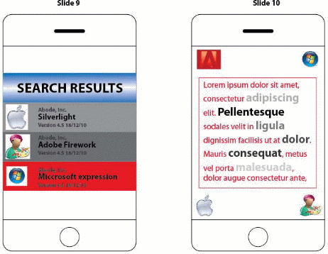
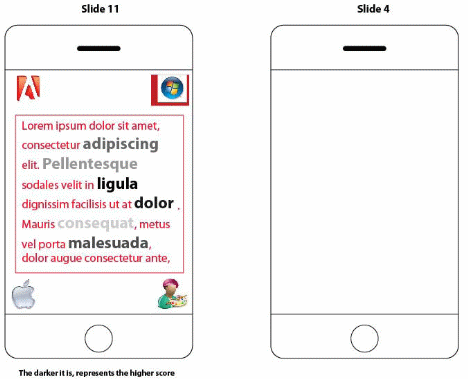
Introduction
Developing iPhone applications has become fashionable in recent days; many application developers have consistently saturated the market with all sorts of ported ecstatic applications which most times are certainly not user-friendly due to the poor nature of designs. The paper is developed in order to actualize a user friendly iPhone which will enhance the following:
- Intuitive interface searching for professional development tools;
- Utilize all the feature and functions in the iPhone;
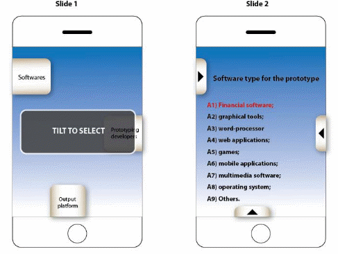
A lot of iPhone users are overwhelmed with prototyping software out there. The prototype developed in this work particularly aims at implementing the proposed metadata architecture in order to demonstrate its role in supporting the adaptation and delivery of content to clients. Consequently, a software type for a prototype which is effective for designing graphical tools, word-processors, web applications, games, multimedia applications, and operating systems will be made use of for the design of a conceptual Windows Mobile application (generated from output platform of the final outcome by vigorously shaking the device for filtration)- this will be achieved through adequately exploring iPhone application components.
Objective
Professional suggestions are important for software searching and comparing. As there are many considerations for selecting prototyping software, there will be grouping of the considerations according to different software types, user groups and output platforms. A short essay of professional recommendation will be given for each of these groups, with key considerations highlighted, so that users can learn how to choose for suitable software.
Rationale of UI design
An iPhone application would ordinarily be designed as multifaceted and would constitute presentations, businesses as well as data-layers. In the development of an iphone application, one is confronted with the choice of developing a thin-web-based-client application or one for clients who are financially buoyant. A client is, thus, base-point for inclusive layers in an iPhone application design. When producing for a client who is financially buoyant, it is proper to locate data/business services externally on the gadget. In a case whereby the garget is to be designed for a thin-client, it would be appropriate to locate the various layers on device’s server-unit. For financially buoyant clients, the iphone application-architecture may be arranged as shown in Figure 1.
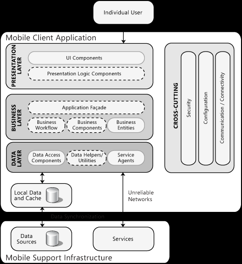
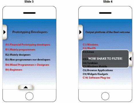
iPhone applications usually constitute User Interface (UI) structures which are located within the presentation-layer, which could as well comprise presentation-logic components. In a situation whereby there is an available Business-layer, there would possibly be the availability of business-logical components; this will include all business-workflows as well as business-entity components which could be needed applications, optional, or facades. The data-layer would ordinarily constitute accessibility to data as well as service-agent components. Less-rigid-laying approaches as well as fewer-discrete parts are usually provided with mobile-phones applications for minimizing footprints and enhancing the user-friendliness of phones. Prototyping the UI design of iPhone applications UI is dependent on there (3) criteria as follow:
- The Software type for the prototype: this is subdivided into: Financial software; graphical tools; Word-processor; Web applications; Games: Mobile applications; Multimedia software; and Operating system.
- This includes the following: The prototyping developers; Programmers; Designers; Non-programmers nor developers; Mixed Programmers + Designers; Beginners.
- This comprises output platform of the final outcome which includes: Windows; MacOS; Linux; Android; iOS; Symbian; Windows Mobile; Browser Applications; Widgets/Gadgets and Software Plug-ins.
UI Design Considerations for the Conceptual iPhone Application Design; Taking into Account Platform Constraints
The iPhone application needs simple architecture, simple UI, as well as a number of distinctive designing parameters to enable workability contained by constraints obligated by the hardware-structure of the systems. For the effectiveness of this design, attention is paid to the constraints rather than making efforts to reprocess architectures or UIs from other web applications or desktops. Studies have reviewed that:
‘The main constraints are memory, battery life, ability to adapt to difference screen sizes and orientations, security, and network bandwidth’ (Rahimian & Ramsin, 2007).
In the process of the UI design for the iPhone application, it is fundamental, then, to retain originality with the purpose of the design rather than institute re-usage of UIs obtained from other desktop-applications. Rahimian & Ramsin (2007) have emphasized a conceptual design:
‘… So that it is as simple as possible and tailored specifically for pen-based input and limited data entry capabilities where appropriate’ (Rahimian & Ramsin, 2007).
For this design, it has been considered that the iPhone application would have to operate in full-screen-mode and would possibly be capable of displaying only a window per a time; hence there would be blockage operation which would put a stop to the user’s applicative interaction. Thus the following considerations are ensured in the ‘User-Friendly’ UI iPhone-application design:
- The design is for a single window, full screen UI: considering that device will be a single user device running only the main application, kiosk mode would be used and then, it is noted that Windows Mobile does not support a kiosk mode, hence Windows CE would be used;
- Note is taken of the screen size and orientation of target device in designing for the application UI, and then consideration is taken of the limitations imposed by the small screen size, limited API, and reduced range of UI controls compared to desktop environments;
- The application is designed for usability by supporting touchscreen or stylus-driven UI, thus, menu bar and other controls are to be placed at the bottom of the screen (and would expand upwards when required) to prevent the user’s hands from obscuring the display, and then support of touchscreen input is ensured by making buttons large enough to support lay out controls so that the UI is usable using a finger or stylus for input; and
- A user visual indication of blocking operations; for example, an hourglass cursor is provided.
Specific Design Issues for Windows Mobile
The preceding point where taken into consideration for the design of Windows-Mobile application:
- The application targets the Windows-Mobile Professional as well as Windows-Mobile-Standard editions; taken into consideration the variation in Windows-Mobile security models on various Window-Mobile versions, it is coded that generalized platform work may not be effective based on variation of model securities for APls. Device’s version Window-Mobile documentation is thus ensured.
- Based on the fact that application is to be managed subsequently by designer (or upgraded in the instance of an existence), adequate attention is given to the understanding of Windows-Mobile operating-system derivations, product-naming, as well as versioning-tree.
- A consistency in the usage of Windows-Mobile APLs is ensured for memory/file structure accessibility. In any case, these are not admitted straight-forwardly after gaining structural handles. It has been noted:
‘Windows CE version 6.x uses a virtualized memory model and a different process execution model than previous versions’ (Komarov, 2009).
By implication, instrumentalities like pointers and file-handles could exist without actually been physical memory-pointers. Therefore, it is emphasized according to studies that:
- ‘Windows Mobile programs that relied on the implementation detail in version 6.x and before will fail when moved to the next version of the windows Mobile’ (Komarov, 2009).
- Mobile-Device-Managers (MDMs) are likely approving resolutions, tracking as well as gathering Mobile-device logs with the assumption that there is the existence of Active-Directory infrastructures.
An effective design requires a pattern which is categorically arranged into Caching, Communications, Data-Access, UIs, as well as Synchronization. This is explained in the following table:
Table 1: Design Requirement Pattern (Braun & Eckhaus, 2008).
Prototyping of UI design
Recent inventions of iPhone applications such as the effort for designing iPhones that can be used as control devices for iTunes are already in the making for enhancing the friendliness with which users of iPhones get with applications. For existing devices and applications, there is replication and gradual saturation in markets. In any case, there are only a number merits associated with RUI as follow:
- It’s potentially very cheap because it uses your existing network and mobile phone;
- It’s based on some widely accepted standards and protocols which mean it is likely to be well supported by manufacturers;
- It employs familiar web technologies which should mean that it’s easier to develop and familiar to users; and
- It doesn’t require downloads, installation or drivers means no tricky setup- it should be as easy as choosing the device from a list and putting it into your bookmarks.
Used Cases Diagram or State Machine Diagram (in SysML)
An obvious problem that has persisted with iPhone application designs is overdesigning. Most often, designers are too concerned about exacted designs that are beyond the usability as studies have revealed:
‘Designers of iPhone applications often tend to disregard common design and usability conventions by offering users slick and shiny user interface designs that go way beyond their standard look and also way beyond their claimed functionality’ (Komarov, 2009).
The following images illustrate overdesigning which may likely prohibit user-friendliness of iPhone applications.
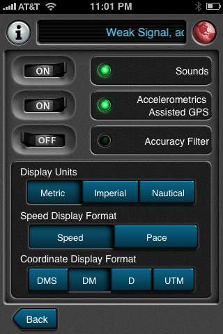
Figure 2 would be compared with Figure 3 to itemize the fault with design in Figure 2.
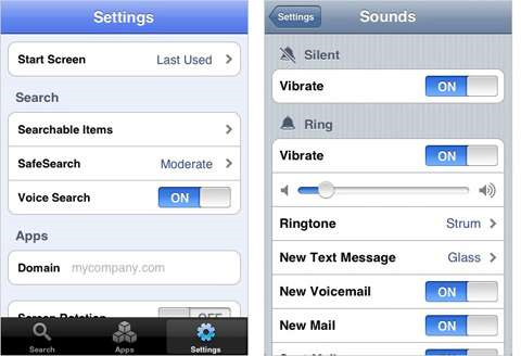
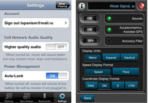
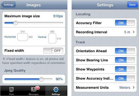
Very notable effects that have made the design in Figure 2 complicated include:
- Turning away from conventional designs is capable reducing the intuitiveness of the application. The user of the over-designed application may have to be more committed to the device in order for them to be able to understand the applications better.
- As a result of the complexity of the design, the user may encounter waste of finances as well as time. The high commitment with which the application designer gets to in order to actualize the design would as well be high time wastage.
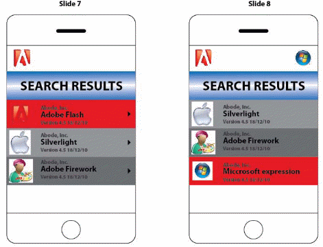
User Testing-Usability plays a role in each stage of the design process. The resulting need for multiple studies is one reason to make individual studies fast and cheap, and to perform usability testing early in the design process. The only way to a high-quality user experience is to start user testing early in the design process and to keep testing every step of the way. Instead of using the proposed tilting function, users have figured it is better for them to rotate the device to get a more accurate direction of the direction of the button they are trying to select. Adding the undo function-users can undo what they have selected or accidently selected as a wrong product. They don’t have to go al the way back or restart the software to arrive at that.
- Thus users can achieve the following:
- Reset back to homepage –for users to easily start another search or other products without needing to quit the program;
- Instead of using result numbers we change it to filtering icons, users are always easier to remember to logos and icons than text. It makes the interface more rich and fun to interact with;
- By adding Email, SMS, Copy features to share with friends function. User has the choice to recommend the product to friends, send reminder to colleagues etc.
Conclusion
This paper has considered specifics that are vital for a iPhone application design and has made use of same in the design of a ‘user friendly’ a Mobile application with the conviction that several designs which have been produced have failed to identify with friendly usage by the customer.
This application can be further apply on more products i.e. clothing’s/computers
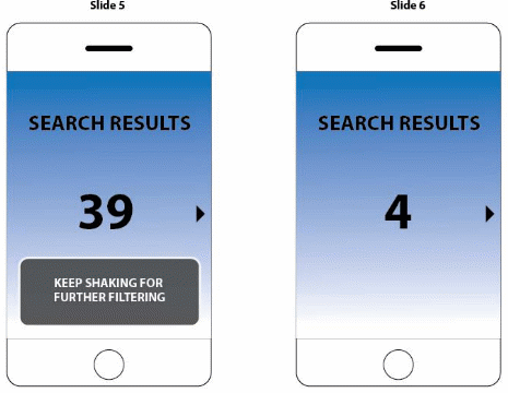
The general Idea is to filter out unwanted results and further fitting the search result to meet the user’s criteria.
References
Braun, P. & Eckhaus, R. (2008). Experiences on model-driven software development for mobile applications. Cambridge: University Press.
Komarov, A. (2009). iPhone Application Design mistakes: Over-Blown Visuals. NewYork: Heves-Lanvegas.
Rahimian, V. &Ramsin, R. (2007). Designing an agile methodology for mobile software development; a hybrid method engineering approach. Ohio: Fastways.
Appendix
