Introduction
Equator Bottler is a food manufacturing company that is located in East Africa. It sells its beverage products in several countries both in the African continent and in the rest of the world. This is a profit-making organization and hence the productivity of its staff is an important indicator of the success of the beverage manufacturing company.
In this paper, the main focus is to produce information in appropriate formats for decision making in the context of Equator Bottlers. This includes the line, pie and bar charts, histograms, and the use of spreadsheets in data presentation. It also has a second separate bit of a business PowerPoint presentation on Equity bank.
Background/ Problem statement
Equator bottlers have three main processing departments. These include the soda line, mineral water line and fresh juice line. The entire three departments are very vital for decision-making purposes in the organization and hence they have to be supported accordingly.
The following data were retrieved from its books for the year ending 2010 concerning the actual sales from the three different lines of production. The data has been used to prepare a range of graphs that portray the state of production and is very useful for decision making.
Equator Bottlers product sales for the year 2010.
Line graph
A line graph is a linear representation of the trends in a given set at different points in time. There can be multiple linear graphs drawn on the same diagram. Such a representation serves very well in comparing the trends of different products at given points in time. This serves very well for purposes of decision making and forecasting (Ewen and Nelson, 200, p. 526)
The line graph below shows the sales of various products by equator bottlers from January to December the year 2010. The production line represents the manufacture and sales of sodas, mineral water, and fresh juices. Each category is represented by a single line on the graph.
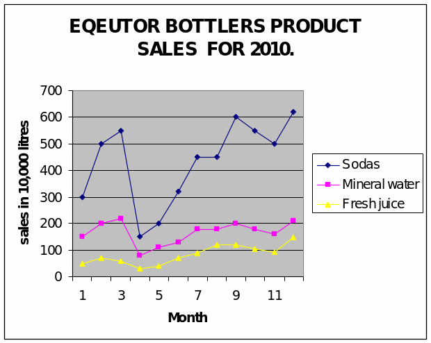
From the above line graph, it comes out very clearly that the sale of sodas is highest throughout the year followed mineral water and finally fresh juice being the lowest. The firm needs to undertake market research and see how it can boost the production of both fresh juice and mineral water. The firm also needs to understand that its core line of products is the soda line. While planning, specific attention should be given to this product, if this is not done, it can get the organization out of business.
Another thing that comes out is that all the products have the highest sales in December and lowest sales in April. This could be partly because of the cold and rainy season in April and the festive season in December. However, the company needs to carry out market analysis to help in forecasting and making decisions about the future.
Pie chart
Pie charts are a circular representation of data that is divided into several pieces within the circle, each piece representing a specific set of data. Each segment is proportional to the set of data it represents. Each part is converted into degrees to create it into a circle. A pie chart can be drawn manually by use of a protractor, or it can be generated using the relevant computer software.
The diagram below represents a pie chart that has been generated from the information extracted from Equator bottlers. The information used is the total column of the three assorted products manufactured by the organization.
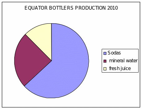
The above figure represents a very clear picture of equator bottlers. It clearly shows its performance in terms of production for the year ended 2010. From the figure, it is clear that the soda production line is the highest for the firm followed by mineral water and finally fresh juice.
For decision-making purposes, equator bottlers should put measures in place to ensure that continues to perform well and even improves. This is mainly because it is the core business of the firm. On the other hand, a keen market analysis should be carried out to produce measures that can be used to improve the mineral water and fresh juice line of production.
The advantages of pie charts are that they are easy to create and understand, they are very clear, and the difference in products is viewed very well. The disadvantages are that the sizes are a relative representation, if done manually they are time-consuming and comparing the sizes by the eyes may not be very accurate (Walkenbatch, 2007, p. 526)
The bar chart
Bar charts are used to represent data in the simple form of bars. Bar charts fall under three main categories namely the simple, compound, and multiple bar graphs. The bar graph drawn below is a multiple bar graph because it has multiple products represented on the same graph. It is generated from the monthly information given in the table above
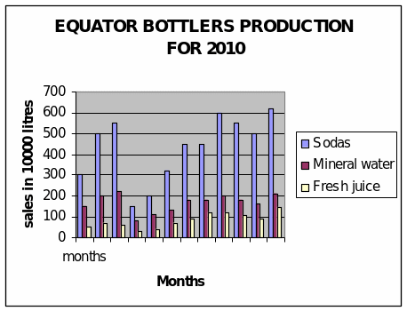
From the above bar chart, it is clear that the quantities are represented by the length of the given bar. Bars of the same colour represent a given product at different points in time. Bars of different colours represent different quantities at the same period.
From the bar chart above, it is quite evident that equator bottlers make the highest sales in soda production and the lowest sales of fresh juice production throughout the year. This simply means that the firm needs to enhance the soda business because it is its main line of business. There also needs to be measures put in place to ensure that the other two lines of production perform well.
In monitoring market trends for decision making and forecasting purposes, it is clear that the company highest volume of sales in December and this could be attributed to the fact that it’s a festive season. On the other hand, we have the lowest sales season in April, and this could be because it is a very cold rainy season. However, the firm needs to do a market survey to identify the causes of these trends.
Understanding these trends helps in forecasting and resource allocation for future purposes. The main advantage bar chart is that it represents the data at specific points in time on the same diagram. If we were using a pie chart for this work, then we would be forced to draw twelve pie charts each month on its own. This would note show clear trend comparisons as a bar graph does. Bar graphs are precise, less time consuming and simple to create and interpret.
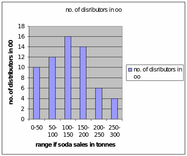
From the histogram above, it comes out evidently that most of the distributors buy between 100-150 tons of sodas. The histogram provides information in the form of bars for data that is continuous. This helps the company in identifying that a majority of their clients purchase 100-150 tons of sodas per annum (Jansen, 2002, p. 613-620)
Recommendations
From the spreadsheet graphs drawn in this paper, it is quite evident that the soda product is the most selling among the three products. It is recommended that the market does an intensive market survey on their customers and competitors to find out the reasons as to why mineral water and fresh juices are not performing well as such.
Once the research is done and the data from the field analysed objectively, the organization will be able to make decisions that are all inclusive to ensure that the two products are bought by the target customer base very well.
Conclusion
From the business scenario discussed in this paper, it is clear that two of the products are not performing very well. They could even be relying on the sodas to sustain them. However, necessary recommendations that can help change this state have been made.
Reference list
Ewen, D. & Nelson, R. 2007. Elementary technical mathematics. Belmont: Cengage learning.
Jansen, C. S. 2007. Advances in data technology. New York: Springer.
Walkenbatch, J. 2007. Excel 2007 charts. Hoboken: Wiley publishing Inc.