Introduction
The world of architecture is rich and amazing indeed, this is why it is always interesting to evaluate and investigate different aspects of design work. Each room and each building has its own purpose, function, and impact on a visitor. In this paper, one of the rooms in the Weisman Art Museum in Minnesota will be analyzed. The chosen building is located on 333 East River Road, Minneapolis.
It was designed by Canadian American architect Frank Gehry in 1993. For a long period of time, this building is considered to be one of the major landmarks on campus, and its rooms contain much information about people’s history and achievements.
The interior of the Weisman Art Museum under consideration is rather conventional and attractive to the visitors. The main challenge of the room was to combine as much space as possible and add the required furniture to meet the expectations of the visitors. It was important to support the idea that it is the room of the museum where people should have a chance to observe innovations, share their opinions, and feel comfortable.
This is why, in the furnished room, the designer focuses on proper lighting, necessity for all subjects in the room to be available for the visitors, and possibility to take rest for people. The furnished room in the Weisman Art Museum is an example of how such elements like furnishing, lighting, color, and construction material should be considered in order to create a perfect image that deserves the right to be a part of art that influences human life.
Historical Introduction of the Room
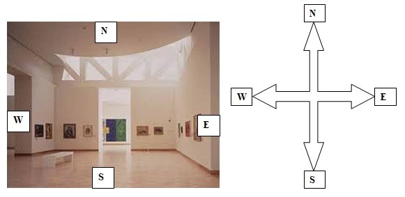
In fig.1, it is possible to observe the room under analysis and define its main purposes and functions. Still, before talking about such aspects of the design, it is necessary to identify its historical worth and development. Each designer has his/her own ideas and imagination to introduce a new room or a new building to public.
The designer of the building is Frank Gehry, still, its patron is another person. The room is placed in the building created in honor of a famous Minneapolis art collector, Frederick R. Weisman who died in 1994. His contribution was great for American art as well as education, this is why it was necessary to recreate the rooms which underline the social and cultural situation of the country, the idea of stability and functionality.
In spite of the current competition, it is not always possible to admit the room and the place that worth certain attention and evaluation, still, there are several reasons of why some rooms of the Weisman Art Museum should be discussed.
First, it is a well-known fact that the director of the museum with its designer makes a decision to improve the design and spend several million dollars to achieve the best ideas. And another reason is the ways of how innovations are made as the museum’s representatives admit that museum’s original site should be narrowed to meet the expectations of visitors and meet the requirements set by modern times.
The evaluation of the room will help to understand what kind of innovations may be required and why the owners of the room as well as the building itself want to redecorate the construction.
It is interesting to define the weaknesses of the projects and introduce new ideas, this is why the chosen room seems to be a captivating subject for discussion from a pure artistic point of view as well as from some social or cultural perspectives. Design is the sphere that cannot accept too many changes at one place, and the room will be changed by the designer himself, so, it is a challenge to understand how changes should look like and whether all of them are appropriate.
Spatial Organization and Planning
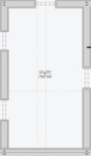
The chosen furnished room is one of the central rooms in the building. Its peculiar feature is a number of doors (fig.2) which allow visitors pass through it any time in order to get another room. Still, it is necessary to underline that it is the room of an art museum; this is why its designer should consider the importance of functionality and accessibility.
Taking into consideration the spatial planning of the building those main objective is to encourage social communication, interactions between visitors, and participation in discussions, each room should have enough space for people to have some privacy as well as special space for discussions.
In other words, each visitor of the room should be provided with the required space in order the main purpose of visiting the museum can be met. In fact, the designer considers all aspects of the room and its purposes so that the chosen room fits into the spatial planning of the building perfectly.
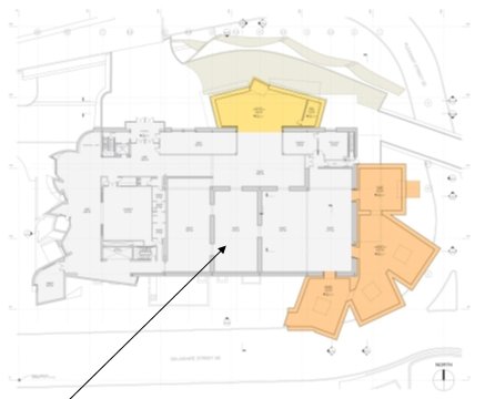
There are several adjacent spaces of the room which are other gallery rooms of the museum. Its adjacent rooms are almost of the same space, still, the northern one is bigger than the chosen room (fir.3) due to its function to unite more rooms alongside the whole museum. Due to the position of the room in regard to other spaces in the building, its axes of approaches are parallel to other rooms. Approximate square of the room is 66m2 (regarding that its width is about 6 m and its length is about 11 m).
Certain attention should be paid to the space organized within the room. The point is that the main challenge for the designer was to consider proper lighting still introduce a unique form of the building. On the one hand, it seems that not all rooms are provided with the daylight; on the other hand, the image of the room in fig.1 proves that in the daytime, the room is properly lightened. It means that the space of the room is properly organized and used by the designer.
As it is the room in the museum, not much furniture may be observed in the room. As a rule, several benches are located in the west part of the room so that they may be observed from other rooms. Such simple still rather functional choice of furniture and use of space is justified by the owners of the museum as their main purpose is to satisfy the needs of the visitors.
Materials and Construction Methods
In the room under analysis as well as in other rooms of the building, the designer makes a decision to use square forms and 90-degree corners. There is no need to use some unique construction methods to amaze the visitor of the room and prove that the chosen room should be recognized among the rest.
What is needed is the idea that the room has its purpose – to be a guide for people and introduce new exhibitions, new ideas, and fresh approaches in the sphere of art. This is why its framing is quite simple what cannot be said about the content of the room. For a long period of time, Frank Gehry admits that his 47,000-square-foot museum is not finished, and the chosen stainless-steel forms should be improved with time.
Thought the chosen museum became popular due to its unbelievable exterior of irregular form, its interior also has its peculiarities and captivating elements. Each element of the room under consideration is a kind of a message from the designer who admits that this room is a unique one: its simplicity should not be regarded as weakness but as a chance to focus on other elements except its form.
The chosen interior of the Weisman Art Museum is rather conventional improved by white walls and geometric details of a ceiling that is partially made of glass. Such choice of ceiling construction is predetermined by a desire to reveal skylights which support natural lighting of the room.
Curvilinear slices one the ceiling and their absence on other elements of the room are also characterized by a particular purpose. For example, it is possible to believe that the designer wants to guide the visitor and shows that the walls of the room are already provided with some interesting details, informative works, and ideas for discussion. Still, it is impossible to exhibit something on the ceiling, this is why this part of the room has its own constant beauty – the connection to the nature, light, and air.
Another important element of the room is its floor. In comparison to the vast majority of buildings around, the designer of the building chooses blonde wood flooring. In addition to the already discussed natural lighting of the room, the idea to use natural wooden material for the floor is justified as it seems to be a good stimulus for the visitors to relax, focus on the exhibits, and evaluate the works offered.
In general, it is possible to say that the room chosen for the analysis contains a number of significant elements properly chosen by its designer in order to underline the main purpose of the room and provide people with the highest level of comfort.
Furnishings and Ornamentation
The design of the room in the Weisman Art Museum proves that the developers of this building do not find it obligatory to create rich and magnificent details inside. It is enough to introduce a mysterious exterior and choose appropriate interior regarding the functions and the peculiarities of each room. In the room under consideration, the designer does not want to focus attention on richness but, vice versa, he chooses simplicity as his key to success. This is why there is no need to search for some rich furnishing and ornamentation.
On the fig.1, it is clear that there is one small still rather elegant bench for visitors to take a rest. In fact, even the location of the bench in the room has its meaning.
The point is that this bench may be observed from different rooms and a person who in need of some rest will see an empty place for sitting. It is necessary to admit that the bench is made of wood still not similar to the one used on the floor. The bench is white, wooden; still, it is not a kind of continuation of the floor. It is another object in the room that should attract visitor’s attention.
The bench is located in the north-western part of the room so that it is lighted by the natural light due to the ceiling as well as the lamps in the building. More than 150,000 people visit the Weisman Art Museum annually, and the administration of the museum is able to evaluate how much place and benches are usually required for an exhibition.
Ornamentation is another element of the room that is always interesting to analyze. The point is that it is a museum where different exhibitions are introduced to public, this is why decorative objects are not constant in the room. As a rule, different paintings or art objects change each other in the room. In fig.1, the room with some painting exhibition is observed. The distance between each picture is almost the same that allows several people approach the image and spend several minutes evaluating it.
The designer cannot predict the colors of the pictures which can be placed on the walls, this is why his choice of white colors for walls, the floor, and ceiling may be based on a kind of uncertainty and the desire to create a room that will meet any subjects of any size. Considering such decision, each painting on the wall seems to take its own place as if the room was created to introduce a particular exhibition.
Functions and Signification
During the whole paper, it is mentioned that the chosen room is one of the rooms in the Weisman Art Museum, this is why its main function is to introduce exhibitions and encourage communication between the visitors of the museum.
In addition to the necessity to create appropriate conditions for exhibitions, this room may become a good example of how natural material may enrich the general view of the room. In spite of the fact that wooden floor, pure white walls, and natural lighting are used in the room, its image captivates and defines how powerful and unpredictable the nature can be.
It is hard to guess whether the functions of the room have been changed since the building was created in 1993, still, it is possible to guess that this room always performs the functions of an exhibitor. Of course, different paintings, subjects, and even furniture could be used in the room, still, its purpose is always the same – to provide a person with a chance to look at art and enjoy its beauty.
In addition to this function, it is possible to admit that this room also helps different people be closer to each other and understand each other’s needs. The patron of the museum, a person in honor on whom the museum was created, Mr. Weisman, wanted to unite people by means of art and destroy inequalities and fears inside of society.
This is why it is possible to believe that each room in such building performs the same functions to contribute to the sphere of art and create more possibilities for people’s communication. This room as well as the whole building is eager to meet a person from different part of the world and open the world of art.
Designer’s Sources and Inspiration
During the last decade, a number of exhibitions have been introduced in the museum as well as in the room that is analyzed. For example, in 2003, the exhibition “In the Spirit of Martin: The Living Legacy of Dr. Martin Luther King, Jr.” took place in the room. This American hero deserved the right to be remembered by society: more than 150 paintings and photographs have been introduced to the public.
Gary Chassman was the developer of the exhibition. He was assisted by Verve Editions and some representatives of the Smithsonian Institution. The Boss Foundation supported the Weisman Art Museum during that exhibition. A number of people gathered to remember the achievements of a genius and demonstrate personal respect to his activities. This room as other rooms in the museum was perfectly prepared by the designer for such event.
Thought the patron of the room did not impact the precedent chosen, it is possible to admit that his contribution to the development of the sphere of art should be considered as an important step by means of which art becomes available to people.
During almost one year, the exhibition “Who Is a Citizen? What Is Citizenship?” was available to the public in the room. With the help of such exhibition, a number of artists like Rockwell Kent were discovered. It is not an easy thing to answer the questions about citizenship by means of paintings, prints, and photographs, and this exhibition was another proof that there was nothing impossible for people. Only a desire and personal intentions have meaning.
Conclusion
In general, the furnished room in the Weisman Art Museum plays an important role in such spheres like art and design. Not many people are able to create a place where a number of exhibitions of different types may be organized.
Frank Gehry shows how simplicity, uniqueness, and care to each detail in the building may create a perfect room as well as a perfect museum. For a long period of time, this museum serves as a good example of how exhibitions should be organized, and the detailed explanation of the room makes it possible to understand what creates a good work and how this work should be perceived by the public.
Bibliography
Abbe, Mary. “Weisman Art Museum’s Expansion Begins: Frank Gehry Designed the Additions to His 1993 University of Minnesota Landmark, Scheduled for Completion in Two Years.” Online Posting. 2009. McClatchy – Tribune Business News. Web.
Bette, Hammel. “Frank Gehry Got His Wish to Expand the Weisman Art Museum.” Architectural Record 195.5 (2007).
Byars, Mel. “Gehry, Frank.” The Design Encyclopedia. (London: L. King Publishing, 2004) 259.
Drengi, Eric. Midwest Marvels: Roadside Attractions across Iowa, Minnesota, the Dakotas, and Wisconsin. (Minneapolis: University of Minnesota Press, 2006) 140.
Gardner-Hugget, Joanna. “WARM: A Feminist Art Collective in Minnesota.” Woman’s Art Journal 29.1. (2011). 64-67.
Map & Directions. Online Posting. 2010. Frederick R. Weisman Art Museum. Web.
Questions and Answers about the WAM Expansion and Campaign. Online Posting. 2010. Frederick R. Weisman Art Museum. Web.
Illustrations
Figure 1

Figure 2

Figure 3
