Problem Statement
During exploratory data analysis (EDA), people navigate through unseen data for an indeterminate amount of time until an unknown insight is discovered. This process is generally defined in the context of scientific workflows, however it is quickly becoming a part of people’s day-to-day lives through news organizations and broadly accessible analysis tools.
The tension here lies in the limited capacities in terms of memory’s amount and decay. People struggle to remember and track parts of the data they have encountered, and this leads to a variety of barriers to further exploration and engagement.
These limitation suggest that a refinement of visualization techniques to support memory in interactive contexts may have broad impact in supporting exploratory data analysis.
Wexelblat & Maes’ Interaction History Framework
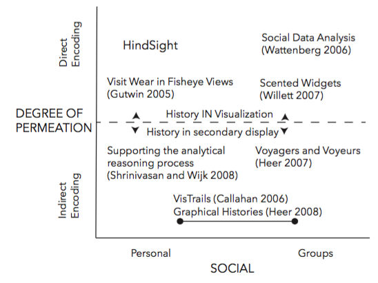
To uncover new opportunities in this stream of research, Wexelblat and Maes’ interaction history framework was applied. They describe six properties to articulate a design framework for interaction history. First, the extent to which people find a space to be transparent and easily understood versus needing background or training to engage with it (namely, proxemic vs. distemic). Second, the degree of effort needed to record history (active vs. passive). Third, the degree to which an object is changed by history (rate/form change). Then, the information people choose to represent history (kind of information). Finally, the two properties which are of the most relevance to the presented research: the extent to which history is directly tied to an object or recorded separately (degree of permeation) and whether history is tied to an individual or a group (personal vs. social).

On the illustration there is the previous research distributed in four quadrants. With the exception of Gutwin’s implementation of visit wear in fisheye views, research in data visualization has typically focused on three quadrants defined by Wexblet and Maes. HindSight lies in the fourth – a direct encoding of personal interaction history. Direct encoding of interaction history on data has clear usability benefits since it situates history signifiers directly onto the data. Moreover, the directly encoding interaction history can improve personal data exploration with a fraction of the overhead.
HindSight
The authors propose HindSight – a representation of personal interaction history that directly encodes interaction history as a visual variable on the data. At its most basic level, HindSight modifies the saliency of data after a user engages with it, leaving visual markers of interaction history. Given an indication of what they have visited, users can quickly segment what parts of the data they have explored as well as what remains unexplored – using their perceptual system rather than their memory. The technical barrier of integrating HindSight into visualizations is low, requiring only simple modification to existing visualization infrastructure.
HindSight Design Process
The core idea of the HindSight is that designers can architect visualizations not only by visually encoding data, but also by encoding their users’ interactions in the visualization itself. One can pose three questions for designers when they are considering to apply HindSight: How do we define history? How do we represent history? Is it worth it?
HindSight shifts one’s perspective of history from “How did I get here?” to “Where have I been before?” and “What is left to explore”. As a result, HindSight may be most beneficial for visualizations in which exploration is a design goal. For example, when interactive news visualizations reveal important context only after users hover over data, encouraging exploration may lead to more nuanced insights that complement the story.
What data can best represent a ‘unit’ of history? Since one can refer to data at various levels of abstraction in a graph, it is important to carefully weigh the entities one chooses when applying HindSight. For example, in the small multiples visualization on the slide illustration one could consider interaction with each chart as meaningful (encoding history at the chart level) or one could consider interaction within each chart to be meaningful. In this case, because chart reordering was a core interaction mechanism in the visualization, the authors encoded HindSight at the chart level, enabling visited charts to remain salient even as the data is reorganized. Choosing an appropriate level of coding for HindSight has the potential to unify exploratory goals with the capabilities of our perceptual system, making user history immediately available for further exploration and discovery.
What duration of user interaction represents meaningful interaction? In the initial pilots, the authors found that triggering a “visit” immediately was not ideal, whereas a short delay (i.e. 500ms) led to more predictable results. A general principle is to delay for long enough that the visit is considered intentional.
The team has also outlined the high-level guidelines for selecting visual channels based on the current design of the visualization and the goals of the designer. There arethree use-cases for applying HindSight encodings. First, augmentation: when unused visual channels are available, augment existing data with additional visual encodings to the target visualization to show interaction history. Second, addition: there is often empty space available in a visualization that can be repurposed for interaction history. Finally, adaptation: when no visual channels are available but displaying history is deemed important, adapt the target visualization to show interaction history by modifying visual channels that are already occupied by data.
Methodology
Hypothesis: the combination of direct encoding and personalized histories in HindSight would positively impact under behavior during exploratory analysis.
Sample:
“The Rise and Decline of Ask MetaFilter” by Jim Vallandingham (N = 92)
“How the Recession Reshaped the Economy, in 255 Charts” by the NYTimes (N = 116)
“Where are the Big Polluters since 1971” by Jeremy Boy (N=206)
Controlled experiments of over 400 participants.
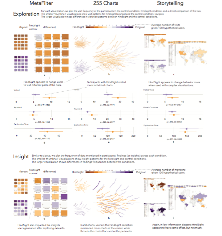
To test the hypothesis, the authors applied HindSight to three visualizations, analyzing exploration behavior during interaction, as well as user-reported insights after exploring the visualization. The cases included in our sample are listed on the slide. Then, the research team conducted a series of controlled experiments of over 400 participants.
Evaluation
- Goal: to determine the effect of directly encoding personal interaction history
- Factors: exploration behavior and post-interaction insight
- Conditions texted with/out HindSight: control and hindsight
- Recruitment of participants: Amazon’s Mechanical Turk, participation in a max. of one out of three studies
- Three phases: Training, Exploration, Insight
- Measures: visited, revisited, exploration time, mentions.
- Contextualization of findings: Open-ended questions
The goal of the present study was to determine the effect of directly encoding personal interaction history on the following factors. First, exploration behavior: how does HindSight impact exploration behavior such as number of charts visited, total time spent exploring the data, and patterns of exploration? Second, the post-interaction insight: how does HindSight impact the insights that people recall immediately after interacting with a visualization?
In each visualization the team tested conditions with and without HindSight. These conditions were control and hindsight. Control referred to a situation where one presents an interactive visualization in its original form, removing only extraneous information. Hindsight referred to a situation when one applied a straightforward encoding of user’s interaction history.
Given the Exploration and Insight phases of the experiment, the authors draw on both quantitative and qualitative measures for evaluation. The first criterion is visited: the number of unique charts that a person directly interacts with during exploration. Second, revisited: the number of instances when a user interacts with a previously visited chart. Third, exploration time: the total amount of time spent in interacting with charts. Finally, mentions refer to the number of times a chart is directly referenced in findings during the Insight phase of our experiment. The research team asked participants to describe their general analysis strategy and to reflect on the difficulty of revisiting charts. With these open-ended comments they aimed at contextualizing the findings.
Results
As a result, the HindSight designs encouraged people to visit more data and recall different insights after interaction. These results illustrate that the long-standing design principles developed by visualization research – principles that allow us to effectively map data to visual variables – can also be used to encode interaction, allowing us to leverage our perceptual system in interactive exploration and sense making.
HindSight generally encourages people to interact more with data. HindSight also impacts the findings users report after viewing a visualization – nudging users towards areas that are typically unexplored in a visualization (for example, areas of high data density). Also, the findings suggest that at the very least, HindSight redirects attention to different data. Whether more interaction is a good thing remains an open question for further research. Moreover, HindSight improves levels of the sustained attention on a visualization, which is one marker of engagement.

References
Ashkenas J., Parlapiano A. (2016). How the recession shaped the economy, in 255 charts.The New York Times. Web.
Boy J., Detienne F., and J.-D. Fekete (2015). Storytelling in information visualizations: Does it engage users to explore data? Proceedings of the 33rd Annual ACM Conference on Human Factors in Computing Systems, pp. 1449–1458.
Gutwin. C. (2002). Traces: Visualizing the immediate past to support group interaction.Proceedings of Graphics Interface 2002, pp. 43–50. Canadian Human-Computer Communications Society. Web.
Heer J., Bostock M. (2010). Crowdsourcing graphical perception: Using mechanical turk to assess visualization design.Proceedings of the SIGCHI Conference on Human Factors in Computing Systems, pp. 203-212. Association for Computing Machinery. Web.
Vallandingham J. (2016). The rise and decline of ask metafilter. Web.
Wexelblat A., Maes P. (1999). Footprints: History-rich tools for information foraging.Proceedings of the SIGCHI conference on Human Factors in Computing Systems, pp. 270–277. Association for Computing Machinery. Web.