Introduction
The present paper is to provide a descriptive analysis of data on four variables, including the percentage of owner-occupied housing units (Pct Owner Occ), home value, household income (HH Inc), and per capita income (Per Cap Inc). These variables were estimated for all 50 states and united in a dataset that was analyzed for the present report. The purpose of the present paper is to provide basic information and highlight possible correlations between them. In other words, the purpose of the present paper is to study the variables before conducting in-depth inferential analysis. Descriptive statistics, correlation analysis, and data visualization methods, including histograms, boxplots, and scatterplots, were used to achieve the purpose. This report is a supplement to the analysis conducted in Microsoft Excel.
Descriptive Statistics
The purpose of descriptive statistics is to summarize large samples of data to understand the distribution of data. Descriptive statistics usually include the measures of central tendency (mean, median, and mode) and measures of dispersion (such as standard deviation, variance, skewness, and kurtosis). Four variables were described using Excel’s data analysis function called “Descriptive statistics.” The results of the analysis are provided in Table 1 below.
Table 1. Descriptive statistics by variable
According to the analysis, the mean of Pct Owner Occ is 66%, with a standard deviation (SD) of 4.28. The distribution is left-skewed (skewness = -0.96) and the tails are heavier in comparison with normal distribution (kurtosis = 1.13). The mean Home Value is $215,114 with an SD of $9,906. The distribution of the home value differs from the normal distribution considerably, as it is right-skewed with a large skewness coefficient (skewness = 1.95), and the tails are very heavy (kurtosis = 5.22). The distributions of both HH Inc and Per Capita Inc are very close to the normal distribution, as skewness and kurtosis are close to 0. The mean of HH Inc is $60,181 with an SD of $9,906, and Per Cap Inc’ mean is $31,936 with an SD of $4,570.
Frequency Histograms and Boxplots
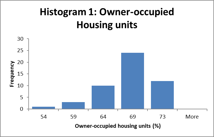
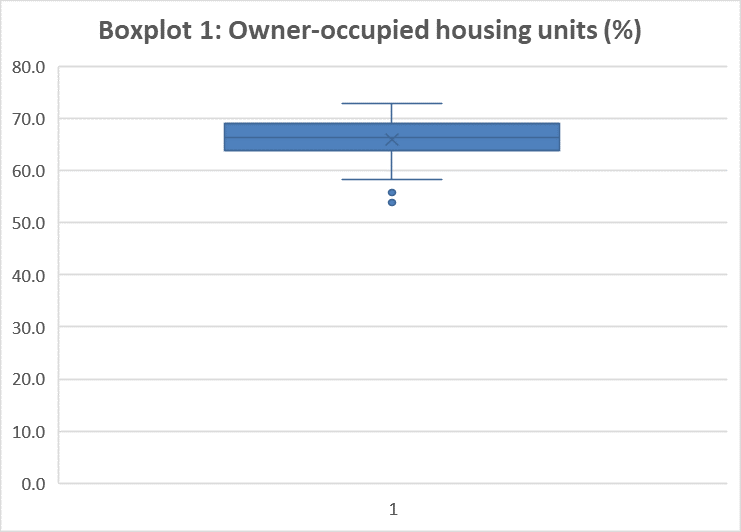
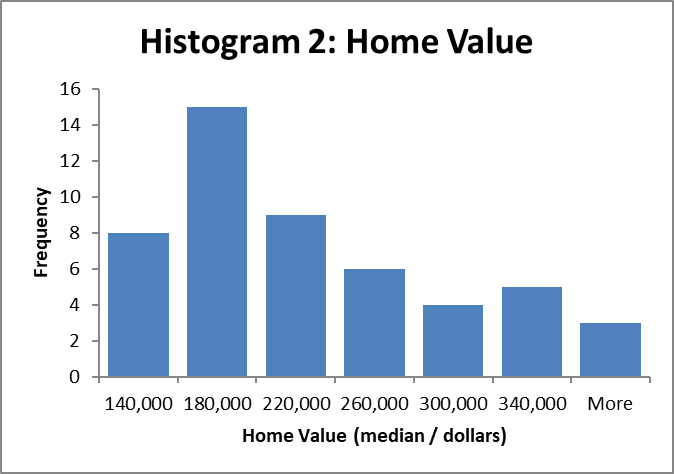
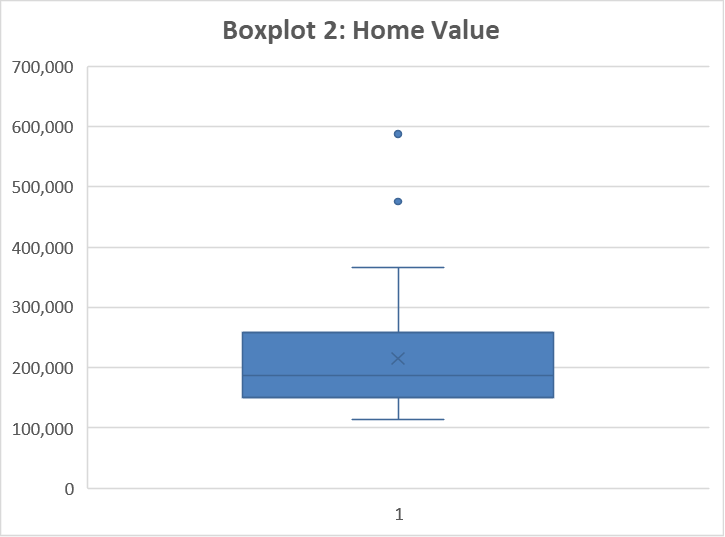
The purpose of the histograms and boxplots is to provide visualization for data distribution. Additionally, such visualizations help to identify outliers if there are any present. The present section will discuss the histograms and boxplots for Pct Owner Occ and Home Value only, as the analysis of these two variables generated valuable findings. The histograms and boxplots for HH Inc and Per Cap Inc revealed that the distributions of the variables were close to the normal distribution with no outliers.
Figures 1 and 2 below demonstrate the distribution of data for Pct Owner Occ in a histogram and a boxplot correspondingly. The histogram visualizes the fact that the left tail of the distribution is longer. Moreover, it suggests that there are outliers on the left from the mean. The boxplot confirms the fact that there are two outliers below the mean for the percentage of occupied housing units in New York (53.9%) and Nevada (55.8%).
Figures 3 and 4 visualize the distribution of data for Home Value using the same methods. The histogram confirmed that the distribution of Home value by state is heavily right-skewed. Moreover, there was significant evidence that there may be some outliers, as many states had average home values much larger than the mean value. The boxplot demonstrated that two outliers were present, including California ($475,900) and Hawaii ($587,700).
Scatterplots and Correlations
The scatterplots and Pearson’s correlation analysis are used to assess the relationships between two variables. Scatterplots help to eyeball the relationships, while Pearson’s correlation analysis helps to quantify the correlations. The present section will discuss scatterplots and correlation analysis for all variables. Table 2 below provides a correlation matrix for the variables.
Table 2. Correlation matrix
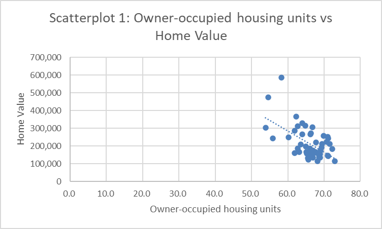
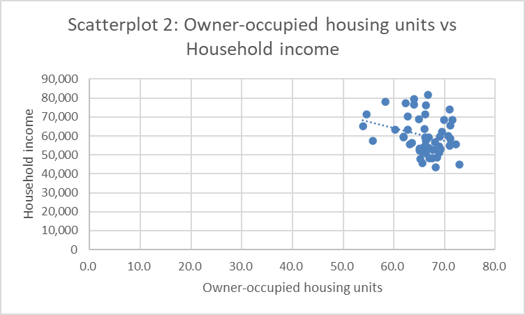
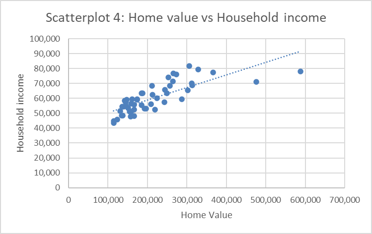
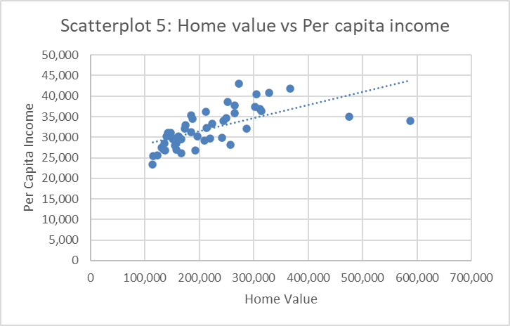
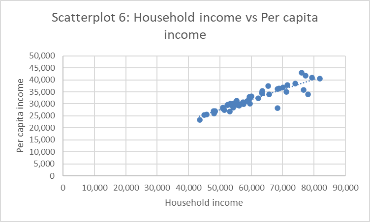
The correlation analysis demonstrated that all the variables are somewhat correlated with each other. On the one hand, there are very strong correlations. Home Value was found to have a strong positive correlation with HH Inc (Pearson’s R = 0.78) and Per Cap inc (Pearson’s R = 0.64). At the same time, Home Value and Pct Owner Occ had a medium negative correlation (Pearson’s R = – 0.56). The strongest correlation was found to be between HH Inc and Per Cap Inc (Pearson’s R = 0.92).
Figure 5 below demonstrates the scatterplot of Pct Owner Occ against Home Value with a trendline. The scatterplot demonstrates that there is a medium negative correlation. Since there is no distinctive pattern that can be recognized, the relationship appears to be linear.
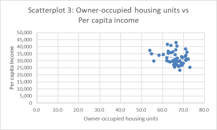
Figures 6 and 7 below show a scatterplot of Pct Owner Occ against HH Inc and Pct Owner Occ against Per Cap inc with trendlines correspondingly. The points in both scatterplots do not seem to form any patterns, which demonstrates weak correlations between the variables. However, it may still be acknowledged that there are weak negative linear correlations between the variables.
Figures 8 and 9 below demonstrate scatterplots of Home Value against HH Inc and Home Value against Per Cap Inc with trendlines. The data points form ascending linear patterns, which implies that there are strong positive correlations between the variables.
Finally, Figure 10 visualizes correlation between HH Inc and Per Cap Inc using a scatterplot with a trendline. The scatterplot forms almost a perfect ascending line, which demonstrates a strong positive linear correlation between the two variables.
Conclusion
Descriptive analysis of the dataset provided with valuable findings. In particular, the analysis of descriptive statistics, boxplots, and histograms revealed that the distribution of Pct Owner Occ was found to be left-skewed with heavy tails, and Home Value was found to be right-skewed with even heavier tails. At the same time, the distributions of HH Inc and Per Cap Inc were found to be very close to the normal distribution. The correlation analysis revealed that all the variables were somewhat correlated. Home Value was found to have the strongest correlation with HH Inc. At the same time, the relationships between Per Cap Inc and Home value were also strong.