The human figure is a prominent subject in the art of most time periods and cultures. Its depictions have progressed from simplified and symbolic to anatomically correct and highly detailed to symbolic and twisted once again.
This essay will investigate the stylistic approaches of different times and artists the subject by examining two paintings currently displayed in the Metropolitan Museum of Art in New York. The works in question belong to two famous artists: Rembrandt van Rijn and Pablo Picasso and are both portraits of a woman. Nevertheless, the two paintings have few similarities, and the highly varying approaches to the same subject matter make them suitable for a study of the methods of displaying the human body.
Flora
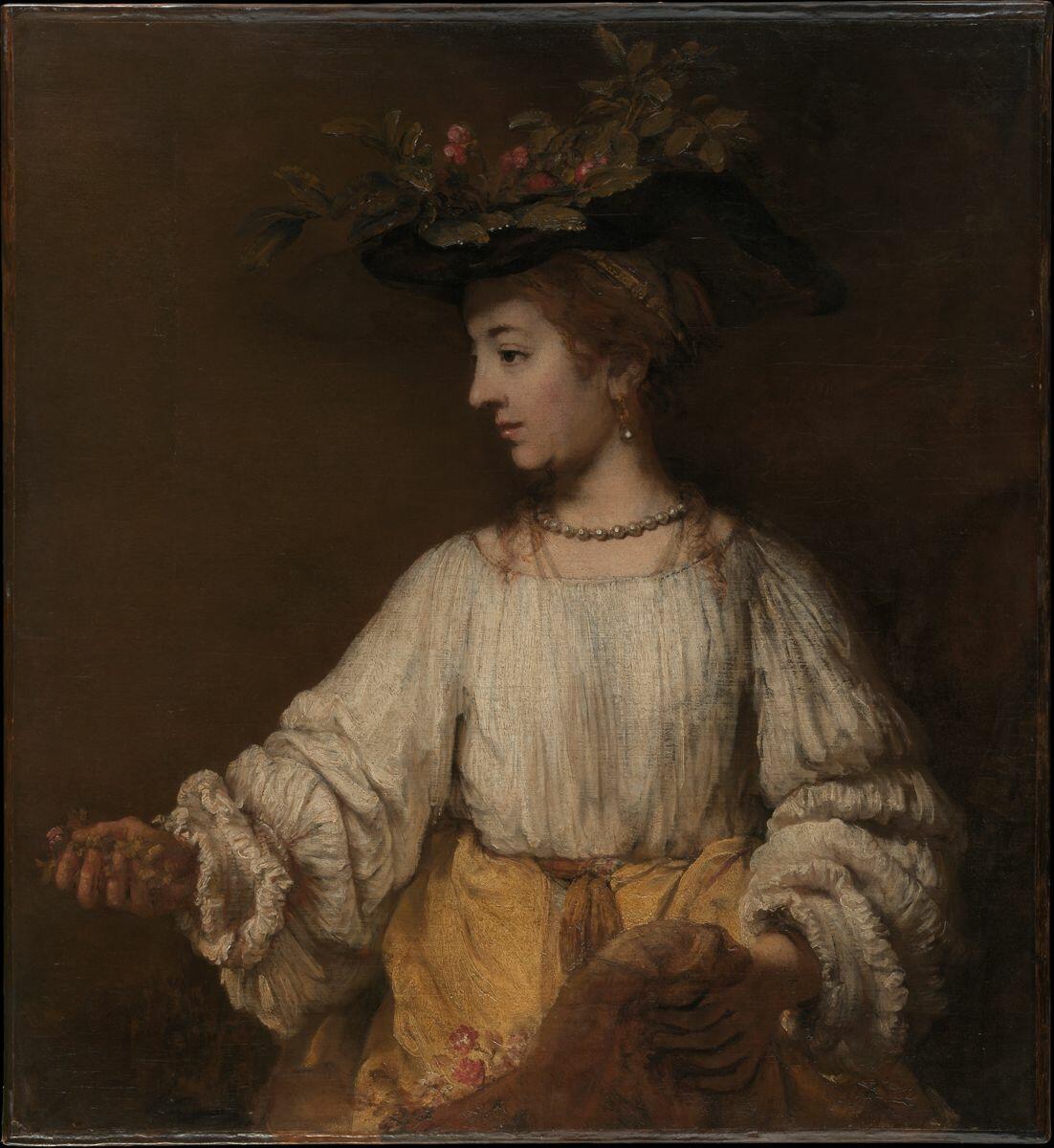
The Flora is a portrait by Rembrandt that is on display in Gallery 964 of the Met Fifth Avenue. The artist painted it close to 1654, and it depicts the Roman goddess of spring (“Flora”). Rembrandt had never been in Italy, unlike many of his contemporaries, but the country’s imagery, its art style, in particular, significantly influenced his work. The painting did not have a model, although it may have been partly based on Rembrandt’s wife, Saskia (“Flora”). Saskia had served as the inspiration for many of the artist’s works, although she had died a decade before the creation of Flora.
1654 is a late period in Rembrandt’s style progression, which is marked by the subdued colors and the rough paint handling. According to Liedtke, the painter adopted this approach in the 1640s instead of the more theatrical and confident way he used before due to the changing tastes of the public as well as his life circumstances such as the death of his wife, his numerous affairs, and his financial issues. Nevertheless, Liedtke adds that Rembrandt stayed a prolific creator for decades after 1640, producing various highly acclaimed works of art and inspiring other artists. The Flora was one of such pictures, created when the artist’s style reached maturity.
Flora is depicted against the dark, featureless background of a studio. The approach is not unique, but most depictions of the goddess tend to display her in her domain of spring, surrounded by plants and flowers. It can be inferred that Rembrandt wanted to concentrate on the depiction of the person as opposed to the mythological concept or the symbol of growth and spring. This approach would also explain the subdued spring motifs of Flora herself. She wears a hat decorated with blooming plants, holds flowers in her right hand, and has more in the fold of her skirt, but the greenery is an addition to the painting and not its central theme, as demonstrated by the muted colors that do not attract attention.
To support the idea that the concept of spring is not central to the work, Flora wears clothing appropriate to the period and the location instead of Roman garb such as a tunic. Her hair is tied up in a bun at the back of her head, although the brown curls at her shoulders may imply that Rembrandt initially wanted her to have shoulder-length curly hair. She wears a loose white blouse with puffy, frilly sleeves and a long yellow skirt tied up with a sash of the same color. She also wears pearl earrings and a necklace, which, while not quite fitting for her domain as a goddess, are appropriate decorations for her outfit.
The painting is anatomically accurate and naturalistic, although the style incorporates Rembrandt’s characteristic roughness. On close inspection, Flora’s hands show different levels of details, with the fingers of the right being relatively detailed and the digits of the left only showing hints at the presence of fingernails on the middle finger and appearing to bend at odd angles. At the same time, Rembrandt seems to have put a significant amount of work into Flora’s clothing and her head, with highly elaborate hair, blouse and skirt folds, and the plants decorating her hat. Flora’s face is painted with a degree of care that is noticeably different from the rest of the work, with no rough lines and numerous small details such as the blush on her cheek or the sheen of her lips. Overall, the painting is a simple and accurate depiction of a woman of Rembrandt’s time with some flower motifs added.
Woman in an Armchair
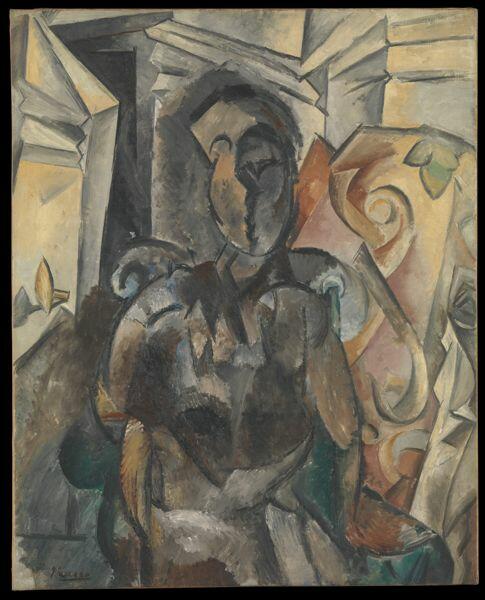
The Woman in an Armchair is a painting by Pablo Picasso, a prominent Spanish artist of the early 20th century. Created in 1909-10, it was the result of the painter’s post-impressionist inspiration that made him want to experiment with the melding of the figure and the environment (“Woman in an Armchair”). The model for the painting, if there was one, is unknown, as the person depicted in it is impossible to recognize. The viewer should complete the image and create the nude he or she believes the painting to be (“Woman in an Armchair”). The portrait is on display in Gallery 908 of the Met Fifth Avenue.
Although Picasso was inspired by post-impressionism, he introduced changes into the composition, which led to the creation of a new art style. 1909 marks the birth of Cubism, for which Pablo Picasso and Georges Braque take credit (“Woman in an Armchair”). Picasso would continue experimenting and improving the style until after the end of World War I (Voorhies). His style would later change, and he would attempt more traditional and more surreal depictions (Voorhies). Nevertheless, the Woman in an Armchair is an excellent representation of the early 20th-century avant-garde art.
At first glance, it is challenging to distinguish the figure of the woman from her surroundings or determine her position in the painting due to the heavy stylization. The layout of the surroundings is as confusing as that of the person’s body, with numerous twists and bends that do not appear to serve a purpose. Furthermore, the colors of what should be different objects bleed into each other, increasing the visual confusion further. However, it is possible to distinguish most of the objects in the scene and make guesses for the rest with enough attention. This effect is likely part of Picasso’s idea of the viewer completing the image himself or herself.
Nevertheless, one can only guess at the exact position of the person in the painting. It appears that her left hand is resting on the armchair, and her right is most likely on her thigh. However, the odd situation of the woman’s right elbow seems anatomically impossible. The subject of the painting appears to be sitting straight and tense without reclining in the armchair, with her legs tightly together. Distinguishing further details is difficult, although the woman’s abdomen seems deformed, implying possible pregnancy. The woman does not display any distinguishable facial features, nor does she appear to possess anything that can be confidently described as hair.
Picasso’s use of colors is a significant contributor to the visual chaos of the image. While the walls and the door in the background appear to be a yellowish white, the object to the right, which could be considered a plant due to the leaf-like green object present near its top, is white and orange. The zone to the bottom left of the painting is painted in darker colors similar to those used for the woman and the armchair for no discernible reason.
The color palette of the woman herself uses colors that would not usually be present in the depiction of a nude human, such as black, gray, and tree-like brown. Furthermore, body parts that would ordinarily be uniform in color on a real person display patches of significantly different colors in Picasso’s painting. The only reason an uninformed viewer would have to say that the work depicts a woman is its name.
Style Comparison
The two paintings are strongly dissimilar, depicting nearly opposite approaches to the display of the human body. Rembrandt’s naturalistic picture concentrates on the person and ignores the surroundings, whereas Picasso’s painting stylizes the figure and blends it into the environment, which is just as bizarre. Rembrandt’s style is mature and subdued, and Picasso’s represents his youth and is innovative and eye-catching. Nevertheless, both artists served as significant sources of inspiration for their contemporaries and can be considered definitive for their period.
Conclusion
Although the two paintings originate from Europe, they represent radically different approaches to the depiction of the human body. Rembrandt’s work is classical, though it displays his style and preferences. On the other hand, Picasso’s painting belongs to an early phase of the new art style that he introduced and is highly unorthodox. The differences between the two artworks that share the same subject matter highlight the variety of depictions of popular topics in art created in different civilizations and periods.
Images


Works Cited
“Flora.” The Metropolitan Museum of Art. Web.
Liedtke, Walter. “Rembrandt (1606–1669): Paintings.” The Metropolitan Museum of Art. Web.
Picasso, Pablo. Woman in an Armchair. 1910. The Metropolitan Museum of Art, New York. The Met. Web.
Rembrandt. Flora. 1654. The Metropolitan Museum of Art, New York. The Met. Web.
Voorhies, James. “Pablo Picasso (1881–1973).” The Metropolitan Museum of Art. Web.
“Woman in an Armchair.” The Metropolitan Museum of Art. Web.