Photography is simply a representation of an image through the recording of light or other electromagnetic radiation using a camera. A good photograph is achieved when basic compositions of photo graphic elements are arranged accordingly within the picture. Some of these elements include lighting, centre of interest, view point and camera angle, placement of the subject, contrast, perspective, tone, background, foreground, pattern, framing, balance and shape among others.
Good pictures are sometimes taken by chance subconsciously; when a photographer presents a picture to his or her audience, the visual impacts created by it result in different reactions and interpretations. The audience’s personal experiences affects its interpretation of what the picture depicts, it might be close to the communication the photographer had wished to convey or a totally different perspective. The perspective might either be a pathos, ethos or logos. The following is a description of three photographs taken on the basis of three rhetorical methods – pathos, ethos and logos.
- Ethos:

Color, contrast, perspective, centre of interest are just several elements that the photographer used to communicate the idea of keeping environment clean. The angle of the camera to capture some parts of the environment surrounding, the three litter bins that are the centre of interest, practically completes the message displayed by the picture and later it will be interpreted by the audience.
- Ethos:

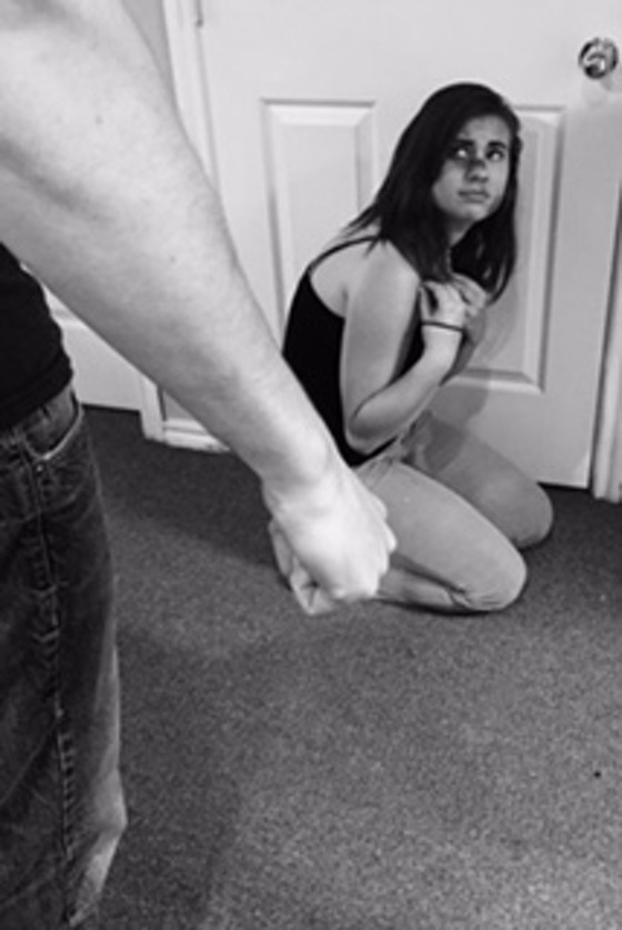
The first idea the audience depicts from this picture is a feeling of anger, domestic violence, sadness, injustice among other unethical practices. The photographer’s centre of interest was the girl on the picture; the expression on her face is well captured to convey the message of unhappiness. The camera captured the aggressor creatively in disguise, the handpicked picture taken by the angle of camera and the feeling portrayed by the perspective summarize the actions or message in order to communicate them further.
- Pathos:

The mixture of color and lighting, arrangement of images, balance and the general viewpoint of the camera angle has greatly enhanced the audience’s portrayal of what is happening on the picture. Alcoholism and its after effects are the message that the photographer of this picture planned to communicate to his/her audience and, actually, the photographer drove the point home. The shadow on this picture underlines the state of the girl. The photographer was very careful not to overuse dark color but to balance it with bright shadors seen on the walls and the floor. In my opinion, he or she did a spectacular job.
- Pathos:

The arrangement of images within this picture totally summarizes the communication intended to be conveyed across. The dark background against slightly bright colored cigarettes butts enhanced the general display of the picture. In spite of the picture being generally dull, the camera angle, tone, pattern of the cigarette butts and the color actually make it active and easily pass the message of environmental degradation or danger of smoking to the audience. The arrangement of forms on this picture is quite horrific in nature, color and perspective, but the photograph was beautifully captured. The main reason for such an arrangement seems to be the intention to pass the idea across.
- Logos:

Through this picture the photographer majorly relied upon the composition and arrangement of images to communicate the message. The argument can easily be picked from the visual aspect of the full litter bin overflowed with garbage. Simplicity, contrast and shapes have been relied upon to emphasize the need to keep our environment clean. The arrangement of the objects on this picture creates a feeling of life, the scattered pieces bring out the action factor on the picture. The lowest point of this picture is the use of shadows. It has been minimally applied on this photograph to an extend of creating a flat image. In spite of it, the message is conveyed to the audience – cleanliness is healthy.
- Pathos: (Recalling the innocence)

Pictures are the best tools one can use to tell a story. The actions and the environment surrounding these actions can easily hook the audience’s emotional buds and make them remember their experiences. On this picture, perspective, the centre of interest, placement of the subject, color and balance were applied to enhance the emotional attachment that can attract the audience. I like the contrast of colors used, especially the blue in the foreground and the bright yellowish sand in the background. It creates a sense of depth on the picture, the harmony, that those two colors establish at the point of separation, is marvelous.
- Ethos:

The arrangement of patterns, color, tone and the centre of interest to convey the need for occasional psychological check up or help for mentally ill people. The use of black with a white illumination on the area surrounding the subject easily hooks up the audience’s centre of interest. It makes the patient be the first thing the audience sets an eye upon. The display and arrangement of shadows on this picture has perfectly made the communication intended to be passed across comfortably.
The lines that are naturally created by the texture of the wood have perfectly raised the feeling of depth and perspective. The eyes get pulled towards the girl progressively by these lines. The composition holds up so perfectly and the use of black and white harmonizes the feeling of togetherness.
- Ethos:

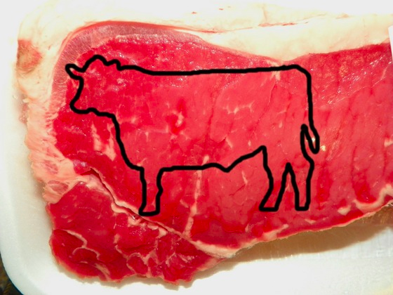
Through this picture the photographer directly indicates the messages shared through the use of contrast and color. The communication derived from this image is likely to be put forth by the animal rights group to underline unfair treatment of animals. The centre of interest has been boosted through the use of color, pattern, shapes and lines. The simplicity of the shapes and lines will probably make the audience interpret the primary idea quickly. The shadow created by the volume of the meat makes the audience realize the size of the actual meat. The white marks within the dominant red color of the meat create the feeling of a three dimensional figure.
- Logos:

Cruelties against the vulnerable people happen very often in the society; and domestic violence is some of the social injustices that occur in modern society. This picture openly shows just how far such a kind of injustice can be meted to an individual. The photographer largely considers color, tone, shapes, centre of interest in order to ignite the emotion this picture tends to raise. The audience’s interpretation is boosted by the arrangement and life, the black and white color gave to this picture.
- Logos: (Increase in abandoned animals)

This picture truly defines the phrase ”picture tells tales”. Color, texture, shapes, tone, contrast, and the angle of the camera have enhanced the feeling of abandonment. The color and contrast as used on this picture have displayed the sense of sadness and despair of this dog. The use of these elements better boosts the campaign against this vice in the society. The photographer made a minor error in balancing dark and bright areas on the photo, the lighting slightly made the image of the dog to disappear and the intended effect of perspective wasn’t achieved in corpore.