Introduction
It is worth mentioning that in contemporary highly developed society with the advanced level of commerce and trade and extremely wide range of various goods that are offered by the manufacturers, advertising has proved to be a highly necessary part of marketing. According to Julian Petley, “advertising is how goods or services are promoted to the public” (4).
Consequently, “the advertisements are made to motivate consumers and inculcate right perception for the product among them” (Rajagopal 4). Concerning this statement, special attention should be paid to the word combination “right perception”, which is, unfortunately, not always synonymic to the word combination “truthful perception”. It means that the main aim of an advertisement is to persuade the customer to buy the product at any cost. To achieve this aim, advertising executives resort to some advertising techniques that may lead to “manipulation” of the customer’s reaction. This is why consumers need to possess advertising awareness to avoid being manipulated into buying the advertised product.
Main Body
To familiarize the audience with the examples of the application of the rhetorical strategies and visual argument in advertising, let us resort to one of the classical cases of successful advertising – the advertisements of Coca-Cola. It is worth mentioning that people in nearly 200 countries drink more than one billion eight-ounce (237 ml) of Coca-Cola products every day. So much Coke has been produced since the first batch in 1886 that if a person put it all into eight-ounce (237 ml) bottles and stacked them up, they would tower 370 miles (595 km) (Bell 4).
It can be stated that Coca-Cola may be characterized by a very skillful application of numerous types of advertising: they invent “catch new slogans”, “jingles, songs for advertising campaigns”, involve “famous faces” into the advertising process (Bell 24-25). Despite this variety of advertising means applied, our attention is claimed by printed media advertisements, which will be analyzed based on historical approach, two advertisements printed in different decades (30s, 50s) will be analyzed. The choice of the time is determined by the differences in economic and cultural spheres of the periods chosen.
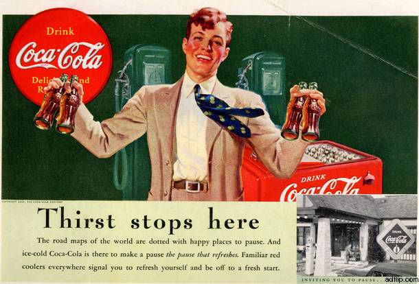
The first example (Picture 1) was published in 1939 in “National Geographic”. This advertisement is the example of the successful combination of the usage of visual argument and rhetorical strategies. The advertise executives resorted here to such attention-getting techniques as the portraying of emotions (Rank unpaged).
Messages state that there are “many advertising situations in which photography can readily be dispensed with and the essential point of an ad’s image can be conveyed quite adequately through drawing” (130-131). The advertisement under consideration is such a case. The drawing presents the audience with a man of an amiable look. His facial expression suggests such emotions as joy, happiness, and frankness, which are supported by the posture of the man – he is put right in the middle of the picture and his hands are open, as if he wanted to hug the viewer.
The image of the man accumulated typical features of male appearance: slim body, rosy cheeks, curly hair. His tie suggests motion and is used to create an informal friendly atmosphere, it is blown by the wind from the man’s chest, and this suggests his openness to the viewer. The man is drawn in bright colors and contracted with one-colored background; the color of his cheeks corresponds to the color of Coca-Cola’s logo, thus putting it into the center of the drawing indirectly. These details combined are aimed at the creation of proximity, sincerity, and trust between the man and the audience. A man like this cannot suggest us anything but a product of high quality. Thus it can be mentioned that here the confidence-building technique is also used (Rank unpaged).

Speaking about the rhetorical strategies used in this advertisement, it should be mentioned that the advertisement suggests a slogan: “Thirst Stops Here”. The advertising executives resort to a stylistic device of pun here. The statement may have two interpretations: a person who will drink Coke will not be thirsty, and even thirst stops here to see what Coca-Cola is. The second interpretation is the example of a metaphor, a common slogan rhetorical technique (Berger 68).
The slogan is printed in large bold one-colored faces, in order not to distract the viewer from the drawing, but to give additional information. The text under the slogan is intentionally printed in fine print so that the viewer could strain his eyes to see the information because the slogan implies its importance. In the text, a rhetorical technique of “herd mentality” is used; “the road maps of the world” suggests that Coca-Cola is spread everywhere around the world and everyone drinks it, so you should do it as well (Berger 71). The central image in the text is “happy pause” which is the example of the application of the desire-stimulating technique, for the physical need to drink is stressed (pause that refreshes, cooler, fresh start). Finally, a “Reward Yourself” rhetorical technique is also applied here: “signal you to refresh yourself” (Berger 72).
The target audience for Coca-Cola products is very wide; it includes different social and economic layers of the population, it is aimed at all age groups, this is why it is neutral on the whole. It seems that, for the time when it was published, it was considered to be a good example of a printed media advertisement. The assumption that can be driven from this ad is as follows: Coca-Cola will help you survive and you may make a pleasant and beneficial pause to overcome your thirst everywhere.
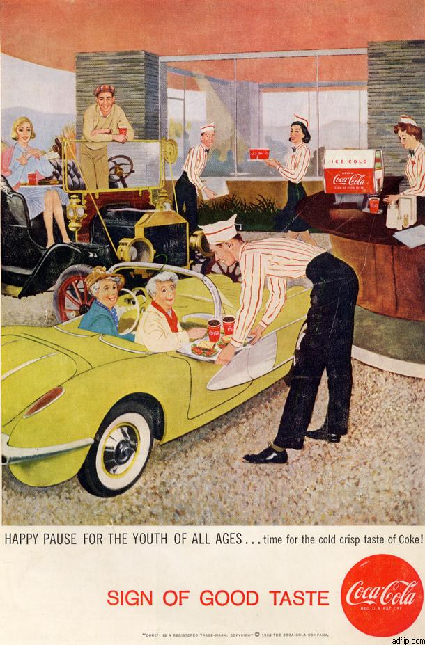
Picture 2 presents the advertisement of the same product, Coca-Cola, but it was published 20 years later in National Geographic. It must be mentioned that these advertisements have common features, but they also have differences that are worth mentioning.

In the advertisement under consideration greater importance is given to the visual image in comparison with the rhetorical techniques. The central characters of the drawing are elderly women who are Coke’s consumers. They are the center of everyone’s attention because they occupy the central position in the picture and all other characters are looking at them. This is the evident application of the desire-stimulating technique: everyone likes the elderly ladies, everyone will like you if you follow their example. Besides, this technique is enhanced by the slogan: Sign of Good Taste. Berger calls this strategy “Keeping up with the Joneses”: if you drink Cola, you are young and have good taste (71).
The emotions provoked by the ad are as follows: admiration, delight, approval. It can be easily recognized that the target market is the category of elderly people, mostly women. This is a successful commercial trick, as it is commonly known that women are always fond of being attractive, young, beautiful, and in the center of attention. This is why this advertisement is sure to be effective and attract a large group of consumers. What is more, it also involves another target group: young people, represented by a couple in the upper left corner. Here the ties between generations are shown, and Coca-Cola is suggested to be the link between generations. The printed text repeats the words that were used in the first ad: happy, cold. Consequently, it may be stated that they are typical of Coca-Cola ads. The slogan also suggests the figurative device “the youth of all ages”, which also strengthens the aiming at the target group.
Conclusion
Finally, if we compare these two advertisements, we should state that both of them suggest the same atmosphere of success, happiness, and universal approval. The second one is more sophisticated and deep by the meaning implied. This is why it is sure to be more effective, but here the negative aspect is that the creators play on women’s weakness: they promise them eternal youth. In the first example, customers are also deluded by the artificial friendly atmosphere. Thus, consumers should be aware of the unapparent mood and techniques that are used in advertisements to mesmerize the customer and to persuade him to buy the product.
Bibliography
Bell, Lonnie. The Story of Coca-Cola. London: Black Rabbit Books, 2004.
Berger, Arthur Asa. Media Research Techniques. Thousand Oaks, CA: SAGE, 1998.
Media Education Foundation. Deconstructing an Advertisement. 2009. Web.
Messaris, Paul. Visual Persuasion: The Role of Images in Advertising. Thousand Oaks, CA: SAGE, 1997.
Petley, Julian. Advertising. London: Black Rabbits Books, 2003.
Rajagopal. Marketing Concepts and Cases. New Delhi: New Age International, 2000.
Rank, Hugh. Classroom teaching aid, pro bono public. Persuasion Analysis, 2008. Web.