Introduction
Data collection and analyses are important for imparting critical thinking, reasoning, and decision making (Siemon, Beswick, Brady, Clark, & Faragher, 2015). Therefore, academicians propose teaching statistics to the upper primary students. Teachers need to carefully introduce statistical process such as data collection, data analysis and data visualization. The content of upper primary class is based as per the syllabus outlined by the Board of Studies New South Wales: Module one and Module two (NSW Education Standards Authority, 2017). First, students at upper primary level need to understand the importance of data and statistics in real-life using common examples from the area of sports, politics, entertainments, and studies (Reeve & Beswick, 2013; Watson & English, 2015). Second, students need to know data types; statisticians deal with two types of data namely the categorical and numerical data (Gelman et al., 2014). Third, teachers should introduce various sources of data such as survey and observation. After presenting students with basic terms and concepts of data, they should then be introduced to technical requirements and skills to analyze data. Teachers should make use of graphs, charts, and tables for presenting the collected data. Bar graph and line graphs are useful plots to represent numerical data. In addition, students should be introduced to present categorical data using tables. These statistical tools should be taught using real-life examples such as distribution of height in class, students’ preferred TV series, and comparison of eating habits among the class members. The data module should aim at teaching decision making using data collection, analysis, and data presentation.
Pedagogy
Statistics is essential to improving students’ understanding of real-world situations. For example, students’ understanding of the techniques of data collection, analysis, and visualization can help them improve their analytical skills and decision-making skills. Therefore, my pedagogy will focus on constructivism i.e. my teaching method will help students in constructing their own interpretation and understanding of statistics using real life experiments and reflection activities. A constructivist method encourages learning through participation and engagement (Churcher, 2014). In this respect, constructivist classroom differs from the traditional classroom. Nevertheless, introduction of basic concept will follow traditional teaching methods where students will be taught statistical terms, tools for plotting graphs, and other necessary concepts. Thus, my teaching method will comprise of both constructivism and traditional teaching environment, where students will be allowed to learn through experiments and surveys. At the same time, the basic concepts of statistics will be introduced through traditional teaching. For example, in the situations when students need to understand data type, data collection methods, and analytical tools such as bar graph, line plot and tables. Moreover, in-depth understanding of real-life implication of statistics requires group work and knowledge sharing which can be best accomplished using the constructivism. Therefore, students will require textbook and workbooks to adhere to the curriculum while the teacher disseminates the important statistical concepts of statistics. In order to develop statistical understanding, students need to engage in open ended questions, inquiries, and collaborative activities. Thus, my pedagogy will ensure a balance between the traditional course dissemination and engaging problem-solving group activities.
Data Collection Requirements
The Data and Statistics curriculum of Australia for Year 5 and Year 6 includes introduction to major concepts such as steps to collect data, steps to display data through meaningful plots, and interpret data. To understand the bigger picture, students will carry out activities and experiments such as data collection, analysis, and representation through reflection and collaboration. The following are the major challenges student face:
- Understanding data collection process,
- How to work with categorical and numerical data, and
- What is most efficient plot to represent a given type of data?
Students learn data collection and analysis by working on familiar data sets such as through popular experiments likes rolling a dice, measuring height of students, counting type of insects in a unit area, collecting information related to popular TV series etc. Students understand the basic requirements, but they do not understand the difference between data types, plots, and critical reasoning to support the choice of a selected type of graph for data presentation. In addition, students also find it challenging to analyze and represent time varying variables such as variation in the ambient temperature over a given period. For example, categorical data are easily represented in tables and bar graphs. At the same time line graphs are best suited for representing time varying variables such as daily temperature of air. Therefore, students need to understand tools fit to present categorical data type and graphical tools suitable for presenting numerical data. Learning software can be difficult to students unfamiliar with the computer programs and its features.
Technological Tool
Data collection or data generation is the source of statistical data. Students can either collect data from primary source or secondary sources. My teaching technique will use primary data source as it closely engages students and challenges their reasoning and analytical ability. For example, a study to identify popular TV series among the students can be considered a possible test bed to teach finer details of statistics to student group. Such a study will need a survey form to collect the preference details and demographic details of students such as gender, age, preference, duration of watching, and overall correlation. While preparing a survey form and circulating it can be considered easy to perform, the collected data will require its interpretation and analysis.
Data representation can be done with or without using software tools. However, software tools are easy to work with and provide easy interpretation and manipulation of data which helps to present the statistical data in user friendly format. In this respect, I propose to use of Microsoft Excel as the software for plotting required graphs such as bar graphs, dot plot, and tables. Microsoft Excel is readily available and easy to install. Moreover, its features are straightforward and similar to word processing software; therefore, I will encourage students to use Excel for plotting graphs and charts. Students can plot different types of chart in Excel such as pi-chart, bar chart, dot plot, line plot, and tables (Liengme, 2015). Students can learn Excel skills through various online tutorials available from reliable sources.
Research Question
This study addresses following research questions: “What is the most preferred type of beverage for students to drink at school?” The above research question closely relates to the daily eating and drinking habit at school. According to Siemon et al. (2015) learning curriculum of probability and statistics should be closely based around the daily interest and experience of students to enhance their learning and understanding. Therefore, a simple, yet useful research question that will be addressed through statistical data collection, analysis, and visualization was selected.
Data Collection and Analysis
Data collection and analysis can be broken into five steps (Siemon et al., 2015):
- Research question formulation;
- Data collection (Survey),
- Data visualization (Table and bar graphs),
- Data analysis (Discussion),
- Conclusion (Findings from the survey).
This study presupposes that students are organizing an event at end of next month, and organizers are planning to order beverage based on the students’ drinking habit in campus. Therefore, to determine preference for different type of beverage, this survey is planned. The survey will collect data from random sample groups on their preferred beverage. The findings from this exercise will help organizers in ordering correct amount and types of beverage based on the results.
The event is planned for year 5 and 6 of upper primary students. Therefore, the survey sample comprises 10 students from each group. The selected samples are called for a meeting and survey forms are circulated with following type of questions:
- Demographic information such as their gender and grade.
- Question on their most preferred beverage in school,
For simplicity, it is assumed that the following beverages are available in the school: coke, lime-water, tea, coffee, and ice-cream. Thus, the survey will collect frequency of each preferred drink. The choice of beverage falls under the categorical data type, which makes the data collection and analysis simpler in comparison to numerical data. In addition, the demographic details of the students are collected which would help understand the effect of gender and grade on the drinking preference. The survey collects the data primarily based on the gender i.e. the collected data and their details are classified based on their gender details. Table 1 shows the sample of the data collected from the survey. After the data collection is over, the survey forms are used to construct a two-way table and bar graph showing type of beverage and preference of students towards various type of beverage available in the school premises.
Table 1. Survey Data
Data Visualization
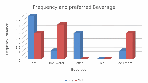
Data presentation is an important step towards deriving substantial results from the survey data; it adds meaningful purpose to the data (Day, 2014a, 2014b). The two-way table adequately presents data with two or more variables; for example, this survey collects beverage preference based on the subject’s gender. Further, students are taught to calculate the frequency of boy and girl for each type of beverage preference. In this respect, this study uses Microsoft Excel to plot two-way table and bar graph. A sample two-way table with a color code shown below is drawn using Excel.
Table 2. Most Preferred Beverage of Sample Group in the School
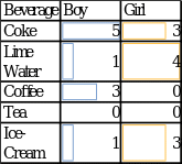
Students are encouraged to use bar graph to show distribution of categorical data. Bar graphs are easy to understand and interpret. In addition, students are also encouraged to use the table to plot the frequency distribution of preferred beverage among girls and boys as shown above. The bar graph shows preferred beverage based on gender of students, providing better presentation of categorical data. Excel captions and axis labels are clearly indicated to present the data in a clear and easy to understand manner. For example, bar graph below shows the boy and girl in blue and red color respectively, consequently making it easy to understand and derive meaningful results.
Discussion
Analytical reasoning and critical thinking being integral parts of statistics need adequate time to be comprehended. Students can learn from their own experience and experiment by practicing among themselves. For example, the data collected using the survey mentioned above provide crude data. While, the use of tables and bar graph to represent the data show better insight into the quality and type of data. This survey tries to address beverage preference of students in the school. Gender and age group might have an impact on the students’ beverage preference. The above plot clearly shows that ice-cream and lime water are more popular among female students, while coke and coffee are more popular among the males. Further, critical analysis shows that tea is popular neither among male nor female students. However, eliminating tea based on the above data might mislead the event organizers because there is possibility the survey sample did not include students who prefer tea to other beverages due to small sample size. Nevertheless, the table and bar graph clearly indicate that following is the order of beverage preference from the most to least liked among students i.e. coke, lime water, ice-cream, and coffee.
Students need to learn critical thinking and reasoning to support and draw conclusive evidence from the collected data. In this respect, students will need to understand the importance of sample size, correct formulation of question, precise selection of graph and tables, and critical thinking. The above survey firstly formulated relevant question based on the type of data required for addressing a given hypothesis or research question. For example, if we intend to study beverage preference, it is irrelevant to collect data regarding students’ favorite subject. Similarly, when representing categorical data (beverage preference), students need to select bar graph instead of line plot. Researchers have highlighted the importance of computational skills towards critical thinking and reasoning abilities of students (Lye & Koh, 2014). The above discussion on teaching methods are in-line with the Australian Curriculum Assessment and Reporting Authority (ACARA) (2016). In addition, students also need to make themselves familiar with features of Excel or any other visualization software to present their data in a meaningful manner.
References
Australian Curriculum Assessment and Reporting Authority (ACARA). (2016). Australian Curriculum: Mathematics. Web.
Churcher, K. (2014). “Friending” Vygotsky: A social constructivist pedagogy of knowledge building through classroom social media use. Journal of Effective Teaching, 14(1), 33-50.
Day, L. (2014a). Australian Curriculum linked lessions: Statistics. Australian Primary Mathematics Classroom, 19(4), 20-23.
Day, L. (2014b). Purposeful statistical investigations. Australian Primary Mathematics Classroom, 19(3), 20-26.
Gelman, A., Carlin, J. B., Stern, H. S., Dunson, D. B., Vehtari, A., & Rubin, D. B. (2014). Bayesian data analysis (Vol. 2). Boca Raton, FL: CRC Press.
Liengme, B. (2015). A guide to Microsoft Excel 2013 for scientists and engineers. London: Academic Press.
Lye, S. Y., & Koh, J. H. L. (2014). Review on teaching and learning of computational thinking through programming: What is next for K-12? Computers in Human Behavior, 41, 51-61.
NSW Education Standards Authority. (2017). Mathematics: Syllabus. Web.
Reeve, E., & Beswick, K. (2013). Using technology to support statistical reasoning: Birds, eggs and times to hatch. Web.
Siemon, D., Beswick, K., Brady, K., Clark, J., & Faragher, R. (2015). Statistics and probability: 5-9 teaching mathematics foundations to middle years (Vol. 2). Australia: Oxford University Press.
Watson, J., & English, L. D. (2015). Expectation and variation with a virtual die. The Australian Mathematics Teacher, 71(3), 3-9.