Graph of Data and the 12-Month Moving Average
Table 1. Moving Average Forecast.

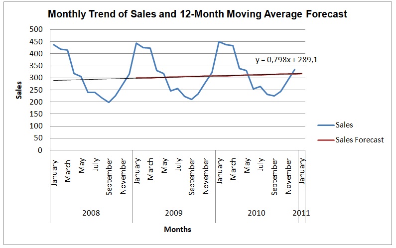
The graph shows monthly trends of sales in The Glass Slipper Restaurant in the period of three years from 2008 to 2010. The trend of sales has been fluctuating over the period with the highest and lowest sales being about 450 and 200 respectively. What is apparent in the graph is that the restaurant has a single peak season in a year where it registers the most sales. The peak season occurs in the first three months of the year, namely, January, February, and March, when the restaurant registers sales of over 400. During August, September, and October, the restaurant is at the off-peak season for the sales are between 198 and 243. During April May, June, and July, the restaurant experiences declining sales from the peak period to the off-peak period. In contrast, during November and December, the restaurant experience a rapid increase in sales from the off-peak to peak period. Overall, the graph shows that there is a seasonal variation in the sales of the restaurant according to peak and off-peak tourist seasons.
The 12-month moving average forecast provides a clear trend of the sales over the period of three years. The forecast shows that sales increase gradually over time for they were about 300 in January of 2008 and have increased to about 318 in December of 2010. Overall, the moving average projects that the sales of the restaurant after 12 months would have increased by about 10. The trend line predicts that sales of the restaurant will increase by 0.798 units every month. Therefore, the forecast of sales indicates that the income of the restaurant appreciates yearly, and thus, the value of the restaurant should be plus the projected sales.
Sales Forecast Using Regression
Table 2. Regression Analysis.
Regression Equation
y = a + bx
b = Σxy – n x̅Ў/ Σx^2 – n x̅^2
a = Ў – bx̅
b = 201538 – (36*18.5*309.39)/ (16206 -36*18.5^2) = 201538 – 206053/16206-12321= -4515/3885 = -1.16216
a = 309.39 – (-1.16216*18.5) = 309.39 + 21.5 = 330.89
Therefore, the trend line is
y = 330.89 – 1.16216x
Sales = 330.89 – 1.16216 (month)

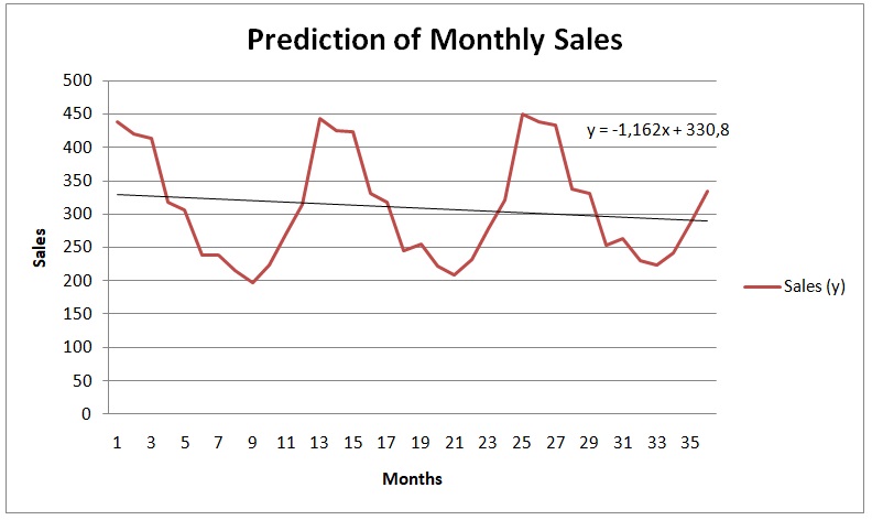
The slope of the regression trend line is not consistent with the trend line of the moving average. While the trend line of the regression is negative [Sales = 330.89 – 1.16216(month)], the trend line of the moving average is positive [Sales = 289.1 + 0.798(month)]. Essentially, the regression line indicates that sales decrease by 1.16216 units every month. In contrast, the moving average forecast shows that sales increase by 0.798 units every month. The reason for the apparent differences is that moving averages considers the overall trend of a year while the regression analysis considers monthly trends. In essence, yearly trends show growth in sales while monthly trends show a decline in sales. Berry (2010) asserts that regression offers instantaneous trends while moving average provides comprehensive trends over a period. Therefore, moving average is appropriate in forecasting sales if offers a comprehensive view of the trend.
Reference
Berry, T. (2010). Sales and market forecasting for entrepreneurs. New York, NY: Business Expert Press.