The Coca‐Cola Company was established in the year 1886 (Arandilla, 2011). It is a large corporation, which has grown from selling only nine bottles a day in 1886 to 1.7 billion a day (Arandilla, 2011). The company has increased from one city in one state to more than 200 states internationally. Due to its exclusivity and unique methods of advertising, the company has won the hearts of billions of buyers across the globe. Coca‐Cola posters are innovative and inventive, and they keep modifying over time, hence, adapting to various tastes (Arandilla, 2011).
Thus, Coca‐Cola is one of the strongest labels internationally, and it is an application instance to analyze the use of persuasion tools and methods in advertising campaigns. The analysis in this paper is restricted to vintage print advertisements. The vintage Coca-Cola advertisements have become very successful in the sense that they assist the Coca-Cola Company in accomplishing two major goals of the advertisement due to the company’s pioneering work in advertising and really wise usage of persuasion tools and methods.
Advertising Campaign
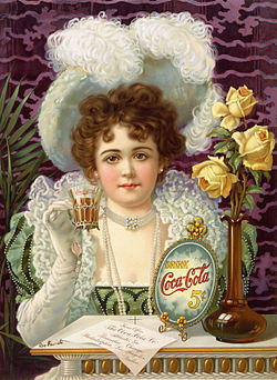
Coca-Cola’s advertisements have crucially influenced the US culture, and it is set down to creating the current visualization of Santa Claus as a man in a red-and-white costume (Arandilla, 2011). Before Santa Claus, the company depended on pictures of smartly dressed young females to sell the drink. Coca-Cola’s primary poster of this type emerged in the year 1895, demonstrating the actress Hilda Clark as its presenter (Illustration 1).
The year 1941 observed the initial usage of the name “Coke” as a label name for the beverage, with numerous posters telling buyers that it is the same as Coca-Cola. In 1971 a composition “I’d Like to Teach the World to Sing” from a Coca-Cola advertisement by Billy Davis turned out to be a hit single (Arandilla, 2011). Certain advertisements in 1960-1986 were made by previous radio host Don Naylor during his work for the advertising company McCann Erickson. The majority of these early advertisements featured movie stars, singers, and sports heroes (Arandilla, 2011). Also, Coca-Cola used children to demonstrate the safety of the beverage for them.
As for the target audience, Guy Cook (1992) claims that the most significant “categorization of advertisements is by customer” (p. 11). The creation of an efficient poster forces the company to study the target audience in order to learn humans’ styles of life, social position, and culture (Cook, 1992). Hence, before the launch of the campaign, Coca-Cola had to study the target market to learn the preferences and requirements of the buyers (Beasley & Danesi, 2002).
Buyers usually respond to the companies that reach out to their hearts and then the wallets. When the organizations are aware of the requirements of the public, they apply certain approaches to persuade people that their major concern is to satisfy the requirements of the buyers (Beasley & Danesi, 2002). The technique of advertising plays a major role at this stage. Stylistic devices, for instance, repetition, exaggeration, comparison, and emphasis, may be applied to underline the major traits of the label and to represent the product as exceptional and special (Kappe, 2012).
On the whole, persuasion is the key issue in advertising campaigns as advertisements aim at persuading no matter the circumstances (Kappe, 2012). Advertisers have to make people think that their goods are the best. However, it is difficult for marketers to convince people who they do not know personally. That is why it is extremely significant to understand how to convince people.
Persuasive Techniques of Advertising
Dissimilar goods demand dissimilar techniques of advertising. Cook (1992) describes “three major types of these techniques” (p. 10). The initial type embraces hard sell and soft sell. Hard selling depends on direct appeal, soft-selling influences mood, claiming that life is much better with the specific product.
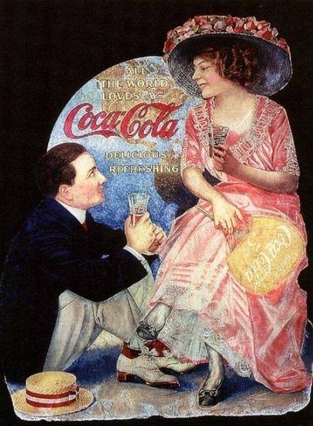
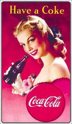
Illustration 2 is the perfect instance of a soft-sell poster. The company openly invites buyers to enjoy the beverage by convincing them that the entire globe adores Coca‐Cola (Kappe, 2012). People can observe a happy couple enjoying time alone while drinking Coke. Hence, the happy couple enjoying Coke turns out to be a symbol of the best beverage for memorable pleasant minutes. Illustration 3, in contrast, applies an imperative sentence to create a direct appeal to buyers. The advertisement is strict, concise, and very clear.
Cook’s second type of advertising technique demonstrates the dissimilarity between reason and tickle (Cook, 1992). Basically, the reason posters offer the necessary motives for acquisition, and tickle variants appeal to emotion and atmosphere. It should be mentioned that the reason/tickle type is not merely the hard/soft distinction with a new name (Cook, 1992). A soft sell frequently implies grounds for acquisition with no direct appeal (Cook, 1992).
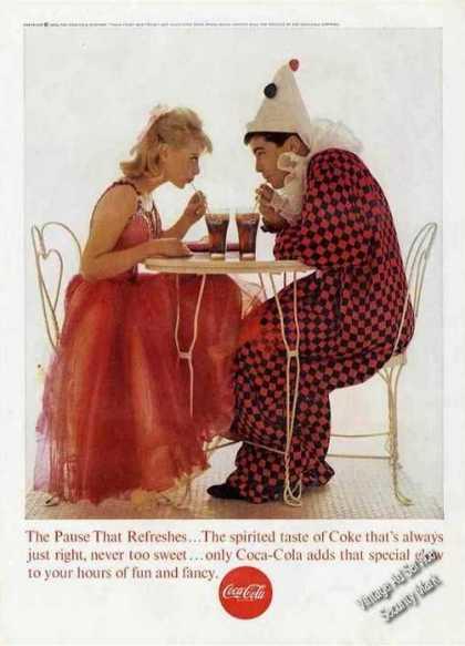
Illustration 4 is the perfect instance of a tickle poster. The company skillfully appeals to emotions with the help of a couple, who enjoy their spare moments together. People can see that they are happy to be together, and the slogan adds to the appropriate atmosphere. Basically, the poster and the message under the image reveal that when you drink Coca-Cola, you enjoy your time.
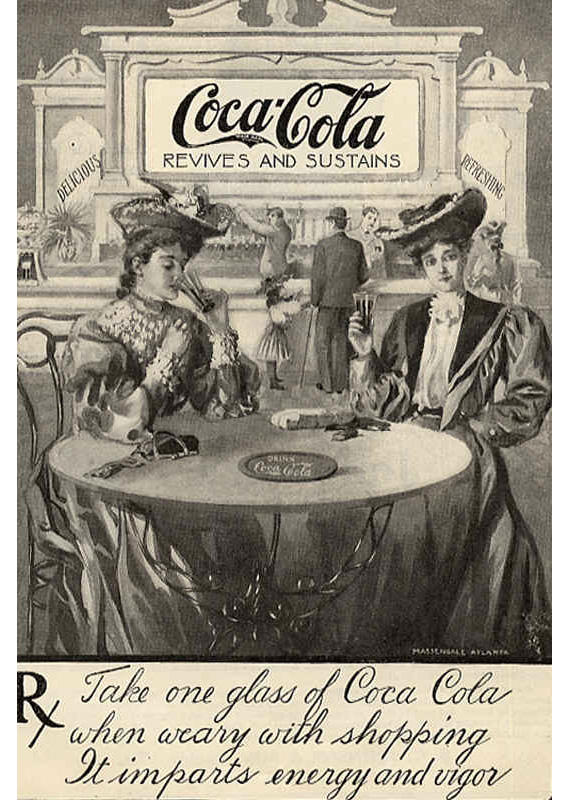
Illustration 5, in contrast, suggests the grounds for the acquisition of the beverage by telling buyers that Coke influences energy and vigor, as well as revives and sustains, which is meant to convince buyers to drink the beverage (Kappe, 2012).
The third type of advertising technique is the distinction between “short copy” and “long copy” (Cook 1992). Consistent with Cook (1992), “it is far simpler to reason in the long copy of a magazine advertisement than in 20 seconds of a television advertisement” (p. 11). The television variant does not offer enough time to provide reasons for acquisition due to the short length of the video (Kappe, 2012). Nevertheless, in the print advertisement, it is easier to reason as it is longer than a television advertisement, and as a result, the company has an opportunity to apply a more narrative style.
Additional Features of Coca-Cola Illustrations
- The logo: The company’s logo may always be observed in all posters. Basically, it is an identification of the beverage.
- CocaCola drink: There is a depiction of the beverage in the posters. The depiction of the beverage allows the company to present it every time to buyers. Also, it is frequently depicted as ice-cold.
- Personages: The company applies numerous characters in its posters; for instance, Santa Claus, Eddie Fisher, and many young people enjoying their life. The characters are represented in the fashion underlying the advantages of Coca-Cola.
- Colors: colors play a crucial role in persuasion as they influence the fashion buyers to treat posters. In fact, red and yellow help to create hypnotic influence. That is why posters are filled with these colors. Colors also have many important meanings, and the marketers need to be aware of these connotations, as the symbolic connotation depends on the situation in which it is applied. Colors also influence people physically as they can manipulate the visibility of an item (Kappe, 2012).
Use of Conventional Rhetoric Methods
The advertisements become particularly convincing thanks to the clever usage of conventional rhetoric methods, such as ethos, pathos, and logos.
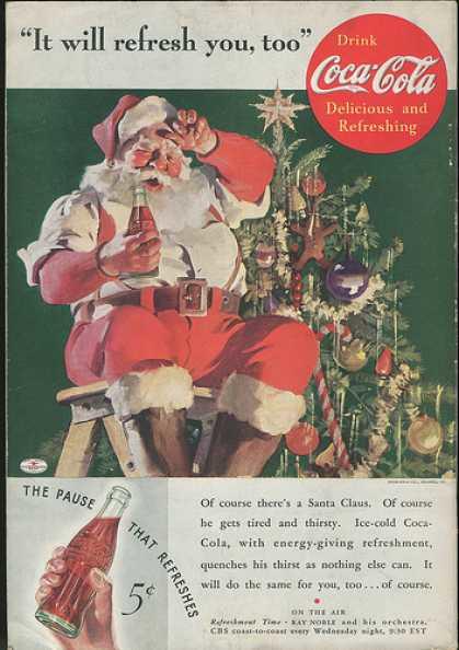
Illustration 6 demonstrates Santa placing the topper on the Christmas tree. Santa feels tired and thirsty. Also, Santa’s body language, when he is mopping his brow, stresses the thought that he is tired. The corresponding information is also written on the poster. However, even the youngest children, who cannot read, have an opportunity to comprehend the message of this commercial.
The point of this particular poster is to appeal to the client’s inner child with Santa decorating a tree. It may be called pathos as Santa Claus is employed to accomplish the aim of putting the finishing touch on the Christmas tree. The beautiful topper becomes the finishing touch to a happy day and a Christmas miracle. Similarly, Coke is the finishing touch to the long day. Additionally, this vintage poster is very convincing as it invokes pathos by forcing the tired individual to stop and refresh. The words “the pause that refreshes” propose future buyers to make a pause and think about tasting cold beverages. The rhetorical provocation is perfect as it suggests itself as an answer to the requirements of tired viewers.
The marketers claim that “ice-cold Coca-Cola, with energy-giving refreshment, quenches his thirst as nothing else can.” This statement is demonstrating the internal character of the rhetoric as it convinces the viewers that the beverage is not merely refreshing, but that it will also raise productivity. This is the key progress in the rhetorical argument as being more energetic is important, particularly in busier days, such as Christmas Eve. Thus, the marketers of the Coca-Cola Company have productively applied pathos by relating to the physical and emotional requirements of the usual middle-class human being.
Furthermore, this commercial applies ethos, as it demonstrates Santa drinking Coca-Cola, which makes viewers wish to drink it as well. Santa is a popular person respected by many people. The appeal of logos to the audience is the basis of why Santa Claus is drinking the beverage. The absence of his jacket and Santa’s body language tell the viewers that he feels very tired and thirsty. This would appeal to the logic of any person as it shows that if you are hot, an ice-cold Coke will cool you down.
Moreover, if this beverage makes so many people, including Santa, feel the joy of Christmas, then it would definitely affect you. Thus, the logos are really credible and efficient as only one look at Santa’s face makes a buyer think that he will be satisfied the second he or she purchases the bottle. The other appeal to the viewers is that the poster is extremely simple. There is a clear scene with Santa Claus, Christmas tree, and Coca-Cola. This is an appeal to the audience as it makes the advertisement easy to comprehend, and the message is more than clear: purchase Coke.
The vintage advertisements presented by the Coca-Cola Company accomplish two major aims. It is clear that the advertising poster is planned to sell goods. Hence, the sale is the major purpose of the advertising campaign. The secondary aim of the poster is to demonstrate that drinking Coke brings a great mood, which all people value, leading to the fulfillment of the main goal, which is a sale. The audience for all Coca-Cola advertisements is any human being who has an opportunity to purchase the beverage. The posters apply various techniques to grasp the attention of the buyers, demonstrating scenes of partying, and underlying the values linked to the great mood. All these elements are united together to create trust within the purchasers and develop a positive mood in their minds. Hence, humans treat Coke as a friendly beverage and evolve the desire to purchase the drink, achieving the company’s goal.
Conclusion
The vintage Coca-Cola advertisements have become extremely victorious in the sense that they help the Coca-Cola Company to achieve two key goals of the advertisement due to the company’s pioneering work in advertising and really wise usage of persuasion tools and methods. Coca-Cola is, perhaps, one of the most flourishing beverage organizations in the globe. By uniting conventional rhetoric methods with other persuasion tools and methods, Coca-Cola has successfully convinced clients that it is the most victorious production of refreshment beverages on the planet.
Referencing
Arandilla, R. (2011). Coca-Cola Advertising Through the Years. Web.
Beasley, R., & Danesi, M. (2002). Persuasive signs: the semiotics of advertising. Berlin and New York: Mouton de Gruyter. Web.
Cook, G. (1992). The discourse of advertising. London: Routledge. Web.
Kappe, C. (2012). The translation of advertisements: issues of semiotics, symbolism and persuasion (Master’s thesis). Web.