Introduction
This is a report about a Web site design for selling self-published books. The site provides various books in various aspects of healthy living. Users can download the e-book at a fee.
Many writers have resorted to self-publishing and there is a growing demand for an online business to sell such books.
Selling digital books on the Web site has become profitable because of the large market throughout the world and a lack of physical inventory.
The owner also has an option of conducting the business from any part of the world with the Internet connection. The e-books shall be useful to users and affect their living habits.
Goal Definition
The aim of this project is to create a Web site for selling self-published books that will attract younger generations who have interests in various topics about. The Web site should have more than 500 visitors in a month.
Requirements
The need to sale self-published books has increased with the development and accessibility of the Internet technologies. The Web site shall use effective payment options that are available in various parts of the world than what other businesses offer.
The Web site shall have the following requirements in order to ensure professional services to visitors and users (Eccher 30).
The visitor can start by browsing the available e-books on the subject of interest. The site may also suggest other books of interest for the visitor. Visitors who are members of the Web site can log in their accounts by using their user name and password.
New users can register new accounts at the Web site at no cost. However, users who wish not to register may explore the available e-books, but they cannot purchase any item from the site.
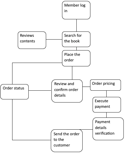
Users who have logged into their accounts can place their orders by specifying the required e-books, the number of copies needed and other important details, and then adding them to the cart. The system shall verify order details and provide the customer with the amount to pay for the items.
In case of any challenge, the system instructs the user to change some of the details. The customer may repeat the process until no more challenges can be noticed. The system shall also verify that the customer has placed the right order, check the quality of the e-book.
The customer will also specify the format of the e-book and the type of file (such as PDF, html, rtf,.doc etc). The customer may then execute the payment of the items by entering the appropriate payment details.
The system shall support different options lack credit cards, VISA, PayPal, and other e-pay solutions. Prices of all items shall be in the US dollar equivalent. The system must verify all payment details and establish the user’s identity in order to protect customers.
Once the customer has executed the payment, he or she will receive a confirmation message through notification border in the account, personal e-mail, and phone number. In addition, the system sends the message to the department to effect the transaction.
After this process, the system then sends the e-book to the customer provided e-mail for download or the customer can get the e-book in the account he or she opened with the company. Before the transaction is complete, users also have a chance to terminate the transaction.
Visitor The system shall also provide opportunities for customers to provide their feedback and suggestions on how to improve services, the Web site, and any other area of interest to them.

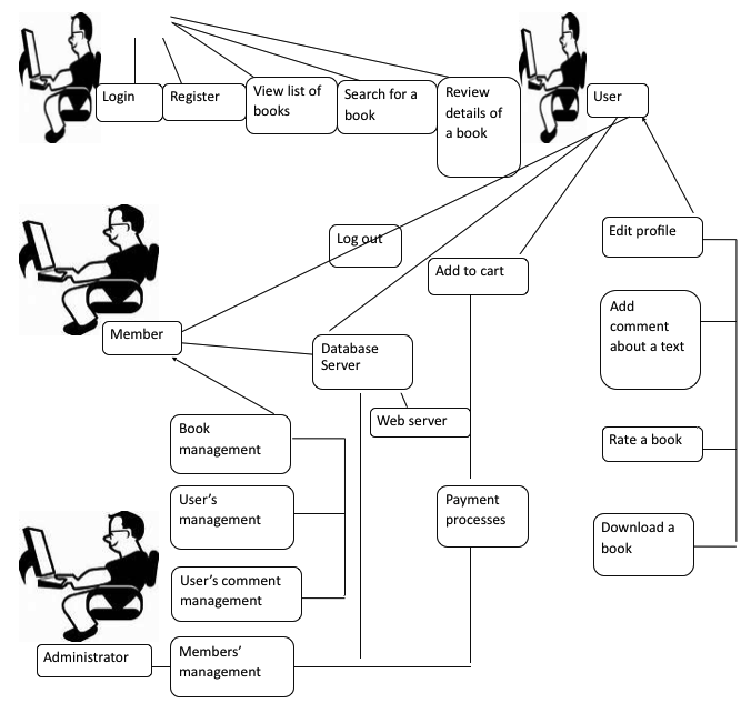
The use case diagram represents the stages of making the online e-book transactions. It shows the scope of the Web site, functional areas, and possible interactions between the visitors and the Web site (Ambler 1). The major players in these processes are:
- Customer: the customer or the visitor is the major player in this process. The company provides opportunities for a customer in another location to purchase the book via the online method.
- Administrator: the administrator can control the entire process of the customer’s interaction with the system. He also takes the role of the system operator and supports the entire process involved in e-book purchase. The administrator verifies all the details and interacts with the customer during the purchase process.
- Database server: the database server stores the members’ identities and other details. It is also important during the registration of a new member.
- Web server: the Web server contains details of e-books, costs, shopping cart, address, comment areas, rating, e-mail addresses, and other important aspects of the Web site.
Users initiate the process by logging on to the system. On the other hand, new visitors can register and become a member. The customer can browse the available books, review their contents, and choose the suitable book.
In addition, the customer can review the book, rate, and add his or her comments. The customer selects the e-book of interest and adds it to the cart. In case of any challenge, the customer can make changes to the order. He can see costs of the item, which the system sends to the administrator.
The customer can then initiate payment by using any of the supported methods. After verification procedures and payment, the administrator can confirm the payment and send the e-book to the customer.
The customer may get the book in his account with the company or in his personal e-mail account.

Site Plan
Logical Structure
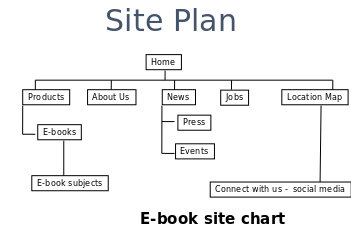
The logical structure has assumed a simple form structure (Booch, Rumbaugh and Jacobson 82). However, this structure may change as the design may acquire new features. The site hierarchy has the entire common navigational links. In addition, topical links are also a part of the structure.
However, the site avoids complex design to enhance usability and navigation. Visitors can navigate the site freely and move from one content to another. For instance, users can skip ‘About Us’ and transcend to ‘Product’ without passing through other areas.
The site plan is clear, simple, and concrete. Thus, it is simple for visitors to navigate from one menu to another without experiences challenges of being lost.

Design Prototype
The design is interactive to allow the Web site to communicate the entire structure, contents, and functionality with other part is a manner provides ease of modification, usage, and merging without technical challenges.
This model shows clickable elements of HTML sections, which users can navigate while in the site. The design shall also have the necessary feel, images, and typography that match an e-book Web site.
The page has footer and header. At the Home page, there are also options for Register for new visitors or Member Log for existing users. At the Footer, there are buttons with links about Contact Us, Social media connection, Pricing, Help, and FAQ.
The Contact Us link leads the customer to the company’s e-mail address and phone number and physical location.
Users have the option of using any of the methods. Under the Pricing tab, customer can view each item with its price tag. In case a customer has challenges, there is a link for help of FAQs.
Whenever the user clicks on the Register button, the registration page shall pop up with all the fields for personal detail requirements and other related information. The process is linear to allow users to follow a simple process of registration.
Users must enter their last names, first names, e-mail address, zip (if applicable), phone number, physical address, and country. The user must then enter the password and confirm it by retyping the same password.
In case of any error, the system will highlight the section with the problem, and the users can make the required changes. After this process, users can then click the button ‘finish registration’.
It will show that the registration is successful, and the system automatically directs the new user to member’s page. However, users can also cancel their registration by clicking the registration button.
The Login page leads the user to where they can enter their user e-mail addresses and password in order to gain access to their account and member’s page. Users have the option of ‘remember my log in details’, which they can confirm or reject.
The system also has a Log out button for users who have completed their transactions. Once in the member’s area or in the account section, users can browse the available list of e-books, reviews, and ratings. User can also add comments and rate a book.
They can choose a book of their interests and review its content before making a decision to purchase.
Users can click on the remove button to remove an item from a list, or they can click on the cancel button to abandon the entire process.
The customer can make the order and specify the quantity. All items have their price tags. The system has automatic total price calculation, which the customer can see at the bottom of the list.
The payment button allows the customer to enter his or her payment information based on the preferred method. They can also cancel the transaction at this stage. The price list and total price are visible to the customer.
The payment process requires the necessary customer’s information. A customer can choose to pay by card or use online payment solutions. In the case of online payment, the customer will just enter the e-mail address and link to the payment account.
He will then confirm the required fields and verify information entered. The card option shall require the name, card number, and date of expiry. The process must undergo all security verification procedures before the customer can execute payment.
The customer can then click the ‘confirmation’ and ‘submit button’ in order to execute the transaction. They can also cancel the order at this stage.
The system automatically generates transaction details and sends to the customer activity section, personal e-mail, and specified mobile number. In addition, the notification and confirmation message also appears on the screen.
Site Implementation
After the prototype stage, the designer must now implement the site. In this phase, the designer only dealt with three phases.
The first phase involves the implementation of the site structure design. The aim is to ensure that the designer distributed all contents of the prototype in a way that is user-friendly and logical.
The designer had various users’ behaviors in mind and used WSDM (Web search and data mining) as the guiding principle in the process. However, the designer also recognized that he could not foresee future behaviors of the users.
Therefore, the decision was on a speculative approach. Whereas the designer could measure other technical aspects like financial, time, and technical challenges, he could not measure users’ behaviors when using the site.
The second phase involved the presentation of the design of the Web site. The aim was to create a favorable feel and look of the site. In this process, the designer used a layout that accounted for users’ characteristics and mission of the company.
The designer used templates in order to reduce several cases of testing, create a consistent design, and enhance the speed of the process. The approach allowed the designer to use automated codes and other graphic parts.
The use of the templates also ensured that the Web site had a good layout for controlling different pages and functions. In fact, the designer realized that it was simple and cost-effective to use templates that only require insertion of information in the fields.
The third phase was the logical data design, which aimed to provide appropriate data for users. The designer presented information in various chunks and parts. This process only strived to ensure that customers got the necessary information they sought.
Thus, the designer concentrated on developing a perfect ontology for data. The designer used XML tool in this process.
During the site implementation process, the designer ensured that the database was maintainable, allow for modification, could not interfere with other functions, and fast enough for users.
Overall, the logical data design remained useful to the programmer. The designer relied on a Query Builder in order to develop such a database with a logical design.
The designer used Web Builder tool like WYSIWYG (What-You-See-Is-What-You-Get) to develop different Web pages. WYSIWYG allowed the designer to customize the site due to its several features, scripts, and templates.
The Adobe Dreamweaver supported several processes, improved the workflow, and reduced time during the coding process. It had library code snippets server debug, and other coding tools. The designer could view the CSS as a whole unit.
This made the process simple by allowing the user designer to see the style, identify areas for changes, and edit the style without changing the code.
The designer generated important features like object chunks, structure of the site, navigation systems, logical data system, design templates, page model, images, text areas, logo areas, and typo styles.
Testing
Functionality Testing
The designer tested for links of Web pages, connections, cookies, links for information submission and receiving.
It also involved testing for “internal links, e-mail links, orphan pages, broken links, and links going to the same page” (Ash 23).
Testing also covers all pages. Forms validate all lists in every field and default values. The designer also tested for cookies and HTML/CSS. Users could scroll the site without difficulties.
Database testing
This tested for consistency of information in the site, query results, retrieval, and updates.
Usability Testing
This involved testing for the ease of navigation, usage, clear instructions, and availability of the Main menu.
There were no spelling errors. Color and font were visible. All contents were within the frame. All images had appropriate size.
Interface Testing
The designer tested for interface elements like “Web server and database server” (Ash 23). The designer ensured that all interface features interacted properly.
There was a logical model for handling errors from application servers. The designer also tested for effects of interruption during transactions. The system always requested the user to cancel and confirm the process.
Compatibility Testing
This involved testing with different browsers, the mobile version, and printing options due different configuration. The Web site must match these standards. The designer used cross browser to ensure compatibility with the major browsers.
AJAX required testing for user interface functionality, security testing, and other validation processes. The designer tested the Web site on various browsers like Firefox, Safari, Internet Explorer, and Opera browser among others.
OS compatibility
The designer tested for the Web site “functionality and compatibility with the various Operating Systems” (Nguyen, Johnson and Hackett 34).
Not all graphic designs and interfaces may be compatible with the current Operating Systems. The designer tested OS like Windows, Solaris, and Linux among others.
Mobile browsing
The new age of technology has shifted to mobile devices, and mobile devices have increased Internet accessibility. Therefore, the designer tested for the Web site on a mobile browser for compatibility (Nguyen, Johnson and Hackett 34).
Printing options
Customers who wish to print their transaction details should not experience challenges. The designer tested for suitability of fonts, graphics, and page alignment for proper printing.
Performance testing
The Web site should bear the greatest load and stress. The designer tested for loading and connection speed. The system could handle several requests, large data, and connection to database and upload to certain pages.
Stress testing
The designer tested if the system could “handle large loads beyond its specified limits” (Nguyen, Johnson and Hackett 34). The areas of focus included log in, registration pages, and other input fields. The crash report was significant for future improvements.
The designer also tested for stress functionality on various browsers, Oss, hardware, and, memory capacities, and software.
Security Testing
Finally, the designer tested for the Web site security features. The system had the ability to record all transactions, error messages, and unauthorized attempts of logins.
Releasing
The Web site was ready for a release after testing. The designer observed whether the Web site met users’ expectations. Users had the option of proving feedback about the overall site experience.
The process also involved measures of goals and any possible correction required for the Web site functionality and usability.
The Web site shall require constant maintenance in terms of improving current features, technology improvement, and changes in the visual features. In addition, the site shall require regular update of available books.
Works Cited
Ambler, Scott. User Interface Design Tips, Techniques, and Principles. 2012. Web.
Ash, Lydia. The Web Testing Companion: The Insider’s Guide to Efficient and Effective Tests. New York: Wiley, 2003. Print.
Booch, Grady, James Rumbaugh and Ivar Jacobson. The Unified Modeling Language User Guide, 2nd ed. Boston: Addison-Wesley, 2005. Print.
Eccher, Clint. Professional Web Design: Techniques and Templates, 4th ed. Boston, MA: Cengage Learning, 2011. Print.
Nguyen, Hung, Robert Johnson and Michael Hackett. Testing Applications on the Web: Test Planning for Mobile and Internet-Based Systems, 2nd ed. New York: Wiley, 2003. Print.