The Azores is a magnificent archipelago in Portugal, comprised of fishing villages, unique landscapes, and green pastures. The region’s extensive and rich resources allow it to produce high quality bio milk that it exports to other parts of the globe. Recently, the Azores Bio Milk Company embarked on an initiative to reach more consumers in the UAE and enhance its product’s appeal and value to available customers. The following proposal details the recommendations for new packaging based on UAE consumer needs and preferences.
Target Audience
The Azores bio milk is safe for consumption and a favorite for many individuals in the UAE and nations around its borders. However, its primary target market includes pregnant and lactating mothers, children, environmentally conscious people, and health-oriented individuals.
Pregnant women and lactating mothers
Pregnant women and breastfeeding mothers are more likely to dig deeper into their pockets for Azores Bio milk because of its proven health benefits. Most other milk and cheese products have artificial additives and preservatives to increase their life span (Javed et al., 2018). However, Azores Bio Milk is purely organic and effective for growth and development. Therefore, occasional shoppers, primarily mothers and pregnant women, will constitute a significant consumer base.
Children
Children are the most valued and cherished target market because of the frequency by which they consume milk and milk products. Natural milk is effective for healthy growth and bone development due to its high nutrient capacity. Therefore, parents are willing to spend more on products that ensure their children are in good shape (Cheikh Ismail et al., 2022). Notably, children these days are given the opportunity to choose what they like from the shelves. Thus, creating awareness of the product’s quality through its appeal to this target group is a reasonable strategy.
Health-oriented individuals and environmentally conscious people
Azores Bio Milk manufacturers are known for how they treat their cows and the methods they use to produce their milk. Therefore, their products are preferable for environmentally conscious consumers and individuals with a sense of responsibility for the environment (Butti Al Shamsi et al., 2018). Hence, the new packaging should target these individuals and promise them value. Similarly, health-oriented consumers pay attention to milk’s nutritional values and benefits (Cheikh Ismail et al., 2022). Hence, they can spend more on fresh and high-quality milk that promises to meet their needs.
Competitor Analysis
The UAE’s most popular milk production brands are Almarai Milk, Al Ain farms milk, Gulf, Safa low-fat milk, and Al Rawabi Milk Company. Almarai Milk has high mineral content and is an excellent source of Potassium. Moreover, it holds the largest market share and is distinguishable by its logo and packaging (Dijk, 2021). Al Ain farms milk succeeds in market share value and is one of the oldest products in the UAE. It is known for its fresh taste, but it holds an emotional value among UAE locals because it was founded by Sheikh Zayed Al Nahyan (Dijk, 2021). Gulf and Safa low is a relatively well-known organization, and Al Rawabi is a popular product with a readily recognizable bottle.
Competing / Complementary Product Analysis
Milk products in the UAE have similar physical attributes because they have a distinct appearance that all organizations have sustained since their inception. However, there is a significant gap in milk packaging among all competitors as all packages are rectangular-shaped cardboard or plastic bottles with just one handle by the side (Poo, 2021). Thus, the new design can use this to make more attractive packaging.
Typography
Most competing products use bold typographies in their labeling, which could be a pro or con. Bold typographies make writings more readable, but children and younger consumers may not find this attractive (Landa, 2018). Altering the typography of the new designs can help achieve these goals by making the bottle recognizable, as the market needs a product that can attract and entice young customers to pick it up as soon as they spot them on shelves.
Use of colors
White and blue are the most dominant colors in the milk and dairy product industry because these shades depict purity and freshness. Subsequently, milk producers in the UAE rarely use other colors resulting in several similarities in their packaged products (Dijk, 2021). Over the past few years, numerous products have saturated the market, calling for diversifying colors to represent milk products for the new generation. Therefore, the new design plans to introduce new colors to gain more attention and attract people in different ways.
Composition
Composition is critical in digital design because it defines the techniques through which elements join to form a whole. The competitor analysis reveals that most companies adopt simple visual elements such as images with dairy products, cows, and milk, thus directly associating the packaging with their milk products. Generally, competitors’ packaging has evenly spaced elements and readable fonts that occupy a reasonable space. This layout is advantageous because it allows consumers to note the most attractive elements of the product instantly (Landa, 2018). However, children and the youth might not find this appealing and might look for something more interesting.
The Final Packaging Proposal (Two and Three-Dimensional Design)
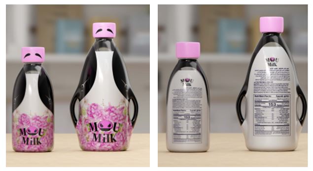
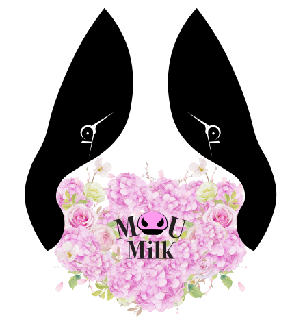
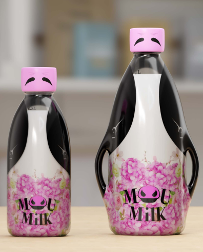
A thorough competitor analysis encouraged me to adopt a cylindrical-shaped bottle with unique elements to the ones available. The main idea was to superimpose a cow’s head onto the whole bottle and avoid using blue shades. Therefore, the principal features of the bottle are its middle transparent layer at its front and black patches to the side to represent a cow’s face, images of hydrangeas flowers covering the bottom of the bottle, and a pink cap to represent the nose. The 0.5L bottle is fully cylindrical, while the 1L bottle has handles that play a functional role of aiding consumers’ grip but is incorporated to represent the cow’s ears. The images below show the two and three-dimensional concepts of the new packaging.

The Final Packaging Proposal (Written Presentation)
The Azores’ highlands are well-known for their natural splendor of fauna, flora, and exquisite wildlife species. However, resources such as milk and high-grade cows that thrive in its landscape have earned the region a good reputation and the interest of investors who have raised people’s living standards. Therefore, this endeavor required highlighting the critical aspects of the Azores and the features that contributed to its globally admired status. While exploring the area’s vast fauna and flora, I discovered that hydrangeas were the most common and well-known species. Thus, I decided that the new packaging would feature a cow and these flowers.
Although I sought to introduce something new to the packaging design, I a regular bottle’s shape because of the diverse consumer base. The new package’s shape should appeal to children, youth, adults, and seniors. Thus, the rounded shape of an ordinary bottle was preferable because it provided a sense of authenticity and aesthetics (Landa, 2018). However, contrary to other bottles, I thought that it should be easy to hold and provide its users with a firm grip. Children have small hands, and most elderly individuals are diagnosed with arthritis, which results in weak bones (Cheikh Ismail et al., 2022). Thus, the handles are intended for these groups as they might find round bottles challenging to hold. Nevertheless, because of weight differences, the handles were only implemented in the one-liter bottles rather than the 500-milliliter bottle.
Several trials led me to believe that the bottle should resemble a cow’s head as this would be more appealing to the general audience. I later placed the hydrangeas flowers on the cow’s head to decorate the final design and enrich its appearance (Landa, 2018). Once I decided on the bottle’s shape and these components, my conception blossomed into life as the handles on the one-liter bottle naturally fit to represent the cow’s ears. The bottle top illustrates the cow’s snout, thus the pink color. The additional colors also play a significant role as they symbolize and identify Azores’ natural features. The colors used on the bottle include white, green, purple, and black, which are vibrant enough to achieve the desired aesthetic.
Finally, I designed the cow’s head as cartoon but made it transparent in the middle for customers to see the amount of milk available in the container. Moreover, I presumed that using a cow’s nose to represent the word ‘O’ in MOU was a good idea. This enabled the logo to simultaneously resemble the bottle’s concept as MOU is the milk’s name. Finally, I adopted the Bodoni 72 typology because it is elegant and contemporary (Landa, 2018). This idea emerged from Azores’ milk, as customers perceive it to be luxurious, which similarly applies to its packaging. The product’s presentation is sophisticated and cohesive, owing to the use of consistent and attractive colors. The final product was brilliant and represented everything I had pictured in mind.
Critical Report and Reflection
Completing the task above allowed me to dive into my imagination and apply numerous concepts learned in class to real-life tasks. More specifically, typography, which refers to the arrangement and design of typefaces or fonts in design, is critical to the general outlook of a package. Typography determines attractiveness and whether the text is readable, thus requiring utmost attention as the wrong font can significantly impact appeal. I settled for the Bodoni 72 Bold font due to its classic appearance.

However, color, images, and shape are vital in creating mood, differentiating brands from others, representing abstract concepts, and attracting consumer appeal toward the product (Landa, 2018). The elements selected for the proposed Azores Bio Milk packaging represented the rich, natural, and aesthetic nature of its landscapes and resources. A product’s composition is crucial to the message a brand intends to send and can help neatly wrap up everything within the limited space on a bottle. Nevertheless, the project was as complex as I had imagined because I experienced several issues during the initial stages of the idea’s conception.

One of the most challenging tasks was designing a cow’s head on a round bottle and making it appealing to children, youth, adults, and the elderly. In addition, I faced issues in designing a logo that could encompass everything the bottle represented and its main ideas. Nevertheless, I accomplished my mission by conducting thorough research and going through instructional and educational videos that guided my processes. The task I enjoyed most is sketching the final design because the activity enabled me reveal and use my artistic talents. However, I learned a lot by documenting all new concepts and every step of the project’s life cycle. Although I was not sure of a direction at the beginning, everything became clear after going through studies and learning resources on innovation and digital design.

The lessons I learned and appreciated most from my engagement with the task’s challenges are the essence of trial and error and documentation when brainstorming. Trial and error methods are particularly critical when there are several options to consider with limited room for error. The approach allowed me to factor in several possibilities and select from the most effective solutions. Documentation is another vital value I obtained from completing the project as it allowed me to note my steps and evaluate my progress. Documentation is necessary for reference purposes and can help one in avoiding repetition. Thus, I plan to share my findings with others and inform them of the most efficient way to succeed. Otherwise, I enjoyed the whole project and was dedicated to overseeing its completion. The process from the beginning to the end was complex yet intriguing and exciting.
During the task, I applied the concepts learned in the visual design and visual language courses to oversee most initiatives. Moreover, familiarizing myself with the basics of Auto Cad enabled me to visualize better what I was required to do and how to achieve the best outcomes. I plan to engage with higher-level design tasks and computer-aided image processing in the future, as these endeavors will expose me to vital skills and open up more opportunities. The project has inspired me to dive deep into product design because it is a rich niche that promises to keep me busy, engaged, and wealthy.
References
Butti Al Shamsi, K., Compagnoni, A., Timpanaro, G., Cosentino, S. L., & Guarnaccia, P. (2018). A sustainable organic production model for “food sovereignty” in the United Arab Emirates and Sicily-Italy. Sustainability, 10(3), 620. Web.
Cheikh Ismail, L., Al Dhaheri, A. S., Ibrahim, S., Ali, H. I., Chokor, F. A. Z., O’Neill, L. M.,… & Hwalla, N. (2022). Nutritional status and adequacy of feeding Practices in Infants and Toddlers 0-23.9 months living in the United Arab Emirates (UAE): findings from the feeding Infants and Toddlers Study (FITS) 2020. BMC Public Health, 22(1), 319. Web.
Dijk, Z. (2021). Upward trend for UAE dairy products. Web.
Javed, I., Mustafa, G., Ashfaq, M., Yasmeen, R., Ghafoor, A., Yasin, M.,… & Imran, M. A. (2018). Competitiveness in agricultural trade of Pakistan with United Arab Emirates. Pakistan Journal of Agricultural Sciences, 55(3). Web.
Landa, R. (2018). Graphic design solutions. Cengage Learning.
Poo, N., (2021). Top 10 dairy manufacturing companies in UAE 2021. Web.