Introduction
The primary goal of this report is to provide a complete overview of all procedures involved in conducting a real-world linear regression model as a form of research study, from generating a subject of study through carrying out a detailed quantitative model for statistical analysis and evaluating the results. This is detailed, focusing on the use of the linear regression model in carrying out the prediction of the housing prices for specified homes in 2019. The predicted prices will mainly be based on the square footage. The hypothesis from this report is whether housing prices from the established homes in 2019 have the same or different prices.
Statistics are the numerical numbers obtained from a dataset’s mathematical modeling, which either characterizes the dataset’s attributes or generates generalizations premised on significant patterns. The probability theory, an area of Math associated with evaluating unpredictability and ambiguity, is included in statistics. Statistics plays an essential role in various fields. It is used to carry out the multiple tasks that play a significant role in individuals’ lives, especially researchers.
Why linear regression model is the most effective?
Linear regression is a paradigm in which the input parameters (x), as well as the single output parameter/variable (y), have a linear correlation (y). On the other hand, the scatter plot refers to a form of graphic or statistical layout that displays data for various parameters for a collection of data using the coordinates from the Cartesian plane. The linear regression model tends to be the most effective for the researchers in carrying their statistical tasks (Fagerland, 2013). This is because it provides a more incredible opportunity to predict the values from a specified variable within the figure/ value of another variable. The scatter plots display a resilient and constructive linear connotation between the specified parameters in use.
The regression model consists of the dependent variable/ response and the predictor/independent variable. The dependent variable is usually designated as the variable on the y axis, whereas the predictor is displayed at the x-axis within the Cartesian plane. The y parameter is stated to be random and can be said with a slight error, while the x parameter is itemized to be the variable without any error; the fact is that it usually occurs in a fixed state.
Data Collection
The various steps used in assembling the raw facts and figures, computing, and evaluating the accuracy of the data are referred to as data collection. It is one of the methods that play a significant role to the investigators as they try to generate feedback to their hypothesis stated and evaluate the generated feedback. Data can be collected randomly from a specified location or collected sequentially from a specific individual.
Sampling the data
Data sampling is a statistical investigation method that involves selecting, manipulating, and analyzing a relevant assortment of data sets to uncover the relationships and the correlations within a big data gathered. It can be used as one way to determine the amount of data to be assembled and when these data have to be collected.
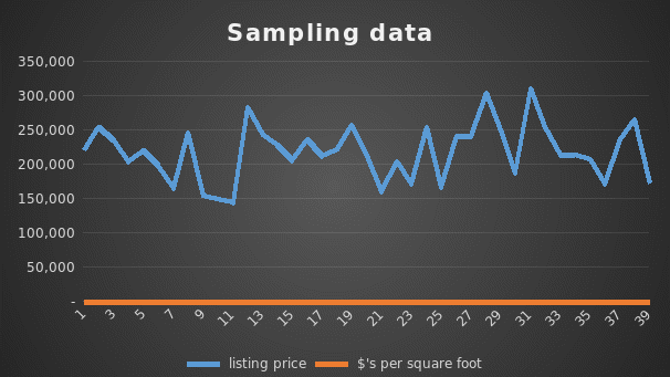
The predictor/independent variable is the square footage from the data collected, while the response/dependent variable is the house price. The price of the house will mainly depend on the square footage displayed.
The dependent/response variables are displayed on the y axis, while the independent/predictor variables are displayed on the x-axis, as shown in figure 2 above.
Data Analysis
The method of analyzing, clarifying, manipulating, and modeling data to identify meaningful data, generate inferences, and assist in making judgments is known as data analysis. Data analysis creates a room where a sum up of the assembled data is displayed clearly.
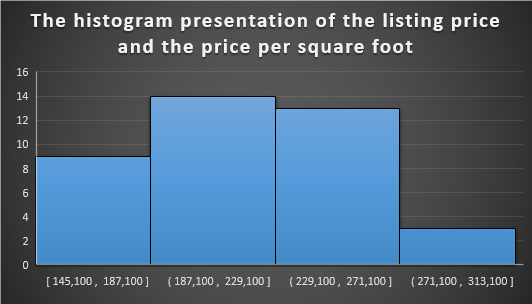
The histogram above gives the display an approximated distribution of the data. This creates an easier way for the investigator to generate a conclusion. The histogram above shows that the highest price per square foot is 14, while the lowest is 3.
Figure 4: The summary statistics.
From figure 4 above, the total mean displayed from the listing price is $218, 974, mean price per square foot is $136, as indicated. The standard deviation for the listing price is $39,516, the standard deviation for price per square foot is $20. On the other hand, the median listing price is $220 800, and per square foot is $134.
The median of a population is where the middle of the dispersion is found. This would be the area where almost half of the findings are on each edge in a graphical interface. The elevation/height of every column in the graph below illustrates occurrences’ distribution.
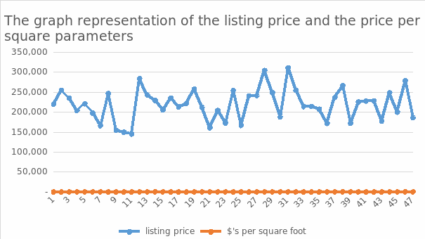
The diversity of the data is referred to as the spread/dispersion of a population. The dispersion is more significant when the samples span a diverse variety. The distribution is less when the models are grouped within a fixed dimension, as displayed between points 37-47, where the graph seems to have a steady movement.
The following features may be used to characterize the various form describe the shapes.
Symmetry. Asymmetrical distributions may be partitioned at the middle when plotted on a graph, as every half is a duplicate copy of one another. The overall number of heights might be minor or numerous in a dispersion. The above charts may be stated to be non-symmetric because they are not portioned at the middle, but there tends to be variation. The outlier is a point that tends to appear as if it is eliminated from the graph, as illustrated from figure 2 on the scatterplot diagram, where 301,000 tends to be much far from the chart.
Regression coefficient populations have only one distinct apex, as illustrated in figure 5 above, where we can indicate that the highest peak of the graph maybe 301,000. At the same time, bi-modal populations have two distinct peaks. The above chart may be stated o be bi-modal; the fact is that it has two extremes, the top and the bottom peak, where the bottom peak reads to a variable of 149,000.
The bell-shaped distributions have a sharp peak in the middle of statistical distribution, as illustrated in figure 5 above, where the graph moves at a solid point to its highest peak. Several dividends have much more occurrences solely on a single part of the graph than others when aesthetically depicted.
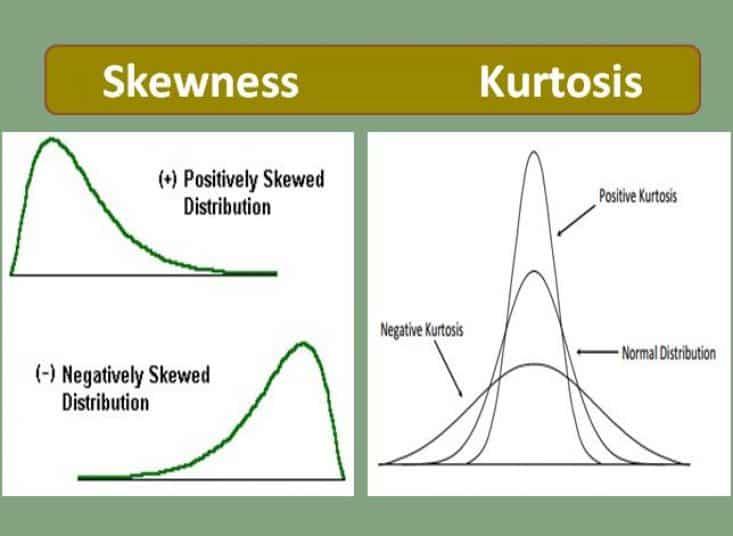
Skewed right populations have fewer instances on the right, while skewed left people have fewer records on the left. On the other hand, kurtosis states how the specified tails from the graphs differ from the distribution. The uniform distribution is when the sightings in data collection are evenly distributed over the solution’s domain. There are no apparent peaks that are uniformly distributed. From the graphs above, we can sum up that the population from this distribution is non-uniform as the data tends to be distributed randomly.
Conclusion
We can sum up that the linear regression model is the most efficient for investigators to conduct their analytical duties. This is because it gives you a better chance of predicting the numbers of a defined parameter well within the estimates of another parameter. The figures demonstrate a robust and productive linear relationship between the particular parameters in use. The investigators find it much simpler to carry out their analysis by using the linear regression models, which play a significant role in statistics. Data might be acquired at random out of a given area or consecutively from a single person. The mean, median and standard deviation are crucial when carrying the analysis as they play a role whereby the researchers can generate their sum based on the analyzed information. Sampling the raw facts and figure tends to be very crucial, the point being that it can be used to determine the quantity of data that needs to be gathered and identify when the data needs to be assembled.
References
Fagerland MW, Hosmer DW (2013) A goodness-of-fit test for the proportional odds regression model. Stat Med 32 (13):2235-2249. Web.