Introduction
This essay is aimed at examining the cover of Sports Illustrated Magazine. This image should be evaluated from ethical, logical, and emotional perspectives. Furthermore, it is necessary to discuss the use of various advertising appeals that are supposed to prompt a buyer to purchase the product.
It should be noted that this issue was released in 2013 after the National Football League finals. Overall, this magazine is intended primarily for the male audience that may include people of various age groups. One should take into account that this cover is strongly based on the controversy surrounding the name of Ray Lewis who was accused of involvement in the murder and the use of performance-enhancement drugs. This information will be important for further analysis.
Thesis
The main message of the cover is that the buyers of the magazine can read learn more about the person who was able to overcome great difficulties and achieve success even despite numerous scandals. The main goal was to evoke the interest of the readers into the content of the magazine. Overall, the rhetoric was quite effective because it prompts a person to buy the magazine. This is one of the main arguments that can be put forward.
The use of appeals
Ethics
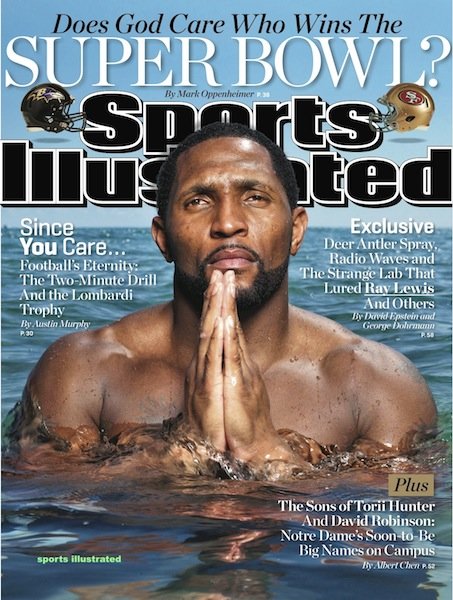
One can argue that that people, who designed this cover, tried to emphasize various ethical aspects of behavior. First of all, they stress the importance of integrity for the professional and personal life of an athlete. It should be taken into account that Ray Lewis stands in the water (see Picture 2 in Appendices), and this image reminds the reader that this person was able to cleanse his reputation from many accusations.
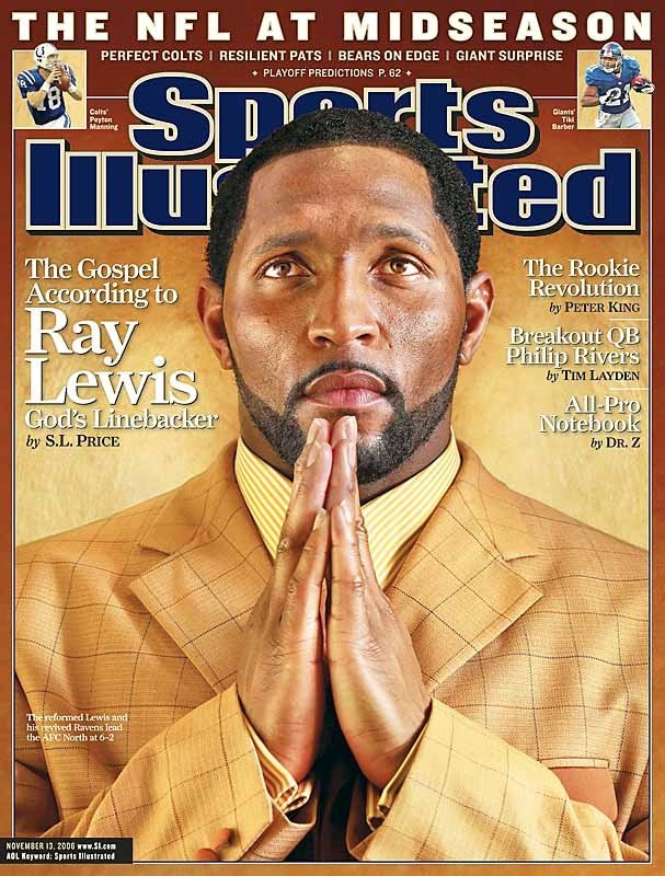
Additionally, such a concept as humility is at the core of this image. One should bear in mind that Ray Lewis is a very religious person and he often speaks about his resignation to God (Eichelberger 201). This theme was explored in other covers that were featuring Ray Lewis (see Picture 1 in Appendices). It is possible to identify several appeals that are closely to ethics. One of them is the need for guidance or the desire to follow moral or aesthetic examples set by other people (Fowles 22).
In turn, the readers of Sports Illustrated Magazine can also want to draw some moral lesson from the behavior of Ray Lewis. Additionally, it is important to consider the need to achieve (Fowles 22). In other words, the buyers may want to find that content that can motivate them to attain success even despite the hardships that the face. Researchers believe that this appeal is important for the success of the printed press (Shimp 327).
Logic
Apart from that, this cover can also be assessed in terms of logic. One should pay close attention to the structure of this image. The viewers can see that the figure of Ray Lewis is placed right at the center of the cover. This strategy is quite justified because it enables to attract the attention of the potential buyers.
Moreover, the title of the cover is also critical because it poses a controversial question to the reader, and he/she is more likely to be interested in the content of the magazine. This method is used by many advertisers (Stafford 188).Additionally, the physical strength of Ray Lewis is also highlighted in this image and this component makes the image more attractive to female audience.
Therefore, one can say that the choices of the designers were quite justified. The image is dominated by blue color, while in the 2006 cover, the yellow color prevails. One can argue that the blue color produces a more soothing impression on the viewer. Moreover, this image is well-balanced and the readers can see what kind of topics will be discussed in the issue of the magazine. It is possible to identify two appeals that are closely related to logic.
For example, the structure of this cover is supposed to evoke the need for curiosity. Jib Fowles and other researchers believes that sometimes advertises try to pose a thought-provoking question to the target audience in order to create this effect (Fowles 22; Stafford 188). This technique was adopted by the designers of the cover. Additionally, the appeal to sex is present in this cover. This effect is achieved by showing the muscular body of the athlete.
Emotions
Finally, one should discuss the emotional effect that the image produces on the audience. It is possible to say that the facial expression of Ray Lewis indicates at the calmness and humility of this person who is not affected by vanity or ambition. This technique was used by the designers of previous covers featuring Ray Lewis.
However, the main difference is that in the 2006 image, Ray Lewis wears an expensive suit, while in the 2013 cover he is almost naked. Probably, this difference was needed in order to show that Ray Lewis is able to disregard his wealth. This is one of the major issues that can be identified. In this case, two appeals play an important role in attracting the potential buyers. One of them is the need to escape from the vortex of the social life which is dominated by struggle, conflicts, and various obligations.
The image of Ray Lewis helps the audience forget about these issues. Thus, the designers of this cover were able to attain their intended goal. Secondly, it is important to about the need for safety which is important for modern people who struggle with the feeling of insecurity. The calmness and strength of Ray Lewis make the viewer feel less vulnerable. This is the way in which various appeals were used on this cover.
Refutation
Admittedly, the interpretation presented in this paper can be questioned because it is based on the assumption that each of the potential readers know about the controversies that are associated with Ray Lewis. If they do not have this background knowledge, they can misunderstand the message of people who worked on the creation of the cover.
Nevertheless, one can mention that the scandals related to this athlete were well-publicized. More importantly, they are familiar to people who take interest in football. Therefore, it is possible to argue that the message of the cover was interpreted accurately.
Conclusion
On the whole, this cover incorporates various appeals such as the need for curiosity or the need for guidance. Furthermore, the creators of this image successfully combine ethical, logical and emotional aspects in order to make the magazine more interesting to potential readers. One can say that this objective was attained.
Appendixes


Works Cited
Eichelberger, Curtis. Men of Sunday: How Faith Guides the Players, Coaches, and Wives of the NFL, New York: Thomas Nelson Inc, 2012. Print.
Fowles, Jib. “Advertising’s Fifteen Basic Appeals”. Common Culture: Reading and Writing About American Popular Culture. Ed. Michael Petracca. Upper Saddle River: Prentice Hall, 1998. 22-30. Print.
Shimp, Terence. Advertising, Promotion, And Other Aspects of Integrated Marketing Communications, New York: Cengage Learning, 2007. Print.
Stafford, Marla. Advertising, Promotion And New Media, London: M.E. Sharpe, 2005. Print.