Introduction
The designs of various historical monuments are usually determined by various factors among them the historical events, personalities, and location of these features. Ancient artists always considered these aspects when developing the designs of different buildings. However, today’s artists have added another twist to enhance the appearance of these features and ensure they serve their purposes, as the importance of functionality and convenience has become a common factor in the designing of new buildings in today’s society. Nowadays, architects tend to believe that a building should not only portray the national heritage of a country but should also serve the intended purposes. Additionally, the newly established policies that govern the construction and quality of urban structures have forced the authorities to restructure and renovate their buildings or face the risk of being demolished. In this case, this paper compares the extension of the Christian Science Center (1971-1973) and the West Wing addition to the Museum of Fine Arts (completed in 1981) while describing their shape and other architectural features.
Comparison
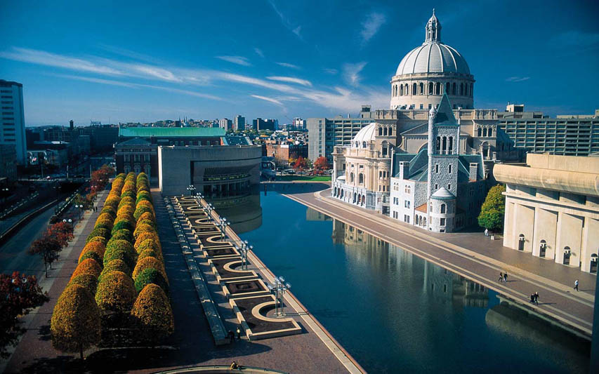
I.M. Pei & Associates (London) was contracted to design a new face of the Christian Science Center and give it both a facelift and extension of major parts to accommodate new rooms (Dierking and Falk 57). A new extension included a complex of buildings that were designed to match and integrate with the themes of the old features. In this case, credit is given to the architectural mastery while being able to extend the ensemble of the buildings and surround the Church. The Sunday School building (Reflection Hall; 235 Huntington Avenue), Colonnade building (101 Belvidere Street), Administration building (along 177 Huntington Avenue), the Reflecting Pool, and other public spaces are some of the major features of this building that can be observed (Dierking and Falk 57) (see Figure 1). This complex of buildings gave the old Christian Science Center both a modern and beautiful look that has changed the overall image of this place. The re-design of the old building led to the establishment of more rooms and space for other activities, and it had a positive impact on the building and its users. For instance, the Sunday School building was designed to meet the demand of a high-end urban center and offer enough space for both office and private activities (Wallach 41). The designer prioritized the need to provide spacious rooms in an urban center without jeopardizing the quality of the architectural and religious concepts connected to the building.
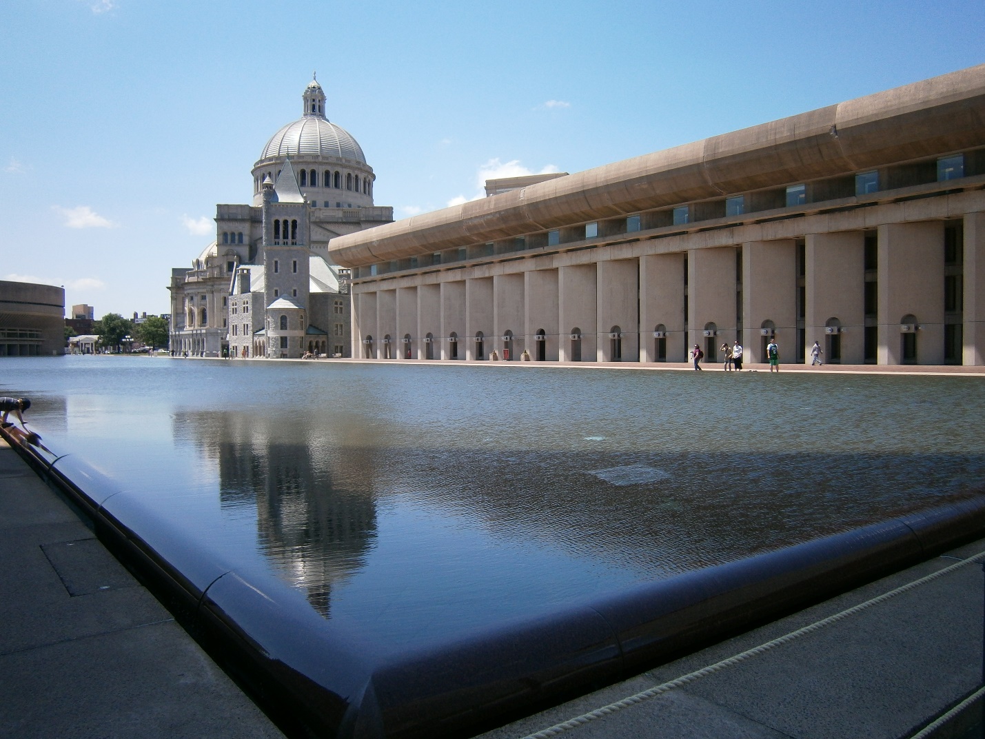
Furthermore, today, these buildings and the headquarters of the Church of Christ’s offices are situated along with the pool (see Figure 1). The glass-like walls on the poolside make this extended part of the building be referred to as the Reflection Hall (see Figure 2). In most cases, the sun is reflected and directed into the hall while creating the contrast of shadows and light (Duncan 280). The large transparent windows allow the spread of the light while distributing the shine across the rooms. Furthermore, the designer wanted to give the building a larger space for conferences and other important meetings, and this extension implements the idea into reality. This notion is introduced by using the location of the room, as it ensures the spread of light by creating a perception of the enlargement.
Secondly, the Colonnade building was also a major extension, and it has changed the appearance of the east end of the structure giving it an angular appearance. It is believed that the designers were motivated by the direction of the wind and evening’s shadow while implementing this design (Meisner 1537). The shape of its exterior rooms enables the structure to seem longer, as it captures the imagination of perspective. In turn, the rectangular look adds the regular nature to the building while harmonizing it with the rest of the city landscape. Lastly, the Administration stands out, as it is designed to exalt itself among the nearby buildings by its sky-scraping height and magnificent design. The tallness of this extension provides the overall center with a symmetrical appearance, and its slender top blends and integrates with the wide foundation. Based on the analysis discussed above, it could be said that other buildings have embraced this architectural design by using an artistic perspective’s approach that makes distant images small while closer ones appear larger.
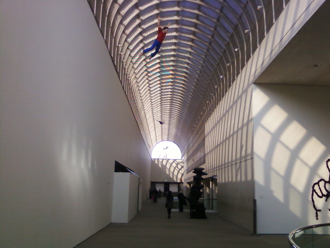
“The Royal Institute of British Architects (RIBA) has announced that the Museum of Fine Arts, Boston, is one of 13 buildings to receive a prestigious 2011 RIBA International Award for architectural excellence” (“Museum of Fine Arts” par. 1). This structure is recognized by the RIBA International Award Committee due to its unique mastery of both architectural and cultural creativity of its time and today. The newly re-designed golden-brown structure depicts the identity and culture of the original users of the building, and it conveys a deep message concerning the value of cultural appreciation in this country. The Museum of Fine Arts opened a new Beaux-Arts building on Huntington Avenue as its first extension. This facility created the now-famous room for both official and cultural conferences (Heath and Lehn 77). Nonetheless, the Linde Family Wing for Contemporary Art is the key element of the extension in this essay (see Figure 3). The illusion of perspective tends to extend the building, and the glass ceiling allows the light to circulate in the area. The extension matches the color of the overall complex and seems like an essential component of the group of buildings while supporting the critical geometrical shapes of the complex. It could be said that the west wing plays the role of the connector while ensuring the circulation of the visitors around the buildings.
The separate description of both buildings tends to reflect the differences and similarities between these innovational projects. The parallels in the design will be highlighted, as the same architect renovated both complexes. In this case, the critical similarity is the importance of light since it tends to enlarge the sizes of the facilities by filling the rooms with shine. In turn, the sophisticated usage of light tends to create the illusion of perspective while cultivating the feeling of the movement across both buildings. Furthermore, the geometrical shapes in the complexes cannot be unnoticed since they imply that the buildings are blended with the other structures present in the landscape of the city. At the same time, it has to be emphasized that the extension of the Christian Science Center and the West Wing addition to the Museum of Fine Arts are balanced and harmonized with the other buildings by playing the role of the additional facilities of the main architectural objects. It could be said that the similarities emphasized above state that the individual design of the architect determines its reflections on each of his innovational masterpieces.
Nonetheless, the differences in architectural features and design exist since the extensions play diverse roles and have dissimilar locations. It could be said the extension of the Christian Science Center is a highlighter, as it tends to emphasize the significance of the church located in the center (see Figure 1). In turn, the West Wing addition to the Museum of Fine Arts plays the role of the additional facility without having any significant impact on the overall structure. Another difference is the purposes of both buildings, as the West Wing plays the role of the gallery with the educational and office facilities while the extension of Christian Science Center combines various duties by utilizing several buildings. At the same time, the addition of the West Wing plays the role of the inside connector within the building. In turn, the extension of the Christian Science Center tends to assure the circulation between facilities while having each responsibility in a separate building.
Conclusion
In conclusion, the analysis of the structures reveals that the architecture is not only important from the aesthetical perspective but also can be functional in terms of the organization of the space. The light, glass, and geometry were the critical aspects in both extensions, as they create the illusion of perspective and enlarge spaces. Furthermore, these features generate the necessary perception of movement within and between the buildings. Nevertheless, the core dissimilarity is the role of the building and the number of facilities used for the same program.
Pictures


Works Cited
“Christian Science Center” 2015. Web.
Dierking, Lynn, and John Falk. “Understanding Free-Choice Learning: A review of the Research and Its Application to Museum Web Sites.” Museums and the Web 98 (1998): 56-57. Print.
Duncan, Carol. “Art museums and the ritual of citizenship.” Interpreting Objects and Collections (1994): 279-286. Print.
Heath, Christian, and Dirk Lehn. “Configuring Interactivity Enhancing Engagement in Science Centers and Museums.” Social Studies of Science 38.1 (2008): 63-91. Print.
Meisner, Robin. “Exhibiting Performance: Co‐Participation in Science Centers and Museums.” International Journal of Science Education 29.12 (2007): 1531-1555. Print.
Museum of Fine Arts. Architectural history. Museum of Fine Arts 2012. Web.
“Reflection Hall and Pool” 2015. Web.
“The Linde Family Wing for Contemporary Art” 2015. Web.
Wallach, Alan. Exhibiting Contradiction: Essays on the Art Museum in the United States, Amherst: University of Massachusetts Press, 1998. Print.