Timeline 1: Works of the First Half of the 20th Century
Trends of the Period
The first half of the 20th century is called the Modernist Era. Being an important period in the history of graphic design, modernism had a number of important trends which made it one of the most interesting and influential periods. The following trends have to be mentioned:
- Functionality: the vast majority of artists truly believe that the form of the work should be determined by function (Meggs and Purvis 238), this is why it was necessary to consider the space and its possible impact on the image.
- Simplicity of fonts: people should get a chance to perceive information on a proper level, and the idea to search for simplicity became the best option to rely on (Arntson 46).
- Loss of integral subject: Barnard defines it as the condition when “individuals are no longer consistent or in harmony with themselves rather they are presented as divided, riven by inner conflict” (113).
- Montage: the idea to use the already created works and improve them by means of current technologies.
- Illusion of paradox: it means beyond someone’s belief (Barnard 113); the technique that develops the sense of absurd in the artwork.
The above-mentioned trends may be properly observed and understood in the works of famous designers and artists. Though the same criteria were set as well as the same technologies and material were offered, each creator made personal improvements to underline the uniqueness of his/her work. The works described below were created during the Modernist Era between 1908 and 1950.
Works and Designers
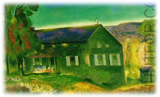
George Bellows was the representative of American realism. He was born in Ohio, still, the vast majority of his works were devoted to and created in New York. In spite of his talents in sports, his true love was art, and he found it necessary to develop his skills in art. His Black House is a perfect example of functionality trend.
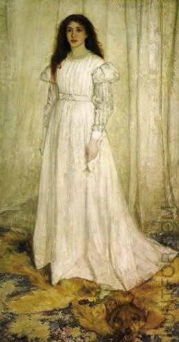
Whistler’s American roots made him one of the most famous British painters. His attempt to use the idea of simplicity provided people with a chance to accept the reality as it is without any other improvements.
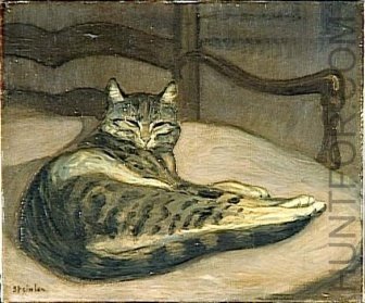
Steinlen is the French Art Nouveau painter whose ideas and methods deserve attention due to their loss of integral subject. The possibility to enjoy the harmony of an idea seems to be a brilliant approach to contribute to the field of graphic art.
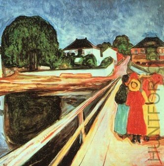
Munch was an important figure in Expressionistic art. He was born in Norway, got education in an engineering college, however, a serious illness interrupted his education. With time, he made a decision to become a painter, and his works serve as the main proof of the correctness of his decision. He took the already known backgrounds and ornaments and introduce his own vision of the image.
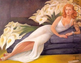
The example of Mexican talent is observed in the work by Rivera. Simplicity of the forms helps to underline the beauty of the image.
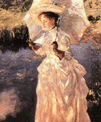
The success of the American painter may be based on his well-round education in German and Italy or on his in-born talents and abilities to use watercolor.
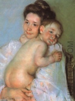
Female positions and ideas were successfully introduced by a French painter and printmaker from Pennsylvania, Mary Cassatt. Her works show how it is possible to combine functionality and simplicity to represent a perfect image from real life.
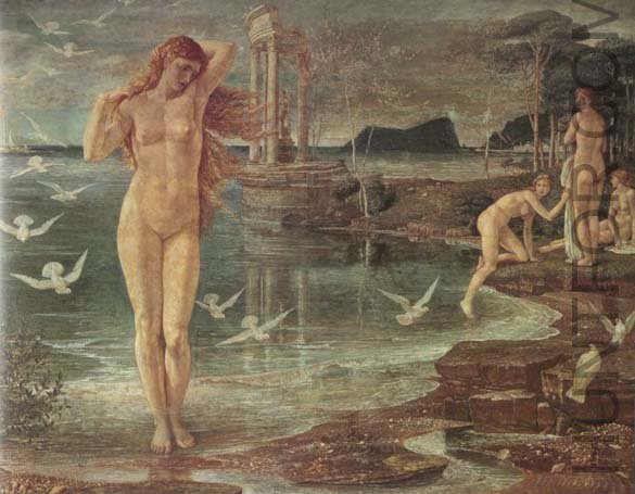
The example of paradox and montage trends is observed in the works of an English artist, the representative of Crafts movement, Walter Crane.
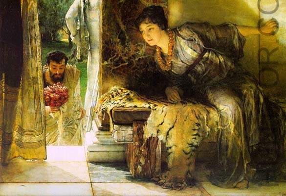
The Victorian painter from Belgium, Sir Lawrence Alma-Tadema, became a famous artist in London due to his abilities to depict the luxury and underline the interiors.

The works of this typeface designer are recognized in different spheres, and his contribution to literature deserves much attention. Eric Gill was a British designer who introduced Perpetua in its proper way. His idea to combine letters with images in a new style became a captivating discovery of the first half of the 20th century.
Timeline 1: Works of the Second Half of the 20th Century
Trends of the Period
The second half of the 20th century is also known as the postmodern period. The peculiar feature of this period in graphic design is that artists, painters, and designers did not want to consider the importance of rules and made everything possible to demonstrate personal attitude to the already formulated ideas. The main trends of this period are as follows:
- Unnecessary connection between form and function: now, it is not obligatory to follow each detail of an image and consider its function but it is more interesting to neglect the idea of functionality.
- Lack of cultural difference in the works of art: the process of globalization (Heller 193) made many people forget their roots and neglect the importance of their own cultures in order to meet the expectations of the audience who is ready to break the rules.
- De centering of a subject: artists want to underline the importance of indirect themes in their works and make the public consider various aspects of the image offered.
- Complexity of the forms: it is more captivating to integrate several ideas, several images, and several forms and introduce one image with the help of which the idea of design is interpreted (Poynor 62).
Works and Designers
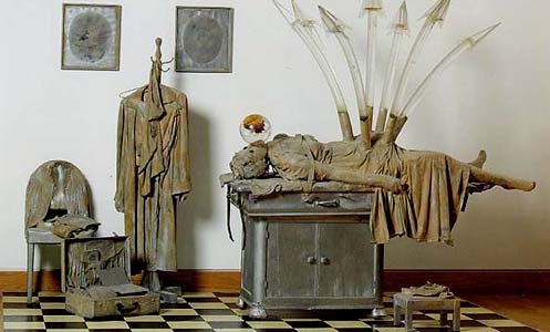
The paradox of the ideas of this American artist made him recognizable within a short period of time. He tried to underline the complexity of modern life and human inability to control it properly.
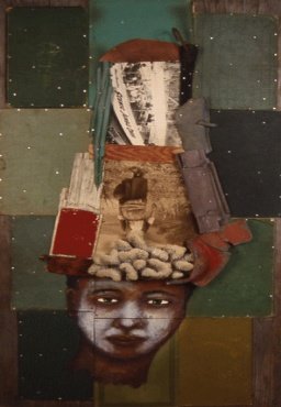
Various ideas are offered by the painters and designers from postmodernism era. Saar is the representative of African-American visual assemblage. In his works, he underlined the complexity of modern life and the necessity of human mind to accept huge amounts of information.
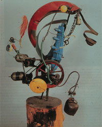
Tinguely was a Swiss painter, sculptor, and the developer of kinetic art in a variety of Dada traditions. De centering of a subject was probably the main idea supported by the creator in his work Baluba III. What he tried to present is a complex image that promote the power imagination of the public.
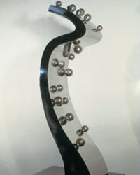
The Belgian sculptor offers his ideas in various forms, and one of them is the eternity of the modern life. It is hard to define the beginning and the end, and the works by Bury reflects this idea in a good way. People cannot always stop the moment and enjoy it to its full extent, and the attempts of Bury show that the moment may be caught.

Another attempt to explain the complexity of life and human choice was made by the kinetic sculpture from the USA. His idea to use the definite forms and unite them into something abstract attracted the attention of many critics and made the sculpture popular in the chosen field.
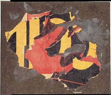
The achievements of an Italian artist, Mimmo Rotella, are known around the whole world. His decollage and psychogeographics works improve considerably the idea of poster presentation. Though not all his works are understandable to the public, his contribution is still regarded as crucial.
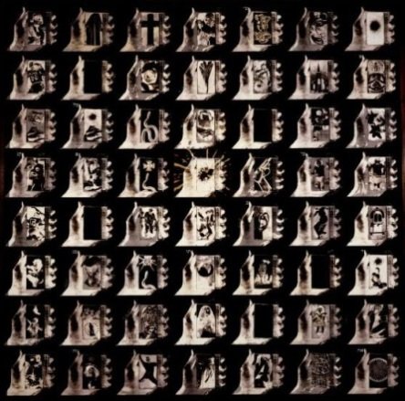
The works by an American West Coast Visual artist introduce the idea of repetition that is noticeable in everyday life. His attitude to the art makes it possible to understand that de centering of an image is not an obstacle in postmodern art but a possibility to define a variety of aspects of modern continuity.

A Swiss artist from Romania contributed a lot the sphere of art in the second half of the 20th century. He showed how the trend of complexity of the art forms may be disclosed in the vast majority of his works. It is not enough to pay attention to one subject only but try to integrate several various ideas into the one whole.
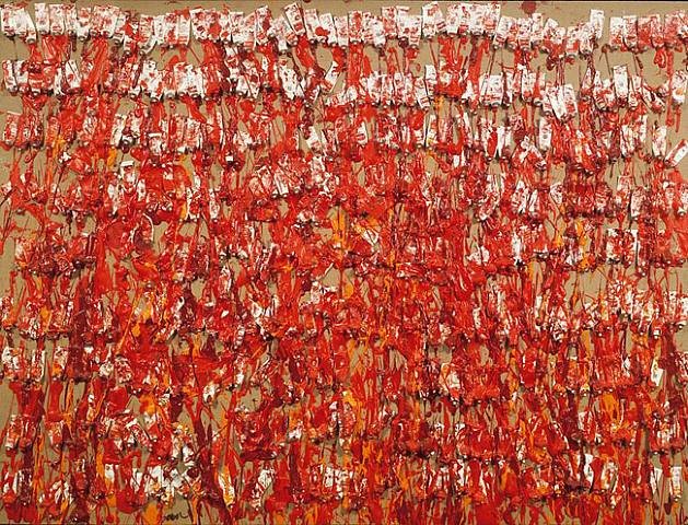
The French-born artist became popular in America. He used art objects as paintbrushes in order to organize the process of painting itself. The more objects are considered in one work, the massive the whole image is.
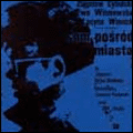
The peculiar feature of many works of this artist is the attention to folk forms of art and the desire to promote inspiration in the public. The typography field introduced by the designer was characterized by the possibility to change forms and to create the reality that has to be accepted.
Works Cited
Arntson, Amy. Graphic design basics. Belmont, CA: Cengage Learning, 2007. Print.
Barnard, Malcolm. Graphic design as communication. New York: Routledge, 2005. Print.
Heller, Steven. The education of a graphic designer. New York: Allworth Communications, 2005. Print.
Meggs, Phillip, B. and Purvis, Alston, W. Meggs’ history of graphic design. Hoboken, NJ: J. Willey & Sons, 2006. Print.
Poynow, Rick. No more rules: Graphic design and postmodernism. London: Laurence King Publishing, 2003. Print.