Introduction: Spatial Design in Hotel Industry in the XXI Century
Hospitality industry faces a number of challenges. On the one hand, it is necessary to make customers feel at home; on the other hand, the services must surpass all clients’ expectations. Because of the necessity to satisfy the clients’ needs, in the XXI century, urban design in general and hospitality design in particular has been directed at perfecting function instead of working on form. However, because of the customers’ increasing demands and the opportunities that technology provides, the need to combine perfect functioning with original forms has arisen, which the design of Dorchester, Mandarin Oriental and Brown’s display.
Spatial design definition and specifics
Spatial design in general is quite a broad concept. It is traditionally defined as “an essential creative activity within planning processes and as a core capacity and skill of planners” (Oosterlynck et al., 2010, p.87).
Hospitality industry in the XXI century
At present, hospitality industry is based on the principle of customer satisfaction. Therefore, the focus is on comfort and the availability of facilities (Boella and Goss-Turner, 2013). Nevertheless, many luxurious hotels tend to experiment with their design and combine unique look and functionality. Thus, the tendency to search for balance between form and function for the sake of helping the visitors feel at home becomes evident.
Literature review
The problem of spatial design in urban setting, particularly in the hospitality field, is a major issue in the XXI century (Pizam, 2012, p.17), just as it used to be several decades prior (Trancik, 1986, p.11). Urban design used to be rather formal; it was only at the end of 1990s that major changes started occurring due to technological breakthrough (De Vries, 2006, p.197). However, with the advent of the Modernist style, the idea that form should follow function emerged (Oosterlynck et al., 2010, p.86). Its father, Louis Sullivan coined the key principles of urban design (Royle et al., 2013, p.118) and spawned the development of various branches of design (Royle et al., 2013, p.54). The difference of design choices based on their purpose shines through in the hospitality field especially (Boella and Goss-Turner, 2013, p.212). In the XXI century, famous hotels aim at two key goals, which are dazzling the visitor with their rich exterior and interior and making the customer’s stay at the hotel as pleasant as possible (Gustav, 2013, p.88).
Therefore, hotel designers do everything possible so that unusual form should be closely related to function, as well as creating unique microclimate of stability and trustworthiness (Schiller and Evans, 2006, p.31). The task has become easier as an impressive amount of flexibility was introduced into the urban design (Beirão and Duarte, 2009, p.7). It has become possible to merge several styles into a single composition (Helper, Wallach, & Helper, 2012, p.73); for example, a mix between futuristic and office style designs has become possible (Irwin, Gitelman & Hoeting, 2007, p.202). Nevertheless, the balance between form and function remains a dilemma for designers, especially concerning the hospitality field (Brooker and Weinthal, 2013, p.118). To research the problem, a case study was carried out. Based on sampling (Thompson, 2012, p.8) of the participants’ answers and on observations of hotels and hotel rooms, suppositions regarding the efficacy of modern hotels design were provided.
Thesis statement
Despite the fact that form is still an important concept of the spatial design of hotels and other elements of hospitality industry of the XXI century (Gustavo, 2013), the decisions regarding form and design in general are clearly related to the principle of usability, flexibility and comfort. While the given tendency does not allow for avant-garde and exotic solutions for urban architecture design, it still provides some room for experimenting, the idea of drifting away from the five traditional principles of urban design grammar being the first and the most important step. On the one hand, the idea of shaping such important concepts as permeability, vitality, variety, robustness and legibility (Schiller and Evans, 2006) may seem a somewhat risky step. Indeed, the five concepts embrace everything that makes urban design so reliable and stable is rather unreasonable. However, following these concepts blindly is what makes most urban houses look the same. With the Mandarin Oriental Hotel, the Dorchester and the Brown’s Hotel, an entirely new principle has been introduced, allowing the designer to experiment with the five principles of urban design. Defined as originality, this principle has clearly created the premises for building the epitome of splendor in the midst of concrete and glass.
Research Tools and Methodology
Methods: qualitative research
As for the research design, the qualitative method can be suggested as the most reasonable approach for the exploration of modern urban design choices in the hospitality service. In order to evaluate the strategies that modern architects use when designing the interior and exterior of hotels and other buildings used as the premises for the hospitality related services, a comparative analysis of designs of several major English hotels will be used. In the course of the analysis, the overall layout of the buildings, as well as the design of their interior and exterior will be evaluated and compared. In addition, the purpose of the designing choices, as well as the common threads with the designs of the buildings and their rooms will be considered. It will be also imperative to analyze the correlations between form and function in the design of the hotels and their rooms. Thus, it will be possible to define whether form follows function in the design of the hotels chosen for the analysis.
Theoretical background
The research is going to be based on Sullivan’s principle of form following function, which was suggested in the XX century, and a more recent approach towards architectural forms analysis, including Biomimicry. It should be noted, though, that the emphasis is going to be put on Sullivan’s theory, seeing how the XXI century concepts have not yet transformed into a self-sufficient theory (Ásgeirsdóttir, 2013, p.4).
The Secrets of Hospitality Industry
One of the key features of hospitality in the XXI century, its flexibility should be mentioned. Seeing how at present, functionality defines stylistic choices, flexibility clearly makes the bulk of urban design, especially the design of entertainment premises. Flexibility is traditionally defined as a “flexible approach towards the specificity of designing urban spaces” (Beirão and Duarte, 2009, p.492)
Spatial Design, Its Purpose and Taxonomy
Types of spatial design: architecture basics
As a rule, four key types of spatial design are traditionally available for defining the possible stylistic choices, analyzing the needs of the potential customers and providing them with the facilities that they need. The census spatial design (2.4.1.2 Census spatial design pros & cons, n. d.) presupposes a thorough description of the location of the object in question. The so-called model based spatial design (Royle et al., 2013, p.289) is based on the necessity to evaluate the parameters of coefficients of a particular model, which will later on be utilized as the standard to compare the results with. The survey method (Thompson, 2012, p.307), in its turn, has little to do with actual survey and means that the selection of locations within the chosen domain has been randomized. Finally, the opportunistic design means that the selection of the area in question is based on its accessibility. Each of the aforementioned types of design is represented in the design of the hotels that will be considered below.
Functions of spatial design
It should also be noted that spatial design has a number of functions, the provision of comfort being only one of them (De Vries, 2006, p.17). Others include ceremonial and aesthetic functions (Brooker and Weinthal, 2013, p.80).
Spatial Design in Hospitality Industry: Important Observations
As it has been stressed above, the choices of a particular spatial design and a certain arrangement of the elements of an interior and/or exterior affect the way in which people feel when being in the building in question. The given fact must be taken into account when arranging the elements of interior and exterior of hotels, restaurants, bars and other places that people chose to spend their leisure time in. Irwin, Gitelman and Hoeting make it obvious that design in hospitality industry pursues the goal of making the customer feel comfortable (Irwin, Gitelman & Hoeting, 2007, p.11). Another goal that the hospitality industry is targeted at is leaving pleasant memories in customers and, therefore, making the clients want to return. Hence the third goal of attracting more customers with its grandeur stems from (Pizam, 2012, p.351).
Finally, the hospitality and entertainment industry clearly attempts at exploring diverse forms of creativity, aesthetics and intellectual expression. Therefore, every single element of spatial design in the present-day hospitality and entertainment industry is aimed at making customers feel both comfortable and excited to keep them returning again and again (Helper, Wallach & Helper, 2012, p.21).
Examples of spatial design and their description
The Dorchester Hotel
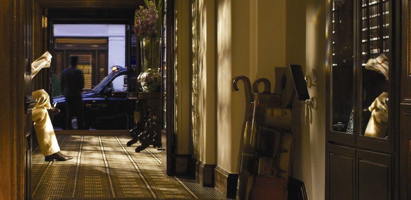
One of the most spectacular buildings in London and the most luxurious hotels in the entire world, the Dorchester Hotel incorporates a number of rather interesting and quite unusual design choices. When casting the very first glance at the hotel interior and exterior, one will notice the fact that its designers were clearly aiming at leaving the visitors astonished. One will literally stand in awe in front of the building when noticing its chic and luxury.
To start with, the shapes chosen specifically for the given hotel design are worth being said a couple of words about. As one may notice easily, the hotel designers made a very efficient use of density, shrinking down spacious rooms visually to create the illusion of coziness and comfort. For example, the use of arches in the hotel interior allows for splitting a spacious room into several smaller zones and, therefore, helps the visitors feel secure. The picture below demonstrates a very efficient planning of the Dorchester Hotel bar, with arches zoning the room.
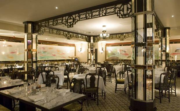
Another important element of the interior design of the hotel, the color cast adds to the depth of the room. Combined with a very peculiar lighting of the rooms, with a very well lit ceiling and a comparatively darker floor, the given element of the interior creates a comfy atmosphere. The density of the elements in hotel rooms, in its turn, might conflict somewhat with the overall feel-yourself-at-home atmosphere, which the Dorchester Hotel designers were obviously trying to create.
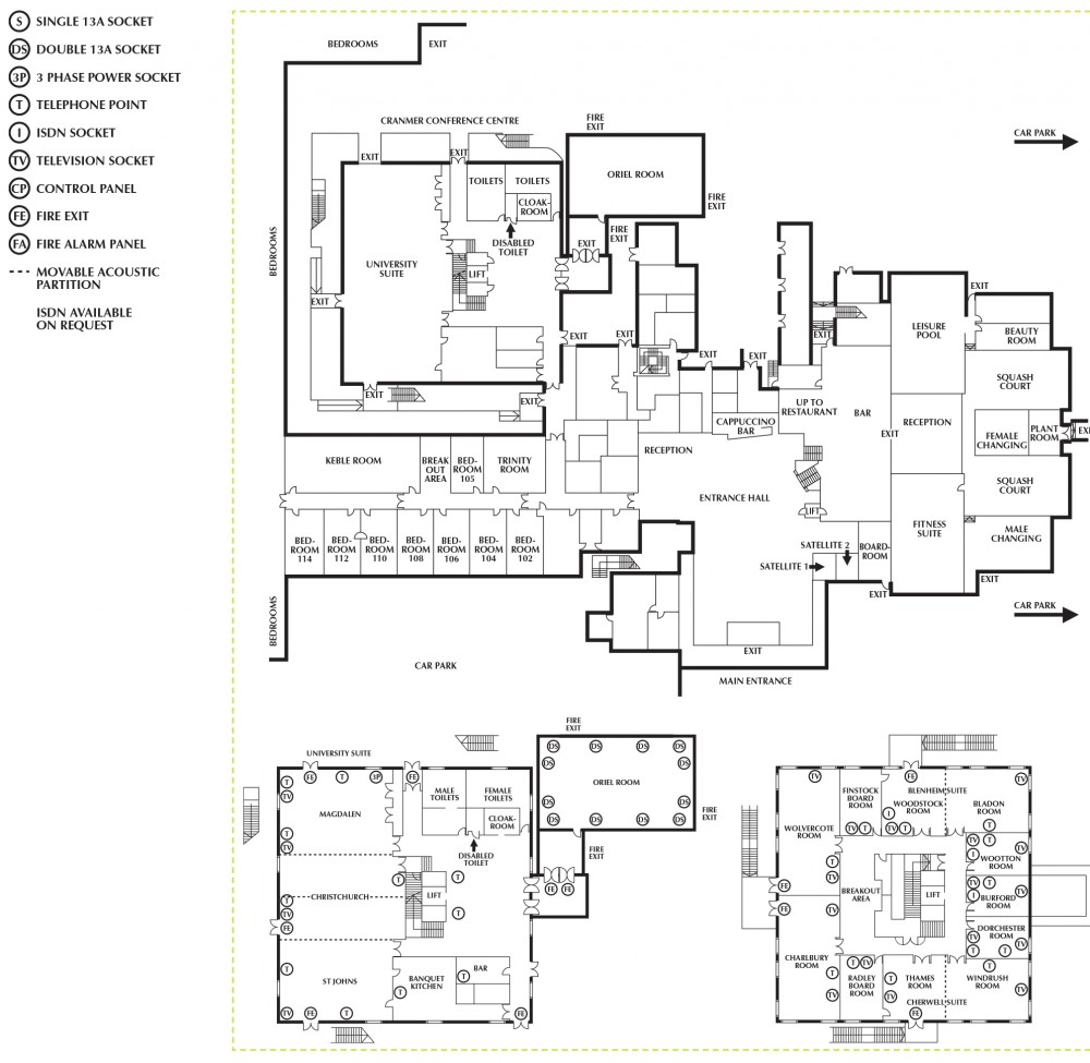
However, because of the specifics of lighting mentioned above, the spaciousness of the hotel rooms is not only compatible with the overall concept of the place, but also aligns with the idea of feeling at home that the hotel managers are trying to promote. According to the hotel price list, feeling comfortable is quite expensive – spending a night at Dorchester will cost £245 with daily delegate rates of £95 for the room service (Dorchester Hotel, n. d.a), a three meal course, Wi-Fi internet access, and a number of other facilities. It is remarkable that the hotel administration charges comparatively little for the additional services that it has to offer. The high price is predisposed by the fine quality of the services provided, as well as for the improved service standards based on the use of the latest technology. For instance, “the latest business and entertainment systems, in rooms and throughout the hotel” (Dorchester Collection, 2014, para.1) are provided according to the official description. Dorchester seems to put all the stakes on creating the feeling of comfort in customers, which seems to work rather well for the company.
Mandarin Oriental Hotel
Another peculiar specimen of spatial design in hospitality services, the Mandarin Oriental Hotel is both similar to the previously described case and different from it. It is similar in that it tries to create the same homelike atmosphere and help its guests relax and enjoy their time; the means that the hotel designer has chosen for the given purpose, however, are quite different from the Dorchester case. To start with, the Mandarin Oriental Hotel is located right next to the Hyde Park, which already sets this building apart from any other hotel in London.
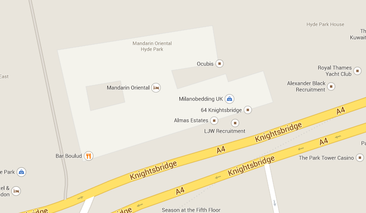
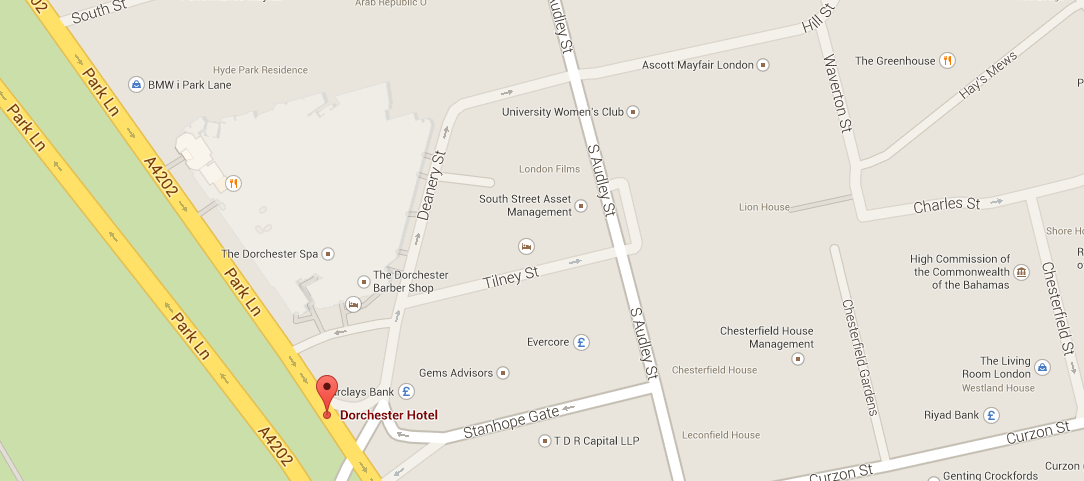
As the map shows, the hotel is also very close to the Knightsbridge. The proximity to the Park and the key communication lines makes the location of the hotel priceless. The Dorchester Hotel, which is located next to the Park Lane, is also favored greatly because of the proximity to the famous street.
In addition to a rather unusual location, the hotel is designed in an Oriental style, in contrast to the Dorchester Hotel described previously. While in Dorchester, the emphasis was obviously put on the homelike atmosphere and the delicate – and quite successful at that – attempt to help the customer feel at home, the Mandarin Oriental Hotel is designed for the clients to feel privileged to be here. As if carved from a picture in a book of fairytales, the Mandarin Hotel is designed to please the eye, and only then to delight the visitor’s tactile senses. Unlike the Dorchester brownish and gold exterior, the one of Mandarin Oriental is designed in a combination of lilac and gold.
Thus, the impression of wonder and uniqueness is created. Moreover, unlike Dorchester, the style of which can be defined as a successful marriage of the Modernist and the Neoclassical ones, Mandarin is a mix between Gothic shapes and arabesque ornaments. The peaks and borders add even more complexity to the overall unusual design, with numerous elements protruding from the front. The hotel looks just as unusual on the inside; its interior is posh; its rooms are very spacious, and both the elements of décor and furniture are arranged in a very symmetric manner. The symmetry, however, often creates a rather hostile atmosphere; though every piece of ornament or furniture is luxurious, they are quite unwelcoming. While the design of Dorchester relies on the power of English tradition, in the given case, every single element of the exterior is anything but traditional, which the architect was obviously targeting at. The prices are quite reasonable, though, £300 for a room (Mandarin Oriental, n. d.).
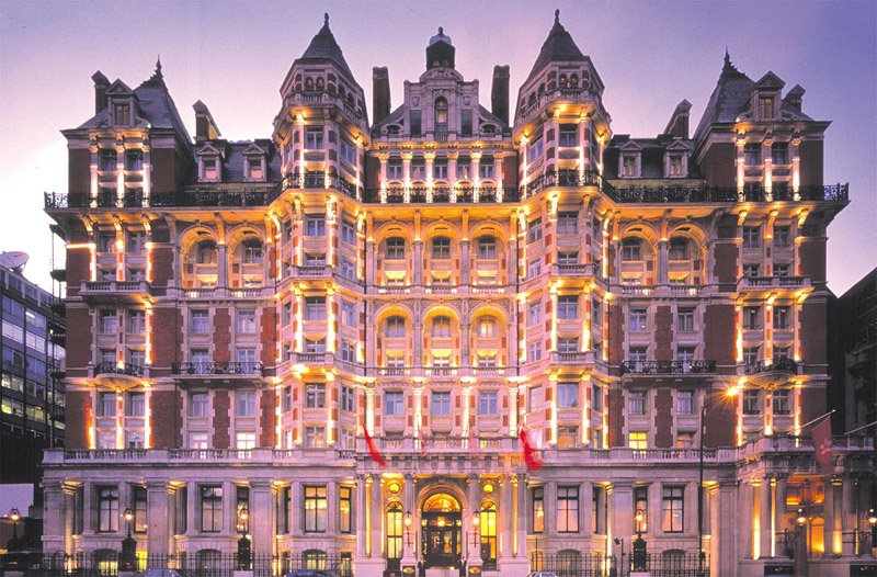
The functions of Mandarin’s design elements are, however, very close to those of the Dorchester hotel. Much like the latter, Mandarin makes clients feel comfortable; it is just that Mandarin’s customers appreciate the entertaining aspect of comfort more than they do the restful one.
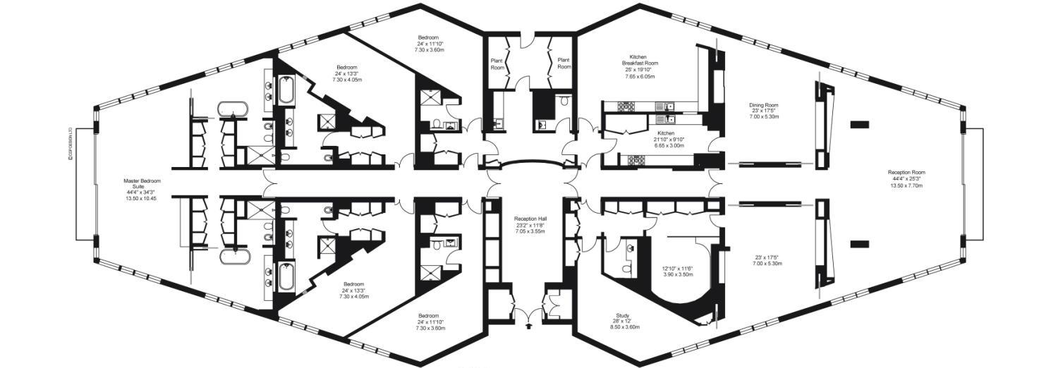
Casting a glance at the interior of the place, one must note that Mandarin uses light in a completely different way than Dorchester does. While the former used light as the means to zone the premises and, therefore, add depth where it was needed, as well as change the proportions seemingly, Mandarin uses light to make the visitors gasp in awe. Mandarin does not have anything to shove into the shadow, and the way in which the hotel and its halls are lit is a graphic example of that.
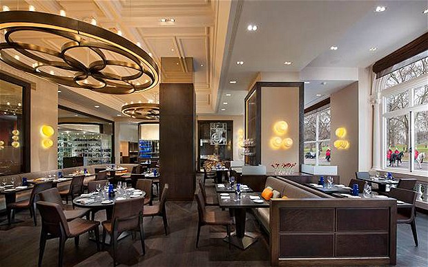
The same cannot be said about every single facility, however; even with their need to shock people into paying attention, designers decided to provide the customers with an opportunity to feel at home, which can be traced in the elements of décor used for lobbies, restaurants and other hotel facilities.
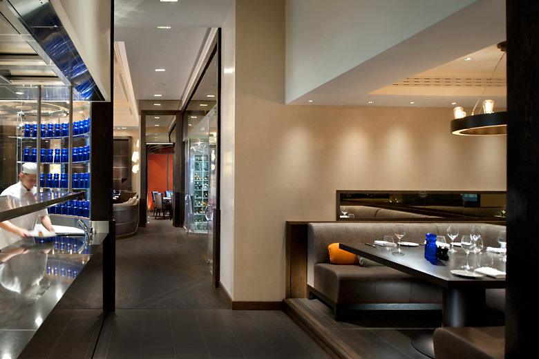
Nevertheless, the refusal to use shadows in order to zone the premises and create a specific atmosphere can be noticed. The designer of the hotel was clearly trying to convey the idea of grandeur of the hotel by stressing how spacious and huge it is, yet the means that the designer has chosen also create an impression of emptiness and loneliness, which drives the charm of the Oriental aesthetics nearly to zero.

As the illustrations above show, the Mandarin Hotel clearly puts its every stake on the spaciousness of its rooms and the chic of its decorations. While a lot has been done to make the guests feel privileged and create truly posh environment for them to dive into, seemingly little effort has been put into making the guests feel at home by adding the details that the guests would relate to their home environment. For example, most of the large rooms have not been zoned; as a result, the guests may feel the lack of private space. Moreover, the lack of smaller zones metonymically makes every guest a small element of a large crowd, therefore, making them feel less special and dissatisfied with the services.
The lights, the density, the depth and the proportions of the rooms show clearly that the Mandarin Hotel wants to astound its visitors with the Oriental luxury, while the design does very little to create the feeling of safe and homelike atmosphere. In some way, the given intention is quite understandable, seeing how every single element of the design shows clearly that the authors wanted to create a fairytale – and, much to their credit, they succeed. The plot of this tale, however, does not seem to revolve around the customers’ comfort as much as it leaves an impression of witnessing a miracle.
Brown’s Hotel
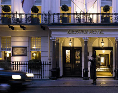
The last, but definitely not the least object of the analysis, the Brown Hotel also creates a unique atmosphere in order to attract more customers, and its design plays a very important part in the way that the hotel conducts its customer satisfaction policy. Also a five-star hotel, which means that it not only meets all basic requirements, but also has a number of additional facilities, such as luxurious accommodation, a wine list, public areas, etc. (Johnson & Clark, 2008, p.24), the given place hardly differs from a range of other hotels. True, it looks very expensive, yet the design clearly serves a very practical purpose in the given place, with the focus clearly being on the customers’ comfort. The entrance to the hotel, for example, though admittedly beautiful, still does not stand out of a huge range of other entrances; as a result, the customers do not have the feeling of entering a completely different world once they cross the threshold of the Brown’s Hotel. In fact, for a luxury hotel, it feels nothing out of the ordinary – true, the elements of its design are extremely expensive, mostly because they incorporate rare materials and the latest technology, yet they seem to be an integral part of London’s mundane life, which is not necessarily a good thing.
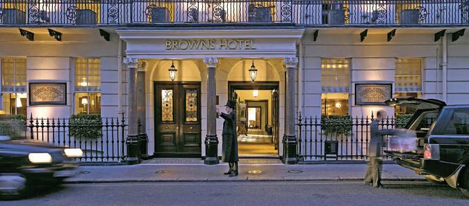
Other elements of the hotel design are also quite peculiar. As it has been stressed above, in hospitality design, customers’ comfort is the top priority, which is to be pursued at all costs. Sometimes compromises can be made for the sake of keeping the style of the hotel unique, like it was with the Mandarin Hotel, where the emphasis was clearly on the unusual look of the place; however, for the most part, every single member of the hospitality sphere attempts at making the clientele feel at home.
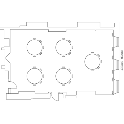
With the advent of innovational urban design and the refusal to return to traditional shapes, however, the task of satisfying the customer has become much more complicated. As a result, the Brown’s Hotel designer clearly decided not to take chances and followed a relatively standard principle of urban designing. In the long run, the Brown’s Hotel can be viewed as the golden middle between the coziness and the lack of originality of the Dorchester Hotel and the luxury of the Mandarin Hotel. However, in contrast to the two hotels mentioned previously, the design of the Brown’s Hotel displays a very reasonable use of space and, therefore, is an example of how dense a hotel room should be.
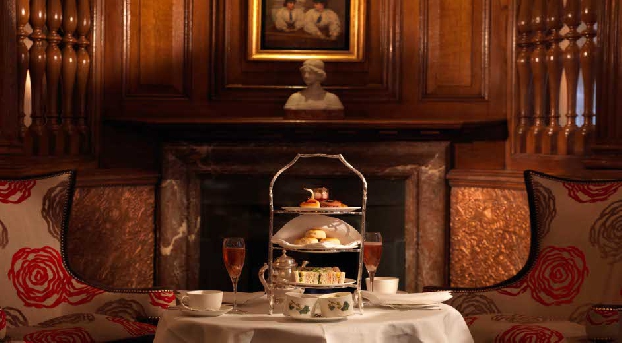
As the example above shows, the density of the room space is quite acceptable; it does not create the same snug and nearly claustrophobic feeling in its visitors as the Dorchester Hotel rooms do, and neither does it leave an impression of emptiness that the Mandarin Oriental Hotel, with all its grandeur, does. It is quite clear that, apart from allowing its visitors to feel like snuggling in a plaid and feeling warm and cozy, the designer of the hotel also made certain that the guests should have enough personal space. Indeed, compared to the zoning of the rooms in Dorchester, the Brown’s Hotel clearly leaves more than enough space for its visitors to have. Unlike Mandarin Oriental, though, Brown’s does not use its spaciousness to amaze the customers; instead, the additional space, which the hotel designer planned very carefully or every single room, helps clients feel that they have enough room and that their personal space is appreciated.
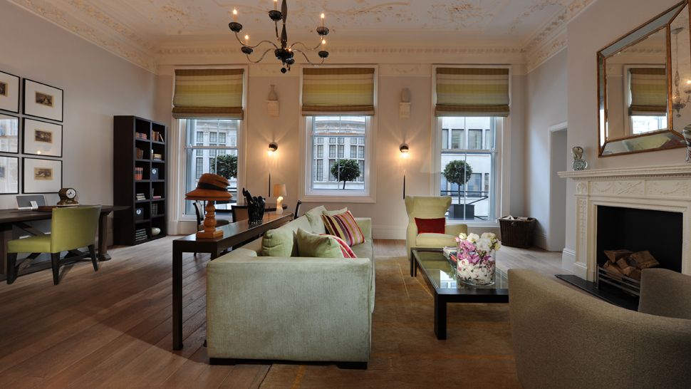
The proportions of the elements in each room are also worth being noted. It is impressive that every single form serves its purpose in the given design and that none of the shapes has been chosen without thinking. To start with, the concept of comfort and coziness, though not shoved in the clients’ faces as in Dorchester, is stressed by the use of predominantly round shapes in the interior. Indeed, there are little to no sharp angles in any of the rooms; even the edges of beds and tables are fairly round, with smooth curves and little to no sharp angles.
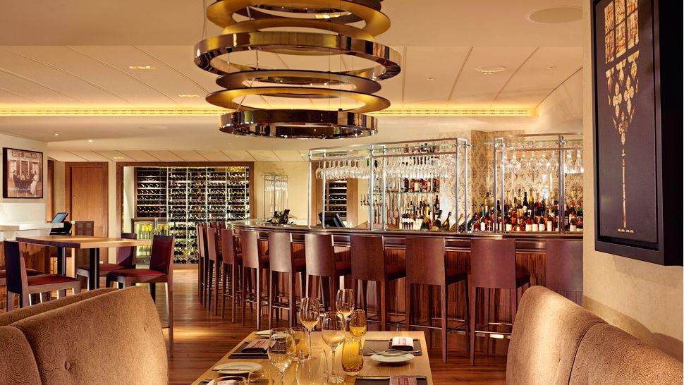
The proportions of the objects located in the hotel are also rather traditional – there are no grad scale elements as the Mandarin Oriental Hotel has; much like the Dorchester Hotel, Brown’s tends to place its customers in a traditional realm of British environment. The same can be said about the proportions of the building’s exterior. For instance, the use of cornices in the building design is evidently the calling card of the designer. The given detail, however, was not added thoughtlessly to the overall concept of the building; instead, it was used for a particular purpose. To be more exact, cornices were added to make the building look more homelike and, therefore, more attractive to the potential customers.
Seeing how family is traditionally considered one of the key values for British people, the emphasis on homelike look was made to not only make the visitors feel more comfortable, but also to sell the legend concerning British people’s obsession with traditions to the customers. This is an admittedly clever idea; according to the existing marketing theories, a product enjoys much greater popularity when it is backed up with an interesting legend. Therefore, instead of merely buying a room at the Brown’s Hotel, a customer buys the serenity of the British life, the solidness of British traditions and the uniqueness of British customs. The Brown’s Hotel, therefore, is a perfect mix between originality that can attract more customers, the cushy feeling that will make them stay longer and the reliability and safety that will keep the customers return again and again, and the credit for these achievements definitely goes to the unique urban design of the place.
List of key features of hotel spatial design
Judging by the observations listed above, the designers and owners of hotels and similar establishments in the entertainment industry pursue three key goals, which are making the customer feel relaxed and comfortable, striking the customer with the luxury and the chic of the establishment, and, therefore, making the client feel the center of the Earth.
The design of the interior and exterior, as well as the subtle messages that are planted into the shapes, colors and forms, is not the only the means to make visitors feel like returning to a particular place. There are also a number of elements of design that might seem less important in terms of the subliminal messages that they convey, but often appear to be crucial in shaping people’s impressions about a hotel, restaurant, lounge bar, etc. In other words, the provision of facilities provided to the clients and the integration of these facilities into the design of the premises is another essential task of a designer. It should also be noted that hotel design is not the only field in which the need to attract the customers’ attention and provide them with comfort and decent services is the key purpose of the designer and the reason for the major designing solutions.
As one might have noticed, designers have to keep a lot of information regarding the needs of the customers in their mind when working on a certain building; moreover, a designer must find new avenues to introduce the services to clients and at the same time make sure that the atmosphere is not affected. For example, it would be absurd to see an air conditioner in a restaurant that has been stylized to look like a medieval inn. Therefore, a designer has to search for the means to either mask the given facility as an element of decorations, or to replace it with a similar device, which blends into the design of the building much easier. Such challenges are extremely hard to deal with, yet they are an integral part of the working process of an urban designer. Among the key challenges of the latter, the ones listed below are considered the most complicated to handle.
Functionality and form
As it has been explained above, in the XXI century, the significance of form subsided, making room for functionality. In other words, the focus of the XXI century design is on whether the customers will be able to feel relaxed within the environment created by the designers. As a result, functionality of the elements of design seems to be the top priority of the present-day specialists.
However, in the era of new technological advances and a steep rise in the number of opportunities regarding the stylistic choices, as well as the choice of material, the return to not the prevalence of form, but its significance and the necessity to experiment with it can be observed. As the examples shown above testify, form is gaining significance slowly but surely, and hence the need to create original designs that serve a particular purpose arises. Every single stylistic choice must be justified and the designer must be ready to answer the question why a particular avenue was chosen to create a certain element of a building.
Space and atmosphere
Judging by the examples of the Dorchester Hotel, Mandarin and Brown’s, when choosing a particular hotel, restaurant, café, or any other public place, people pay a great deal of attention to the atmosphere that the design choices contribute to.
Time and scale
As complicated the process of designing a hotel or a restaurant is, it still results in the creation of a building that will be standing in its place years after it was built. In some way, designing a building, especially its exterior, is very close to creating a work of art; it will stand the test of time and will not be destroyed, demolished or wiped off the face of the earth a couple of months after it was built. The same cannot be said, however, about other elements of urban architecture, such as weddings, exhibitions, or any other event that takes place in the open air. As soon as the event is over, the design choices that a professional was working on for so long will be destroyed or at the very best taken apart in order to put them together hastily as soon as a similar event of lesser importance will take place. Therefore, it is emotionally devastating to create the works that are to be demolished in a couple of months, weeks or even hours.
Stylistic differences depending on the purpose.
As it has been stressed above, most representatives of the hospitality and entertainment industry aim at providing their customers with maximum comfort and making the clientele feel at home within different setting. However, different elements of entertainment and hospitality industry have slightly different goals, which is also to be taken into account when implementing a particular plan on urban design. For instance, such places as restaurants, cafes, receptions, etc., have different objectives and, therefore, must use appropriate stylistic choices in the design of their facilities.
Clearly the most complicated task of all, the design of a wedding ceremony depends on a number of factors, starting with the preferences of the couple and down to such basics as the number of people invited and the budget allowed to spare. However, when it comes to the actual demands regarding the design, couples are usually very vague on their wishes, leaving it to the designer to choose the elements required for making the wedding look neat.
In contrast to other works that a designer is traditionally assigned with, i.e., restaurants and hotels design, weddings pursue the goal of making the event memorable. While for hotels, bars, restaurants, exhibitions, etc., it is crucial to shock, thrill or excite the viewer or the customer into paying attention, for a wedding, it is important to be festive and leave a memorable trace in the lives of the newlywed. Therefore, the stylistic choices are a bit different for the given event.
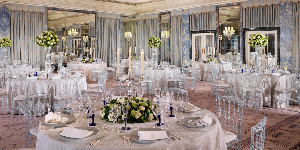
While it would be wrong to assume that the concept of comfort is taken out of the wedding ceremony completely, it is necessary for a designer to keep in mind that, in contrast to the hospitality sphere, a wedding ceremony puts the stress on the effect that it has on the guests, whereas comfort is being pushed to the bottom of the priorities list. Hence the basic choices for wedding ceremonies design come from. As a rule, wedding ceremony design is restricted to the traditional decorations and the arrangement of chairs and tables that is quite similar to that one offered in hotel restaurants. For example, Dorchester offers a very festive yet typical manner of decorating the premises, which one can easily expect to see in any wedding feast.
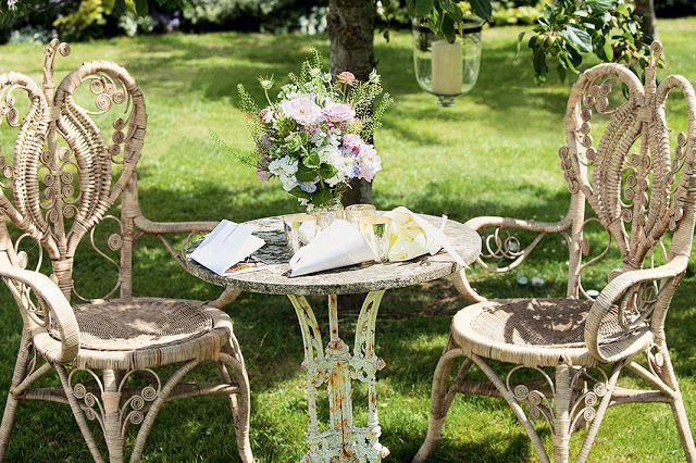
Sometimes, wicker chairs are used instead of usual chairs, especially if the ceremony takes place in the open air. While usual chairs are more traditional, wicker chairs are used more often nowadays, which is the prime example of a function being more important than the form. Indeed, it is much more comfortable to be seated in a wicker chair, especially in the open air, instead of sitting in a stiff manner in a usual chair.
To make the process of designing even more complex and exciting, new methods of marking the isle for the bride to go down are offered every day. Again, with a slight shift from functionality to form, the given solutions are quite elegant.
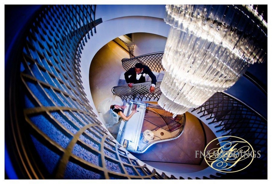
However, going down an uneven aisle with an adjacent stairs is quite problematic for a bride wearing high heels.
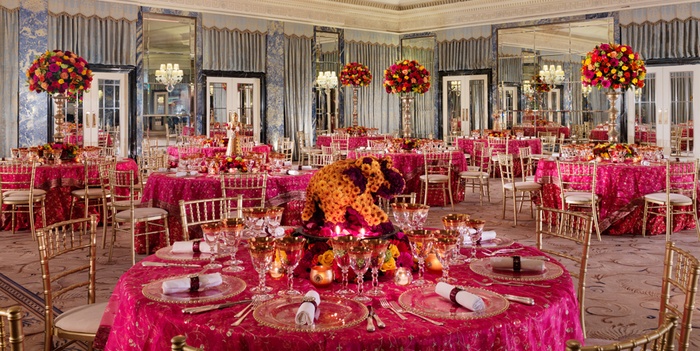
Unlike wedding ceremonies, in which the impression about the design and its aesthetics are much more important than the actual comfort of the services provided, in the design of such places as receptions, restaurants and cafes, the concept of comfort is put at the top of the designer’s priorities list in the same way as it is in hotel design.
Wedding at Mandarin is definitely different from the ceremony carried out in the Dorchester Hotel. Though clearly being equally expensive and glorious, the two hotels offer strikingly different designs in wedding fests. Much like the design of the hotel rooms, restaurants and other premises, the arrangement of weddings, though not exactly Oriental, is clearly aimed at making the event chic, luxurious and, most importantly, exotic.
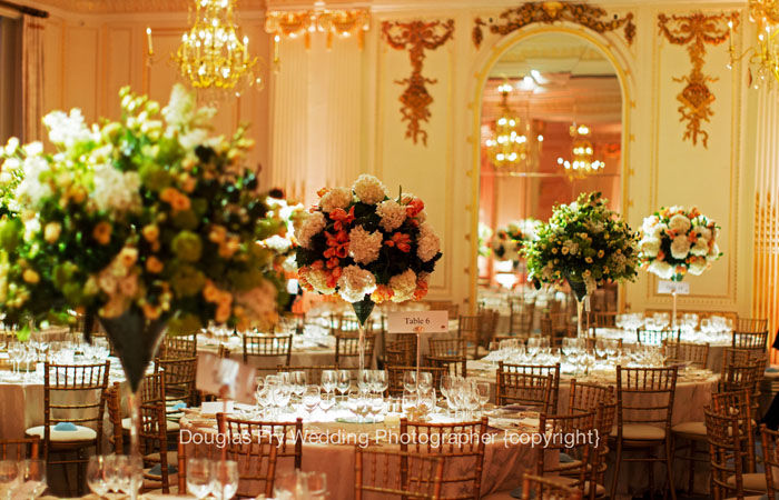
As the picture provided above shows, the wedding ceremony in the Mandarin Oriental Hotel differs from the one in the Dorchester wedding arrangement in the use of smaller details of décor. While the principle of tables arrangement remains practically the same, the designers in Mandarin use the elements of decoration that are immediately perceived as Oriental. For example, the red elements on the left and right from the opening, as well as the decoration above the opening, have clearly Oriental patterns and, therefore, leave an impression of a very exotic event taking place.
As far as weddings and receptions in Brown’s go, one must mention that the hotel claimed to be the oldest in London definitely has much to offer its customers in terms of festivity. However, unlike the Mandarin Oriental Hotel and Dorchester, the Brown’s Hotel manages to retain the atmosphere of comfort that the customers feel once they cross the threshold of the building. It is rather questionable, though, whether people actually need the air of security during a wedding. Indeed, with a number of guests having fun and many things going on, including music, congratulations, contests, etc., it will be quite difficult to notice the homelike atmosphere and give it credit that it deserves. Therefore, it seems that Brown’s puts too many stakes on its trump card and does not bother to explore other opportunities.
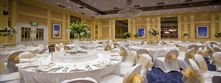
Moreover, the way in which the designer of weddings in Mandarin uses space and location is truly amazing. It would have been relatively easy to arrange a wedding in a hall; however, in some cases, the locations are mixed, i.e., wedding can be transformed from an indoor to an outdoor event, as it is shown in the picture below. It is quite remarkable that in the given case, light is used in a very reasonable manner, with an aisle that allows for making the premises well lit and spacious.
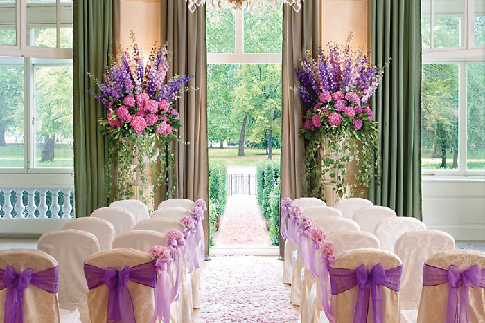
A couple of words must be said about the use of color in urban design in hospitality and entertainment industry. There is no secret that the color cast of the elements of urban life is not quite diverse and is usually restricted to pale and grayish colors. With the inclusion of rather gaudy elements like billboards, shop signboards and public transport advertisement, every single resident of a megalopolis craves for satisfying their need for aesthetic elements in their life. Luckily, the hospitality industry provides the given opportunity in ample quantities. Taking the aforementioned hotels as an example, one will notice easily that the color cast is very refined and well thought out, with all elements of the interior and exterior done and combined in impeccable taste. As a closer inspection of the three hotels in question shows, most of them tend to use yellowish, brownish and reddish palettes in order to enhance the atmosphere of restfulness and comfort. The Dorchester Hotel, for example, clearly intends to use yellowish and brownish colors with occasional use of blue and black in order to create the relaxing and comfortable atmosphere.
The same can be said about the Brown’s Hotel, where brown and yellow colors are also prevalent. It would be wrong to claim that the hotel designer uses solely the given palette – quite on the contrary, each of the hotels provides very graphic examples of how the choice of colors affect customers’ attitude towards the services provided. It would be wrong to claim that, with poor services, bad food, no Internet connection and rude staff, the cast of colors would save the situation; however, the designer’s choice to us the yellow and brown palette seems to have affected the way in which customers perceive the hotels. Seeing how these color choices are made within the boundaries of the “warm” color palette, it can be assumed that the yellowish and brownish designs of the hotel premises influence the clients’ mood, making them feel at home, which is the exact emotion that hotel design is meant to trigger.
Finally, the issue regarding the materials used for the design of the hotel premises and other elements of hotel design should be brought up. Like any other luxury hotels, neither Dorchester, nor Brown’s, nor Mandarin Oriental tend to save on the quality of the services provided to the customers, and the choice of materials used for the interior design is a graphic example of that. According to what the Mandarin Hotel descriptions say, Luke Hughes, who designed most of the Mandarin Oriental Hotel interior, decided to use a combination of oak and steel in order to create the place that would both look as an element of an exotic oriental environment and create the my-house-is-my-fortress atmosphere. Much to the designer’s credit, he succeeded in his plan; apart from stirring a range of emotions from excitement to awe with its incredible design, the hotel leaves an impression of a completely safe and very hospitable place.
Unfortunately, the abundance of decorations blows the design out of proportions; therefore, the designer failed to leave an impression of coziness in the visitors. The Dorchester Hotel also makes efficient use of traditional oak and upholstered headboards (What is the design style of the Dorchester?, n. d.). However, unlike Mandarin Oriental, Dorchester puts a very strong emphasis on its homelike atmosphere, with handmade carpets, floral fabric and antique furnishing. The choices made by Dorchester designer are much closer to the traditional British lifestyle. Thus, they will most likely meet the expectations of the people who have only read about Britain and, therefore, have a very stereotypical image of the state, its people and environment.
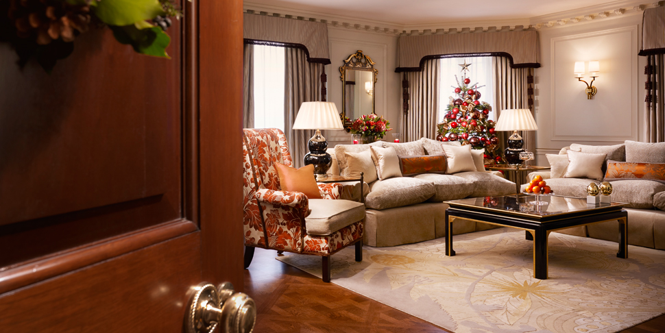
Finally, the Brown’s Hotel did not escape the traditional oak furnishing, either – the Donovan Bar is also filled with antique furniture and other elements traditionally associated with Britain, including wrought-iron banisters and stained glass windows. The key intention of Olga Polizzi, the designer, seems to have been the restoration of Britain as people knew it from Agatha Christie’s stories. Giving the clients a weird feeling of safety, confidence and comfort, the Brown’s Hotel clearly is a staple of the British culture for most foreigners.
Another peculiar choice for each of the hotels to go with is the idea of including marble into the design of the interior and exterior (CPP Luxury, 2012, para. 3). On the one hand, the given choice might seem somewhat dated, especially given the abundance of nonetheless beautiful materials, such as commercial stone.
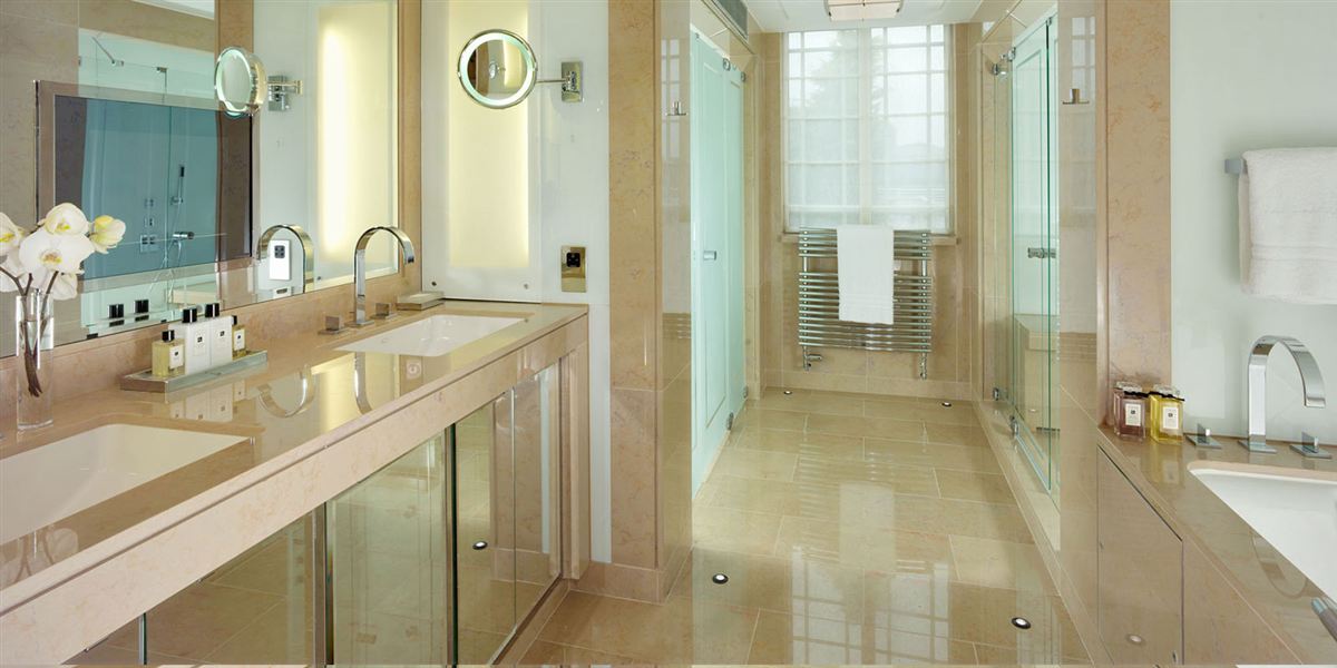
On the other hand, marble is relatively cheap, which means that the designer has more opportunities for saving money and using them to furnish the hotel in an impressive way. Indeed, with all its grandeur and the need to make her visitors stand in awe in front of the Mandarin Oriental Hotel, the designer decided to choose marble as the basic material for building the hotel. The decision to use marble was also based on the durability of the material – marble elements of the design will literally last for centuries.
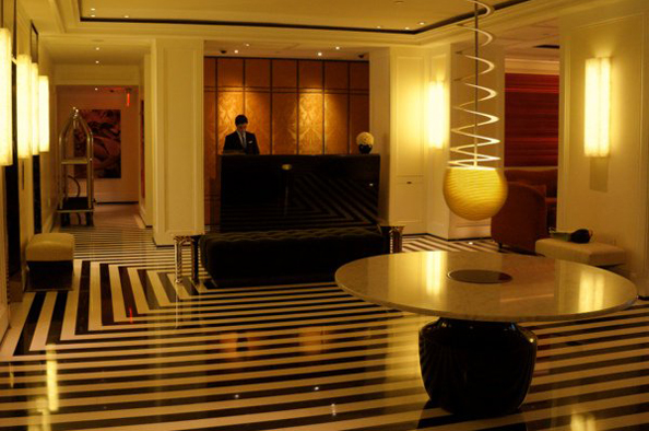
The same does not go for the Brown’s Hotel, though; without placing a strong emphasis on the durability of the materials used for the design of the hotel, parquet creates a unique atmosphere and at the same time looks much more impressive than marble.
Analysis of the Key Features and Trends of Spatial Design in Hospitality Industry
Reasons for spatial design choices: coziness and grandeur combined
Defining the key trends in the hospitality industry in the hotels in question, one must mention the fact that these hotels focus primarily on to things, i.e., the functionality of the design and the impression that it leaves on the customers. It is quite noteworthy that, despite the fact that in modern architecture, the need to stress the significance of function while drifting away from the concept of form has been recently heralded, the tendency to incorporate form and function has recently appeared.
Current tendencies in hospitality industry spatial design and future expectations
The research has shown that the tendencies in spatial design evolution in the hospitality industry are clearly shifting from the focus on the function of the elements of décor, interior and exterior to making a reasonable compromise between the usability and aesthetics of the objects incorporated to create the interior and exterior of hotels, restaurants, receptions, etc. The given trend can be explained by the fact that with the advent of new technologies, more opportunities for creating both durable and aesthetically pleasing material have emerged.
Conclusion: Where Hospitality Crosses Spatial Design
Despite the fact that the key tendencies in urban planning seem to concern viewing functionality as the top priority of urban design, in the hospitality industry, the customers’ comfort and aesthetic pleasure seem to remain the key issues that need to be taken into account when designing a hotel or any other establishment of the like. As the results of evaluation of London’s three major hotels show, the designers focus on whether every single facility is going to be available to customers, therefore, comprising the elements of functional design and aesthetically pleasing choices.
References
Census spatial design pros & cons (n. d.). Web.
Ásgeirsdóttir, S. A. (2013). Biomimicry in Iceland: present status and future significance. Web.
Beirão, J. and Duarte, J. (2009). Urban grammars: towards flexible urban design. eCAAde, 23 (1), pp. 491–500.
Boella, M. and Goss-Turner, S. (2013). Human resource management in the hospitality industry. New York, NY: Routledge.
Brooker, G. and Weinthal, L. (2013). The handbook of interior architecture and design. New York, NY: A&C Black.
Brown’s Hotel (n. d.). Web.
Brown’s Hotel (n. d.a). Web.
Brown’s Hotel (n. d.b). Web.
Brown’s Hotel in London hotels on Concierge (n. d.). Web.
Brown’s Hotel London (n. d.). Web.
Cordiero, D. A. (2013). Layouts we love: 8500 square feet at One Hyde Park, the residences at Mandarin Oriental London. Web.
CPP Luxury (2012). The Dorchester Hotel London unveils 22 stunning new suites. Web.
De Vries, M. (2006). Teaching about technology: an introduction to the philosophy of technology for non-philosophers. Berlin: Springer.
Dinner by Heston Blumenthal Restaurant|Mandarin Oriental Hotel (n. d.). Web.
Dorchester Collection (2014). Hotel services.Web.
Dorchester Hotel (n. d.). Web.
Dorchester Hotel (n. d.a). Web.
Dorchester: oak furniture (n. d.). Web.
Dorchester room (n. d.). Web.
Elegant London wedding halls (n. d.). Web.
GIS data (n. d.). Web.
Floor plans (n. d.). Web.
Gorgeous hotels (n. d.). Web.
Gustavo, N 2013, ‘Marketing management trends in tourism and hospitality industry: facing the 21st century environment,’ International Journal of Marketing Studies, vol. 5, no. 3, pp. 13–25.
Helper, D J, Wallach, P R, & Helper, D E 2012, Drafting and design for architecture, 9th edn, Cengage Learning, Belmont, CA.
Johnson, R &Clark, G 2008, Service operations management: improving service delivery, Pearson Education, Harlow, UK.
Irwin, K M, Gitelman, A I & Hoeting, J A 2007, ‘Spatial designs and properties of spatial correlation: effects on covariance estimation,’ American Statistical Association and the International Biometric Society Journal of Agricultural, Biological, and Environmental Statistic, vol. 12, no. 4, pp. 450–469.
Londin fine dining|Mandarin Oriental Hyde Park Hotel (n. d.). Web.
London wedding venues (n. d.). Web.
Mandarin Hotel (n. d.). Web.
Mandarin Hotel Hyde Park offers ‘Best of the British’ but look at those rooms (n. d.). Web.
Mandarin Oriental (n. d.). Offers. Web.
Mandarin Oriental Hotel, London(n. d.). Web.
Mandarin Oriental Hyde Park Hotel (n. d.). Web.
Mandarin Oriental Hyde Park Hotel London (n. d.). Web.
maps|code(n. d.). Web.
Oosterlynck, S., Van den Broeck, J., and Albrechts, L. (2010). Strategic spatial projects: catalysts for change. New York, NY: Routledge.
Pizam, A. (2012). International encyclopedia of hospitality management. New York, NY: Routledge.
Royle, J. A., Chandler, R. B. and Sollmann, R. (2013). Spatial capture-recapture. Walham, MA: Academic Press.
Schiller, S. de and Evans, J. M. (2006). Assessing urban sustainability: microclimate and design qualities of a new development. Geneva, SW: The 23rd Conference on Passive and Low Energy Architecture.
The Dorchester (n. d.). Web.
The Dorchester Hotel, Mayfair, London: review (n. d.). Web.
The Dorchester – probably the best hotel in the world(n. d.). Web.
The Dorchester Hotel London wedding photography (n. d.). Web.
The wedding gurus: 2012 (2012). Web.
Thompson, S. K. (2012). Sampling. New York, NY: John Wiley & Sons.
Trancik, R. (1986). Finding lost space: theories of urban design. New York, NY: Wiley & Sons.
What is the design style of the Dorchester? (n. d.). Web.