Introduction
Apple iPod remains among the best-recognized products of the company. Such longevity can be attributed in part to the effectiveness of its marketing campaign, referred to as iPod Silhouettes. Since its onset in the early 21st century, the campaign has undergone a number of minor changes, preserving the original simplicity and minimalistic style. The campaign is also notable for marking a watershed moment between two major eras of the company. The launch of an iPod resulted in the re-emergence of Apple as a major player in the global market of consumer electronics. This success can be partially attributed to the message communicated by the campaign – that of innovation, simplicity, and “hipness” of the company’s new products. At the same time, the visual component of the campaign aligned well with the new direction in the design of shapes and forms of the devices as well as its software components. The following paper presents an analysis of typography, imagery, shapes, and colors used in the campaign.
Apple Narrative
In a certain sense, the lack of minor details was the manifestation of Apple’s new design philosophy emphasizing the essential features and the ease of use. This approach is especially apparent in the revised Apple logo introduced roughly at the time of the campaign’s launch. The logo in question was a monochromatic depiction of an apple with a bite on it. The decision to retain the shape while changing the color scheme was indicative of the overall change in design philosophy that combined minimalism and accessibility with originality and fun historically associated with the company’s offerings. In addition, it provided the necessary level of credibility by distancing from a rainbow palette, which has lost its chaotic appeal at the time of the launch.
It is also important to mention that the initial message behind the logo was the rebellious and disruptive stance and the readiness to search for knowledge, which was a popular narrative at the time of the company’s establishment. In this light, the redesigned logo retained the symbolic meaning of the imagery while discarding its obsolete component. Thus, the updated logo represents a commitment to innovation and originality achieved using the newly available technology and with regard to the needs and desires of a contemporary audience.
The social and cultural effects of the campaign have since expanded beyond its intended reach. The recognizable style was mimicked in popular media both for humorous purposes and as a part of several social awareness campaigns. Finally, it shaped the testes and perceptions of portable devices both within and outside the target audience. Thus, it can be said with certainty that the design choices pertinent to the campaign were at least partially responsible for the current state of consumer preferences and values.
Typography

The 2003 campaign is most notable for the introduction of an iconic Myriad Apple font. The Myriad is a sans font, which is a significant departure from the previously used Apple Garamond, a serif font. The most likely goal of this change was to mark a departure from traditional approaches and to harness bleeding-edge technology in order to deliver value to the customers. Unlike serif fonts, the use of which is traditionally reserved to printed media or the emulation of retro aesthetics, sans fonts were designed specifically for computer displays and took into account relevant aspects of technology. In this light, the shift from Garamond to Myriad can be perceived as a sign of commitment to innovation.
The campaign utilizes fonts of two different sizes, with the word “iPod” written in a larger font and campaign catchphrases in a slightly smaller font at the bottom of the image. Neither of the fonts uses characters that are sufficiently larger than the other elements of silhouettes. This non-intrusive approach allows capitalizing on the visual message. The white color of the font is used throughout the campaign to further strengthen the association between it and the primary color of the brand. The font is placed against the background of a solid color to create a sense of boldness and clarity. The effect is further increased by tight spacing, which adds to the bold look while at the same time creating the impression of efficiency and modernity without compromising the legibility. In other words, the typography combines utility and attractiveness, adding to the appeal of the product and capitalizing on its main strengths.
Images and Shapes of Products

One of the most readily recognizable features of the campaign in question is the use of silhouettes of people listening to the music on their iPod and dancing along. The presence of an iPod is emphasized through the use of a high-contrast color scheme (white player and headphones on a black human-shaped area). Such an approach has two advantages. First, it capitalizes on a recognizable shape (a portable device with headphones attached) and, by extension, effectively communicates the values of a product (lightweight, convenient, and slim). Second, it creates the feeling of uniqueness associated with its product, allowing the consumers to use it as an identifier of their preferences and, as a result, become a part of a certain sociocultural group.
The imagery also accurately reflects the design choices used for the player. The posters typically portray an iPod as a white rectangle with a smaller grey rectangle within it representing a screen. Such an approach was new at the time since the majority of portable musical devices had relatively feature-rich designs with numerous buttons and switches. In other words, the campaign effectively communicates the attractiveness of simple geometric shapes with the scarcity of minor details characteristic of the company’s approach.
The described approach can also be observed in the design solutions pertinent to the player. Starting from the first generation, iPods avoided complex organic curves and relied instead on simple geometric shapes. The entire interface was organized in a trademark wheel shape, with auxiliary buttons forming a circular perimeter around the main control element. This approach was retained in the overwhelming majority of models and further enhanced by removing borders between buttons. A similar approach was used in the interface, which remained predominantly monochromatic and flat even after the introduction of high-resolution color displays.
Color
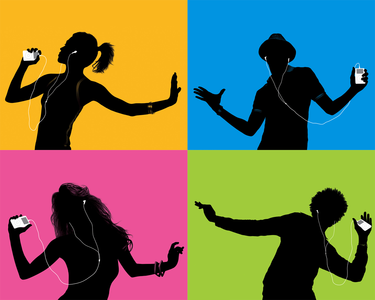
The campaign demonstrates a particularly inventive use of colors. A typical silhouette poster would incorporate a relatively minimalistic color theme. The main components of the scheme are a black silhouette of a dancing person, a white silhouette of an iPod with stock headphones, and a plain-colored background. The color of the background is different on every image and may include yellow, green, blue, violet, and purple, among others. The background is solid and does not use a gradient. Importantly, none of the elements on the poster includes canvas, further enhancing the impression of clarity and minimalism.
The described color scheme creates an uncluttered area that allows for a distinctive representation of the product. The shapes are easily distinguishable and can be recognized from a significant distance. In addition, it increases the recognizability of the product by capitalizing on a trademark white color of the device and its peripherals. White is commonly associated with clarity, simplicity, and innovative technology, and was relatively underused at the time of iPod’s launch.
The effect is further amplified by the animation used in the campaign, during which the headphones swing in response to the silhouette’s moves. This detail adds to the feeling of freedom and comfort associated with the products. Finally, the diverse backgrounds communicate the idea of originality and uniqueness. Essentially, such a move allowed Apple to retain the feel of innovation and simplicity associated with the white color of the brand with the sense of being special communicated by vivid backgrounds.
Presentation of Chosen Campaign

Conclusion
As can be seen, Apple’s Silhouettes campaign constitutes a major change of direction in the company’s strategy. The emphasis on minimalistic color schemes and solid colors communicated the value of a new approach to visual design incorporating clean lines and scarcity of minor details. The switch to a sans font enhanced the impression of modernity and the effectiveness of the technology. Finally, the overall minimalistic feel, the high-contrast solutions, and the fluency of the animation created a sense of comfort and accessibility. It is safe to conclude that the campaign in question played a major role in the current perception of the company.