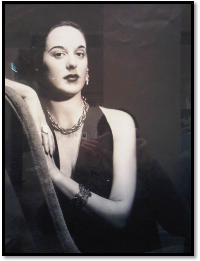
First, I went to the gallery in the State Library of Victoria in Melbourne. I like the Keith Gallery it has spectacular pictures. However, at the entrance of the gallery, I took a picture that shows the entry of the gallery that has photos on it. It got me thinking, what if the picture was not there will the area be more open. The pictures are large and frameless. It has several photos on it. These photos are mounted on glass and being an indoor setting their is the utilisation of great lighting.
The photos are randomly placed at the entrance of the gallery. The focal length is too short. The gallery has utilised a lot of artificial lighting strategically placed to hang from the ceiling. The lighting in the gallery is, therefore, well distributed. If the photos were not placed at the entry of the gallery, it would have opened the gallery with the illusion of a wider space and more room. The gallery entrance looks compact and squeezing for space. If the pictures were placed on the wall and individually placed, then a visit to the gallery would take more time to observe the photos individually keenly. The entry is rather busy with this photo at the entrance.
The photos are mounted on glass and are well lit with artificial lighting. The images create a contrast of the other, as one is an indoor setting while the other was shot outdoors. The depth of the field is rather shallow and narrow.
Similarity of Photos

In all the four photos women are the subjects of the photos. The models in the photos are well dressed, and their make up in place portraying an image of glamour. In all the photos, there is a minimal colour with white and black as the dominant colour. The choice of background is brilliant, bringing out the subject clearly. The subjects stand out as there is a conscious effort to ensure the subject stands out. The background supports the pictures’ concept.
The subjects like in the first, third and fourth picture are placed to emphasise symmetry while in the second photo, the artist sought to apply the rule of thirds. The images are well lit in line with the concept of photography. In each of the photos except the third, there is only one subject. In the first photo, there are writings in white against a black background, which is a heavy enough element of the picture apart from the main image.
In the second picture, the concept is brought out well, but the technical execution of the image is lacking. The concept behind the photos is well brought out as that of glamour with dominant female subjects. The lighting does do any justice to bring out the emotions in the picture as it is too dull and flat for love and romance, not harsh enough for the pain and minimal use of colour to create contrast.
Conclusion

In the last photo, the lighting is great, very well used to lay emphasis on the subject. The subject is placed to emphasis symmetry. The concept seems to be that of a glamorous woman portrayed as one in control of whatever is around her. The picture portrays the picture was well thought of, and effort put in to deliver the concept of glamour and confidence. The background of the effort is very subtle, bringing the subject of the picture as the dominant feature. The model is well-posed leaning, to clearly bringing out her dress and well-layered jewellery. There is a minimum colour, therefore minimal contrast and the dominant image coming out clearly. The image is in focus and sharp. The lighting fails to bring out the emotion behind the image; it is not easy to share the feelings of the image.