The website represents an online store for musicians looking for cheap deals on various musical instruments and professional studio equipment. The main purpose of the website is to ensure a stable connection to the service and provide its users with the ability to connect with each other. Another purpose of the website is to find its niche because this type of website is not really common and might become quite popular among the targeted community.
Goal Definition
The website’s key goal is to implement an approach that would help musicians sell their used musical equipment and instruments for a reasonable price. The goal may also be defined as creating a website based on the bids coming from the users looking to buy a particular product (the current design, however, does not reject fixed prices).
Requirements
The website should follow several requirements. First, the team should monitor the market and identify their competition. This is necessary to help the team understand what their customers will look for on their website and plan their development activities according to a premeditated strategy based on the evaluation of the market. Second, the developers should pay close attention to the usability and functionality of the website. The website is expected to load quickly and concisely to provide the necessary information. A slowly loading website will turn customers away from the service, so this requirement is essential. Third, the team should ensure that only relevant content is posted on the website. The information should be updated recurrently (Sørum et al. 699). Fourth, the team should be aware of the ways to advertise and use SEO tactics. A higher rank in the search results is guaranteed to bring more potential customers to the website. Fifth, developers should not underestimate the power of social networking. The last requirement is to link the website to social networks and allow the users to share the information about the items they like or are looking to buy.
Site Plan
For this website, the grid model is used. This is done because the developer expects to divide the items into several categories. The related and recommended items will be displayed on the page (Sørum et al. 700). This model is chosen because it displays an organized list of items and makes it easy for the user to pick the necessary product or sort the search results respectively. Nonetheless, the developer will not implement a pure grid structure and will use a mixed type instead.
Design Prototype
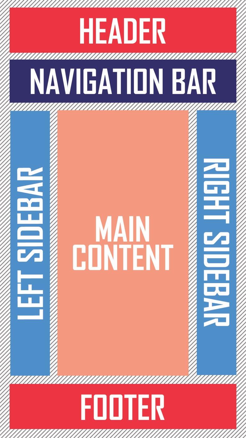
The prototype represents a typical vertical layout with two sidebars and an area for the main content (Figure 1). The items contained within the navigation bar will be separated into several categories to comply with the grid model that has been chosen during the previous development stage. The current design has been elaborated to provide the expected users with a layout that looks simple but is represented by a good user experience (Al-Qeisi 2286). This is backed by the supposition that not all musicians deal with websites regularly. Moreover, a complex layout would confuse users, and this might result in a high bounce rate.

The links should be dynamic (similar to the website itself) to let the users travel outside the website if needed (Cebi 1040). Consequently, the website would also feature several icons representing social networks to follow the company on social media and share the link to a certain product with the customer’s followers or friends (Safar and Mahdi 101).
Site Implementation
The site is implemented in compliance with the premeditated plan. The developer expects to analyze the performance and introduce necessary changes throughout the process of implementation. The design is accurately applied to the chosen website model. The implementation of the current website should be seen as a creation of a dynamic network helping people to connect.
Testing
The website was tested in several directions – graphic user interface (GUI), general acceptance and adequacy, user experience (UX), code validation, and frequent checkups for bugs and possible limitations (Myers 80). First, the GUI was evaluated based on the looks of the website. The design featured a strict color palette and disproved aggressive colors (except red which may be used to highlight hot deals and sales in the future). Second, in terms of the UX, the website was found to be navigated easily and quickly (Sivaji and Tzuaan 30). All of the delays in the page loading time were successfully mitigated. The developers also performed both black box and white box testing.
Releasing
Before releasing the website, the developers identified that the website fully complies with the initial objectives. The developers also found that the website satisfies user expectations. Nonetheless, the team expected to perform several corrections to the website design and changed the fonts to make it look more professional. After the release, the team concentrated on the possible upgrades and politely asked the first-hand users to provide relevant feedback concerning the website.
Works Cited
Al-Qeisi, Kholoud et al. “Website Design Quality and Usage Behavior: Unified Theory of Acceptance and Use of Technology.” Journal of Business Research, vol. 67, no. 11, 2014, pp. 2282–2290. Web.
Cebi, Selcuk. “Determining Importance Degrees of Website Design Parameters Based on Interactions and Types of Websites.” Decision Support Systems, vol. 54, no. 2, 2013, pp. 1030–1043. Web.
Myers, Glenford J. The Art of Software Testing. New York, NY, Wiley, 2012.
Safar, Maytham, and Khaled A. Mahdi. Social Networking and Community Behavior Modeling: Qualitative and Quantitative Measures. Hershey, PA, Information Science Reference, 2012.
Sivaji, Ashok, and Soo Shi Tzuaan. “Website User Experience (UX) Testing Tool Development Using Open Source Software (OSS).” SEANES, vol. 3, no. 1, 2012, pp. 21–54. Web.
Sørum, Hanne et al. “Public Websites and Human–Computer Interaction: An Empirical Study of Measurement of Website Quality and User Satisfaction.” Behaviour &Amp; Information Technology, vol. 31, no. 7, 2012, pp. 697–706. Web.