Topic Name and Description
Name
Jerry’s Life.
Description
This website acts as not only a blog about the life of Jerry through the years but also details the various pranks, gags, and ridiculous misadventures of Jerry as he tries to anger, irritate, annoy and otherwise aggravate everybody around him. All of Jerry’s misadventures have been recorded via tiny video cameras that have been strategically placed in various locations to show the shock, outrage, and expletive-filled rants of Jerry’s victims for the enjoyment of viewers all around the world.
Target Audience
Age
16 – 23.
Gender
Primarily male but can encompass females as well.
Justification
The reason this specific audience is being targeted is due to the fact that the information found on the site is highly amateurish. As such, the site’s main goal is to entertain people through a look at Jerry’s life and by presenting various types of videos in what can only be described as “cheap comedy”. It is based on this that the viewer demographic is isolated primarily to individuals who are in high school and college since they are able to better relate and find the content entertaining as compared to individuals of younger or older demographics who would either be unable to understand the inherent hilarity of the pranks or would find the content far too immature and thus would not be entertained in the least.
Competitive Analysis
Analysis of Good Sites
The first site to be analyzed which is owned and operated by French prankster Remi Gaillard. The content of the site primarily focuses on the various pranks he pulls off within France and other international locations. Overall, the look of the site is quite simple with a bland grayish blue-gray background, however, since the site has a selection of his videos already present via thumbnails on the front of the site itself along with a very easy-to-navigate menu section this enables visitors to easily browse the content of his website making it a good starting point for the design of Jerry’s site.
Similar to the design of nimportequi.com, resents a variety of user-submitted prank videos through an easily accessible search interface located at the top of the page. The home page itself contains a vertical list of the latest videos submitted with a rather simple gray and blue background which makes it easy to view the videos. What is good about this website is that it has a far better method of categorization as compared to the site of Remi.
This site features the pranks of a couple named Nikki and John. Overall, the site utilizes a standard Word press-based design with several sets of vertical and horizontal thumbnails highlighting the various prank videos the couple has created. With a simple white and gray backdrop the site design does seem like an ideal method of easily presenting videos without the fuss of having to design something from scratch.
Analysis of Bad Sites
While this website is one of the most visited sites in the world the fact remains that its seems far too complicated a format to utilize for just a personal site. It is doubtful that the content within Jerry’s site will reach even a quarter of the articles and videos seen on cracked.com and as such the complicated categorization system used by the site does not seem like an ideal method to utilize.
The website owned and operated by YouTube star Philip DeFranco receives several hundred thousand views in a month and is quite simple to create. The main issue I have with particular site is that its descending format means that users would have to keep on scrolling down in order to view past content which for me is a bit too inconvenient in the long term especially if the number of videos on the site increases.
This particular YouTube page is used by the “Funnydoods”, who are two roommates that like to prank each other. While from a visual perspective, this site looks nice, the fact remains that since they cannot add additional content aside from their videos severely limits the potential that this potential page could have had.
Summary
Based on an examination of the six sites, it can be assumed that the best way in order to present the videos on Jerry’s site would be to create a gallery on the front of the site with a series of select videos while at the same time incorporating an easy to use search and categorization function in order to make it easy for viewers to look through the videos that Gerry has made (Rubin et al., 2011).
Content Requirements
Content Inventory
Photos of Jerry, Beautiful mind poster photo, airsoft links, charity photos, airsoft photos, prank photos, early life photos, teenage life photos
Category and Labels
Early Years, Teenage Years, Education, Gallery, Career, Music Genre, Sports Health Art, Causes, FAQ, Sitemap, Membership Area, Login, about Jerry, Home Page, Contact Jerry, prank videos, and prank photos.
Navigation Scheme
Global Navigation
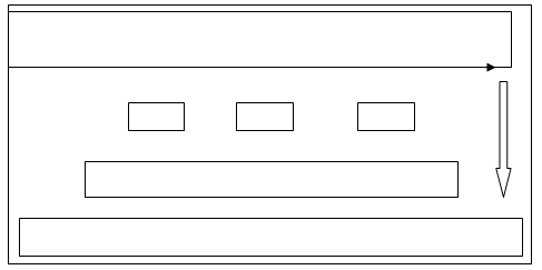
The header on top of the page will serve as the main navigation scheme for the site with drop-down menus under the “categories” section serving as the primary method from which users will select the type of prank video they will want to see (Djonov, 2007). It will contain a header with the following details: Early Years, Teenage Years, Education, Gallery, Career, Music Genre, Sports Health Art, Causes, FAQ, Sitemap, Membership Area, and Login
Local Navigation
Local navigation on the site will consist of a series of date-based navigation buttons (i.e. September 17, October 12, etc.) under each video category. This will enable visitors to easily access prank videos that were uploaded on this specific date under each category.
Footer
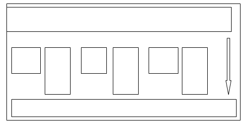
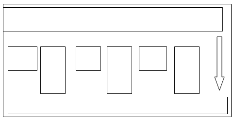
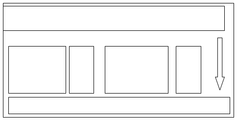
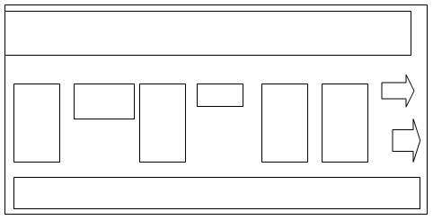
The footer section will contain a “recommended for you” section wherein a slider showing random videos with the highest views will appear. Users can scroll through the various thumbnails presented via two arrow navigation buttons placed on either site enabling them to see up to a maximum of 15 random videos. It is expected that by having this video located on the video page after the “comments” section, this will in effect encourage users to stay longer on the site and thus increase the possibility of them viewing more videos (Griffiths & Christensen, 2005).

Content Design
- Early Years – this section will show 3 photos of Jerry while he was a child, however, they must be hilarious photos and explain how since he was young he was always a prankster.
Early Years - Teenage Years – this section of the site will also show 3 hilariously themed photos of Jerry, this time through the section will explain how he slowly started developing the idea of posting videos of his pranks.
Teenage Years - Education – this section will feature a picture of the front of Jerry’s school, two photos of the faculty members he enjoys pranking, and will feature details regarding pranks already pulled on the teachers.
Education - Gallery – in this section, two pages of thumbnails will be shown detailing screenshots of the various pranks Jerry has pulled which will link to videos of the pranks themselves.
Gallery - Career – this section will detail what careers our siblings have and the pranks Jerry has pulled on them.
Career - Music Genre – this section will feature an image of the band “Black Sabbath” as well as have a YouTube-embedded video of one of their songs. It will also contain a detailed description as to why Jerry likes “Black Sabbath”
Music Genre - Film Genre – this section will feature a photo of the film poster “A Beautiful Mind” and will feature a detailed description about why Jerry likes this movie so much.
Film Genre - Sports Health – under this section Jerry will feature 3 links to various Airsoft shops and competitions that he enjoys attending with me.
Sports Health - Art – in this section, Jerry will display the various pieces of art that he has been fascinated by
Art - Causes – here Jerry will show his efforts with the local community showing various pictures of him helping the poor.
Causes - FAQ – this section will contain various frequently asked questions that people would like to know.
FAQ - Sitemap- this section acts as the site map of Jerry’s website and contains various details about the website.
- Membership Area – this is a forum on the site that can only be accessed via the login section on the top of the page.
Membership Area - Login – this is a Java script-enabled login application that will be located on the top of each site page.


Home Page
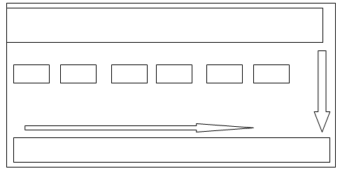
The homepage of the site will have a funny animated banner showing a cartoonish representation of Jerry pranking several people while directly below that will be a search bar with a category section to make it easy for users to find particular videos. Below that will be the navigation buttons of the site containing the buttons for “Home”, “Video History”, “About Jerry” and “Contact Jerry”. In the interest of keeping things nice and simple without overwhelming viewers, the main page will feature a short table gallery featuring a variety of thumbnails taken from various scenes within the video. Should a viewer place their mouse pointer over the thumbnail a short description in white text within a black box will appear detailing the content of the video and how long it is (Shelstad, 2005). Directly below this short gallery will be a short message from Jerry telling people to enjoy the site and have fun looking through the content.

Video History
This section will contain all of the videos created by Jerry which will be categorized under a specific date and will be embedded on the site through YouTube.

About Jerry
This page will feature a 4×4 inch size photo of Jerry that will be placed on the left-hand side of the page. After which directly beside it will be a description of Jerry in Times New Roman size 14 font detailing the reasons behind him establishing a prank site and why he tries to aggravate people one a daily basis. At the bottom of the page will be short Q&A section answering a variety of questions that users may want to know about Jerry and about the future of the site itself

Contact Jerry
This section will feature yet another 4×4 photo of Jerry (decidedly different this time) and will have a short section detailing the use of the contact form either for sending funny videos that users would like to be featured on the site. The form will have section indicating whether a particular message will be categorized under a potential business agreement or if it’s just an ordinary user with a video. The form will not send the message unless this particular section has been selected. The form will contain sections for the name of the user, the subject header, the body of the text as well as an upload section where users can paste a download link for Jerry so that he can download the video from any number of free files sharing sites

Visual Design
Description and Justification of Design
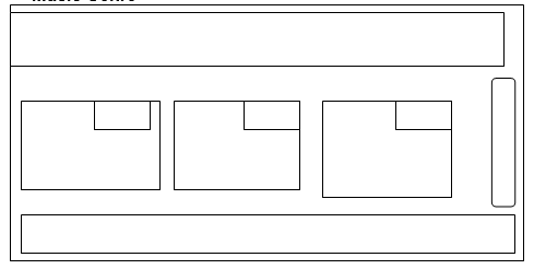
The visual design of the website will emulate that seen on www.nikkiandjohn.com. The reason this particular type of site design was chosen was due to the fact that the black rectangular area on top which is separate from the gray area on the bottom is simplistic however it looks rather good.
Description of the Color Scheme
- Site background: #363526
- Page background: rgba(247,164,75,0.6)
- Navigational Background: #130f0c
- Site title color: #ffae00
- Navigation color: #ffae00
- Heading Color: #222
- Body text color: #1a0f0f
- Body link hover color: #c8e920
The reason this particular color scheme was chosen is due to the fact that the contrasting light and dark colors help to bring out the quality of the photos and make the information easy to read. Arial size 14 font will be utilized for all text.
Reference Page
Djonov, E. (2007). Website hierarchy and the interaction between the content organization, webpage, and navigation design: A systemic functional hypermedia discourse analysis perspective. Information Design Journal (IDJ), 15(2), 144-162.
Griffiths, K. M., & Christensen, H. (2005). Website Quality Indicators for Consumers. Journal Of Medical Internet Research, 7(5), N.PAG.
Rubin, V. L., Gavin, P. T., & Kamal, A. M. (2011). Innovation in Public and Academic North American Libraries: Examining White Literature and Website Applications. Canadian Journal Of Information & Library Sciences, 35(4), 397-422.
Shelstad, M. (2005). Content matters: analysis of a website redesign. OCLC Systems & Services, 21(3), 209-225.