Introduction
Teaching Web design in secondary school can present significant challenges. However, the need for Web sites among organizations makes it a worthy learning course. This is because most contents formerly available in other forms are now online.
Web design students and teachers should demonstrate skills in graphic, photography, and art among others. The three main areas of Web design are construction and layout patterns, content and images, and management of the site. These areas must focus on usability, mortised, and multimedia aspects of the site.
The Web design industry experiences rapid changes. Thus, it remains difficult to predict the outcome of the coming years. However, students and teachers shall still rely on currently available technology for their works. Further, Web designers shall apply different techniques in the creation of new sites.
A notable change in the Web design industry is building the framework. For instance, we have experienced changes from the table-based HTML (Hypertext Markup Language) to XHTML (Extensible Hypertext Markup Language). There are also Cascading Style Sheet (CSS) based designs that use style sheets to style pages, rather than XHTML table structure which requires many codes (Eccher, 2011).
Designers can use various approaches in Web designing. However, the guiding philosophy should be aesthetic (professional feel), usability (ease of accessing and processing information), and functionality (functional aspects of the site such as data contents) of the Web site.
The practical nature of Web design requires teachers to facilitate the learning process. This is because Web design requires creativity and learners’ potential (Goldstein, 1986). Thus, the process must empower learners and enable them to have control of the design process.
Construction and layout
Students and teachers must recognize that a good layout is necessary for presentation of professional image of the site. It also enhances usability of the Web site through ease of information access. Layout and construction refer to positioning elements of the Web site as necessary to improve usability. Web designers must consider positioning and scrolling when constructing the Web layout.
The initial stage in teaching Web designing involves learning the construction and layout. These are the basic steps in developing a functional Web site. The process may involve creating layouts through editing an existing template or creating a new layout.
Students can use software packages like Adobe Illustrator for creating drawing and graphics and Adobe Photoshop for editing images to create Web sites. Web designers use Adobe Dreamweaver to connect both the Photoshop and Illustrator to the Web. This ensures that the programs are compatible with the language of HTML.
Great Web sites designers accurately position their contents to eliminate the need for searching relevant information in the site. Such relevant information should be easy to locate. Thus, positioning the menu is crucial for Web site usability. Technically, designers tend to put the menu on the left or on the top of the page.
However, it is important to note that layout should be able to accommodate all the necessary changes that may occur without compromising the design. For instance, the figure below shows that the site cannot handle such content unless the designer reduces the font size.
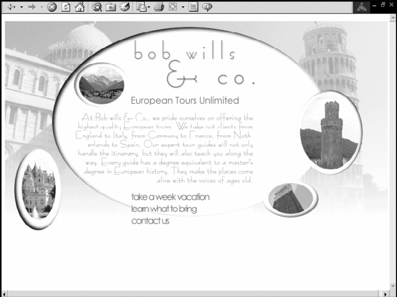
Successful designers use many cached contents on the header section. This method reduces the download time for contents relying on the same header. Creating header for every section can hinder Web site communication. Designers should use existing and standard Web usability tools. This may include position of elements like the logo. This is how the designer should exploit Web site usability so as to enhance usability of a new site.
The design layout should also consider the body. This is important because deciding on the best position has remained difficult. Users tend to ignore contents at the bottom of the page. Thus, upper sections of the site have provided usability by default. Therefore, the work of the designer is to make use of lower areas through creativity. For instance, the designer can use images and graphics to attract users to such sections.
Students and teachers must note that no design is perfect. Changes and evolutions of sites can prove this. However, positioning is critical to the design content and layout. Tools used in designing Web sites are the same. However, how designers use such tools vary considerably.
This is where some designers apply mortised designing. David Siegel refers to mortising as putting “two images together using a table” (Siegel, 1997). However, the term should also cover texts, functionality, and graphics. These should improve the form, usability, flexibility, and attractiveness of the site.
Students and teachers can rely on mortising for creating both usability and multimedia in Web site designing. Mortising enhances the functionality of the site. In addition, it also enables the designer to apply various techniques in the graphic area.
However, mortising goes beyond the site aesthetics. Novice designers can use “HTML editors like Adobe Dreamweaver and Microsoft Office SharePoint Designer (these are WYSIWYG editors) to create good sites” (Eccher, 2011).
Teachers and students should realize that mortised sites depend on the knowledge of the designer rather than software packages. Such knowledge and skills provide the designer with the capabilities to use “CSS, XHTML, and images creatively to design fast and customized Web sites with less codes” (Eccher, 2011).
This is an example of a site designed using WYSIWYG editor (see below). The designer used images and XHTML in a way that reduced the entire content to small content.
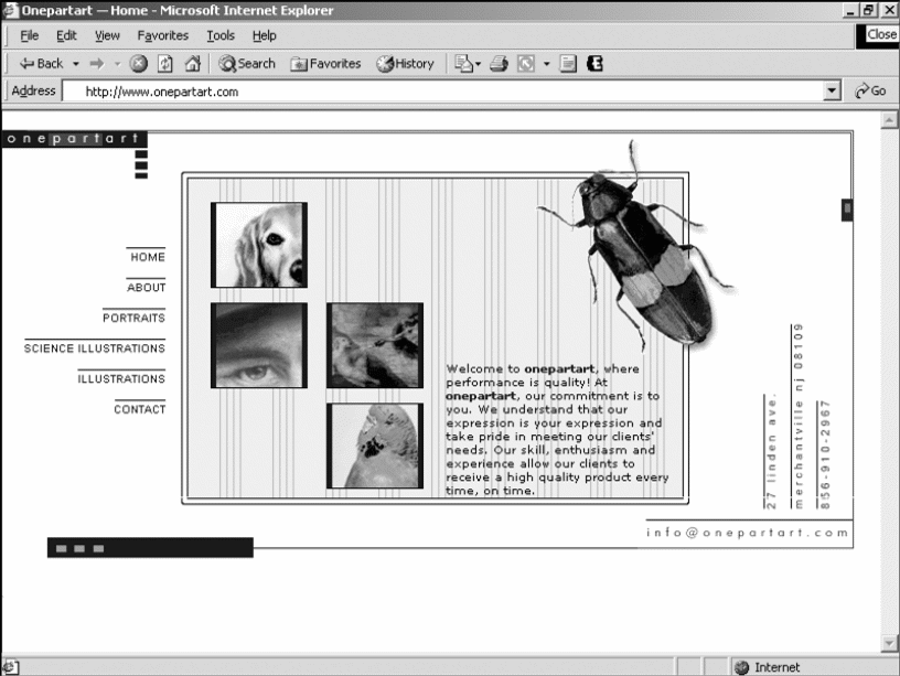
Students and teachers must note that creating a mortised site is not hard. This is because creating such a site does not require extensive learning or introduction of new knowledge in Web development. Learners should only concentrate on learning application software like Adobe Photoshop.
In addition, the designer must also learn basic, creative style using CSS, graphics, and XHTML. These are mandatory and common tools for Web developers. Still, learners can enhance their sites using applications like Flash, JavaScript (scripting language) and other programming languages.
Teachers and learners must recognize the need for integrating theory and practice in Web site design course (Goldstein, 1986). This is because the differences between sites, in terms of their qualities, emerge due to different knowledge of designers, and how best such designers apply their theoretical knowledge into practice.
The most important factor to creating such Web sites is applying the CSS knowledge in positioning most contents of the site appropriately instead of using XHTML, and compressing and saving graphics and images. CSS allows the designer to create homogenous site.
This is because the designer can develop any form of layout using other programming techniques and compressing and saving images properly to enhance the attractiveness and usability of the site.
There are some inherent advantages in using the CSS design over XHTML design that learners should know. The CSS design uses lesser codes to develop a Web site. This implies that the outcome (barring the style sheet) is simple and easy to follow.
This provides opportunities for students to master techniques and procedures of Web development and how contents relate to each other. Thus, the main advantage learners can derive from CSS design over XHTML-table design is the difference in the amount of codes required in designing.
CSS designs also provide considerably light weights and download sizes. This enhances the speed of the site and creates effective usability experience for users. CSS design also provides easy site management in terms of adding, editing, and deleting contents.
A designer can make changes in a single page that cascades to the entire site just like in db-driven sites. CSS design also provides opportunities for easy printing of pages than in XHTML.
Designers must also focus on Web site navigation during the design process. At the same time, the designer must also look at maintenance and usability of the Web site. Navigations are also the site menus. Menu must help users find any item they require from the site contents.
Thus, a menu should be smart to improve Web site usability. Maintenance of a Web site tends to be difficult. This explains why navigation should be simple to ease processes such as detecting errors, deleting, adding, or editing items.
Content and images
Contents and images provide learners with opportunities of choosing sites that they want to create. In all these, learners must know the importance of the content management system (CMS) in powering the site. CMS provides easy steps in posting images and words in the site. This should also focus on search engine optimization (SEO) and the idea of inserting ad banners to the site.
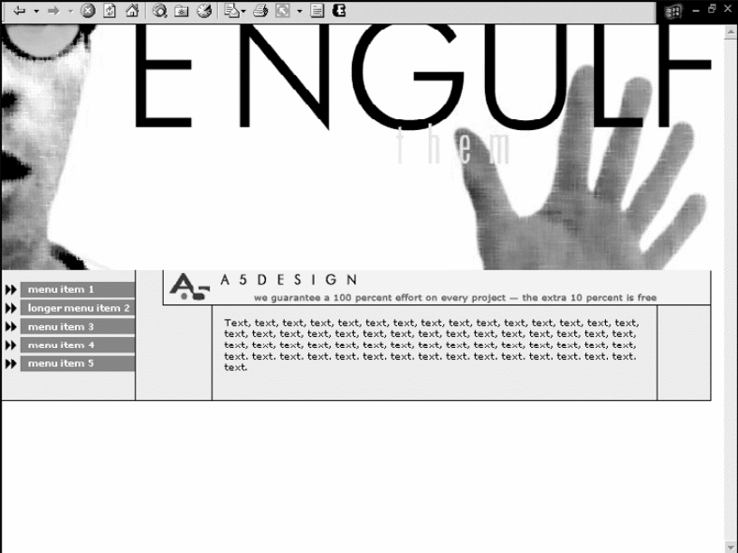
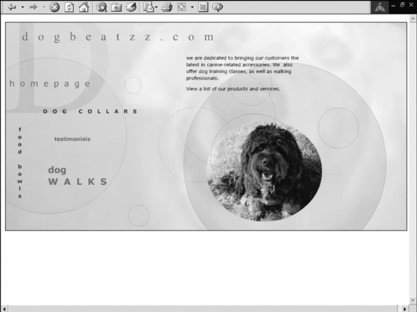
Web sites contents vary depending on their usability. We have low, medium, and high content Web sites. Low content sites may only consist of a single page e.g. an online brochure. The Web site may only have the basic information that users search. These can be services, products, client information, and contact details. Low content Web sites require much graphic to fill due to limited contents on the page.
However, the entire site does not need a full image as designers may decide to leave some white space as shown in the below image. Thus, the designer must balance the content and image accordingly.
Medium content Web sites are mainly in the business category. This is a strategy of avoiding the creation abundant information that can overwhelm the user. The site has limited contents on the homepage. However, the amount of contents and images are almost equal.
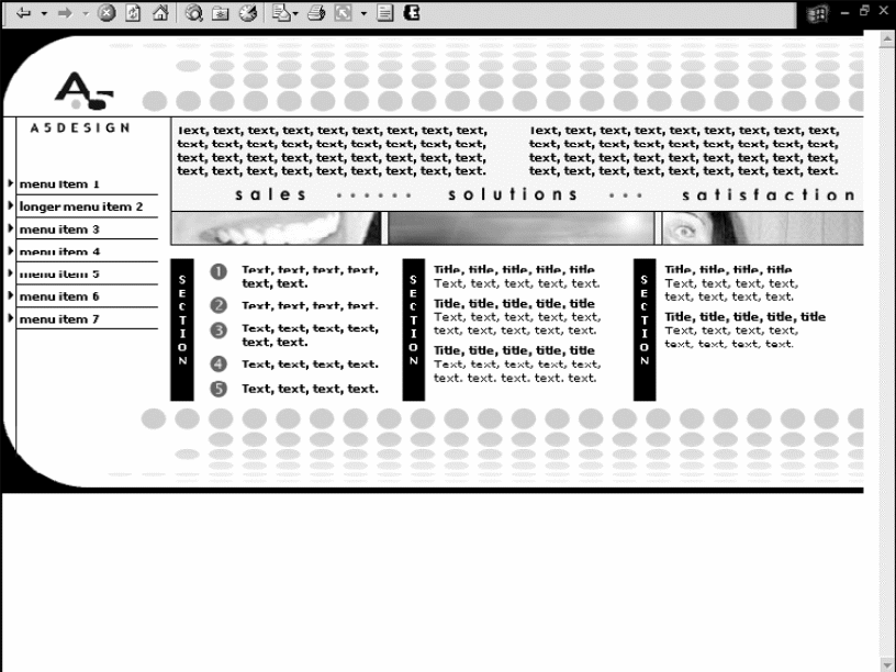
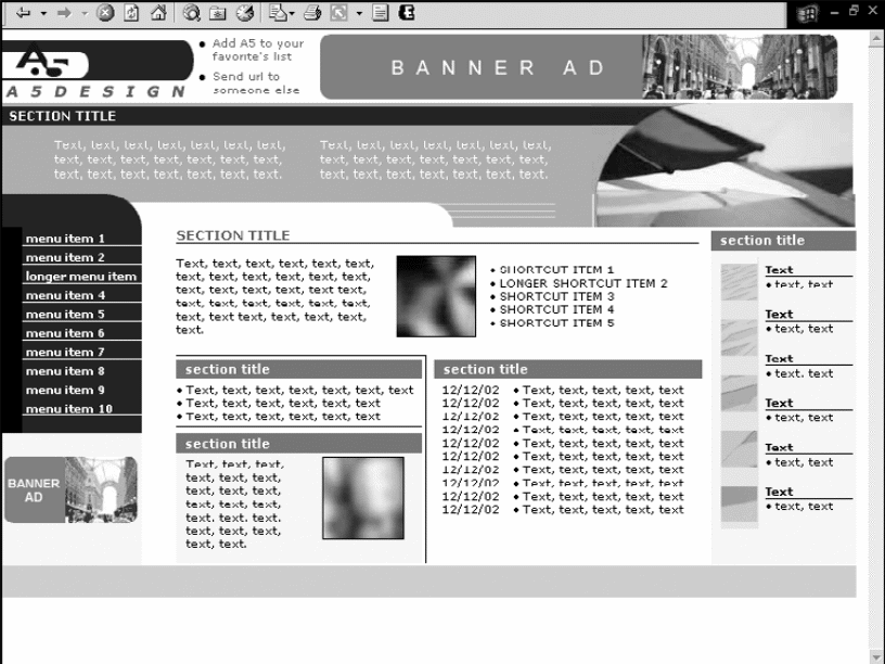
High content Web sites mainly focus on providing information or on sales of products. These Web sites have many contents as the designer limits the amount of images (Black, 2011). The site may have small images or blurred images at a given point. These sites usually have more than five areas of contents as shown.
All the CMSs perform the same task. However, their functions depend on the Web site capabilities, costs, and complexity of the system. Therefore, management of Web sites may follow certain specifications depending on the following scenarios. First, there is the basic CMS. These Web sites consist of small and medium-sized sites with standard and basic features.
These Web sites have readily available functionality that is necessary for their content management. These contents may consist of basic information, corporate brochures, interactivity, and basic intranet for the workforce and the organization. Second, there is mid range CMS. This happens when the size, the number of contents, and complexity of the site increase.
In this case, the CMS strives to achieve a given informational and communications objective as it acquires the status of an application platform. Such Web sites may have different micro-sites, interactive marketing tools, and intranet for the entire organization. Third, there is the complex CMS case. In this case, the site has fully achieved an application status and may have several interconnected contents.
The volume of the Web site content may increase considerably depending on the size of an organization. This may be the case of most e-commerce and library Web sites (Peterson, 2006).
Availability of such functions and applications require Web sites to accommodate complex processes regarding workflow, contents, and IT governance systems. Web sites that require complex CMS have heavy usages in e-commerce, multiple channels, intranet for the global employee, and other processes that require large quantities of data.
The SEO delivers results to users. However, developers must apply search engine’s algorithm in order to achieve strong results. SEO algorithm performs analyses and calculates a site ranking. Algorithm must remain secret to their developers so that it can serve the purpose of ranking the site high among competitions. Designers can rely on some techniques when creating high-ranking sites.
However, the strong SEO foundation is on the content. Strong contents provide better chances of high-ranking during a search. In addition, developers must also apply keyword research. The best place to start from should involve competitors search.
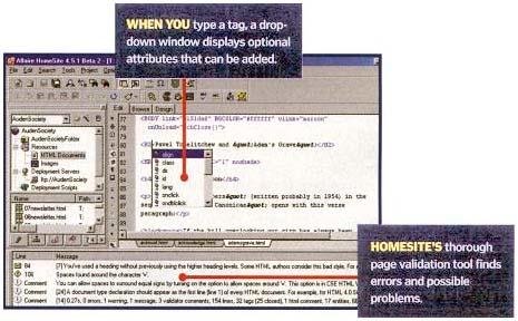
Students should also learn about site management using various applications. Management also involves protecting the site and its contents. Some sites have disclaimer notices regarding the site contents to protect their owners from liability. Site management should also extend to marketing the site, gaining subscriptions, and conducting routine tests to ascertain the site effectiveness.
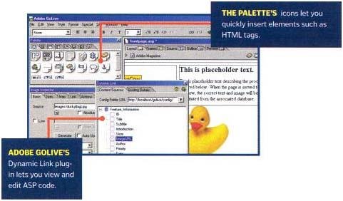
According to Mendelson and Simone, site management has become robust with many tools such as GoLive (Mendelson and Simone, 2000). Such application platforms allow users to organize “files and folders, generate a site map, and centralize additional assets, such as external URLs and color palettes” (Mendelson and Simone, 2000). At the same time, users can also change contents through addition, deletion, or modification.
GoLive also monitors the effectiveness of the site by reporting potential errors like orphan files and broken links. This application has capabilities of automatically fixing some internal links.
Multimedia
The designer should also pay attention to multimedia aspect of the Web site. Web site developers may use video, audio, and animation to develop interactive sites. Designers can compress “vector-based graphics smaller than bitmap images and still manage to maintain the images” (Eccher, 2011).
Adobe Flash animation software packages are “useful in creating multimedia sites” (Eccher, 2011). Applications of multimedia technology in the Internet continue to evolve with developments in technology.
Conclusion
Students from a school in New Jersey demonstrate that Web site designing can be self-taught. They developed a standard-based Web site as a group by depending on each other for support. It is important to note that none of these students had formal training in Web designing. They acquired knowledge of CSS and HTML through self-learning.
As a result, they have also acquired PCs refurbishing skills and are now Microsoft Authorized Refurbisher. This enables these students to provide technological support to the whole school (Borchardt, 2008). These students demonstrate humanistic approach to education. They have the freewill to learn.
We can see that approaches to education are changing due to changes in technology. The Internet enables distance learning to take place. Instructors can share learning materials and communicate with students.
A study by Oliver, Kellogg, Townsend, and Brady shows that virtual schools can provide online learning and course design through provisions of leadership elements like technical knowledge, constant feedback, and understanding of expectations between students and instructors (Oliver, Kellogg Townsend and Brady, 2010).
Teachers and students should also note that Web site designers need professional skills in order to design Web sites that can offer effective usability. These should include online access, copyright and safety issues, and integration of different Web tools for site management.
Students and teachers should know that usability of a Web site is critical in designing regardless of the available tools. Focus on usability eliminates issues of confusion for users through eliminating many contents and hyperlinks that access unrelated contents.
The idea in usability should also show the ease of Web site navigation. This implies that site maintenance should be simple in terms of deleting, editing, or adding new contents. At the same time, the site should support quick downloads and be compatible with multiple Web browsers.
Web sites must attract and retain its users through delivering valuable contents. However, this requires skills, knowledge, professionalism, and time. At the same time, Web sites require regular maintenance and updates.
References
Black, E. L. (2011). Selecting a Web Content Management System for an Academic Library Website. Information Technology & Libraries, 30(4), 185-189.
Borchardt, P. (2008). High Tech High School Wins School Web Site of the Month. Tech Directions, 68(2), 22-22.
Eccher, C. (2011). Professional Web Design: Techniques and Templates (4th ed.). Boston, MA: Cengage Learning.
Goldstein, H. (1986). Toward the Integration of Theory and Practice: A Humanistic Approach. Social Work, 31(5), 352-357.
Mendelson, E. and Simone, L. (2000). Design A Great Site. PC Magazine, 19(10), 134.
Oliver, K., Kellogg, S., Townsend, L. and Brady, K. (2010). Needs of elementary and middle school teachers developing online courses for a virtual school. Distance Education, 31(1), 55-75.
Peterson, K. (2006). Academic Web Site Design and Academic Templates: Where Does the Library Fit In? Information Technology & Libraries, 25(4), 217-221.
Siegel, D. (1997). Creating Killer Web Sites. New York, NY : Hayden Books.