Problem Identification
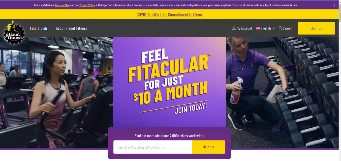
The problem with the website is the lack of navigation and information, which might be important for current and potential members. More new gyms are opening in the USA, and the competition is growing quickly. It is crucial to have a specific strategy to attract new customers through the unique history or attractive appearance of the internet page. Planet Fitness is one of the massive gyms in the United States that became one of the first in the sports industry, but poor IT support caused several performance problems that should be solved immediately. The main page of the website may make visitors lost in the navigation as there is a lot of different information provided (Planet Fitness). Even though a professional frontend development makes a visual representation of the website more attracting, the information could be more divided into different pages shown in the navigation bar.
Audience Analysis
The audience of the gym is diverse, and they are happy to see people of different ages from 18 years old. According to Konig et al. (2018), around 84% of Internet users are young people from the age of 25. Consequently, the most common type of person who visits Planet Fitness internet page is a 25 years old man, who is working full time, has no children, prefers to follow a healthy lifestyle and enjoys active routine. The gym can support the activity of the person and motive to complete the set tasks.
Usability
To understand the level of satisfaction of website users, it would be helpful to make a pop-up window that suggests taking a two-minute questionnaire and give a feedback on the usage experience. The questions will find out if users would like to change the website representation and what exactly should be transformed. By evaluating the responses, some changes and improvements should be applied. The most realistic responses from the users can be the requests related to the design change and the instructions regarding the usage of the navigation bar. The comments should not be underestimated as the success of the gym depend on the customer’s experience.
Solutions and Recommendations
The current website’s main page does not have many links to other important contents, and it may make those users who do not use the internet regularly confused. Moreover, many people prefer to visit websites that look aesthetically pleasing and minimalistic. The IT specialists of the organizations should follow many trends to ensure that the web page stays modern and attract more clients. I would suggest decreasing the amount of useless text in the link descriptions but pay attention to placing FAQs and training programs sections on the main navigation bar.
Moreover, it would be useful to make a pop-out window when the user hover over the link to see what information is provided by the other link without leaving the main page. This technique may save a lot of time and make the computer less overloaded. It is psychologically approved that the appearance of the website may create a specific trust of potential customers and when the main page attracts the eye, individuals are likely to use services from this organization (Rothenfluh and Schulz, 2017). Consequently, some comments from current members and photos gallery can increase the loyalty from other users of the website. The picture shows the current main page of Planet Fitness site that can be improved in the nearest future.

Information Design Principles Applied
The principles of design are crucial in transforming web pages and making them more advanced. According to Shepard et al. (2017), there are 12 key aspects of the successful design creation and by following every step, the company may produce a competitive internet space. By understanding the combinations of colors, IT specialists may be able to influence the mood of website visitors and force them to click specific links unconsciously. Also, this technique includes balance that means that there should not be a lot of content on the one page. Emphasis and proportion do not strain users and allow them to concentrate on other important elements.
Planet Fitness should work under the hierarchy and ensure that the important links are not hidden behind other navigations. Moreover, they should avoid repetitions of the information to allow members to read less and understand more. Frontend developers can follow specific patterns which include rhythmic representation of content and includes white spaces to ensure that the website is minimalistic and clear. The variety and unity of information is also important as the main mission of the web page is to explain the policies of the company by moving users between pages.
Reflection
The presented web page helped me to understand what advantages and disadvantages internet platforms can have and how they can be eliminated. This knowledge can help in my future profession as IT is one of the most perspective industries where I want to work. Before applying changes, the main aim of the organization should be revealed and based on the customer’s preferences, the content and navigation can be modified.
References
Konig, R., Seifert, A., and Doh, M. (2018). Internet use among older Europeans: An analysis based on SHARE data.Universal Access in the Informational Society, 17, 621-633. Web.
Rothenfluh, F., and Schulz, P. J. (2017). Physician rating websites: What aspects are important to identify a good doctor, and patients capable of assessing them? A mixed-method approach including physicians’ and health care consumers’ perspectives.Journal of Medical Internet Research, 19(5). Web.
Shepard, L. A., William, R. P., and Davidson, K. L. (2017). Design principles for new systems of assessment.Phi Delta Kappan, 98(6), 47-52. Web.