Introduction
It has always been stated that art is subject to personal interpretation, this holds true for various works of art especially those whose themes and design are part of the abstract category of art. An initial examination of both works to be analyzed reveals that each is part of two distinct categories of art with the first emphasizing expressionism and the second being part of minimalist impressionism. Each has its own distinct themes and methods of interpretation and as such this will be explored in order to address each work’s formal elements in order to give readers both a visual and interpretative analysis of the two works of art chosen for this paper.
Determining the Inherent themes and style in the work
When first examining art one must take into account each art’s inherent theme and message in order to understand the stylistic justifications that went into the usage of color, shapes, contours, and lines in the art itself.

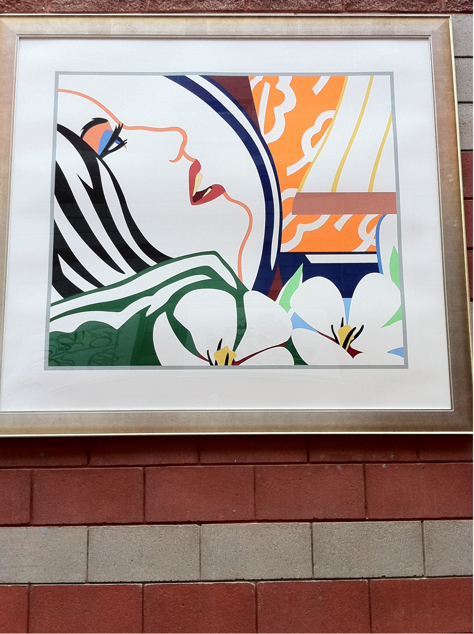
For example, in the first painting by Wesselmann it can be seen that the style of the abstract painting follows modern-day expressionism identified through its use of a subjective perspective in trying to incite an emotional response from viewers. While the painting itself is far from the quality of the old masters of abstract art it does bring out a certain emotional response as it can be interpreted that the woman in the painting is actually dying.
This is identified through the apparent halo surrounding the woman, the imagery of using white poppy flowers in the lower right corner of the painting, and the apparent “final gasp” of air that she is attempting to have before death claims her.

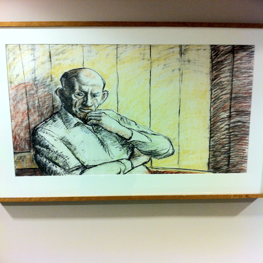
The second painting, “Nilleig Ruiridh Eoin a Phlan”, made by Ellison Robertson is more akin to impressionist styles as it can be seen through the use of relatively thin lines, its slightly open composition in terms of the scarcity within the work, and its emphasis on the accurate usage of lighting in the piece itself. Further evidence that this particular work follows the impressionist style is the use of a common subject matter as the primary basis of the painting namely the use of an old man as the subject to be depicted.
In this particular painting, it can be seen that the theme is apparently connected to the concept of introspection wherein the subject in the painting is apparently thinking deeply as evidenced by the furrowed expression and the classical “hand on chin” motif that has been used time and time again in various artwork to depict a subject deep in thought. It is based on the identification of themes and styles used in the works to be examined that a better and more detailed examination can now be done.
Visual Description and Analysis of the Paintings
Based on the expressionist style of distortion to invoke an emotional response the 1st painting seemingly tries to invoke a sense of pity for the character in the portrait but actually fails rather spectacularly at doing. As mentioned earlier one method of interpreting the painting is by thinking that its thematic expression is that of a woman breathing her last breath from her bed as she is about to die.
This is particular symbology is interpreted through the use of white poppies in the painting which symbolizes a pure death, namely a death that comes from a life well-lived. In the painting, we can see that on the left-hand side streaks of white are evident in the hair of the woman which are meant to symbolize old age. This is further evidence that the woman is the portrait is about to die and the artist has captured her “literal” last breath on his canvas.
Unfortunately in terms of artistic representation, the lines feel too “clean” in the sense that they seem more artificial and unimaginative than they are truly artistic. The entire painting seems to exude a feeling of artifice wherein through its use of curving straight lines any form of actual emotional connection established with viewers is lost. The painting feels too “modern” too “artificial” in the sense that it has lost its artistry by trying to appeal to too many audiences.
While there are various colors utilized in the work they feel flat, dead, and lack any form of actual liveliness. While it may be true that the work itself may have been created through some use of felt tip markers this just further emphasizes its divergence from true art. In fact, in terms of the overall balance and texture of the piece, it just seems too “clean” in the sense that it feels far too planned out, that the realism that can be captured at the moment is not there at all.
While it may be true that its utilization of space and contours is efficient therein lies the problem wherein the painting seems too “perfect” in the sense that it lacks any divergent emotion from the artist and merely looks like a piece that can be created within a few minutes on a computer. While there are many interpretations of what can be called “art” the fact remains that I know what I like and this painting diverges from everything that I would actually call “likable” art.
When basing the second painting on the impressionist style of the 19th century the emphasis on lighting within it can thus be clearly seen and appreciated. The use of light and shadows lends the painting a surreal realistic quality wherein the character within seems almost lifelike. This surprising when taking into consideration the rather minimalist perspective the artist utilizes wherein the background is nothing more than a series of striated lines depicting a wooden wall.
In fact, the overall use of color in this particular work is rather sparse which I believe was intentional in order to bring further emphasis on the subject of the painting itself. The most striking and realistic feature is the face of the man where the use of age lines, slightly shadings of brown, and the use of a distinct black shadow on the left-most portion of the face while emphasizing the color white on the right-hand side creates an almost 3d like realistic effect where the subject within seems to have been paused momentarily in a stitch in time.
In fact, when examining the rest of the painting it can be seen that the most painstaking detail applied to it was concentrated on the face with the rest of the subject’s body being akin to a sparse outline. This particular facet of the work itself could be considered purposeful on the part of the artist as he attempts to concentrate the perception of the viewer directly on the face and bring about the fanciful introspection of wondering what the person in the painting is thinking about. Overall the use of lines in this particular case is dominated by either thin line outlines as seen in a majority of impressionist works or by jagged dark lines utilized to create the effect of depth and shadow.
The one dominating color in this painting is the color yellow as seen directly in the middle of the painting which is actually utilized as a means of creating the almost 3d like effect on the man wherein the brightness of the yellow on the right-hand side contrasts nicely with the dark shadows on the left most side creating the impression that the sun is striking the wall directly to the left of the man creating the shadow-like effect on the left.
Comparison and Contrast
When comparing the 1st painting to the 2nd one, it is a no-contest victory for the second painting due to the stylistic rendering utilized and the realistic use of lines, color, and shading to almost bring to life the subject in the painting. The first painting feels too artificial and clean in terms of the way in which it was created. It lacks the vibrance seen in the second painting and in fact the first painting seems more like a piece of modern art easily created on a computer.
It fails to portray any apparent skill on the part of the artist as compared to 2nd painting where the overall skill is definitely apparent. What must be understood is that when making comparisons and contrasts between two different styles of creating artwork, you are not just evaluating the work itself but also the skill of the artist who made it. In this particular case when examining both artworks I have disparaged the first and acclaimed the second, I have called the 1st artist untalented and the 2nd gifted. This is not out of a sense of bias but rather an observation of skill through the very work they created.