There are many ways to communicate and Visualization is one of them. It is a powerful tool that aids communication as it acknowledges the power of visual skills. Visual communications, as the name indicates, is the type of communication that uses visuals to relay information.
As such information, data and knowledge can be relayed in a manner that it can be looked upon. Therefore visualization is one of the knowledge management techniques. The use of visuals media make information more meaningful to people. There are several visual communication tools that are used to make communication more meaningful.
Among the visual communication tools are: information graphics, symbols and signs, shapes and colours, charts and graphs, and typography. Each of these visual media tools is useful for presentation of specific type of information. Graphs and tables, topography and use of colours are important visual tools that aid the presentation and comprehension of data.
Graphs and tables are the crudest form of visual communication. This is because the technologies and techniques used in formulation these types of visual mediums are simple and easy to use. Graphs and tables are used to add more meaning to quantitative data.
Graphs help to highlight the relationships between values being described by giving them size. While using graphs and tables it becomes easier to discern how the variables are related in terms of the trends and pattern.
For graphs and tables to be effective they must be minimal obstructions that obscure the information being relayed. Features such as 3D effects and background pictures should be avoided in construction of graphs and tables.
However, colour can be used to enhance meaning. Colour helps to highlight the actual differences in the variables being compared as well as showing the correlations between those variables (Few, 2006).
The advantage of graphical representations over tables is that graphs help readers to interpret data in form of shapes and colours, which is not possible while using tables.
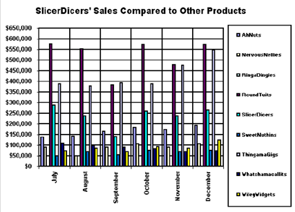
Tables are graphical methods of presenting data in form of numerical values. As such, it becomes easier to locate specific values. The figure below shows an example of a simple graph that uses colour to contrast a number of variables

Other than in graphs colour can be used in photos and pictures. Colour is useful as a form of visual communication tool as it is known to affect human behaviour. This is because each of the colours has a specific meaning. Black colour represents mourning, while white colour may be used to reefer to peace and purity.
In most of the cultures across the world, red mean danger. Due to the varied meaning of colours across cultures, they are therefore used to express connotations about reality. Furthermore, colours are sued to express feelings and emotions such as joy, anger, love and fear.
Colour should also be used sparingly as the more the number of colour used in a graphical representation the more chaotic the presentation becomes. However, the use of colour has a number of advantages.
It increases comprehension of the information being relayed as it increases recognition of specific data of colour is that it increases the comprehension of can be used to link related data, improves learning and reduces error of interpreting data. As such colour is effective in aiding the recall of knowledge.
For colour to be effective as a visual tool it must be used with space around it to show separation. Bright colours should be used to indicate priority information (Hostetler, n.d.). When colour is used on photos and pictures it helps to enhance reality as opposed to black and white images.
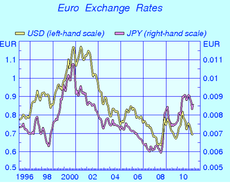
Colour also adds meaning to identity of the photos as it rouses the sense of perception (Douglis, 2004). The graph below shows how colour indicates trends and relations between the EURO against the US dollars and Japanese yen exchange rates

Topography is another of the visual communication aids that is used to aid communications. Topographical forms are used effectively to evoke feelings and emotions from the audience. This is achieved via combining physical form with textual forms.
Topography is used to convey one of the most useful attribute of than existences: motion. Through the use of topographical a sense of direction is achieved. The use of topographical forms is combined with technological innovations resulting to visual communication referred to as topographical animations.
Topographical forms can also be used to relay the essence of time. Using visual topographical forms in motion, objects may be made to appear and disappear into space thus indicating a sequence of time. The figure below is a topographical representation of visual punctuation that evokes human feelings of thrill, hope or apprehension using the exclamation mark (Hostetler, n.d.).

The use of visual communication tools has therefore been used facilitate better relay of information. Visual communication tools such as images, colour pictures and topography are used to add more meaning to a message as they aid the comprehension of information.
Visual also enhance the meaning of a message as they evoke emotions from the reader. Moreover, visuals can also be used to express other dimensions such as direction, space and time. As such communication is effective through visual communication tools.
Reference List
Bank of Finland (1999). Euro exchange rates. Web.
Douglis, P. (2004). When color makes the difference in conveying ideas and meaning. Communication World, 21(4), 52-53. Web.
Few, S. (2006). Stephen Visual communication. Web.
Hostetler, S. (n.d). Integrating Typography and Motion in Visual Communication. Web.